10 Tips to Create Lead Generation Forms That Actually Convert
Generating leads is one of our priorities as marketers. An average of 67% of us, according to SageFrog Marketing Group, say it’s our number one priority! Nothing better than forms to turn an anonymous visitor into a lead. Contact,...

Generating leads is one of our priorities as marketers. An average of 67% of us, according to SageFrog Marketing Group, say it’s our number one priority!
Nothing better than forms to turn an anonymous visitor into a lead. Contact, demo request, download…. These are key elements of a lead generation strategy. It also includes tactics that generate more traffic to the website to boost sales and improve the conversion rate. In today’s world, effective lead generation strategies are crucial for every business to grow.
Filling out a form, however, is a particularly delicate moment: the more information we ask of our visitors, the less interested they will be in providing it. To reduce these obstacles, we need to transform this moment with forms that are designed for them, easy to fill out and relevant. We have tested forms: here is our feedback and our 10 tips to create smart B2B forms and improve your lead generation.
What Is a Lead Generation Form?
A form, mainly in B2B, is a block that can be installed on your website to collect information about your prospects. It is often accessed after clicking on a call-to-action. Their purpose? Convert visitors into leads and then qualify them little by little.
We can find several types of forms:
Contact form: to propose to our contacts to make an appointment and to exchange.Demo request form: to offer a demonstration (as its name suggests) of our product or service.Event registration form: for a physical event or a webinar.Content access form: where, in exchange for information, our prospects can download a white paper or access a webinar replay.A form is a valuable asset for collecting information about your prospects. By strategically placing forms, you can:
Generate leads and transform unknown visitors into contacts.Better understand our audience and who comes to our site.Identify problems and adjust our communication or marketing campaigns.10 Tips to Create Forms That Actually Convert
1. Inspire Confidence
A visitor comes to your landing page. He is still hesitating to fill in the form that stands between him and your offer, a lead magnet or premium content (like an ebook).
If he is there, it’s because he clicked on one of your call-to-action or on a link on social networks. In all cases, he has already taken the first step and shows an interest (still precarious) in what is behind the form.
He is not far from providing the information that would make him a lead and not just a visitor. But he asks himself a question: “Can I really trust this company?”
To encourage him to go further, you have to prove to him that you are trustworthy.
How do you do this?
By always proposing useful and relevant content: the visitor will be more inclined to complete a form on a site whose content is always of high quality.By taking care of the landing page: the landing page to which the form is associated must state the benefits of the offer and include reassuring elements (testimonials or an “About” section to remind them of the company’s purpose).2. Offering a Counterparty That Is Worth It
To initiate the relationship, we need information from the Internet user. We, therefore, seek to obtain and receive data through our forms.
But why would a visitor agree to complete our contact form? He won’t do it without any compensation.
The lead generation form must be considered as a transaction. For the user, the bargain would be as follows: “If I give you my information, what do you give me in exchange?
Therefore, the offer or content promised must provide value. The visitor will have no interest in sharing his data for content that he can easily find elsewhere in self-service.
By value we mean:
Saving timeRemove a technical or operational barrierBringing together dispersed information, and making it more accessibleMaking a complicated concept simpleBringing expertise3. Avoiding Distractions
A visitor is about to complete a lead generation form? Even if it’s a bit early to break out the champagne, it’s already a big step in the relationship.
At this point, it would be a shame if they were to be distracted by another request and back out.
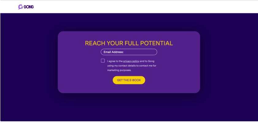
This is why our landing pages should not contain any distracting elements. We will therefore remove from our landing pages navigation menus, links to other pages and, of course, CTAs, as here at Gong:

The goal? That the user is “focused” on one action and one action only: filling out the form.
4. Position the Form Skillfully on the Landing Page
The anatomy of the landing page greatly influences the conversion rate of forms. Not only must the landing page be reassuring and free of distractions, but another variable related to the page design is often overlooked: the location of the form.
One might think that the position of the lead generation form is irrelevant. However, according to a study conducted by Quicksprout, one site saw its form conversion rate jump by 24.6% simply by moving them from the left to the right side of the page.
Here, it’s up to us to monitor: if our prospects are more sensitive to a form that is immediately visible on the landing page, it’s better to favour this format. If, on the other hand, our landing pages with more information and a lower form have better results, it is up to us to adapt. The best thing is to test and monitor the performance of your pages.
5. Don’t Ask for a Phone Number (Except When Necessary!)
According to Quicksprout, 37% of site visitors abandon the form if they are required to enter a phone number. So you have to ask yourself the right questions:
Do we really need the phone number at this stage of the buying process?Can we make it optional to generate more leads?We will nurture the lead mainly by email. It is therefore not imperative to get a phone number right away to nurture the relationship.
If the phone number is essential to the good continuation of the relationship, it is better to encourage than to require. For example, you can offer a faster response in return to boost conversions.
6. The Longer It Takes, the Worse It Is?
As marketers, we have grown up with the idea that the shorter a form is, the more likely it is to convert.
In fact, a study dating from the early 2010s and widely repeated posited this causal link between the number of questions on a form and the conversion rate.
This idea is now being challenged by new studies that show that this relationship is not universal.
A longer form does not necessarily convert less well.
More than a question of length, it is a question of balance between the level of motivation of the user to obtain the counterparty and the level of effort required to obtain it.
To put it more simply, a user will take a “cost/benefit” approach. If he thinks he has a lot to gain, he will agree to fill out a longer form. He will consider that the effort is justified by the added value of the counterpart.
7. Adapting the Button Text
That’s it. The visitor has filled in all the fields of the form. All he has to do now is click on the button. And now he is still hesitating.
What can you do better at this stage?
Adapt the text of the button. Instead of the commonplace “Send”, why not try something more in line with the context. According to Quicksprout, “Click here” generates 30% more conversions than the default text.
The idea here is to favour a text, oriented towards action (therefore, preferably, with a strong action verb), but which implies that the user will receive something – and not have to make any effort. Thus, we can favour: receive rather than download, get rather than ask and start rather than activate.
A click trigger is a small sentence that can be added above or below the button to convince or reassure visitors to our page. For example, for a webinar registration page, the trigger can specify that if users are not available on the date of the event, they can still register to receive the replay.
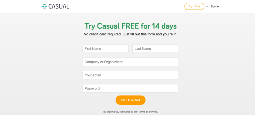
Here is another example, with the classic “No credit card required” click trigger.

8. Explain the Next Steps
If we want the user to fill in our form, we must be transparent about what will happen next.
It is not only a matter of being clear about the nature of the consideration but also of indicating how and for what purposes we will use the data collected. On the one hand, this will increase the sense of trust and on the other hand, it is compliant with the GDPR.
9. Manage the Proportion of Required and Not Required Fields
There is nothing worse than coming across a form that immediately asks for too much mandatory information. It is up to us to determine which information is the most important for us, and to distribute it sparingly throughout our forms to avoid the block effect.
In our experience, prospects are rarely led to fill in mandatory fields by themselves. However, it doesn’t hurt to leave a few, as long as the required fields are clearly visible, using a bold font or an asterisk.
The best thing to do is to put in a few non-mandatory fields for each mandatory one, as this makes it easier for the prospect to complete the information. A highly motivated prospect will fill in all the fields, but a prospect who doesn’t really want to expand may say to himself: “After all, I only have to fill in one of the four fields!
10. Add Labels to All Your Fields
Form labels are very important. They must be clear and precise, there is no point in extending them. For accessibility reasons, you should not just fill in the placeholders, but also do the work of titling the fields.
If our placeholder repeats what we say in the title, we might as well remove it to lighten the visual. However, this may be the time to give an example, add an indication or precision… Here, the two contents must work in harmony for maximum fluidity.
What tools should you use to create your contact forms?
1. Plezi One
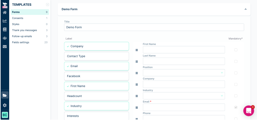
Plezi One is a free tool to create and publish lead generation forms.
The purpose of Plezi One is simple: to let you generate more leads on your website and give you a better understanding of the acquisition and conversion processes.
With its drag & drop form builder, you can easily create forms with automated email responses. Its integration with WordPress makes the publication of forms very fast and easy.

Using Plezi One, you’ll be able to quickly multiply the number of forms on your website and multiply the chances of converting visitors into leads. And it works. Users of Plezi One increase their conversion rates by an average of around 80%.
2. Contact Form 7
Contact Form 7 comes with a contact form template that can be quickly added to both your blog posts and web pages.
Once you’ve activated the plugin, just copy the form shortcode and paste it into a post or page. Visitors to your website will then be able to send messages directly to your inbox using the form on your website.
Once you’re happy using the basic form, you can add more features by taking advantage of the third-party extensions to Contact Form 7 listed on the developer’s website.
3. Gravity Forms
Gravity Forms is an advanced tool that allows you to choose different types of fields to add to your form. These can then be modified to meet your specific needs. You also have a range of options to determine how most of the field types behave.
Form settings let you:
Limit the number of accepted form submissions,Define the period during which the form is active,Require users to be signed in to your website before using the form,Enable form animation.Forms have an important impact on lead generation. Sometimes all it takes is a seemingly small change to positively or negatively influence the conversion rate. In this article, we have detailed the best practices to date. But, as we have seen with regard to form length, nothing is set in stone.
Some commonly accepted rules can be challenged. Therefore, when it comes to forms, it is best to test different variations of form, design and content yourself and compare the results.

 FrankLin


![11 Website Page Load Time Statistics You Need [+ How to Increase Conversion Rate]](https://blog.hubspot.com/hubfs/website%20load%20times.jpg#keepProtocol)


