11 A/B Testing Examples From Real Businesses
Whether you're looking to increase revenue, sign-ups, social shares, or engagement, A/B testing and optimization can help you get there.
 Troov
Troov

Whether you're looking to increase revenue, sign-ups, social shares, or engagement, A/B testing and optimization can help you get there. But for many marketers out there, the tough part about A/B testing is often finding the right test to drive the biggest impact — especially when you're just getting started. So, what's the recipe for high-impact success? Truthfully, there is no one-size-fits-all recipe. What works for one business won't work for another — and finding the right metrics and timing to test can be a tough problem to solve. That’s why you need inspiration from A/B testing examples. In this post, let's review how a hypothesis will get you started with your testing, and check out excellent examples from real businesses using A/B testing. While the same tests may not get you the same results, they can help you run creative tests of your own. A hypothesis can make or break your experiment, especially when it comes to A/B testing. When creating your hypothesis, you want to make sure that it’s: When creating a hypothesis, following the "If, then" structure can be helpful, where if you changed a specific variable, then a particular result would happen. Here are some examples of what that would look like in an A/B testing hypothesis: Let’s go over some real-life examples of A/B testing to prepare you for your own. Most websites have a homepage hero image that inspires users to engage and spend more time on the site. This A/B testing example shows how hero image changes can impact user behavior and conversions. Based on previous data, HubSpot Academy found that out of more than 55,000 page views, only .9% of those users were watching the video on the homepage. Of those viewers, almost 50% watched the full video. Chat transcripts also highlighted the need for clearer messaging for this useful and free resource. That's why the HubSpot team decided to test how clear value propositions could improve user engagement and delight. HubSpot used three variants for this test, using HubSpot Academy conversion rate (CVR) as the primary metric. Secondary metrics included CTA clicks and engagement. Variant A was the control. For variant B, the team added more vibrant images and colorful text and shapes. It also included an animated "typing" headline. Variant C also added color and movement, as well as animated images on the right-hand side of the page. As a result, HubSpot found that variant B outperformed the control by 6%. In contrast, variant C underperformed the control by 1%. From those numbers, HubSpot was able to project that using variant B would lead to about 375 more sign ups each month. Every marketer will have to focus on conversion at some point. But building a website that converts is tough. FSAstore.com is an ecommerce company supplying home goods for Americans with a flexible spending account. This useful site could help the 35 million+ customers that have an FSA. But the website funnel was overwhelming. It had too many options, especially on category pages. The team felt that customers weren't making purchases because of that issue. To figure out how to appeal to its customers, this company tested a simplified version of its website. The current site included an information-packed subheader in the site navigation. To test the hypothesis, this A/B testing example compared the current site to an update without the subheader. This update showed a clear boost in conversions and FSAstore.com saw a 53.8% increase in revenue per visitor. The visuals on your web page are important because they help users decide whether they want to spend more time on your site. In this A/B testing example, Expoze.io decided to test the background on its homepage. The website home page was difficult for some users to read because of low contrast. The team also needed to figure out how to improve page navigation while still representing the brand. First, the team did some research and created several different designs. The goals of the redesign were to improve the visuals and increase attention to specific sections of the home page, like the video thumbnail. They used AI-generated eye tracking as they designed to find the best designs before A/B testing. Then they ran an A/B heatmap test to see whether the new or current design got the most attention from visitors. The new design showed a big increase in attention, with version B bringing over 40% more attention to the desired sections of the home page. This design change also brought a 25% increase in CTA clicks. The team believes this is due to the added contrast on the page bringing more attention to the CTA button, which was not changed. Many landing pages showcase testimonials. That's valuable content and it can boost conversion. That's why Thrive Themes decided to test a new feature on its landing pages — customer testimonials. In the control, Thrive Themes had been using a banner that highlighted product features, but not how customers felt about the product. The team decided to test whether adding testimonials to a sales landing page could improve conversion rates. In this A/B test example, the team ran a 6-week test with the control against an updated landing page with testimonials. This change netted a 13% increase in sales. The control page had a 2.2% conversion rate, but the new variant showed a 2.75% conversion rate. Getting users to engage with email isn't an easy task. That's why HubSpot decided to A/B test how alignment impacts CTA clicks. HubSpot decided to change text alignment in the weekly emails for subscribers to improve the user experience. Ideally, this improved experience would result in a higher click rate. For the control, HubSpot sent centered email text to users. For variant B, HubSpot sent emails with left-justified text. HubSpot found that emails with left-aligned text got fewer clicks than the control. And of the total left-justified emails sent, less than 25% got more clicks than the control. Making the most of email promotion is important for any company, especially those in competitive industries. This example uses the power of current customers for increasing email engagement. Neurogan wasn't always offering the right content to its audience and it was having a hard time competing with a flood of other new brands. An email agency audited this brand's email marketing, then focused efforts on segmentation. This A/B testing example starts with creating product-specific offers. Then, this team used testing to figure out which deals were best for each audience. These changes brought higher revenue for promotions and higher click rates. It also led to a new workflow with a 37% average open rate and a click rate of 3.85%. For more on how to run A/B testing for your campaigns, check out this free A/B testing kit. A/B testing examples like the one below can help you think creatively about what to test and when. This is extra helpful if your business is working with influencers and doesn't want to impact their process while working toward business goals. Fashion brand Vestaire wanted help growing the brand on TikTok. It was also hoping to increase awareness with Gen Z audiences for its new direct shopping feature. Vestaire's influencer marketing agency asked eight influencers to create content with specific CTAs to meet the brand's goals. Each influencer had extensive creative freedom and created a range of different social media posts. Then, the agency used A/B testing to choose the best-performing content and promoted this content with paid advertising. This testing example generated over 4,000 installs. It also decreased the cost per install by 50% compared to the brand's existing presence on Instagram and YouTube. Paid advertising is getting more expensive, and clickthrough rates decreased through the end of 2022. To make the most of social ad spend, marketers are using A/B testing to improve ad performance. This approach helps them test creative content before launching paid ad campaigns, like in the examples below. Underoutfit wanted to increase brand awareness on Facebook. To meet this goal, it decided to try adding branded user-generated content. This brand worked with an agency and several creators to create branded content to drive conversion. Then, Underoutfit ran split testing between product ads and the same ads combined with the new branded content ads. Both groups in the split test contained key marketing messages and clear CTA copy. The brand and agency also worked with Meta Creative Shop to make sure the videos met best practice standards. The test showed impressive results for the branded content variant, including a 47% higher clickthrough rate and 28% higher return on ad spend. Pivoting to a new strategy quickly can be difficult for organizations. This A/B testing example shows how you can use split testing to figure out the best new approach to a problem. Databricks, a cloud software tool, needed to raise awareness for an event that was shifting from in-person to online. To connect with a large group of new people in a personalized way, the team decided to create a LinkedIn Message Ads campaign. To make sure the messages were effective, it used A/B testing to tweak the subject line and message copy. The third variant of the copy featured a hyperlink in the first sentence of the invitation. Compared to the other two variants, this version got nearly twice as many clicks and conversions. On this blog, you'll notice anchor text in the introduction, a graphic CTA at the bottom, and a slide-in CTA when you scroll through the post. Once you click on one of these offers, you'll land on a content offer page. While many users access these offers from a desktop or laptop computer, many others plan to download these offers to mobile devices. But on mobile, users weren't finding the CTA buttons as quickly as they could on a computer. That's why HubSpot tested mobile design changes to improve the user experience. Previous A/B tests revealed that HubSpot's mobile audience was 27% less likely to click through to download an offer. Also, less than 75% of mobile users were scrolling down far enough to see the CTA button. So, HubSpot decided to test different versions of the offer page CTA, using conversion rate (CVR) as the primary metric. For secondary metrics, the team measured CTA clicks for each CTA, as well as engagement. HubSpot used four variants for this test. For variant A, the control, the traditional placement of CTAs remained unchanged. For variant B, the team redesigned the hero image and added a sticky CTA bar. For variant C, the redesigned hero was the only change. For variant D, the team redesigned the hero image and repositioned the slider. All variants outperformed the control for the primary metric, CVR. Variant C saw a 10% increase, variant B saw a 9% increase, and variant D saw an 8% increase. From those numbers, HubSpot was able to project that using variant C on mobile would lead to about 1,400 more content leads and almost 5,700 more form submissions each month. Businesses need to keep up with quick shifts in mobile devices to create a consistently strong customer experience. A/B testing examples like the one below can help your business streamline this process. Hospitality.net offered both simplified and dynamic mobile booking experiences. The simplified experience showed a limited number of available dates and the design is for smaller screens. The dynamic experience is for the larger mobile device screens. It shows a wider range of dates and prices. But the brand wasn’t sure which mobile optimization strategy would be better for conversion. This brand believed that customers would prefer the dynamic experience and that it would get more conversions. But it chose to test these ideas with a simple A/B test. Over 34 days, it sent half of the mobile visitors to the simplified mobile experience, and half to the dynamic experience, with over 100,000 visitors total. This A/B testing example showed a 33% improvement in conversion. It also helped confirm the brand's educated guesses about mobile booking preferences. A lot of different factors can go into A/B testing, depending on your business needs. But there are a few key things to keep in mind: You can see amazing results from the A/B testing examples above. These businesses were able to take action on goals because they started testing. If you want to get great results, you've got to get started, too. Editor's note: This post was originally published in October 2014 and has been updated for comprehensiveness.

A/B Testing Hypothesis Examples
A/B Testing Examples
Website A/B Testing Examples
1. HubSpot Academy's Homepage Hero Image
Problem
A/B Test Method
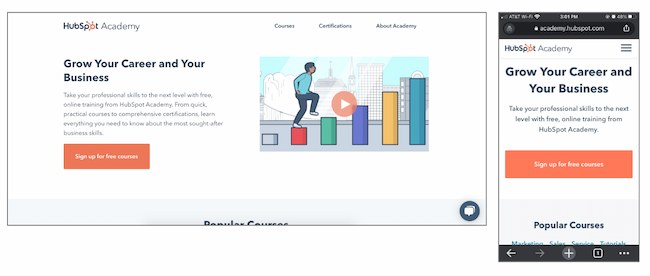
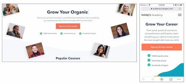
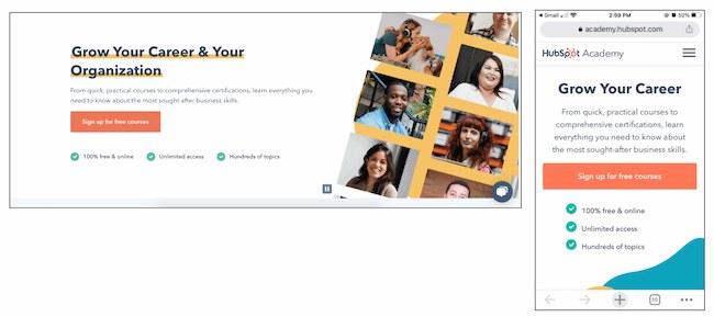
Results
2. FSAstore.com’s Site Navigation
Problem
A/B Test Method
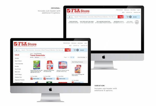
Results
3. Expoze’s Web Page Background
Problem
A/B Test Method
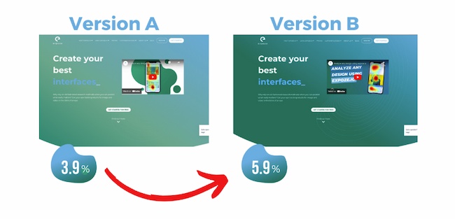
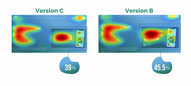
Results
4. Thrive Themes’ Sales Page Optimization
Problem
A/B Test Method
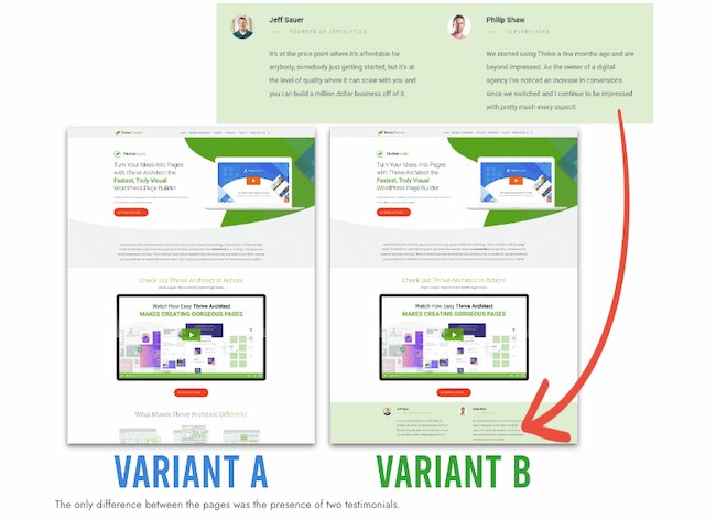
Results
Email A/B Testing Examples
5. HubSpot's Email Subscriber Experience
Problem
A/B Test Method
Results
6. Neurogan’s Deal Promotion
Problem
A/B Test Method
Results
Social Media A/B Testing Examples
7. Vestiaire’s TikTok Awareness Campaign
Problem
A/B Test Method
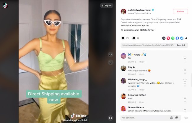
Results
8. Underoutfit’s Promotion of User-Generated Content on Facebook
Problem
A/B Test Method
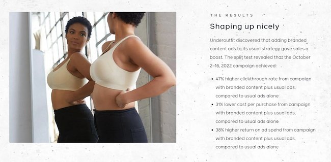
Results
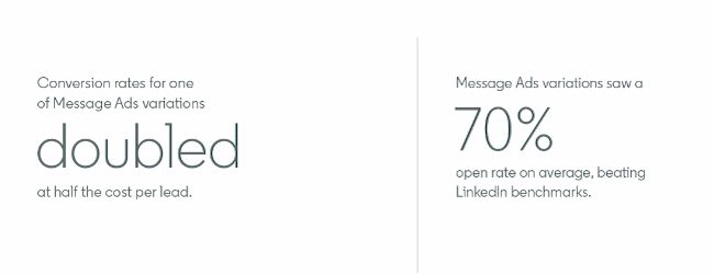
9. Databricks’ Ad Performance on LinkedIn
Problem
A/B Test Method
Results
Mobile A/B Testing Example
7. HubSpot's Mobile Calls-to-Action
Problem
A/B Test Method
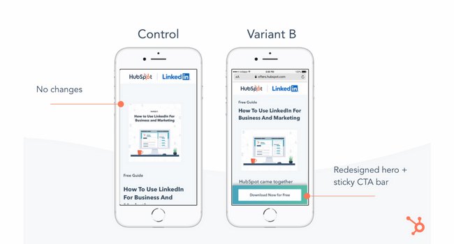
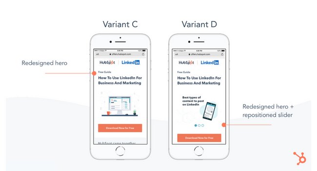
Results
11. Hospitality.net’s Mobile Booking
Problem
A/B Test Method
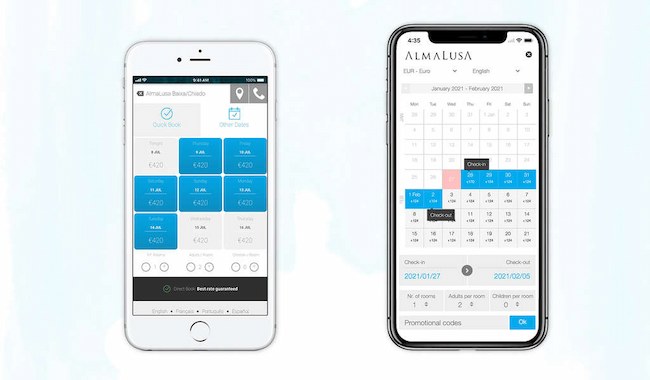
Results
A/B Testing Takeaways for Marketers
Start Your Next A/B Test Today