5 Essential Logo Variations That Every Business Needs
Logos are an important part of developing brand awareness and recognition for your business. After all, they are plastered everywhere from websites and social media accounts to business cards and marketing materials. Your logo is often the first thing...
Logos are an important part of developing brand awareness and recognition for your business. After all, they are plastered everywhere from websites and social media accounts to business cards and marketing materials.
Your logo is often the first thing potential customers will see when they are introduced to your brand, so it’s critical to leave a strong impression. But did you know that you’re not limited to just one logo? In fact, having a few key variations of your logo can be beneficial for different marketing contexts.
In this article, we will cover the what and the why of logo variations. By the end, you will have a clear understanding of the designs you need on hand and when to use each of them. Let’s get into it!
Importance of Developing Logo Variations
Creating multiple variations of your logo may seem like unnecessary work upfront, but it will save you time and energy in the long run. Logo variations allow you to tailor your branding to specific size requirements, applications, and situations.
By taking care of this design work in advance, you can avoid any hiccups or inconsistencies down the road when you need to whip up a quick social media post or design a merch line. Plus, having a variety of logo designs gives you the freedom to be creative with your marketing collateral and experiment with different looks to keep your brand fresh.
For example, a horizontal variation may be better suited for header space on your website while a circular logo can be used on social media platforms like Facebook or Instagram. By designing both versions in tandem, you can ensure that your branding is cohesive and flexible no matter where it’s being used. As the business expands to develop new products, services, or markets, you will have on-brand resources that can be easily applied to new materials.
5 Essential Logo Variations
Now that we’ve gone over the importance of developing multiple logo designs, let’s break down the five variations that every business should have in its toolkit.
1. Primary Logo
Before worrying about logo variations, every business needs to nail its primary logo. This go-to design will be used most often and will likely become the face of your brand. As such, it’s important to put extra thought into making sure it fits your brand’s ethos.
The primary logo should be simple enough to be memorable but also unique enough to make your brand stand out from the competition. Although text-based primary logos are increasingly common, symbols or logos that incorporate both text and imagery can also be very effective.
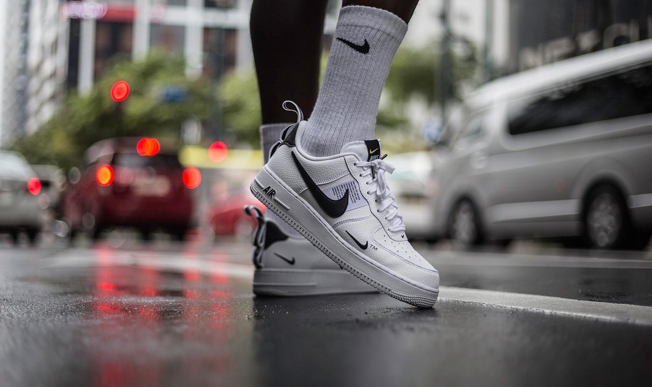
For inspiration, think about some of the most recognizable brands in the world, like Apple, Nike, and McDonald’s, and take note of the simplicity of their designs. These iconic companies have largely built their brand recognition on the strength of a simple, but memorable primary logo.
2. Secondary Logo
A secondary logo, sometimes referred to as a ‘vertical’ or ‘stacked’ logo, is a variation of the primary design that is better suited for narrower spaces. And in rare instances where the primary logo is vertical, the secondary logo should take on a horizontal design.
The secondary logo is typically a rearrangement of the elements in the brand’s primary logo. It should have the same font, colors, and overall look as the original design, but be adapted for a different orientation.
Secondary logo variations are often used on mobile web designs, social media profile pictures, clothing tags, and business cards.
3. Submark
Unlike the secondary logo, which is a rearrangement of the primary, the submark is a smaller and more simplified logo variation. When the primary or secondary logos are not suitable, the submark is a condensed version that still maintains the integrity of the original design.
The submark is typically a symbol, monogram, or initialism that can be used on its own or as an icon. By dropping much of the accompanying text, such as the slogan or business name, the submark allows for more versatility and can be used in a wider array of applications. It may be placed over imagery as a watermark, embroidered on company merchandise, or added to the website footer.
For example, the world-renowned fashion brand Gucci doesn’t use its full name in its submark. Instead, it uses a double ‘G’ monogram that is immediately recognizable to fans of the designer label. Similarly, Nike drops its brand name and leaves only its trademark “swoosh” symbol in its submark.
4. Wordmark
A wordmark, also known as a logotype, is a text-based logo that prominently features the brand name. Traditionally, wordmark logos have been designed in custom, hand-drawn fonts to give them personality.
However, in recent years many brands have traded in the unique look and feel for a bolder, more immediately recognizable design. As a result, even the most luxurious of brands have begun to converge around a handful of similar wordmark styles.
Many businesses, such as Yves Saint Laurent, Burberry and Balmain, have abandoned ornate serif fonts in favor of modern and easy-to-read black lettering. While this loss of individuality may be mourned in the fashion world, it has undoubtedly made these logos more versatile and easier to reproduce across different applications.
5. Favicon
A favicon is a 16px by 16px icon that appears in a web browser tab. While it may seem like a tiny and unimportant detail, these simple images play an outsized role in building brand recognition when someone visits your website.
As long as your webpage stays open in a browser, the favicon will remain visible, subtly reinforcing your brand identity. Plus, when someone has multiple tabs open, a favicon can help them quickly and easily find your site again.
Favicons are typically the brand’s initials, submark, or another symbol that is unique to the company. Favicons can also double as app icons or social media profile pictures, which is an added bonus for your design effort.
Logo Variations Recap
While the primary logo is the cornerstone of your brand identity, these five logo variations are essential for creating a cohesive and recognizable design system. By having a few different versions of your logo ready to go, you will be prepared for any branding or marketing exercise that comes your way.
To recap, every business needs:
Primary logoSecondary logoSubmarkWordmarkFaviconThis combination of designs will give you the flexibility to reinforce your branding in a variety of contexts, both online and offline. And if you feel stressed just thinking about all of the different logo designs you need, don’t worry—you can always hire a professional logo designer to help you out!

 ValVades


