7 Essential Landing Page Elements You Need to Have
Landing pages are one of the most important elements of lead generation. But they’re only effective if you know what to put on a landing page to begin with.
 KickT
KickT
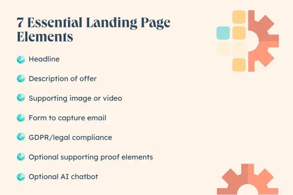
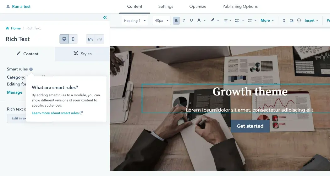
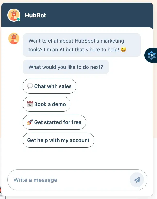
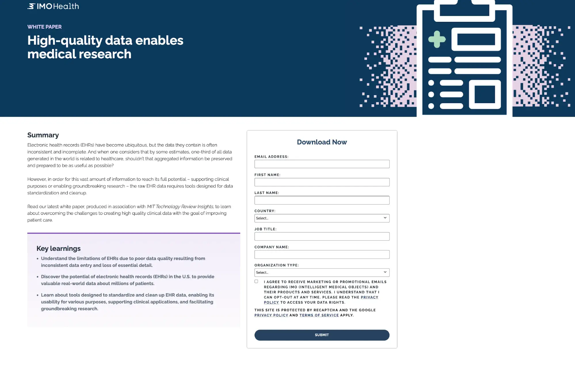
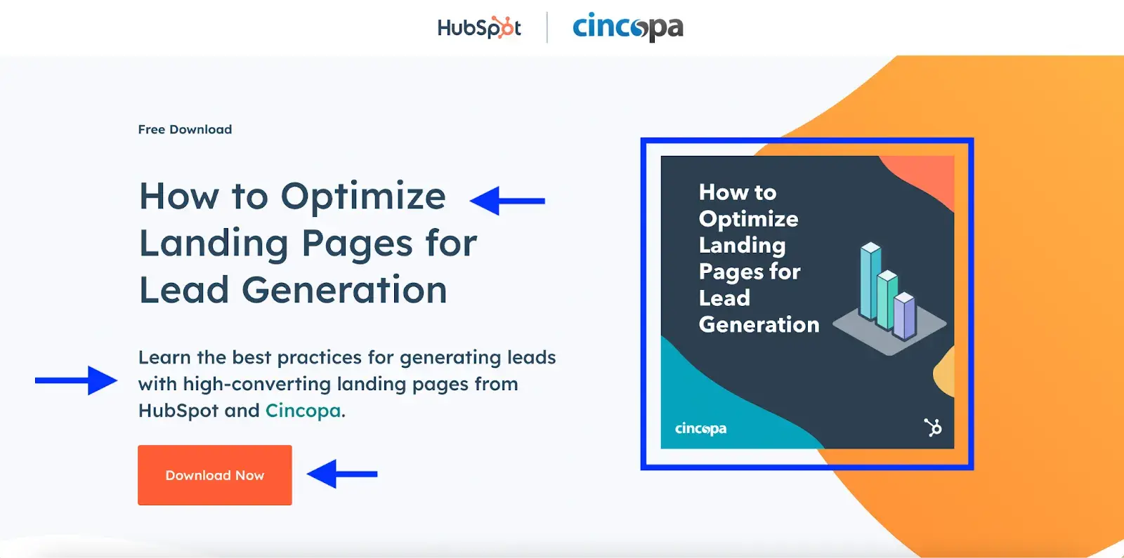
Landing pages are one of the most important elements of lead generation. But they’re only effective if you know what to put on a landing page to begin with. It’s common to put more attention and resources into your main website and product pages, but landing pages are the most direct way to convert a higher percentage of visitors into leads. To get the most out of your lead generation strategy and increase your conversion rate, here’s what to put on a landing page. A great landing page turns your visitors into leads. Sometimes referred to as a lead-capture page, landing pages contain a lead generation form that collects the visitors’ contact information in exchange for something of value, like an ebook, an offer, or a discount. The basic elements of a great landing page are: The difference between a landing page and your main website is that your website doesn’t have a single goal or call-to-action (CTA) for visitors to follow. The goal of a landing page is to tell your visitors exactly what you want them to do and why they should do it. You can create as many landing pages as you want — one for every campaign or offer you launch, for example. According to a 2023 survey we conducted, over half of marketers have between five and 10 landing pages on their websites. Homepages, while still an important element of a website, are typically less focused on a particular task because they serve the masses. They’re great for direct traffic, but when you can control how visitors arrive on your site, a landing page is the best place to send them. When you have a specific product or campaign to promote, create a dedicated landing page for it. You can drive traffic to that page through email marketing, social media, and pay-per-click (PPC) advertising. If your messaging and the rest of the landing page features are aligned with the visitor’s goals, you’ll have a greater chance of converting visitors into leads. In a 2023 HubSpot survey of 101 marketers, 10.9% say their landing pages have a 20% or higher conversion rate on average. Wondering what it takes to get a stellar landing page conversion rate? Check out the tips below to learn what to put on a landing page to drive traffic and gain leads. It can be tempting to direct visitors to your website homepage simply because you’re unsure what to put on a landing page in the first place. But if you’re running a campaign for a specific product or offer, you need a dedicated landing page. As mentioned above, homepages typically have too much messaging, making visitors feel lost. I'd also recommend not using a main site product page either. Even if your homepage and sub-pages are awesome, a dedicated landing page will perform better when it comes to converting visitors into leads because they are focused on one task. Plus, you don’t need experienced design skills to create landing pages. You can use a landing page builder to seamlessly create a landing page that matches your website and offering. In fact, our survey found that 43.6% of marketers use pre-made CMS themes and templates to create their landing pages. Get Started With HubSpot’s Free Landing Page Builder Your headline should be benefit-focused to let people know right away what’s in it for them. Keep it brief while clearly communicating your offer. You can go into more detail with a brief description. The description should emphasize the benefit in the headline and provide a few more reasons why visitors should convert. Writing compelling copy that engages users can be a challenge at times. But don’t let this part slow you down in the landing page process. Instead, consider using an AI tool like HubSpot’s Campaign Assistant. The tool can help you generate copy for your landing page in seconds — all you have to do is refine it so it’s in your brand voice. Speaking of AI: If you have an AI chatbot, consider using it on product landing pages. Here’s an example from HubSpot’s landing page for its landing page builder (say that 10 times fast): Finally, don’t skip the visuals. Of marketers surveyed, 38.6% say that video is the landing page element that most positively impacts conversion rate, while 35.6% say imagery or graphics do. In either case, landing page visuals are clearly impactful, so take your time developing images and videos for your landing page campaigns. A landing page is used for one purpose and one purpose alone — to encourage a visitor to take a specific action. To keep visitors focused on your landing page’s content and message, remove the main site navigation from the page so they don’t move off the page. We ran an A/B test for paid ad visitors and found that removing the main navigation boosted our CVR by 11%. Rebecca Hinton, a CRO strategist here at HubSpot, says, “If you send [paid ad visitors] to a website with full navigation, maybe they get distracted. Maybe they just [wanted the ebook].” HubSpotter Curt del Principe talked to Hinton and has the whole story, plus everything you need to run your own A/B test. You should also be mindful of navigation as it relates to the lead generation on your landing page. If you have a form, keep your questions to a minimum. Of the marketers we surveyed, 30.7% suggest four is the ideal number of questions to put on a landing page. Need to add a form to your landing page? You can easily put together a form using HubSpot’s free form builder tool. In the landing page example below from MIT Technology Review, the form includes seven fields to fill in, with one being optional. The rest of the page is straightforward, offers clear navigation, and outlines exactly what you’ll get after submitting the form. Don’t stuff too much information on your landing pages. Make it clear what the page is about and what you want the visitor to do. Limit the amount of copy, images, media, and links to only what’s necessary, and organize your content in a proper structure so objects are in logical order. It’s especially important that the CTA is as crystal clear as possible for the visitor. Let’s take a look at an example landing page from HubSpot. This landing page is designed to promote a free guide about optimizing landing pages for lead generation. The design is simple — as soon as a visitor lands on the page, they’re greeted with the most essential elements: The headline and description are clear and let visitors know exactly what the offer is and why they need it. The CTA button is also straightforward, which is another best practice for landing pages. Looking for more inspiration for your landing page? Check out these stellar landing page examples. When thinking about your CTA button, avoid using the word “Submit” — it’s vague and it doesn’t let the user know exactly what they’re submitting their information for. Always use language that indicates what they’re getting in return. For example, “Download Now,” “Get your Free Evaluation,” or “Join our Mailing List.” Whether a visitor comes from a PPC ad, email, or CTA from another source, ensure the messaging matches throughout the entire conversion path. If your PPC ad says, “Download our Marketing Ebook,” your landing page should say the exact same thing — or be similar enough that users know they’re in the right place. If there is a disconnect in your messaging, visitors will feel as if they are in the wrong place and will likely hit the “Back” button. Friction is caused by objects (or missing objects) on a page that inhibit a visitor from taking action. This can include providing too much information (adding complexity), animation that is distracting, lack of customer proof or security, etc. Make your visitors feel confident in their choice to provide their information. To reduce friction, keep the page simple. Include your most important elements, like the main message, your offer, and the lead generation form, at the beginning of the page. Save the more detailed description, testimonials, and FAQs for later in the page as the visitor scrolls down. Don’t require visitors to read too much, and don’t present internal links that will lead them away from the landing page. Do include social proof elements such as customer testimonials, number of downloads or sales (to indicate acceptance from others), or security badges (if you’re dealing with sensitive data such as credit card information). And, as mentioned above, make sure messaging matches throughout their conversion path. What you put on a landing page is just as important as what the landing page is for in the first place. While landing page campaigns should be used often in your lead generation strategy, be intentional about what you’re offering. The offer has to be valuable for leads to exchange for their information, and it has to be something they can’t get anywhere else. Here are a few examples of what provides value and what doesn’t: When it comes to lead generation forms, there is no magic answer for the number of form fields that should be required. But here is one simple rule of thumb: Only ask for what you or your sales team really needs. If you don’t need their hair color, don’t ask for it. Try to stay away from sensitive or confidential information, too. As for contact information, depending on what you’re generating leads for, name and email address is usually enough. HubSpot’s forms (below) ask for information based on whether you’re already in our CRM — that way, you don’t have to input info we already have. If you want to ask for more, 25.7% of marketers in our survey agree that a phone number is the next most important thing to request on a landing page form after name and email. Every new campaign or offer needs a landing page. The more landing pages you have, the more opportunities to convert traffic into leads. And because these landing pages aren’t directly linked in your website’s navigation, you don’t need to worry about crowding your site or distracting visitors who are casually browsing your company page. According to our 2023 survey, a majority of marketers (37.6%) have five or fewer landing pages on their websites. However, 6.9% of marketers have over 26 landing pages on their websites. There is no magic number, but you can create as many landing pages as you have offers. This is optional, but it’s another great way to drive more visitors to your landing pages. Include social media sharing links or a social sharing widget on your landing pages so visitors can easily share that content with their own personal networks, and, in turn, drive more opportunities for converting leads. If you partner with another company on an offer — let’s say an ebook — make a plan for both teams to distribute the landing page on their channels. The more coverage you can get, the higher the chance of visitors you’ll have. Evaluate your landing pages, and use these best practices as a checklist for setting up the perfect page. Effective landing pages are what will turn your website into a lead-generating machine. And don’t forget to test your landing pages to see which ones work best for you. There are really just a few essential elements that you should feature on your landing pages — this isn’t the time for maximalism. Use these tips to create landing pages for your products or offers, and watch your conversions grow. Editor's note: This post was originally published in March 2013 and has been updated for comprehensiveness.
Landing Page Elements
What to Put on a Landing Page: 10 Tips and Best Practices
1. Never use your homepage as a landing page.
2. Follow the standard structure.
3. Remove extra navigation.
4. Keep the objective simple and straightforward.
5. Match the content to a visitor’s previous source.
6. Reduce friction.
7. Focus on value.
8. Only ask for what you need.
9. Create a lot of landing pages.
10. Make your landing pages shareable.
Create Great Landing Pages


![How Meta Makes Its Money [Infographic]](https://imgproxy.divecdn.com/Kn_lAdtd3hjL-g3cebdKw3vQ_uTSMewIOId-plpm62o/g:ce/rs:fit:770:435/Z3M6Ly9kaXZlc2l0ZS1zdG9yYWdlL2RpdmVpbWFnZS9tZXRhX2Fkc18yLnBuZw==.webp)