The 16 Best Abandoned Cart Emails To Win Back Customers
Abandoned cart emails are an essential part of an email marketing strategy — especially if you’re serious about boosting sales.

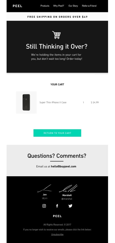
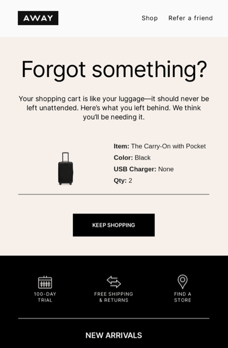
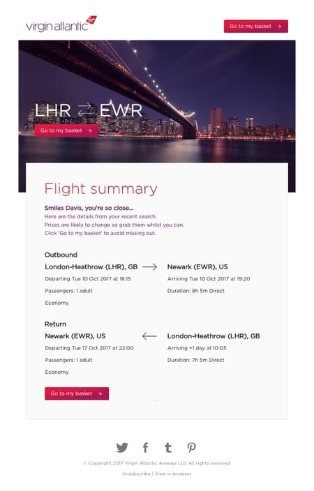
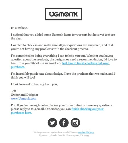
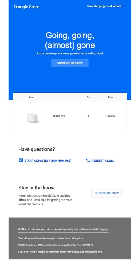
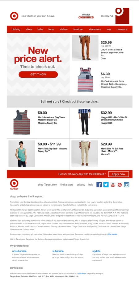
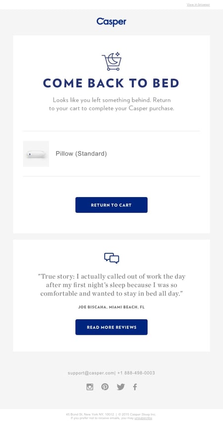
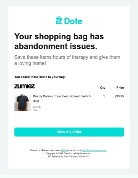
Abandoned cart emails are an essential part of an email marketing strategy — especially if you’re serious about boosting sales. Whether you sell to other companies or consumers, you can benefit from sending cart abandonment emails to buyers who haven’t completed their purchase. Here, you'll find abandoned cart email templates to get you started, plus effective abandoned cart email examples to inspire your own. An abandoned cart email is an email sent to customers who almost made a purchase to encourage them to complete their transaction. Abandoned cart emails can be triggered by buyers leaving the final checkout page, placing an item on their cart, or abandoning the purchasing process at any point. Abandoned cart emails are one way to convert lost business and turn a hesitant prospect into a customer. If you feel like you’ve lost your customer’s business once they failed to click “Check out now,” don’t fear. Customers navigate away from the checkout page for many reasons, and if one of those is merely timing, abandoned checkout emails can help you finally win their business. But what kind of tools can you use for sending abandoned cart emails? For non-email-marketers, this may feel like a difficult question to answer. You’ll need several tools: Ecommerce Point-of-Sale Software: First, you need a point-of-sale software that can detect when users abandon their carts. Most tools offer this feature, and a few come with a built-in emailing tool to send abandoned cart emails. Ecommerce Website Builder: If you’re a new retailer, you can benefit from switching to a dedicated ecommerce website builder. These types of site builders come bundled with point-of-sale software and attribution reporting, helping you send abandoned checkout emails to customers. Email Marketing Service: Of course, you need an email marketing tool to send the emails to your contact database. Most point-of-sale software and website builders can integrate with email marketing tools, and vice versa. Once you have your tools, you can then begin using cart abandonment email templates. To build your abandoned cart emails, you can find templates in any email marketing tool. Tools like Squarespace, Wix, or HubSpot will have templates to help you get started. For instance, you can use a pre-made template for the layout, but customize the message, images, and design. Here's an example template from our marketing kit: Download HubSpot's Abandoned Email Template The messaging in abandoned cart emails is fairly simple. Below is an outline of the basic structure: Snappy subject line Introduction text Items left in the cart Offer or discount Checkout button or call to action (CTA) Reviews or social proof Closing text While this outline is helpful if you're sending one abandoned cart email, you might consider a drip campaign for your cart recovery emails. A drip campaign is a series of automated emails. For an abandoned cart workflow, the emails could be structured like this: Email 1: Cart reminder (sent a few hours after cart abandonment) Email 2: Follow up (sent a few days later) Email 3: Promotional discount (sent a few days after email two) A series of emails will work much better than a single email for abandoned cart emails. Jordan Pritikin, a team manager for HubSpot's email and growth marketing team, says, "When you're writing an abandoned cart email, personalization is key. What was the actual product or service that was abandoned? What are the value propositions that most resonate with the individual you're sending to? Why did they object to the purchase initially and how can you, as the business, help assuage those objections? The more personal your abandoned cart email, the more likely it is to succeed!" Now, let’s take a look at the best examples that hit the mark. The email above was sent to me by hair care company Prose after I left the site before completing my transaction. This email checks several boxes: It uses a catchy tagline ("Ready When You Are") as a friendly reminder to revisit the site, it has an enticing CTA encouraging folks to "Make My Custom Formula,” and it uses social proof in the form of ratings. Combined with a friendly tone and clean graphics, this email is pretty persuasive. The “Make My Custom Formula” CTA is unique and true to the brand, extending the personalized customer experience that began when I first visited the website. When crafting your abandoned cart emails, try to build upon your established branding to create a seamless CX. Whiskey Loot's abandoned cart email utilizes unique and engaging copywriting to entice customers to complete their purchase. They include a list of reasons to purchase their whiskey, provide answers to frequently asked questions, and use clean design to draw your eye to the CTA. With this abandoned cart email, the customer has all the information they might need to complete a purchase. We like that this abandoned cart email focuses on informing the recipient, not just generating a purchase. This tactic works well to increase trust while cementing Whiskey Loot’s clever brand voice. Depending on the type of product you sell, your abandoned cart emails should both entice and inform the recipient. The best element of Peel's abandoned cart email is the free shipping offer. Not only do they encourage customers to purchase what's in their cart, but they also include an incentive for buyers to add more items to their cart and complete checkout. In addition, this is a classic layout for an abandoned cart email: intro text, items in cart, CTA, questions, and footer. Peel includes text that creates urgency for buyers, such as “Don’t wait too long!” and “Order today!” But they don’t include it as the heading, striking the right balance between casual (“Still thinking it over?”) and urgent. We also like that it includes the founders’ signatures at the bottom, making the company feel personable and small. This is a good move for smaller businesses whose CEOs are involved heavily in the everyday tasks of the business. Short, sweet and to the point, luggage brand Away has an abandoned cart email with only a few elements: introduction text ("Forgot something?"), CTA ("Keep shopping"), and closing text offering more navigational paths ("New arrivals", “Suitcases,” and so forth). With this email, customers won't get distracted by extraneous information and will focus on the action Away wants: purchase completion. Away not only prompts recipients to check out, but also offers additional avenues for purchase, such as exploring new products and other categories. No matter which link users click on, they’re bound to end up at a checkout page again. When including links to your emails, ensure they all fulfill the purpose of leading to a purchase. In this example, Dyson does several things very well: They use clear text that is helpful and fun to read. For example, "All is not lost" and "We saved the contents" let the customer know that Dyson wants to be helpful. They include an image of the product and list the item still in the customer's cart. They add a sense of urgency. The text, "Your basket for this promotion was saved, but the offer is only for a limited time" creates a sense of importance about this purchase. They include two CTA buttons. This allows customers on mobile to see a CTA button even as they scroll down. These buttons make it easy to complete their purchase at every touchpoint. Overall, this email includes the right elements, while also showcasing a sleek, clean design that makes it easy to read. Dyson plays to one common fear of online shoppers: Losing the contents of their carts and forgetting what they meant to purchase. That alone might make the recipient feel like they should check out before all is lost. Avoiding pain is sometimes a more powerful motivator than gaining a benefit. When creating your checkout abandonment emails, you might use a similar psychological trick. In this example, Virgin Atlantic uses engaging text and three CTA buttons to encourage customers to complete their purchase. The personalized intro text, "Smiles Davis, you're so close…" makes customers feel like they're being spoken to directly, while also reminding them how close they are to travel. This email also includes flight information, so they have everything they need to make a purchase. When writing your own abandoned cart emails, this is a good example to follow because it takes away any roadblocks for the customer. We love how personalized this email is — down to the outbound and inbound locations of the flight. It also includes an image of the destination, indirectly increasing the recipient’s desire to fly. When sending abandoned cart emails, you might include an image of the customer’s “destination” — a happier self, a new product on their shelves, or any other positive result. Ugmonk uses a different approach to their abandoned cart email. They focus entirely on personalization, making it seem like the owner and designer is reaching out directly to answer any questions. Plus, this includes two in-line CTAs so the customer can finish checking out instantly if they want. This is a simple approach that your target audience may prefer. This email feels more like a message from a friend than from a company, making it feel less like a “sales” play and more of a “get to know you” play. We especially love how it’s signed by the company’s CEO, and how he mentions his passion for design. If your company is small or sells a niche product, consider taking a friendly, frills-free approach like this one. Drop's abandoned cart email is a good example because of its use of images and copywriting. Drop creates urgency in the bolded text "ends in 19 days." After they create urgency and include their CTA, they also add other items that the customer might be interested in based on what's in their cart. This is a good strategy to get the customer back on their site browsing other items they might want, hopefully turning into a completed purchase. Drop creates a sense of urgency, but isn’t pushy, and it includes various product images to entice potential buyers. We especially love the extended catalog below the fold, providing additional items the recipient might want to consider. This is a perfect example of an abandoned cart email because it includes every element: Great copywriting, clear CTA, personalization by showing the customer's cart, and urgency. With text like "Going, going, (almost) gone" and "Our popular items sell out fast", customers are engaged. They also feel compelled to complete their purchase so they don't miss out. This email closes with a CTA to answer questions and subscribe to their product updates. Again, Google focuses on ensuring the customer feels like they don't want to miss out on anything. Target takes a different approach in their abandoned cart email by offering a discount on the items in the customer's cart. The text "New price alert" and "Time to check out" make it hard to walk away. But if that approach doesn't work on their customer, Target also includes similar items to get their customer browsing and shopping again. Target designed this cart abandonment email just like its website, building upon the experience customers get when they visit target.com. You can take a similar approach if your catalog is specially large. For instance, you can provide a navigation menu right at the top of the email. What I love about this example is that Casper uses social proof. Word of mouth and reviews are becoming increasingly important in the world of marketing. When people don't complete a purchase, it might be because they haven't finished their research. Casper's abandoned cart email makes it easy for the customer to pick up where they left off in regard to their research. Plus, it includes snappy text and clear CTA buttons that entice the customer to continue shopping. Casper’s email is short, simple, and effective — and it includes a clear call-to-action that’s impossible to miss. But we especially love the second call-to-action to “Read more reviews.” Someone who hesitated to finish their purchase may have done so because they’re not sure Casper is “worth it.” Reading more reviews is key to convince this type of buyer. Funny, interesting text is the way to your customer's heart. Dote excels at it with humorous copywriting. In their email, they say "Your shopping bag has abandonment issues" and "Save these items hours of therapy and give them a loving home." This text is entertaining, which makes the brand compelling to its customers. This example showcases how to use abandoned cart emails to illustrate your brand's personality and create brand enthusiasts. This email is short, sweet, and to the point, making it easy to continue shopping. The “View my order” CTA is both unique and effective, cementing the fact that you risk leaving behind your order, not just any items in the store. It feels pleasantly personal, humorous, and targeted. The bottom of Moschino's email is unique because it includes information on secure payments and easy returns. For clothing ecommerce businesses, these are some of the top reasons that customers don't want to make a purchase online. With their abandoned cart email, Moschino is trying to quell any doubts and take away any reason for hesitation. In addition, they also list the items in the cart and use clear CTAs. Moschino’s email is highly on-brand, down to the imagery, font, and colors. Plus, as mentioned, it includes notes on their payments being secure and their returns being simple and easy — a concern a potential buyer might have, since Moschino’s offerings are on the more expensive side. If you sell luxury goods, you might consider a similar approach. Haoma is a luxury skincare brand that knows its customer might hesitate to splurge — so instead of sending an abandoned cart email that prompts users to complete their order, it prompts them to ask for help if needed. The button at the bottom seals the deal by inviting users to add the item back to their cart. This technique is helpful if the visitor only browsed your website or removed the item from their cart prior to checking out. If you run a luxury brand, you can take several steps to reassure buyers that they’re making the right choice. You can provide assurances about returns and safe transactions, as Moschino does above, and give them a second chance at learning more about their potential purchase. These steps can sometimes be more effective at driving purchases than including a CTA to “Buy Now.” Luno’s cart abandonment email takes several steps to reel in hesitant buyers. It reminds them of an enjoyable activity they could partake in (“Going camping soon?”), tells them how they’ll benefit (“You’re one step away from camping in comfort”), and includes a gentle nudge with a time constraint (“We’ll save the gear you left behind for 24 hours”). The unmissable CTA seals the deal. Luno’s careful and targeted copywriting makes this one of the most effective abandoned cart email examples we’ve ever seen. When creating your own email, pay attention to the copy — it can sometimes play a bigger role than imagery or other elements. This cart abandonment email from Le Puzz hits all the right notes: It’s peppy, inviting, and probing, but not pushy. Its call-to-action, “Shop Puzzles,” gives the recipient a chance to browse through more options in case they no longer want their previous choice. This is an excellent technique for brands where users might quickly change their minds about their choice, which might lead to an abandoned cart. Prompting them to browse the catalog again is an excellent way to recapture this type of lead. Le Puzz’s playful brand voice and bright brand colors play a huge role in its abandoned cart email. From its cheery “Hello again!” to its whimsical “We found a lost puzzle. Could it be yours?”, the company encapsulates the fun experience of completing one of its puzzles. If you sell one specific product, you might want to take a similar approach — bringing the product experience to life with your copy and colors. Whether you send one email or implement a full drip campaign, there are a few best practices to keep in mind when planning an abandoned cart email. For example: Send your abandoned cart emails within a few hours after a customer abandons their cart. For example, if you work at a company like Zappos, and someone doesn't complete their purchase, you might send an abandoned cart email anywhere from three to five hours after they leave your site without completing a purchase. At the very least, you want to make sure you are sending the first abandoned cart email within 24 hours. However, it’s important to note that the efficacy of those emails goes down if sent after the 24 hour window. Abandoned cart emails should be personalized to the customer you're sending them to by including the items that were left in their cart and addressing them by name. Including a list of the items they left behind may persuade them to go ahead and complete the purchase, since they’ve already expressed interest by adding them to their cart. Your abandoned cart email should encourage customers to complete their purchase. For example, the CTA might be something like "Buy Now" or "Resume Your Order." Creating a CTA that takes them directly to checkout will save your customers time, make it easy to review their items, and further encourage them to complete the purchase. The copy should be snappy, concise, and compelling. Great copywriting is interesting enough to entice someone to complete their purchase. It should be friendly and mirror your brand voice. Your subject line should be interesting enough to get people to open the email. For example, using something like discounts, humor, or questions could intrigue the customer enough to click. If you wanted to include a promotional offer, your subject line could be something like "20% off all purchases." You can use reviews and testimonials to strengthen your branding and create FOMO (fear of missing out) among customers who abandoned their cart. For example, including reviews in your abandoned cart emails for specific products can tempt someone to purchase. Undoubtedly, there are many different approaches to the abandoned cart email. We suggest A/B testing different variations to see what works for your audience. Do they prefer personalized emails? Discounts? Humorous text? It's important to find out. Abandoned cart emails can create brand enthusiasts and delights customers at every touchpoint. With stellar copywriting and branding, you can earn your customer's trust and loyalty. Editor's note: This article was published in September 2019 and has been updated for comprehensive.

Abandoned Cart Email
Abandoned Cart Email Templates
Abandoned Cart Email Sequence
Best Abandoned Cart Email Examples
1. Prose
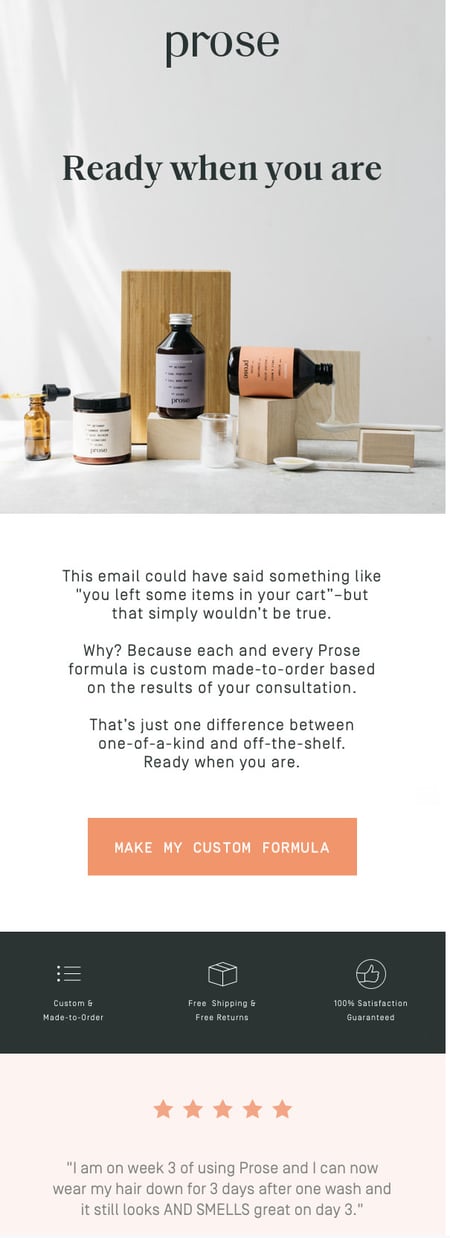
What We Like
2. Whiskey Loot
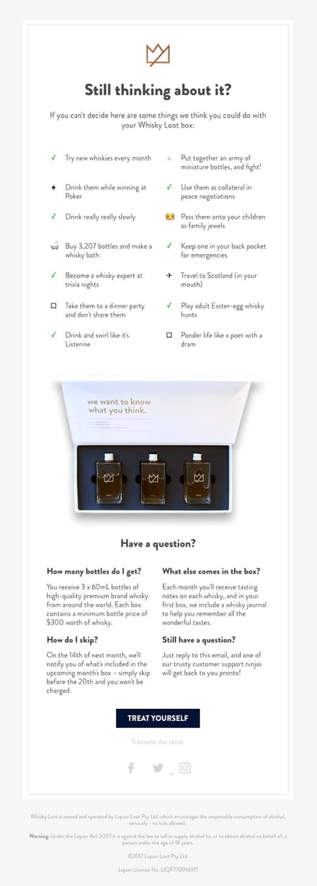
What We Like
3. Peel
What We Like
4. Away
What We Like
5. Dyson

What We Like
6. Virgin Atlantic
What We Like
7. Ugmonk
What We Like
8. Drop

What We Like
9. Google
What We Like
10. Target
What We Like
11. Casper
What We Like
12. Dote
What We Like
13. Moschino
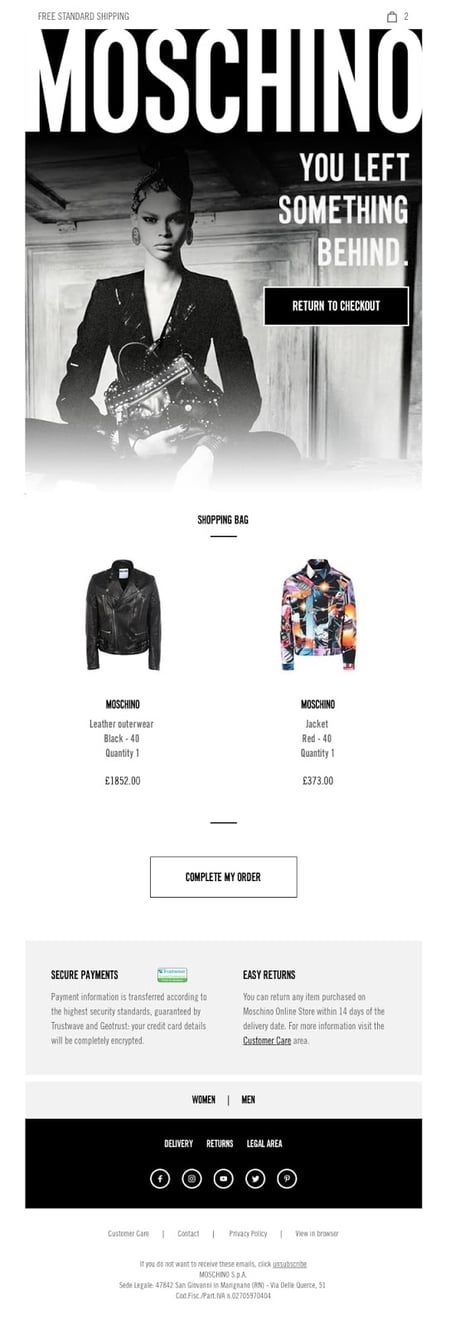
What We Like
14. Haoma
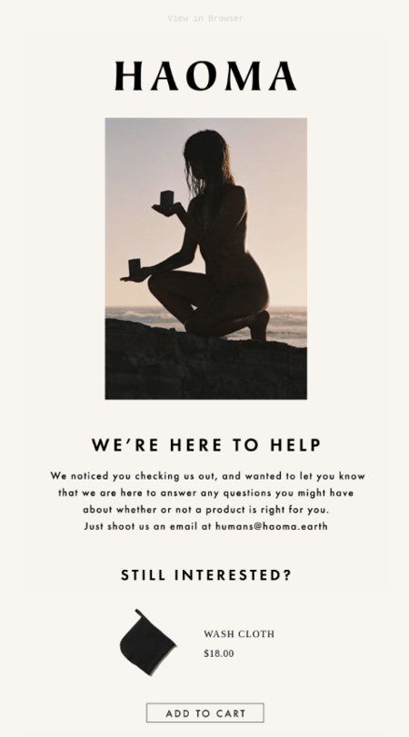
What We Like
15. Luno
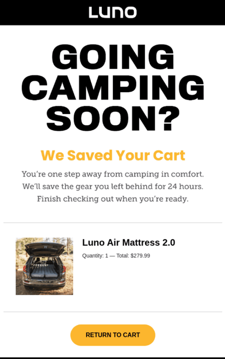
What We Like
16. Le Puzz
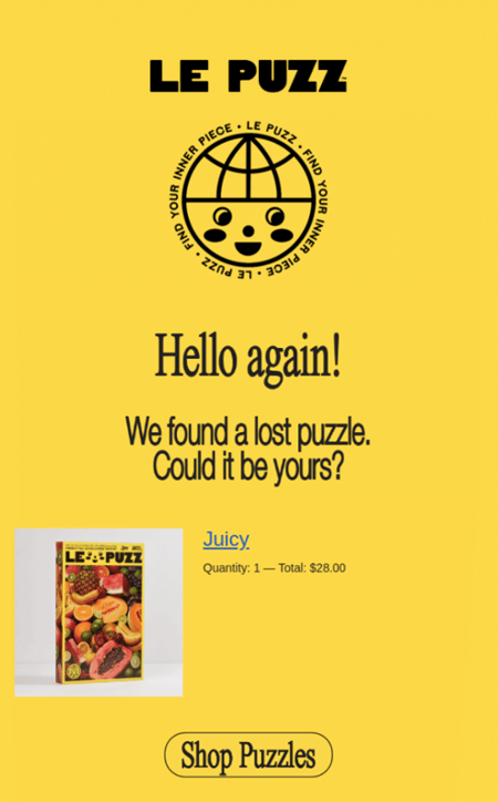
What We Like
Abandoned Cart Email Best Practices
1. Choose the correct timing.
2. Personalize, personalize, personalize.
3. Include a CTA to resume shopping.
4. Pay attention to your copywriting.
5. Include an enticing subject line.
6. Consider adding social proof.
7. A/B test your email to learn what’s most effective.
Create Abandoned Cart Emails That Convert

 Tekef
Tekef 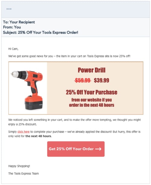


![16 Leadership Resources for Any Stage of Your Career [+ 9 Extra Tools]](https://blog.hubspot.com/hubfs/leadership-resources.jpg#keepProtocol)


