These 11 Living Room Bookshelf Ideas Will Instantly Transform Your Space
Bookmark this. The post These 11 Living Room Bookshelf Ideas Will Instantly Transform Your Space appeared first on Camille Styles.

My relationship with my books is everlasting. With their dog-eared pages and patinaed covers, books endure well into our tech-saturated world. Every time I look at my little library, I revel in the literary travels I’ve taken. That’s why I love to explore fresh living room bookshelf ideas for inspiration on how to arrange these bounded beauties.
Typically, the tip for a stylish bookshelf is as follows: include one-third books, one-third home décor accessories, and one-third negative space. I’ve learned this rule of thumb from interviewing countless interior designers. My take? Go rogue. Let the shelves breathe or fill them until they’re brimming. Of course, you want to avoid clutter but you can still play by your own rules. It’s invigorating to create on a clean palette—and in this case, your shelf is your canvas.
For inspiration, I perused our Home Tour archives to see how some of the most design-savvy women we know style their bookshelves. Each of these shelving arrangements boasts personality and charm. They’re an invitation to mix colors and keepsakes, blend different titles and genres, and lean flea-market finds next to favorite authors.
So, to draw from Camille’s advice from her own recent living room bookshelf refresh: Put on a great playlist, get creative, and breathe some new life into your home with these 10 ideas pulled from some of our favorite spaces.
Feature image by Michelle Nash.
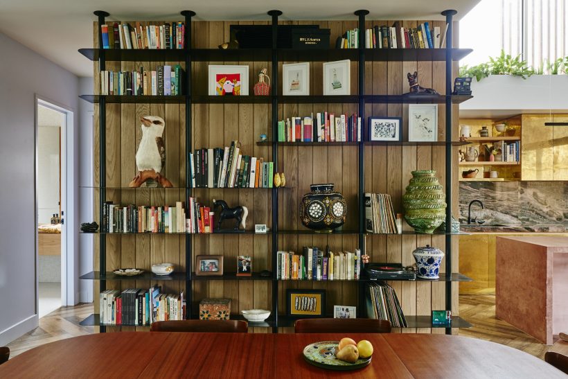
Image by Nikole Ramsay
#1: Looking Up
Leave it to Alex McCabe, the co-founder of textile and home décor collection Kip&Co, to boast one of the chicest bookshelves—ever. Everything about this set-up, from the rich black industrial materials to the quirky art, impresses, but what is particularly noteworthy is the vertical scale. McCabe capitalized on the floor-to-ceiling real estate to display her beloved books and keepsakes.
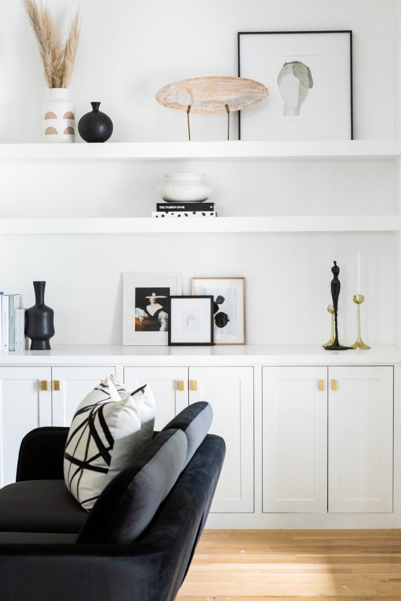
Photo by Danielle Sabol
#2: Going Minimal
A handful of books. Several noir collectors’ items. Three minimally framed pieces of art. This minimalist bookshelf set-up à la Ashley Robertson is total dream. For one, it proves that you don’t need much to create a conversation-worthy shelf. It also celebrates the beauty found in allowing negative space to breathe.
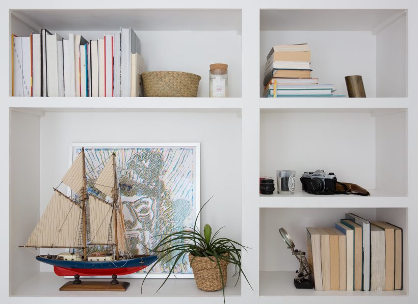
Image by Molly Culver
#3: Embracing the Flip Side
Austin-based interior designer Emily Kunas has a knack for merging color and natural materials, as evidenced by her stunning and breezy 70s condo. She also adds an unexpected twist to things: Her shelf boasts extra interest with the books’ spines turned inward. This look offers a layer of natural-hued texture.
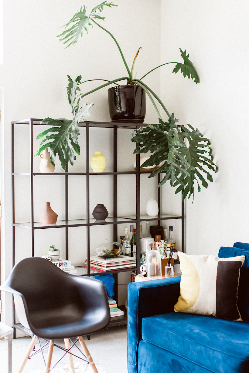
Image by Laura Alexandre
#4: Letting the Books Take the Back Seat
That’s right. It’s a bookshelf—but it’s also a means to display anything you want, be it plants, art, even negative space. Consider only adding a few books to the shelf to let alternate pieces shine. Christina Cleveland nails this décor look in her creative DIY-inspired Austin loft.
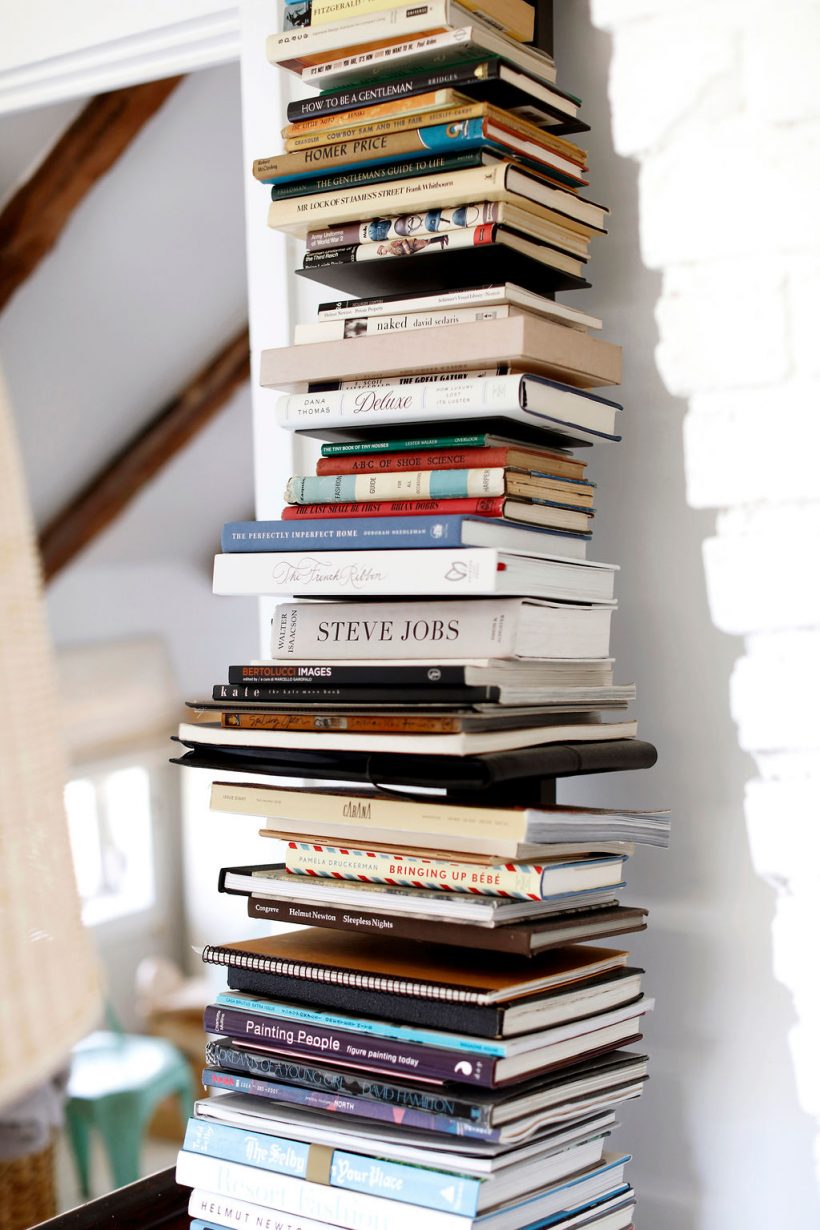
Image by Belathée Photography
#5: Mixing and Matching
No rules are followed on Jennifer Vaughn Miller’s shelf, which is one of a million reasons to love it. The New York-based designer blends sizes, genres, and colors, even tossing in a few notebooks, in her vertical bookshelf. The result is a look that’s equally eclectic and accessible.
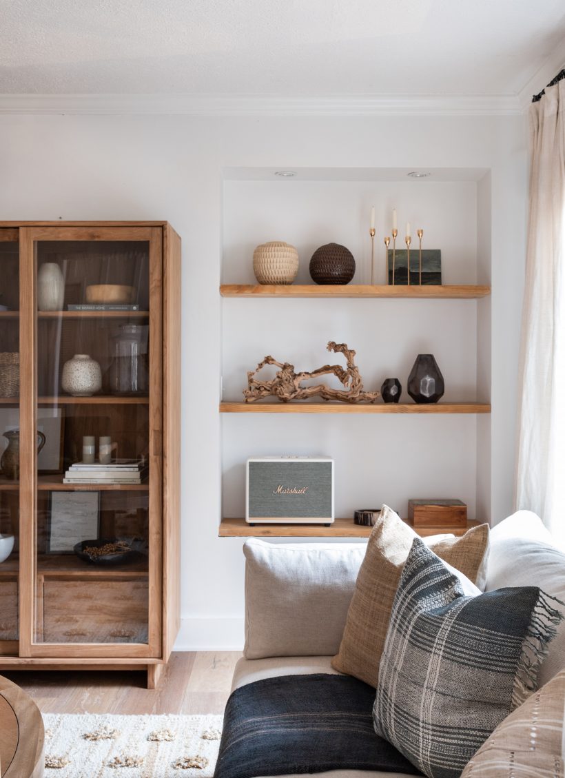
Image by Ashlee Fox
#6: Keeping It Neutral
We know that Anissa Zajac, the co-founder of House Seven Design + Build, says to always follow a plan when it comes to interior design. For her own Indiana cottage, she abides by the rule of allowing neutrals and textures to reign, which is so beautifully exemplified in her bookshelf. With minimal books and ample texture, this look is a study of the beauty of earthy accessories.
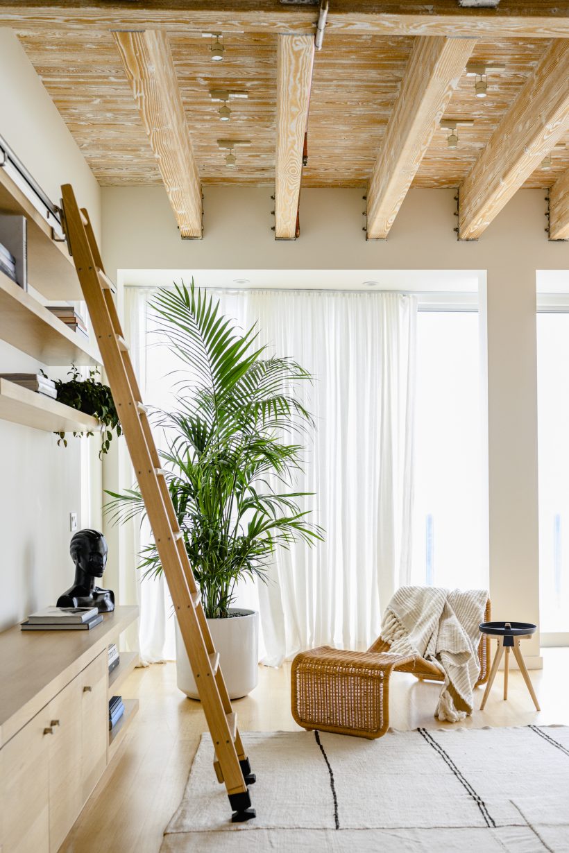
Image by Teal Thomsen
#7: Ladder Matters
There is undeniable ease inside the home of Ashley Merrill. Everything has its place and intention, including this mobile ladder gracing the living room shelves. Leaned against a track that goes from one end of the shelved wall to the other, it allows for easy access to books and keepsakes displayed at high heights. Brilliant and stunning.
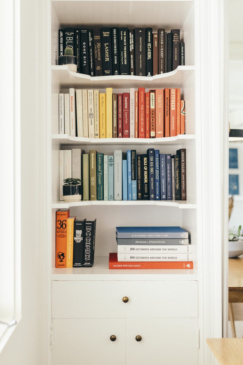
Photo by Michelle Nash.
#8: Color Coding
Grouping books according to their cover colors is such an easy way to add instant dimension to a space. And when you incorporate the color-coding look in a taller bookshelf, it naturally draws the eye upward, thus making a small living room seem bigger.
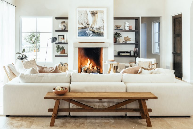
Image by Michelle Nash
#9: Two-Sided
Noticed and admired: dual-sized shelves that showcase varying amounts of books and collectibles, as seen in Camille’s cozy, neutral living room. These shelves are different in size while still anchoring the space and offering ample room to showcase a mix of books, plants, and other small home accessories—all of which can be changed and updated for a quick (and affordable) room refresh.
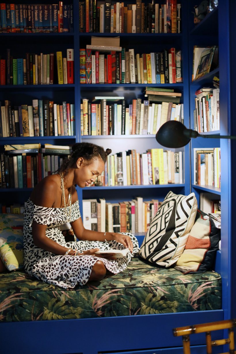
Image by Belathée Photography
#10: Painted Shelves
Traditionally, bookshelf colors tend to come in neutral wood, black, or white. This makes sense, considering that it’s usually the displayed books and wares that call the attention. But that’s not to say the shelf itself can’t take some of the spotlight, just as Megan O’Neill’s striking sapphire blue bookshelves do here. A coat of vibrant paint seriously ups the ante.
#11: Crisp White
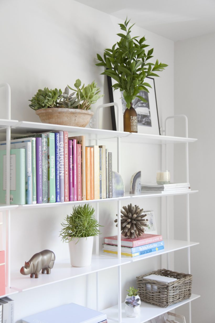
With the above said about a brightly painted bookshelf, a row of sublimely white shelves will always do the décor trick of streamlining a room. Here, the combination of the low-profile frame and snow-white whites ensures that the color-coded books, magazines, plants, and accessories draw in the eye.
What’s your favorite way to style your bookshelves? Share which of these ideas you’re excited to try, stat!

 Koichiko


