This Windows 12 concept makes me excited for a full redesign
A Windows 12 concept showcases a full reimagining of how the next generation could look.

As Microsoft users anticipate Windows 12, an enthusiast has drafted up ideas of a dream concept for the upcoming operating system — and I have to admit, it gets me excited for the possibilities.
YouTuber Addy Visuals recently shared a concept video showcasing what Windows 12 could look like with some features that many users might prefer to see on the operating system. The concept video shows Windows 12 with a new dock-like taskbar similar to macOS, with separate sections for widgets, pins, and quick settings, according to Neowin.net.
The video goes on to detail a Windows 12 system that allows you to switch between default, joined, classic, or compact views, giving you several options for UI styles. For functionality, the design proposes how you can create folders on the taskbar, as well as an easier way to collect and organize apps into folders and groups within File Explorer.

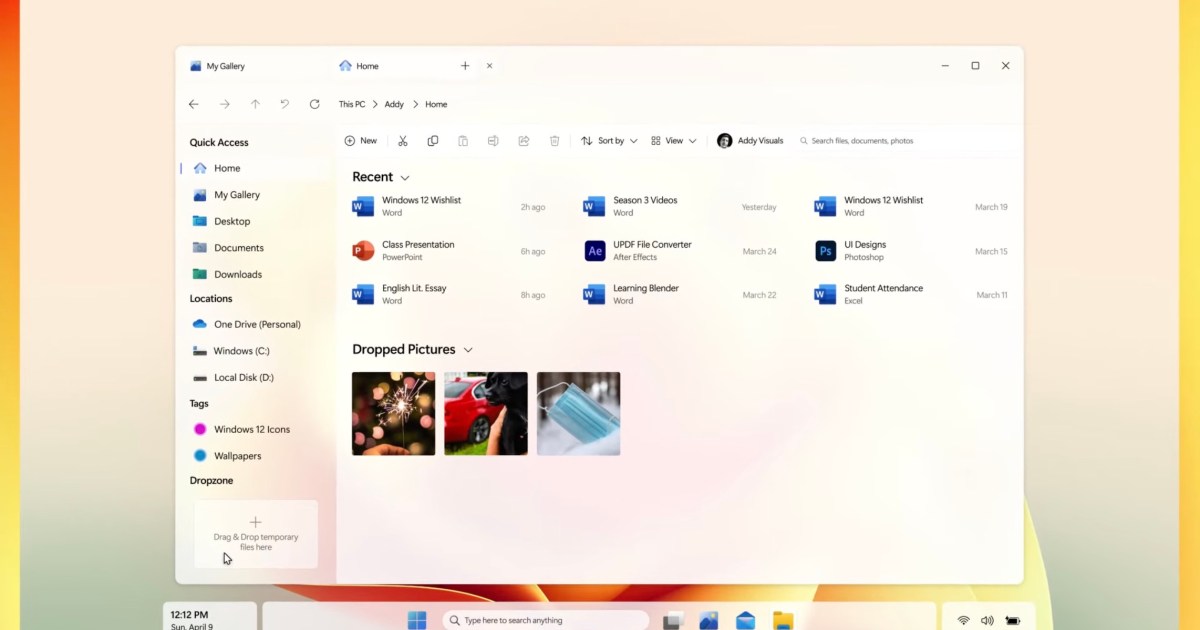
File Explorer itself is completely redesigned, with a more open layout and a temporary Drop Zone for files and folders that haven’t found their final home on your desktop.
In contrast, some of the current rumors circulating about Windows 12 suggest that it might be developed to be more modular and customizable. The operating system, code-named, “Next Valley,” already has a number of prospective system requirements in place that PCs will need for compatibility, including 8GB of RAM.
TechRadar notes that seeing the possibility of what Windows 12 could be through concepts is challenging because it can lead to disappointment when the features don’t come to fruition on the final release. Details suggest Microsoft has been working on the software since February 2022 and that a final version might roll out to the general public in the second half of 2024.
Twitter leaker XenoPanther suggests that Microsoft might soon begin testing the operating system on its Canary channel, the publication added. So, while Windows 12 likely won’t resemble this concept, it may not be long until we see what Microsoft has been working on.
Editors' Recommendations
More details leak about a modernized, modular Windows 12 Ranking all 12 versions of Windows, from worst to best 4 Windows 11 accessibility features that make it easier for everyone to use Windows 11’s new update cadence finally makes sense Windows 11 explores an expanded, full-sized widget board
Fionna Agomuoh is a technology journalist with over a decade of experience writing about various consumer electronics topics.
In addition to computing, she specializes in smartphones and the Android operating system. She runs the blog TechieSupreme.com where she primarily follows these topics.
Fionna's freelance work is published at Lifewire.com, GearBrain.com, Online-Tech-Tips.com, TomsHardware.com, Refinery29.com, Mozilla.org, Digital.com, and PopularMechanics.com. She has also previously worked on staff at Newsweek Media Group, and Business Insider.
Fionna lives in Brooklyn, New York where she enjoys exploring the city, finding new cocktail lounges, and planning her next trips.
Windows 11 is getting a major Mac feature soon
Microsoft is testing a task overflow bar in Windows 11 that works much like the stacks feature in MacOS.
The feature is now available in the Windows 11 Insider Preview Build 25163, which rolled out to the Dev Channel on Thursday. The overflow makes it so that when you have more apps open than can fit in the taskbar, they are stored in their own section, which can be accessed via an ellipses icon (…) on the bottom-right section of the screen. You can click the icon to view, access, or close the still-running apps that no longer fit on the crowded taskbar.
Windows 11 is testing a major change to the taskbar
Windows 11's taskbar has been among its most controversial elements. But Microsoft's latest Windows 11 Insider Preview (Build 25158), which is now available in its Dev Channel, could bring back some older features of the taskbar some may appreciate.
The preview build highlights several UI changes to the Windows 11 taskbar, including a reintroduction of the search bar, which was previously a well-known feature in Windows 10, The Verge noted.
I’m a die-hard Windows fan, but the M1 Mac Mini converted me
I am not going to lie. I am a die-hard Windows fan. I love my Surface Laptop Studio, and I'm tuned in to every new update to Windows 11. It's not that I don't dip out of the Microsoft ecosystem from time to time, but I always find myself drawn back to its familiar embrace.
But then, the M1 Mac Mini came around. I sold my own old MacBook Pro and "traded up" to the M1 Mac Mini, eager to test out the latest hardware for myself. As much as it feels like heresy to say, this little machine has made me a believer after just two months.
The performance is amazing

 ShanonG


.jpg)


