14 Best Types of Charts and Graphs for Data Visualization [+ Guide]
There are more types of charts and graphs than ever before because there's more data. In fact, the volume of data in 2025 will be almost double the data we create, capture, copy, and consume today.
 JimMin
![14 Best Types of Charts and Graphs for Data Visualization [+ Guide]](https://blog.hubspot.com/hubfs/types-graphs-charts.jpg#keepProtocol)
There are more types of charts and graphs than ever before because there's more data. In fact, the volume of data in 2025 will be almost double the data we create, capture, copy, and consume today. This makes data visualization essential for businesses. Different types of graphs and charts can help you: Data visualization builds trust and can organize diverse teams around new initiatives. Let's talk about the types of graphs and charts that you can use to grow your business. Channels like social media or blogs have multiple sources of data and when you manage these complex content assets it can get overwhelming. What should you be tracking? What matters most? How do you visualize and analyze the data so you can extract insights and actionable information? Do you want to convince or clarify a point? Are you trying to visualize data that helped you solve a problem, or are you trying to communicate a change that's happening? A chart or graph can help you compare different values, understand how different parts impact the whole, or analyze trends. Charts and graphs can also be useful for recognizing data that veers away from what you’re used to or help you see relationships between groups. Clarify your goals, then use them to guide your chart selection. Different types of charts and graphs use different kinds of data. Graphs usually represent numerical data, while charts are a visual representation of data that may or may not use numbers. So, while all graphs are a type of chart, not all charts are graphs. If you don't already have the kind of data you need, you might need to spend some time putting your data together before building your chart. Most businesses collect numerical data regularly, but you may need to put in some extra time to collect the right data for your chart. Besides quantitative data tools that measure traffic, revenue, and other user data, you might need some qualitative data. These are some other ways you can gather data for your data visualization: Choosing the wrong visual aid or defaulting to the most common type of data visualization could cause confusion for your viewer or lead to mistaken data interpretation. But a chart is only useful to you and your business if it communicates your point clearly and effectively. To help find the right chart or graph type, ask yourself the questions below. Then, take a look at 14 types of charts and graphs you can use to visualize your data and create your chart or graph. Download the Excel templates mentioned in the video here. Charts and graphs are perfect for comparing one or many value sets, and they can easily show the low and high values in the data sets. To create a comparison chart, use these types of graphs: Use this type of chart to show how individual parts make up the whole of something, like the device type used for mobile visitors to your website or total sales broken down by sales rep. To show composition, use these charts: Distribution charts help you to understand outliers, the normal tendency, and the range of information in your values. Use these charts to show distribution: If you want to know more information about how a data set performed during a specific time period, there are specific chart types that do extremely well. You should choose a: Relationship charts can show how one variable relates to one or many different variables. You could use this to show how something positively affects, has no effect, or negatively affects another variable. When trying to establish the relationship between things, use these charts: To better understand each chart and graph type and how you can use them, here's an overview of graph and chart types. A bar graph should be used to avoid clutter when one data label is long or if you have more than 10 items to compare. Bar graphs can help you compare data between different groups or to track changes over time. Bar graphs are most useful when there are big changes or to show how one group compares against other groups. The example above compares the number of customers by business role. It makes it easy to see that there is more than twice the number of customers per role for individual contributors than any other group. A bar graph also makes it easy to see which group of data is highest or most common. For example, at the start of the pandemic, online businesses saw a big jump in traffic. So, if you want to look at monthly traffic for an online business, a bar graph would make it easy to see that jump. Other use cases for bar graphs include: Use a column chart to show a comparison among different items, or to show a comparison of items over time. You could use this format to see the revenue per landing page or customers by close date. While column charts show information vertically, and bar graphs show data horizontally. While you can use both to display changes in data, column charts are best for negative data. For example, warehouses often track the number of accidents that happen on the shop floor. When the number of incidents falls below the monthly average, a column chart can make that change easier to see in a presentation. In the example above, this column chart measures the number of customers by close date. Column charts make it easy to see data changes over a period of time. This means that they have many use cases, including: A line graph reveals trends or progress over time and you can use it to show many different categories of data. You should use it when you chart a continuous data set. Line graphs help users track changes over short and long periods of time. Because of this, these types of graphs are good for seeing small changes. Line graphs can help you compare changes for more than one group over the same period. They're also helpful for measuring how different groups relate to each other. A business might use this type of graph to compare sales rates for different products or services over time. These charts are also helpful for measuring service channel performance. For example, a line graph that tracks how many chats or emails your team responds to per month. A dual-axis chart allows you to plot data using two y-axes and a shared x-axis. It has three data sets. One is a continuous set of data and the other is better suited to grouping by category. Use this chart to visualize a correlation or the lack thereof between these three data sets. A dual-axis chart makes it easy to see relationships between different data sets. They can also help with comparing trends. For example, the chart above shows how many new customers this company brings in each month. It also shows how much revenue those customers are bringing the company. This makes it simple to see the connection between the number of customers and increased revenue. You can use dual-axis charts to compare: An area chart is basically a line chart, but the space between the x-axis and the line is filled with a color or pattern. It is useful for showing part-to-whole relations, like showing individual sales reps' contributions to total sales for a year. It helps you analyze both overall and individual trend information. Area charts help show changes over time. They work best for big differences between data sets and also help visualize big trends. For example, the chart above shows users by creation date and life cycle stage. A line chart could show that there are more subscribers than marketing qualified leads. But this area chart emphasizes how much bigger the number of subscribers is than any other group. These types of charts and graphs make the size of a group and how groups relate to each other more visually important than data changes over time. Area graphs can help your business to: Use this chart to compare many different items and show the composition of each item you’re comparing. These graphs are helpful when a group starts in one column and moves to another over time. For example, the difference between a marketing qualified lead (MQL) and a sales qualified lead (SQL) is sometimes hard to see. The chart above helps stakeholders see these two lead types from a single point of view– when a lead changes from MQL to SQL. Stacked bar charts are excellent for marketing. They make it simple to add a lot of data on a single chart or to make a point with limited space. These types of graphs can show multiple takeaways, so they're also super for quarterly meetings when you have a lot to say, but not always a lot of time to say it. Stacked bar charts are also a smart option for planning or strategy meetings. This is because these charts can show a lot of information at once, but they also make it easy to focus on one stack at a time or move data as needed. You can also use these charts to: Also known as a Marimekko chart, this type of graph can compare values, measure each one's composition, and show data distribution across each one. It's similar to a stacked bar, except the Mekko's x-axis can capture another dimension of your values— instead of time progression, like column charts often do. In the graphic below, the x-axis compares each city to one another. You can use a Mekko chart to show growth, market share, or competitor analysis. For example, the Mekko chart above shows the market share of asset managers grouped by location and the value of their assets. This chart makes it clear which firms manage the most assets in different areas. It's also easy to see which asset managers are largest and how they relate to each other. Mekko charts can seem more complex than other types of charts and graphs. So, it's best to use these in situations where you want to emphasize scale or differences between groups of data. Other use cases for Mekko charts include: A pie chart shows a static number and how categories represent part of a whole — the composition of something. A pie chart represents numbers in percentages, and the total sum of all segments needs to equal 100%. The image above shows another example of customers by role in the company. The bar graph example shows you that there are more individual contributors than any other role. But this pie chart makes it clear that they make up over 50% of customer roles. Pie charts make it easy to see a section in relation to the whole, so they are good for showing: A scatter plot or scattergram chart will show the relationship between two different variables or reveals distribution trends. Use this chart when there are many different data points, and you want to highlight similarities in the data set. This is useful when looking for outliers or for understanding the distribution of your data. Scatter plots are helpful in situations where you have too much data to quickly see a pattern. They are best when you use them to show relationships between two large data sets. In the example above, this chart shows how customer happiness relates to the time it takes for them to get a response. Great use cases for this type of graph make it easy to see the comparison of two data sets. This might include: Try to choose two data sets that already have a positive or negative relationship. That said, this type of graph can also make it easier to see data that falls outside of normal patterns. A bubble chart is similar to a scatter plot in that it can show distribution or relationship. There is a third data set shown by the size of the bubble or circle. In the example above, the number of hours spent online isn't just compared to the age of the user, as it would be on a scatter plot chart. Instead, you can also see how the gender of the user impacts time spent online. This makes bubble charts useful for seeing the rise or fall of trends over time. It also lets you add another option when you're trying to understand relationships between different segments or categories. For example, if you want to launch a new product, this chart could help you quickly see the cost, risk, and value of your new product. This can help you focus your energies on a new product that is low risk with a high potential return. You can also use bubble charts for: Use a waterfall chart to show how an initial value changes with intermediate values — either positive or negative — and results in a final value. Use this chart to reveal the composition of a number. An example of this would be to showcase how overall company revenue is influenced by different departments and leads to a specific profit number. These types of charts and graphs make it easier to understand how internal and external factors impact a product or campaign as a whole. In the example above the chart moves from the starting balance on the far left to the ending balance on the far right. Factors in the center include deposits, transfers in and out, and bank fees. A waterfall chart offers a quick visual that makes complex processes and outcomes easier to see and troubleshoot. For example, SaaS companies often measure customer churn. This format can help visualize changes in new, current, and free trial users, or changes by user segment. You may also want to try a waterfall chart to show: A funnel chart shows a series of steps and the completion rate for each step. Use this type of chart to track the sales process or the conversion rate across a series of pages or steps. The most common use case for a funnel chart is the marketing or sales funnel. But there are many other ways to use this versatile chart. If you have at least four stages of sequential data, this chart can help you easily see what inputs or outputs impact the final results. For example, a funnel chart can help you see how to improve your buyer journey or shopping cart workflow. This is because it can help pinpoint major drop-off points. Other stellar options for these types of charts include: A bullet graph reveals progress toward a goal, compares this to another measure, and provides context in the form of a rating or performance. In the example above, this bullet graph shows the number of new customers against a set customer goal. Bullet graphs are great for comparing performance against goals like this. These types of graphs can also help teams assess possible roadblocks because you can analyze data in a tight visual display. For example, you could create a series of bullet graphs measuring performance against benchmarks or use a single bullet graph to visualize these KPIs against their goals: Seeing this data at a glance and alongside each other can help teams make quick decisions. Bullet graphs are one of the best ways to display year-over-year data analysis. You can also use bullet graphs to visualize: A heat map shows the relationship between two items and provides rating information, such as high to low or poor to excellent. This chart displays the rating information using varying colors or saturation. In the example above, the darker the shade of green shows where the majority of people agree. With enough data, heat maps can make a viewpoint that might seem subjective more concrete. This makes it easier for a business to act on customer sentiment. There are many uses for these types of charts and graphs. In fact, many tech companies use heat map tools to gauge user experience for apps, online tools, and website design. Another common use for heat map graphs is location assessment. If you're trying to find the right location for your new store, these maps can give you an idea of what the area is like in ways that a visit can't communicate. Heat maps can also help with spotting patterns, so they're good for analyzing trends that change quickly, like ad conversions. They can also help with: Now that you've chosen the best graph or chart for your project, try a data visualization resource that makes your point clear and visual. Data visualization is just one part of great communication. To show your customers, employees, leadership, and investors that they're important, keep making time to learn. Editor's note: This post was originally published in November 2020 and has been updated for comprehensiveness.Types of Charts and Graphs to Use for Your Data
![An Introduction to Data Visualization for Marketers [Free Guide]](https://no-cache.hubspot.com/cta/default/53/6ecf26a9-faff-4c16-a2d4-b70751ce8b65.png)
How to Choose the Right Chart or Graph for Your Data
1. Identify your goals for presenting the data.
2. Figure out what data you need to achieve your goal.
3. Gather your data.
4. Select the right type of graph or chart.
5 Questions to Ask When Deciding Which Type of Chart to Use
1. Do you want to compare values?
2. Do you want to show the composition of something?
3. Do you want to understand the distribution of your data?
4. Are you interested in analyzing trends in your data set?
5. Do you want to better understand the relationship between value sets?
Featured Resource: The Marketer's Guide to Data Visualization
 Download this free data visualization guide to learn which graphs to use in your marketing, presentations, or project -- and how to use them effectively.
Different Types of Graphs and Charts for Presenting Data
1. Bar Graph

Best Use Cases for These Types of Graphs:
Design Best Practices for Bar Graphs:
Use consistent colors throughout the chart, selecting accent colors to highlight meaningful data points or changes over time.
Use horizontal labels to improve readability.
Start the y-axis at 0 to appropriately reflect the values in your graph.
2. Column Chart

Best Use Cases for This Type of Chart:
Design Best Practices for Column Charts:
Use consistent colors throughout the chart, selecting accent colors to highlight meaningful data points or changes over time.
Use horizontal labels to improve readability.
Start the y-axis at 0 to appropriately reflect the values in your graph.
3. Line Graph

Best Use Cases for These Types of Graphs:
Design Best Practices for Line Graphs:
Use solid lines only.
Don't plot more than four lines to avoid visual distractions.
Use the right height so the lines take up roughly 2/3 of the y-axis' height.
4. Dual Axis Chart

Best Use Cases for This Type of Chart:
Design Best Practices for Dual Axis Charts:
Use the y-axis on the left side for the primary variable because brains are naturally inclined to look left first.
Use different graphing styles to illustrate the two data sets, as illustrated above.
Choose contrasting colors for the two data sets.
5. Area Chart

Best Use Cases for These Types of Charts:
Design Best Practices for Area Charts:
Use transparent colors so information isn't obscured in the background.
Don't display more than four categories to avoid clutter.
Organize highly variable data at the top of the chart to make it easy to read.
6. Stacked Bar Chart

Best Use Cases for These Types of Graphs:
Design Best Practices for Stacked Bar Graphs:
Best used to illustrate part-to-whole relationships.
Use contrasting colors for greater clarity.
Make the chart scale large enough to view group sizes in relation to one another.
7. Mekko Chart

Best Use Cases for This Type of Chart:
Design Best Practices for Mekko Charts:
Vary your bar heights if the portion size is an important point of comparison.
Don't include too many composite values within each bar. You might want to reevaluate your presentation if you have a lot of data.
Order your bars from left to right in such a way that exposes a relevant trend or message.
8. Pie Chart

Best Use Cases for This Type of Chart:
Design Best Practices for Pie Charts:
Don't illustrate too many categories to ensure differentiation between slices.
Ensure that the slice values add up to 100%.
Order slices according to their size.
9. Scatter Plot Chart

Best Use Cases for These Types of Charts:
Design Best Practices for Scatter Plots:
Include more variables, like different sizes, to incorporate more data.
Start the y-axis at 0 to represent data accurately.
If you use trend lines, only use a maximum of two to make your plot easy to understand.
10. Bubble Chart

Best Use Cases for This Type of Chart:
Design Best Practices for Bubble Charts:
Scale bubbles according to area, not diameter.
Make sure labels are clear and visible.
Use circular shapes only.
11. Waterfall Chart
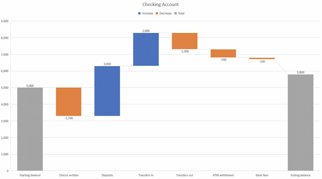
Best Use Cases for This Type of Chart:
Design Best Practices for Waterfall Charts:
Use contrasting colors to highlight differences in data sets.
Choose warm colors to indicate increases and cool colors to indicate decreases.
12. Funnel Chart

Best Use Cases for These Types of Charts:
Design Best Practices for Funnel Charts:
Scale the size of each section to accurately reflect the size of the data set.
Use contrasting colors or one color in gradated hues, from darkest to lightest as the size of the funnel decreases.
13. Bullet Graph

Best Use Cases for These Types of Graphs:
Design Best Practices for Bullet Graphs:
Use contrasting colors to highlight how the data is progressing.
Use one color in different shades to gauge progress.
14. Heat Map

Best Use Cases for Heat Maps:
Design Best Practices for Heat Map:
Use a basic and clear map outline to avoid distracting from the data.
Use a single color in varying shades to show changes in data.
Avoid using multiple patterns.
Put These New Types of Charts and Graphs Into Action
![Blog - Data Visualization [List-Based]](https://no-cache.hubspot.com/cta/default/53/2f02d8fe-c9b0-4078-a3ae-5831c892fbd0.png)