25 of the Best Website Homepage Design Examples
You never get a second chance to make a first impression. That’s why you need thoughtful homepage design.

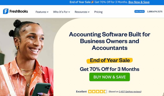
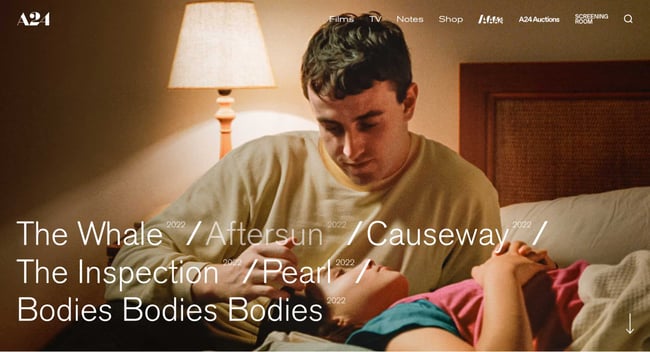
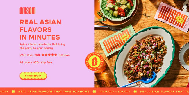
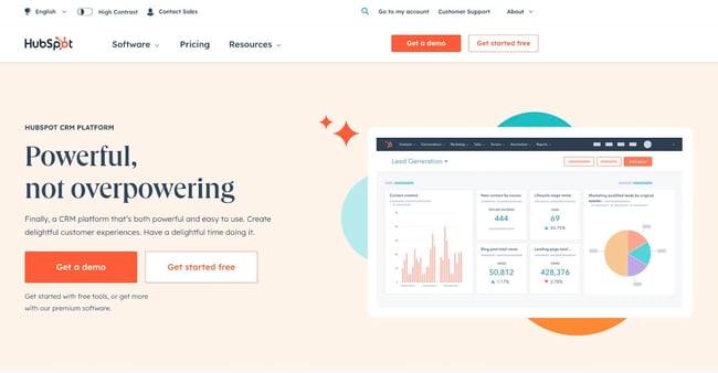
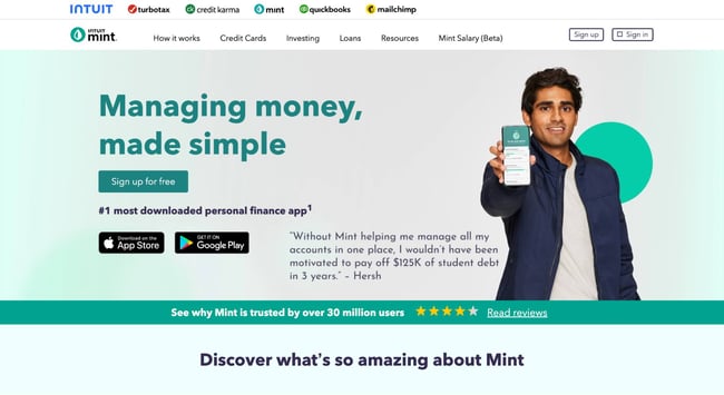
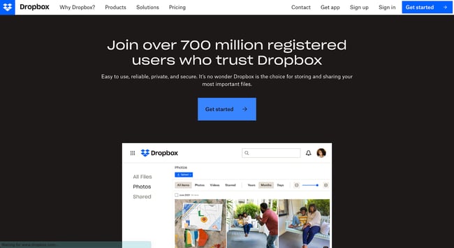
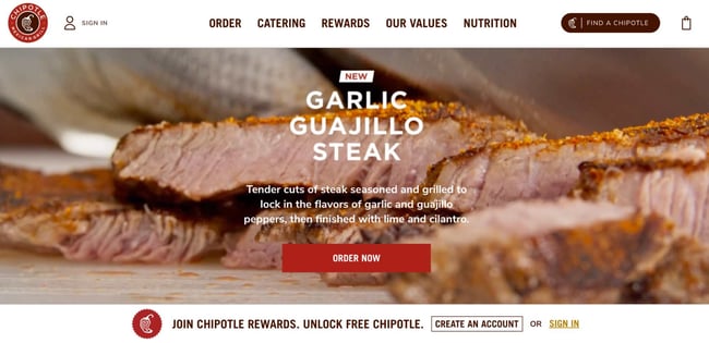
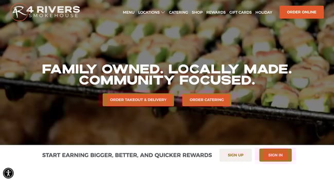
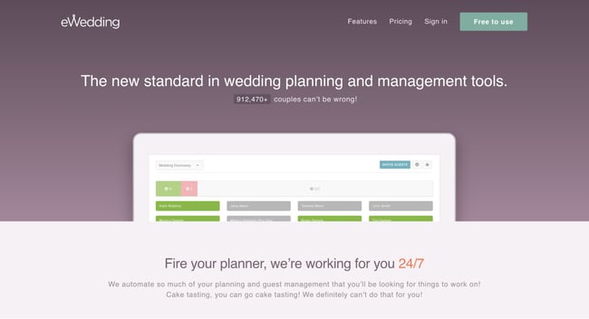
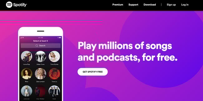
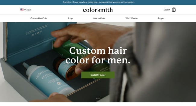
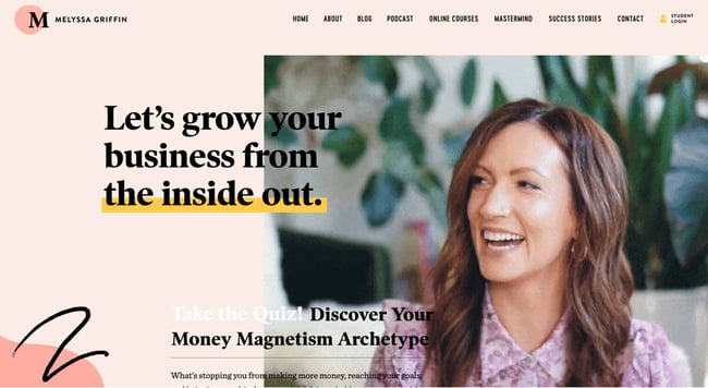
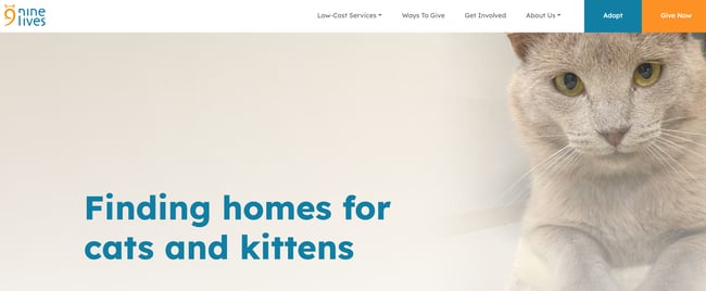
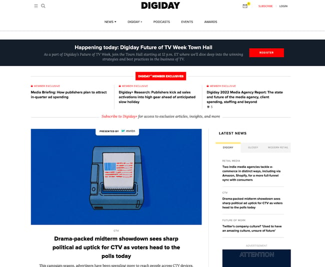
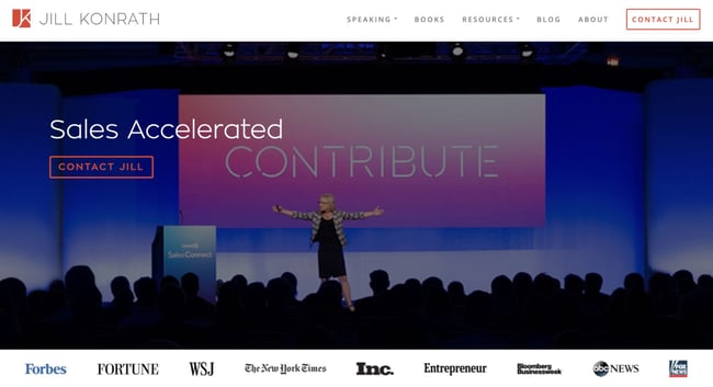
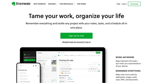
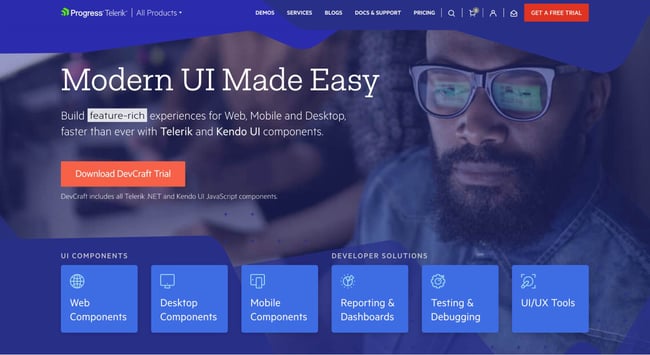
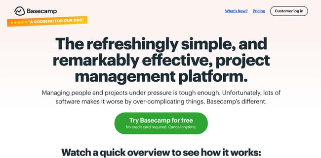
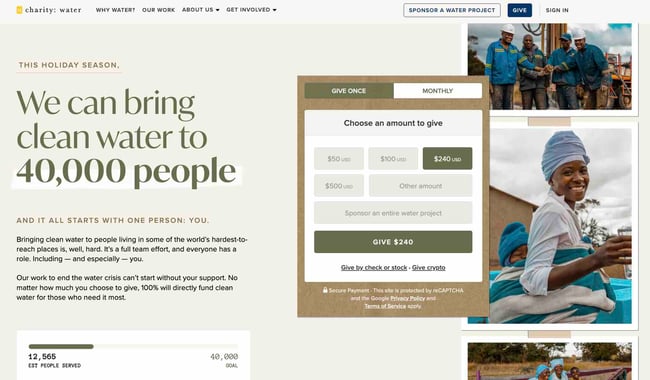
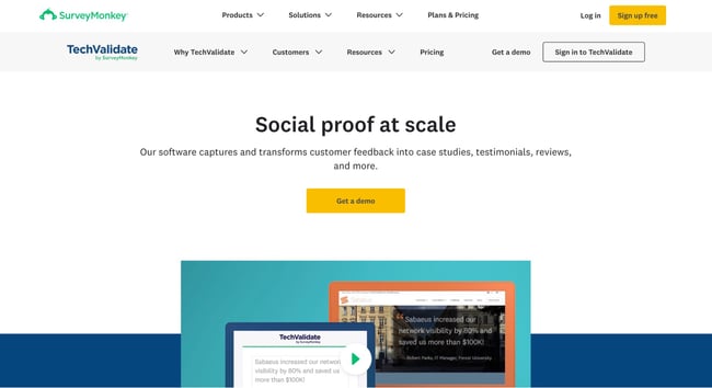
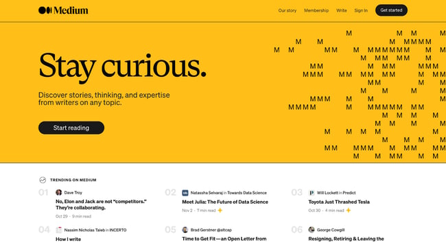
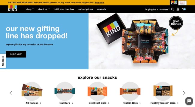
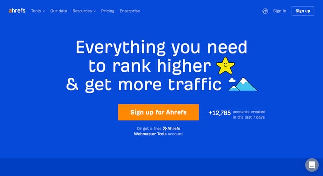
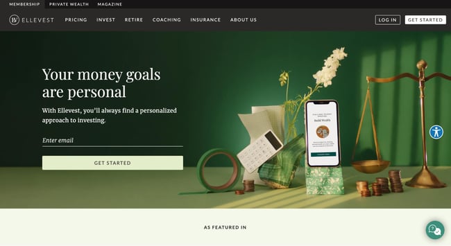
You never get a second chance to make a first impression. That’s why you need thoughtful homepage design. When designing your site, think of your homepage as a virtual front door. If a new visitor doesn’t like what they see, their knee-jerk reaction is to hit the “back” button. So, what makes a website’s homepage design brilliant instead of bland? In this post, you’ll learn the ins and outs of home page design. Then, you can see sites that put these best practices to work. A good website clearly explains who you are, what you do, and what visitors can do on your site. It also resonates with your audience and has a value proposition. Your site should be optimized for multiple devices and updated to adapt to new design trends. All of the homepage designs shown here combine the following elements. Not every page is perfect, but the best website designs get many of these elements right. If you’re a well-known brand or company (i.e., Coca-Cola), you can get away with not having to describe who you are and what you do. However, most businesses still need to answer these questions so that each visitor knows they’re in the right place. Steven Krugg sums it up best in his bestselling book, Don't Make Me Think: If visitors can’t identify what it is you do within seconds, they won’t stick around long. A homepage needs to be narrowly focused — speaking to the right people in their language. The best homepages avoid corporate jargon and eliminate fluff. When a visitor arrives on your homepage, your design needs to compel them to stick around. Therefore, the homepage is the best place to nail your value proposition so prospects choose to stay on your website. Mobile devices accounted for 65.85% of global traffic in October 2022. So clearly, your website needs to be mobile-friendly if you want to attract a significant share of the online market. A mobile-friendly website is easy to navigate. Avoid “flashy” objects that get in the way of browsing. That includes flash banners, animations, pop-ups, and other unnecessary elements. Calls-to-action help you encourage visitors to take specific actions. Examples include “Free Trial,” “Schedule a Demo,” “Buy Now,” or “Learn More.” Most homepages use primary and secondary calls-to-action to direct visitors to the next logical step. Remember, the homepage’s goal is to compel visitors to dig deeper into your website. CTAs tell them what to do next, so they don’t get overwhelmed or lost. More importantly, CTAs turn your homepage into a sales engine and not just brochure-wear. The best home pages are dynamic. They constantly change to reflect their visitors’ needs, problems, and questions. Some homepages also use A/B testing or dynamic content to make informed changes. A well-designed page is vital for building trust, communicating value, and navigating visitors to the next step. These homepages effectively use layout, white space, colors, fonts, and other supporting elements. Now, get ready to learn about excellent homepage design through the following 23 real-life examples. List Snippet FreshBooks is an accounting software for small and medium-sized businesses. And the site’s homepage makes the company’s mission clear. The page lays out FreshBooks’ features so visitors can quickly understand what they stand to gain from trying the tool out. There’s a great use of contrast and positioning with the primary calls-to-action. It’s clear the company wants you to convert when you arrive. “Try for Free” is also a very compelling CTA. What we love: FreshBooks uses customer testimonials to tell real-world stories of customer success. They also employ social proof by including star ratings from third-party sites. The film company’s homepage is made up of only trailers for its new films. This is a great strategy to showcase A24’s work in an engaging way. What we love: This website showcases the best of simple design. Each item on the homepage is a full row — consisting only of one image and large text. Nothing is cluttered and each featured movie or shop item pops. With a headline that reads “Real Asian flavors in minutes,” visitors know exactly what they’re getting once they land on this homepage. Omsom sells packets that include the spices and base ingredients for Asian cooking. Customers just need to add veggies and protein. What follows as you scroll is Omsom’s value proposition and how their product works. These sections are vital as they give skeptical visitors more reasons to shop with the brand. What we love: The hero section features reviews, a free shipping offer, and a sumptuous image. These elements motivate visitors to take action even before scrolling. We’ll take a second to toot our own horn. HubSpot’s homepage starts with an eye-catching headline that explains what we do and for who. This information is followed by a dual CTA. You can choose to book a demo or sign up for free. What we love: There’s a clever use of figures and statistics to show the vastness of HubSpot’s community. Seeing 150,000+ users in over 120 countries will instill trust in visitors. At a glance, you can tell what Pixelgrade offers: WordPress themes. The big title, followed by a descriptive subtitle, lets visitors know what to expect. The right side gives you a glimpse of how their WordPress themes look. Then, as you scroll, the page provides three reasons why you should use Pixelgrade. Each reason is followed by a testimonial from real-life customers. What we love: The design is simple, and the color combination does a great job of making the call-to-action stand out. Mint’s home page makes the company’s message clear: Their app makes managing your money simple. Simplicity is reinforced throughout the homepage design. The site gives off a secure but easygoing vibe, which is essential for a product that handles financial information. There’s no-jargon or confusing language. The page also contains a simple, direct, compelling call-to-action copy: “Sign up free.” What we love: The mention of 30 million users is a great use of social proof. This will likely convince visitors to try the tool. Dropbox also relies on simple design and branding. It includes only what is essential: A large, relevant image with supporting copy and a “Get started” call-to-action button. Its sub-headline is simple yet powerful: “Easy to use, reliable, private, and secure. It’s no wonder Dropbox is the choice for storing and sharing your most important files.” No need to decode jargon to figure out what Dropbox really does. What we love: Throughout the homepage, Dropbox describes different use cases for their tool. Doing so helps visitors know exactly how (and if) Dropbox can help them. The homepage is an excellent example of agility and constant change. Chipotle's current homepage is all about the latest addition to its menu. You can also see the company’s other service offerings well. That includes online ordering, gift cards, and catering. What we love: The food photography is detailed and beautiful. The pictures make visitors hungry just by looking. Now that’s an effective use of visuals. Drool. That's what I think when I arrive at the website for 4 Rivers Smokehouse. Fantastic photography and the headline “Family Owned. Locally Made. Community Focused” easily sell the experience. As you scroll, you’re taken on a tour of the services, menu, and people having a great time. What we love: A brief note about the company’s history is found at the bottom of the page. The company’s story adds to the brand’s authenticity and deepens its relationship with customers. For those love birds planning their big day, eWedding is a great destination for building a custom wedding website. The homepage isn’t cluttered and only includes the necessary elements to get you started. The homepage includes excellent product visuals, a great headline, and a call-to-action that reduces friction with the copy, “Start now.” To convince more visitors to use eWedding, the site has a cost calculator that helps estimate how much couples could save on total RSVP, a cash registry, and a custom website. What we love: The live counter of the number of wedding websites built using eWedding (over 900,000) is excellent social proof. Spotify has mastered the mantra “less is more.” Visitors are immediately greeted by a simple value proposition. They can play songs and podcasts at no cost. A simple CTA takes you to a signup page. As you scroll, the page explains why you should choose Spotify. The site reinforces that you can get started right now “no credit card required.” What we love: Spotify’s homepage includes a short FAQ. Each question explains how to use the platform, including how to make a playlist and where to find podcasts. Simple answers showcase that Spotify is easy to use. Remember, your home page should explain what your product does. Colorsmith shows that explaining your mission can be simple. The “custom hair color for men” headline immediately tells visitors what the website is about — thereby eliminating any confusion. Under the headline is a video showing real people using Colorsmith in their routine. This video draws an audience in and helps them create a mental picture of themselves using the products. What we love: There’s a consistent use of the “Craft My Color” CTA. A single CTA throughout the page limits distractions and clarifies the desired course of action for visitors. Melyssa Griffin’s site showcases both her expertise and personality. Melyssa does well to include an image of herself so visitors can get familiar with her. She isn’t just a random website. She makes it clear she’s a human whom people can connect to. The page uses bright colors without being overwhelming, making it easy to understand Melyssa’s central business offerings. What we love: Visitors are invited to take a quick quiz. This allows visitors to learn their money management archetype, while Melyssa generates leads. If you’re a nonprofit in search of a website role model, look no further. Nine Lives is a California-based cat adoption center. Their headline “finding homes for cats and kittens” makes their mission clear. As you scroll, you’ll see different ways you can get involved with the rescue — and that’s not just adopting a cat. You can learn about ways to give, vaccination options for your furry friend, and ways to volunteer. What we love: Nonprofits can benefit from multiple CTAs. Your home page should lay out the many ways people can interact with your organization. Unlike other online news publications that inundate homepages with as many headlines and images as possible, a single article takes up most of Digiday’s top section. Its featured image is eye-catching, and the headline just asks to be clicked. What we love: The top of the homepage only has one icon to click — which leads you to a subscription page. This homepage gets straight to the point. From the headline and sub-headline, it’s clear exactly what Jill Konrath does (and how she can help your business). Visitors can also easily find Jill’s thought leadership materials, which is important to establishing her credibility as a keynote speaker. The pop-up subscription CTA uses social proof to get you to join her thousands of other fans. What we love: It’s easy to subscribe to the newsletter and get in touch — two of her primary calls-to-action. Over the years, Evernote has turned from a simple note-saving app into a suite of business products. Evernote does an excellent job of packaging many potential messages into a few key benefits. This homepage uses a combination of white space and its signature bright green and white highlights to make conversion paths stand out. Following a simple headline (“Tame your work, organize your life”), the eye path then leads you to its call-to-action, “Sign Up For Free.” What we love: Evernote also offers a one-click sign-up process through Google to help visitors save even more time. “Stuffy enterprise” isn’t the feeling you get from Telerik’s website. For a company that offers many technology products, its bold colors, fun designs, and videography give off a Google-like vibe. The website uses a simple, high-level overview of its six product offers. It’s a very clear way of communicating what the company does and how people can learn more. What we love: The copy is lightweight and easy to read. It speaks the language of its customers. Basecamp’s homepage features a brilliant headline and sub-headline that explains what they do and how they’re different from the rest. The call-to-action is bold and above the fold. What we love: In this example, the company chose a more blog-like homepage (or single-page site approach), providing much more product information. Charity: water uses visuals, creative copy, and use of interactive web design to engage visitors. The website’s main purpose, to accept donations, is brought to the forefront with the payment gateway right above the fold. For those who miss the donation gateway at the top of the page, the website also shows other ways they can donate once they scroll below the fold. What we love: This nonprofit employs great uses of video and photography, particularly in capturing emotion that causes action. Software tools should explain their value proposition and how their product works on their homepages. TechValidate executes this brief with mastery — pairing beautiful design with essential information. This homepage is beautifully designed, making use of white space, contrasting colors, and customer-centric design. The headline is clear and compelling, as is the call-to-action. What we love: The product’s video is front and center. Customers know just what to watch to learn more. Medium’s homepage uses a simple header, sub-header, and CTA button before drawing visitors’ attention to the trending stories — the main point of the website. What we love: The homepage uses social proof to get visitors to start clicking around. The “Trending on Medium” section lets visitors know where to find high-quality content. Kind Snacks website makes you hungry just from the images. The bold colors produce contrast, making the words and images stand out on the page. The website also makes use of a carousel to show the brand’s wide array of products. All of the options reinforce that anyone can find their new favorite snack. However, Kind’s website is more than just selling individual products. The homepage also introduces visitors to gifting cubes, build-your-own-box options, and mini products. What we love: Kind’s website also features a subscription option. Here, the brand clearly lays out the benefits visitors would enjoy if they subscribed. Ahrefs offers many tools that can help teams improve their SEO. However, the home page keeps offerings simple, prompting visitors to sign up. Simplicity is reinforced by the site’s design. There’s no clutter thanks to the solid background and simple typography. The color contrast between the blue, white, and orange colors is eye-catching and makes the headline and CTA pop. What we love: Ahrefs uses different social proof elements throughout the page. For instance, visitors can see the number of new Ahrefs accounts created in the past week above the fold. “Your money goals are personal.” This headline is powerful and makes visitors want to learn more about the product. The images show, rather than tell, one of the company’s value propositions: a mobile app, pair of scales, and calculator that move with you. What we love: “Get Started” is a great CTA — in fact, we use it ourselves here at HubSpot. When clicked, it takes visitors through a few simple steps to set up a profile and start investing. When it comes to beautiful homepage design, remember: Less is more. Your homepage’s job is to present your mission and explain what visitors can gain from your offering. Keep these best practices in mind when you revisit your site. Soon, you’ll be on your way to making our list.
What makes a good website?
Homepage Design Best Practices
1. The design clearly answers who you are, what you do, and how visitors can engage with your site.
2. The design resonates with the target audience.
3. The design communicates a compelling value proposition.
4. The design is optimized for multiple devices.
5. The design includes calls-to-action (CTAs).
6. The design is always changing.
7. The design is effective.
Homepage Examples
1. FreshBooks
2. A24 Films
3. Omsom
4. HubSpot
5. Pixelgrade

6. Mint
7. Dropbox
8. Chipotle
9. 4 Rivers Smokehouse
10. eWedding
11. Spotify
12. Colorsmith
13. Melyssa Griffin
14. Nine Lives Foundation
15. Digiday
16. Jill Konrath
17. Evernote
18. Telerik by Progress
19. Basecamp
20. charity: water
21. TechValidate
22. Medium
23. Kind Snacks
24. Ahrefs
25. Ellevest
Building the Best Home Page

 MikeTyes


![6 Tactics to Boost Ecommerce Sales [Without Discounting]](https://blog.hubspot.com/hubfs/boost-ecommerce-sales-fi%20%281%29.jpg#keepProtocol)

