27 Copywriting Examples From Businesses With Incredible Copywriters
Knowing about copywriting is great, but nothing beats excellent copywriting examples at your fingertips.

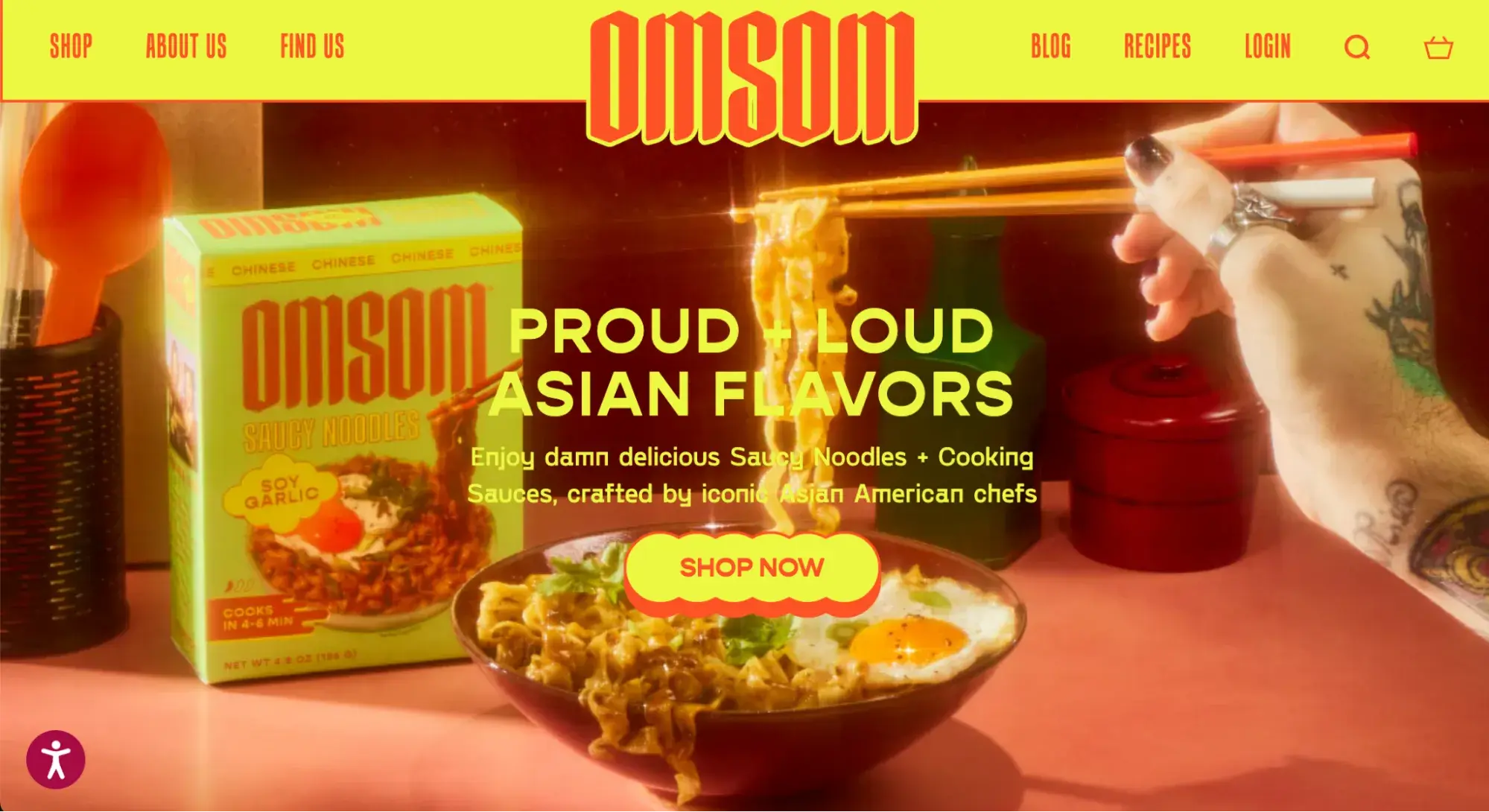
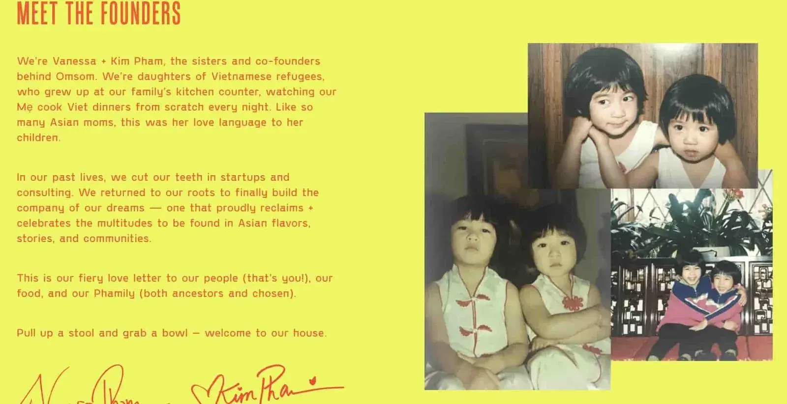
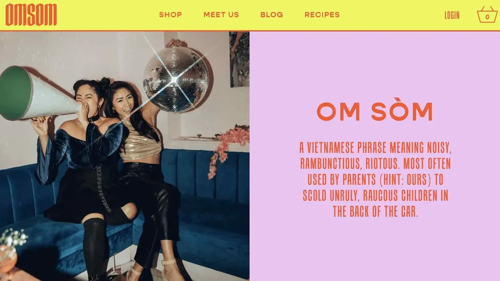
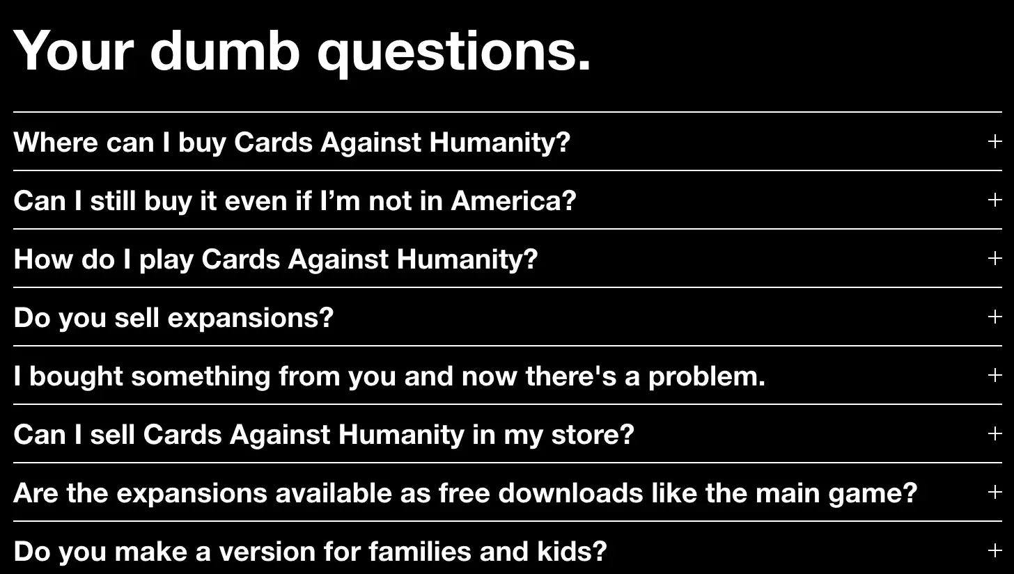
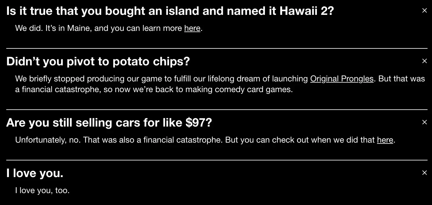
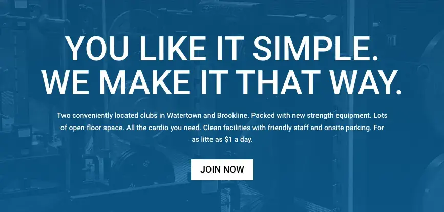
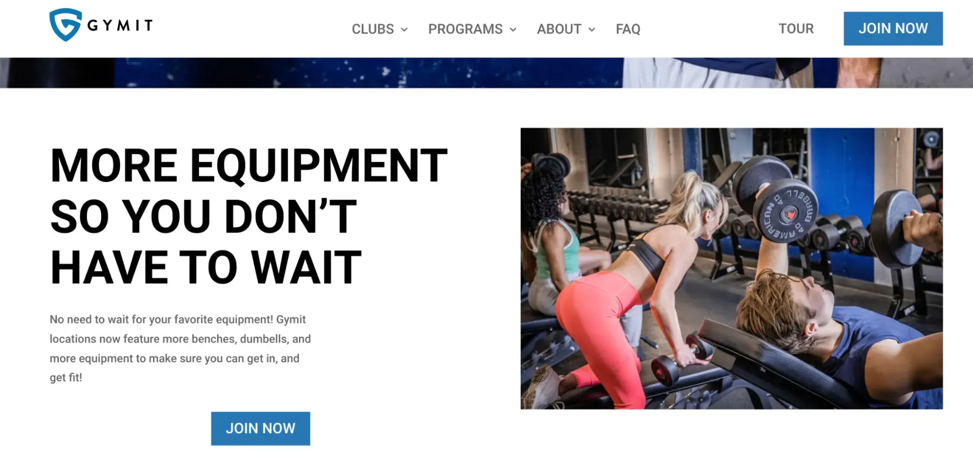
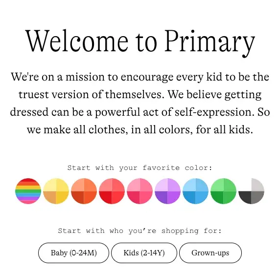
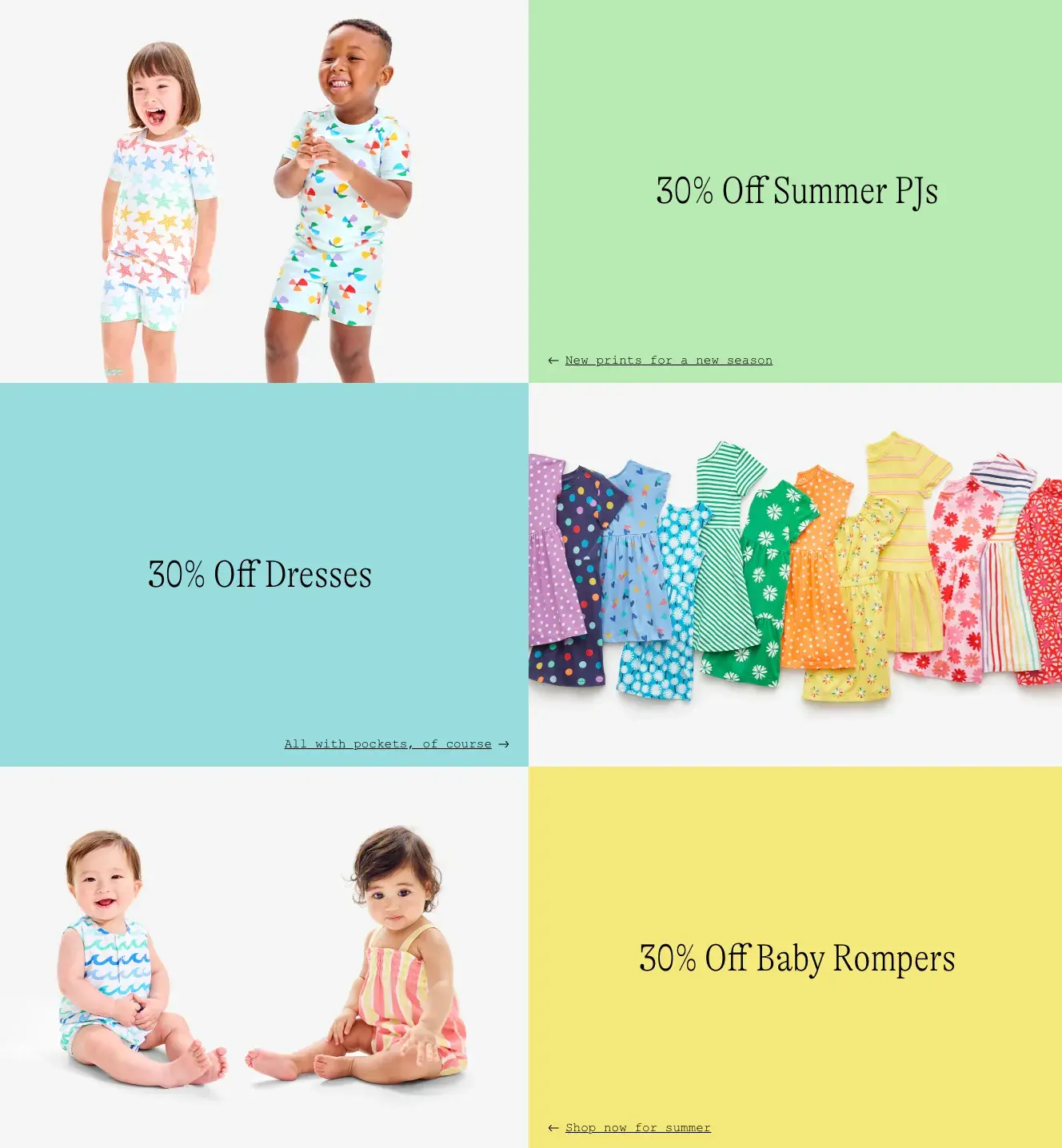
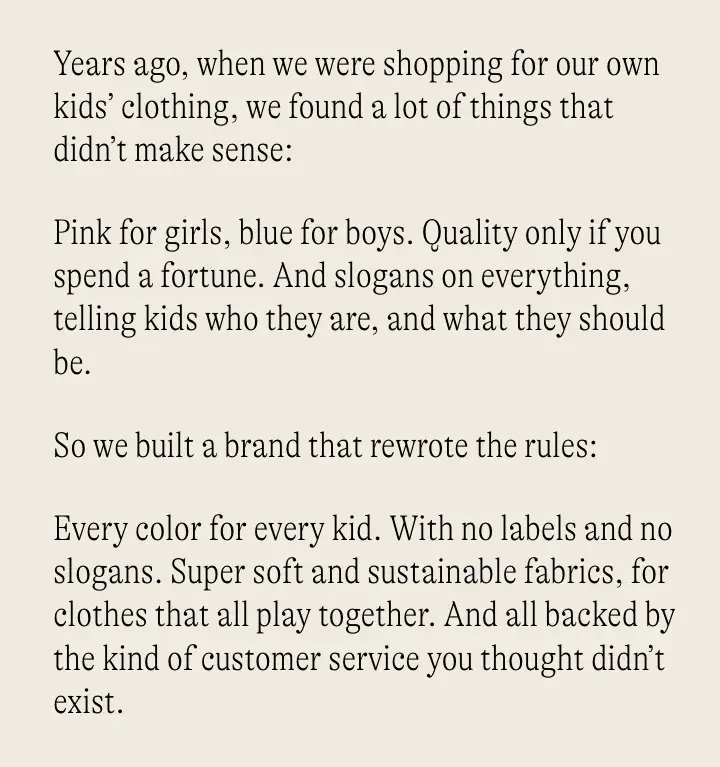
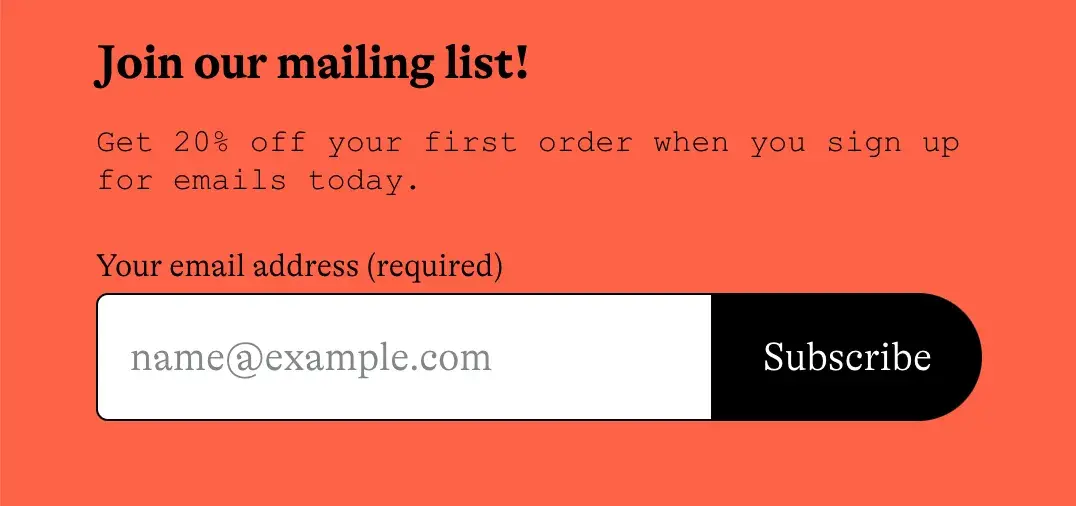
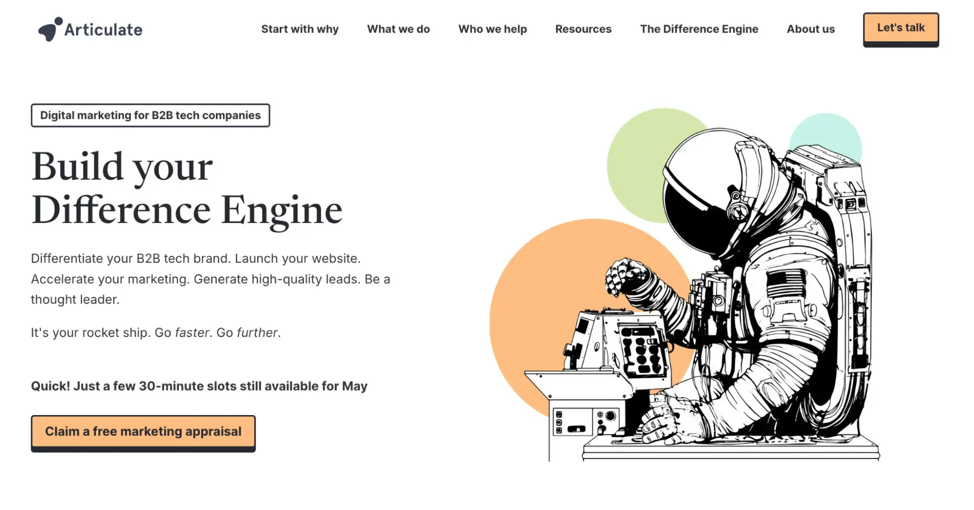
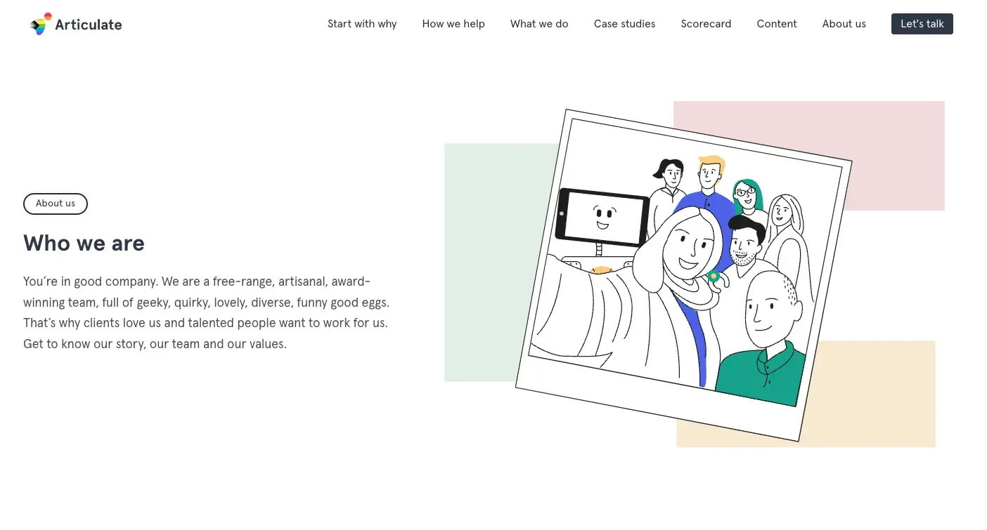
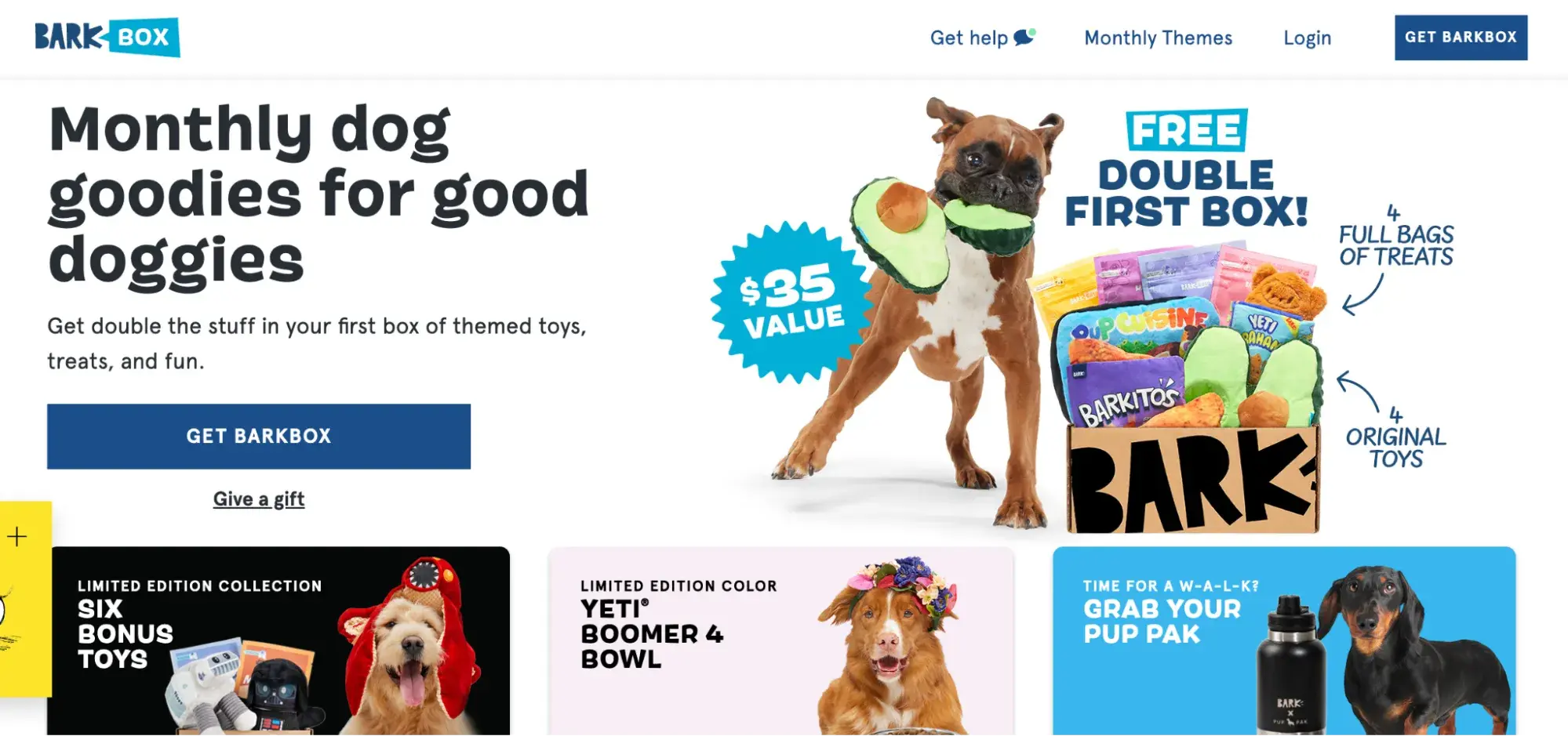
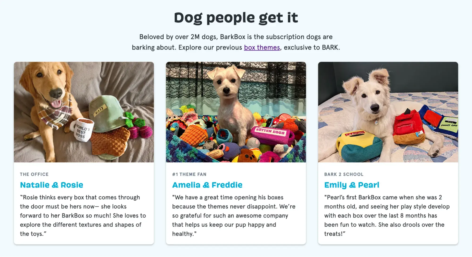
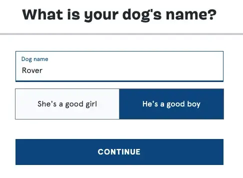
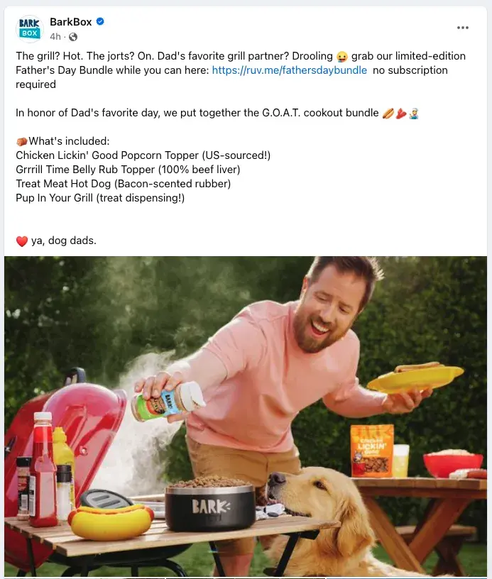
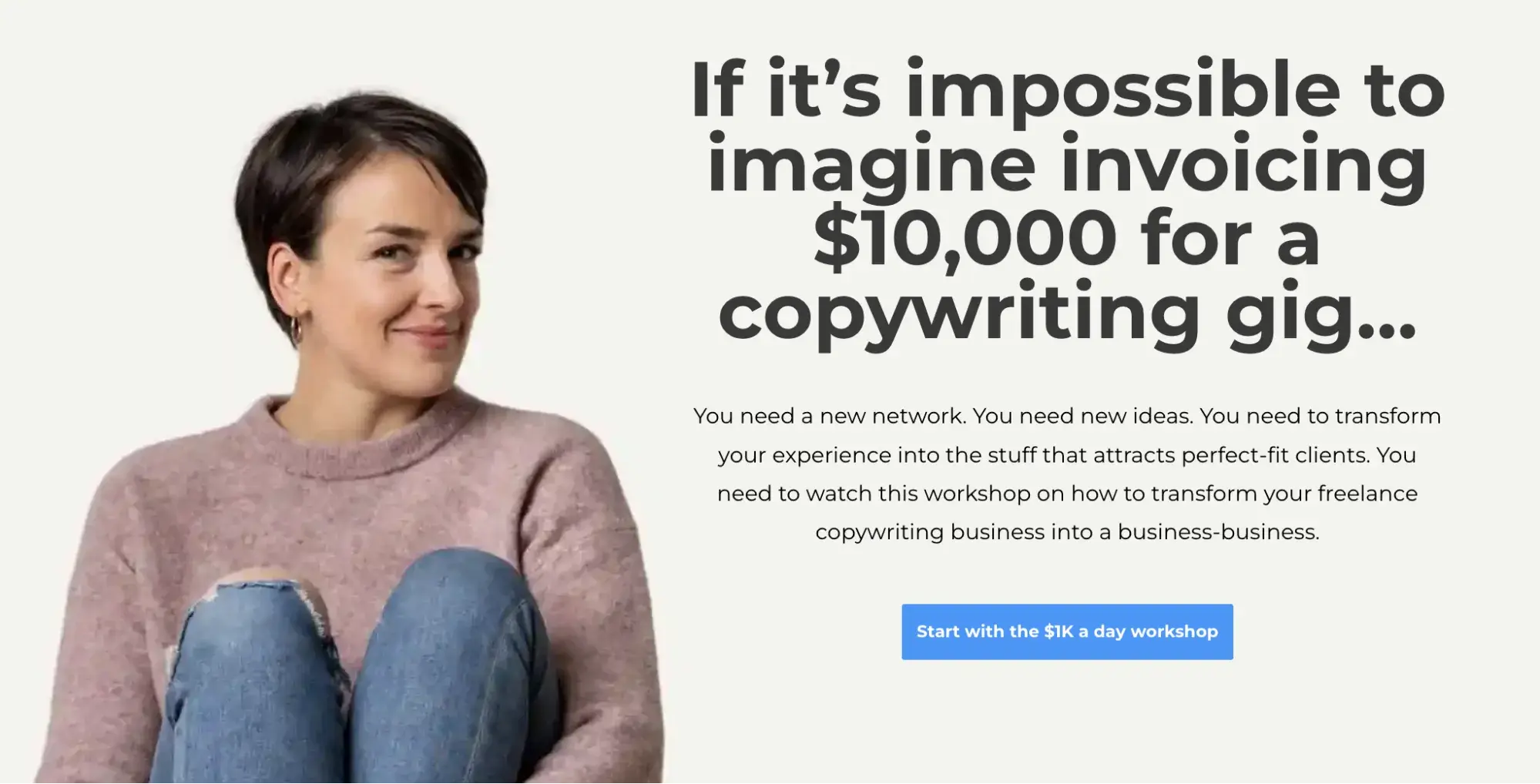
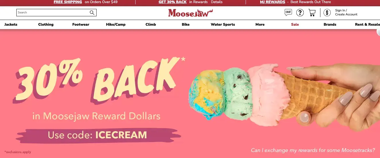
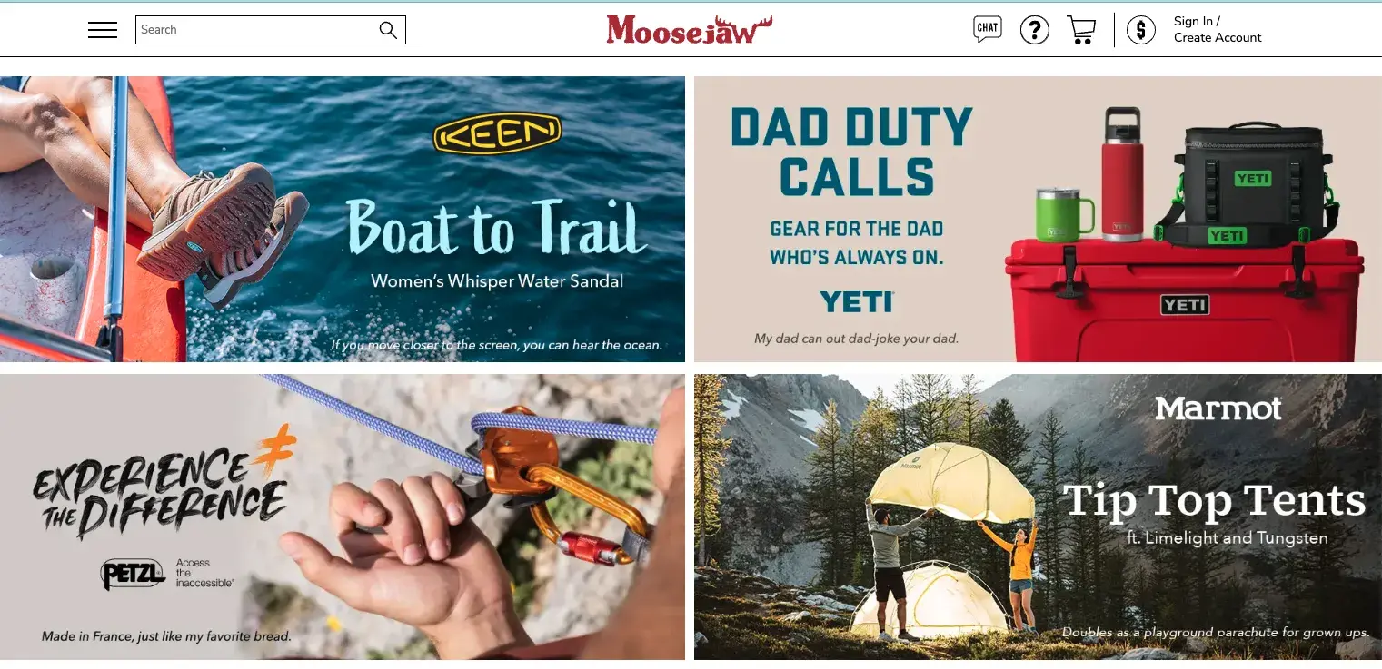
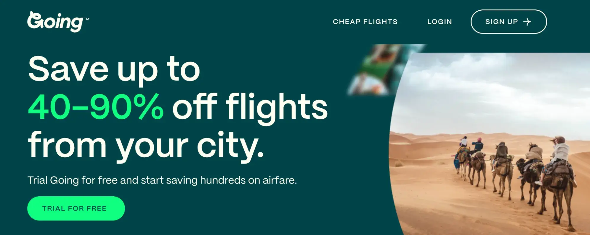
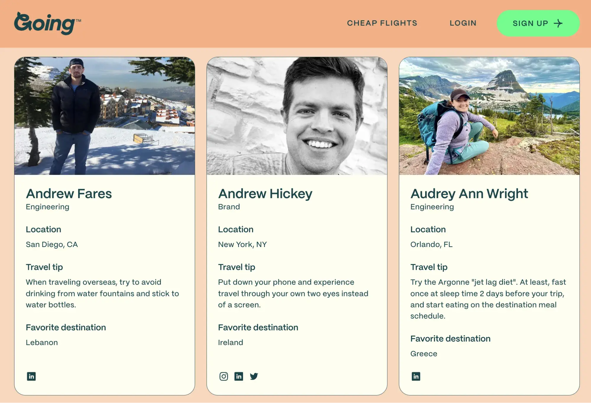
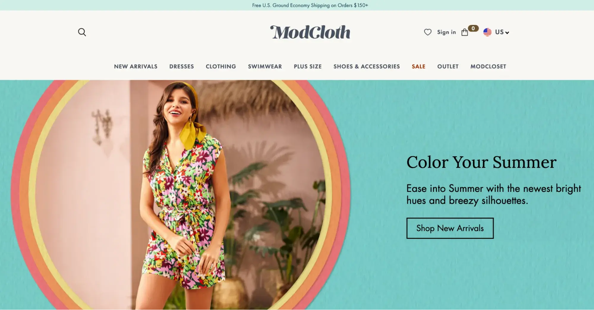
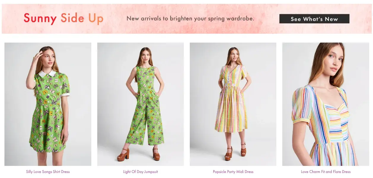
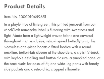
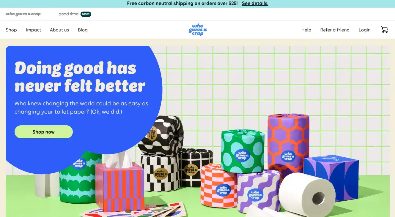
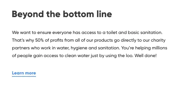
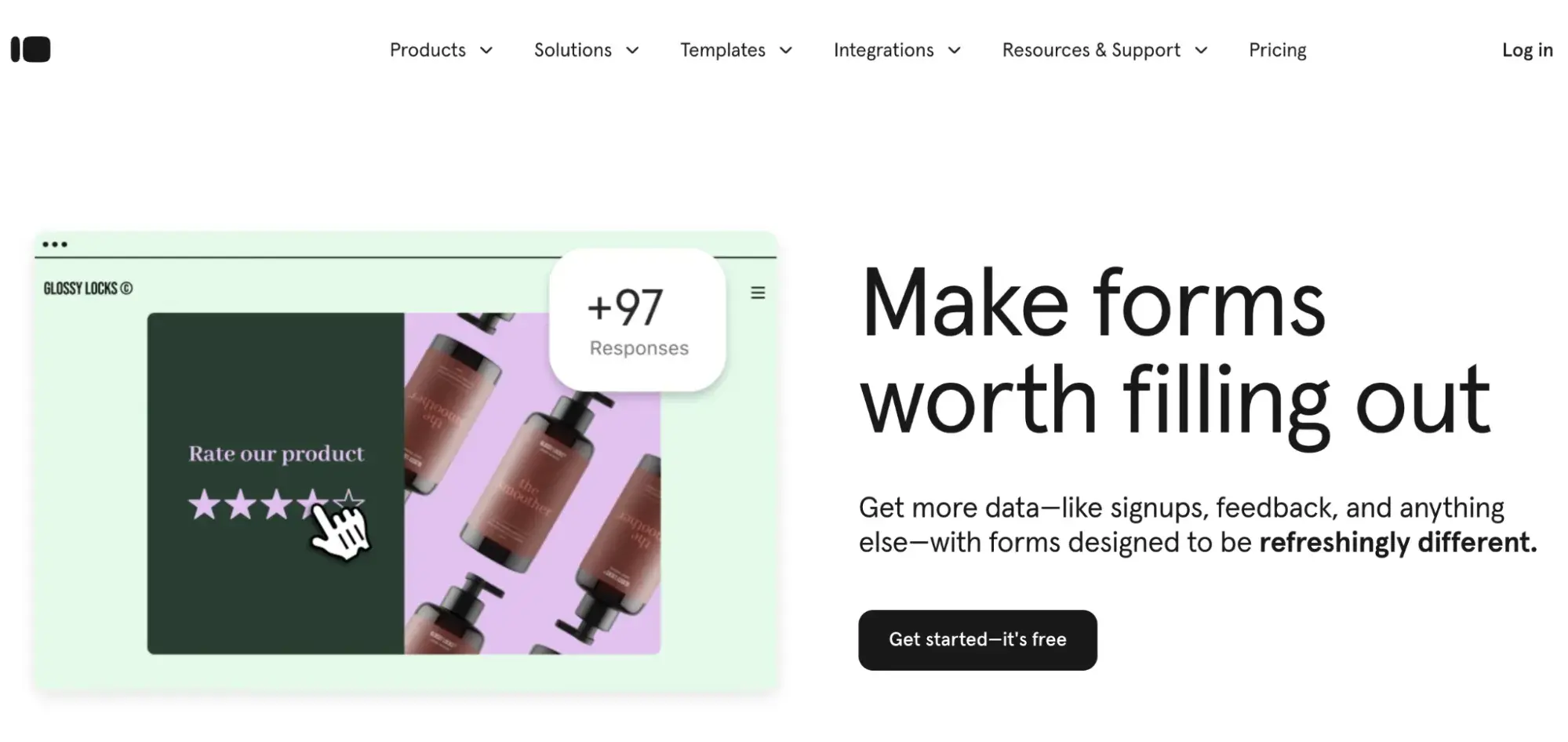
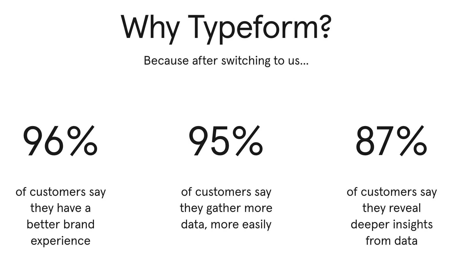
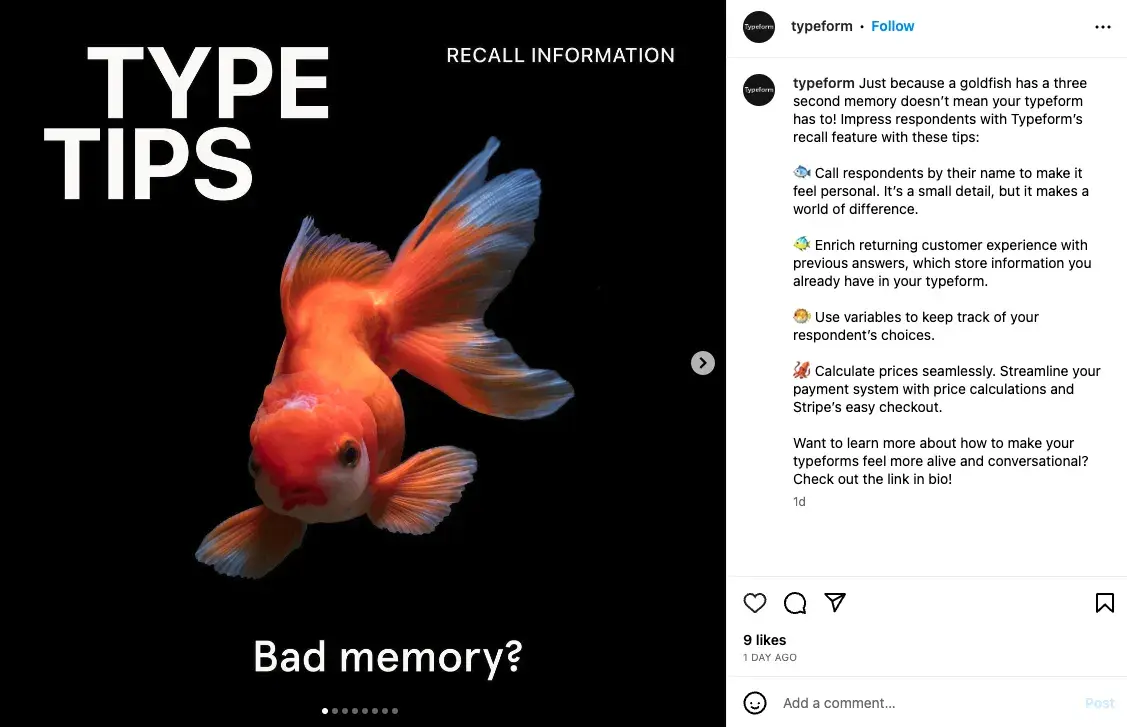
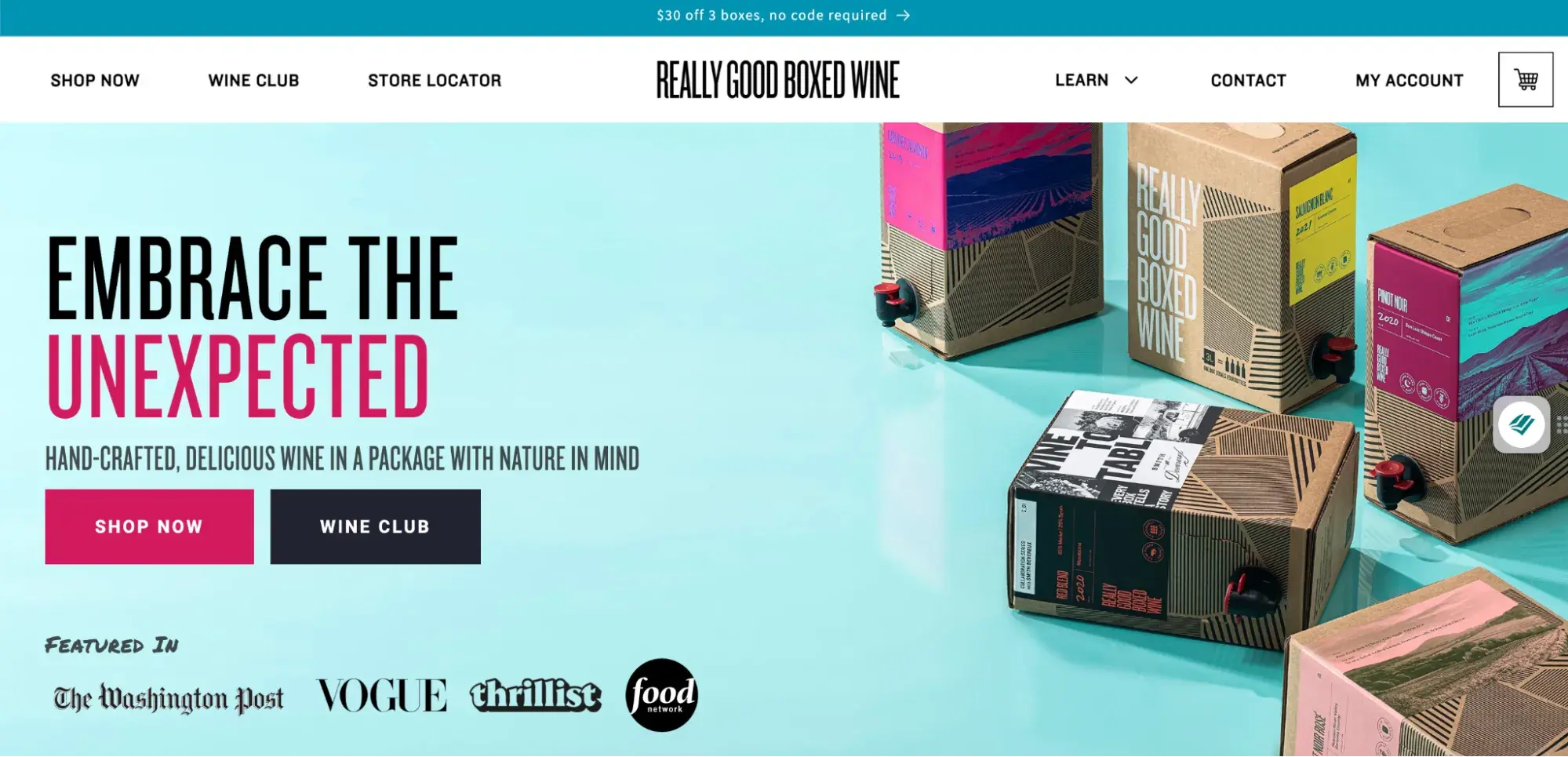
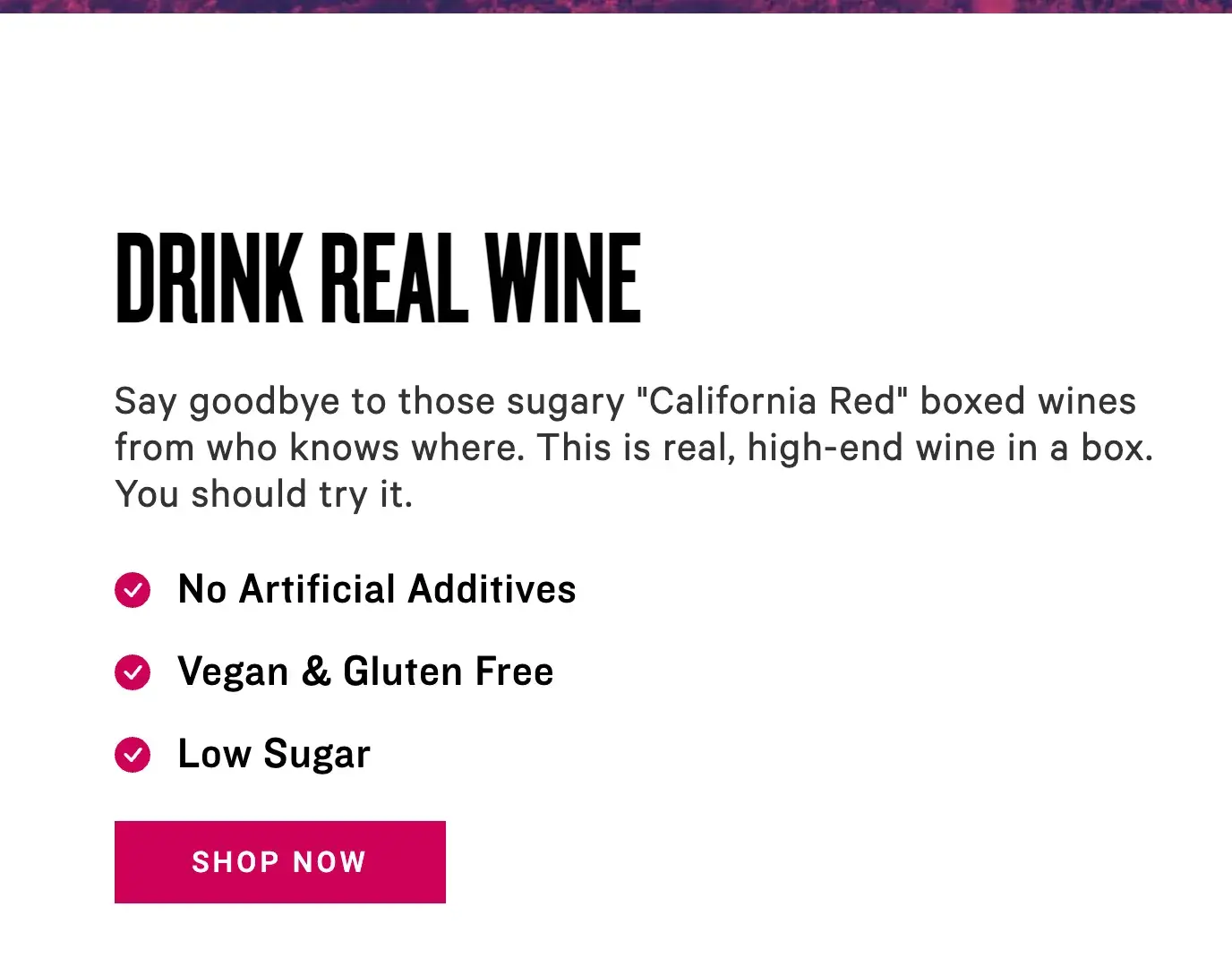
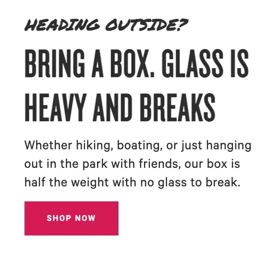
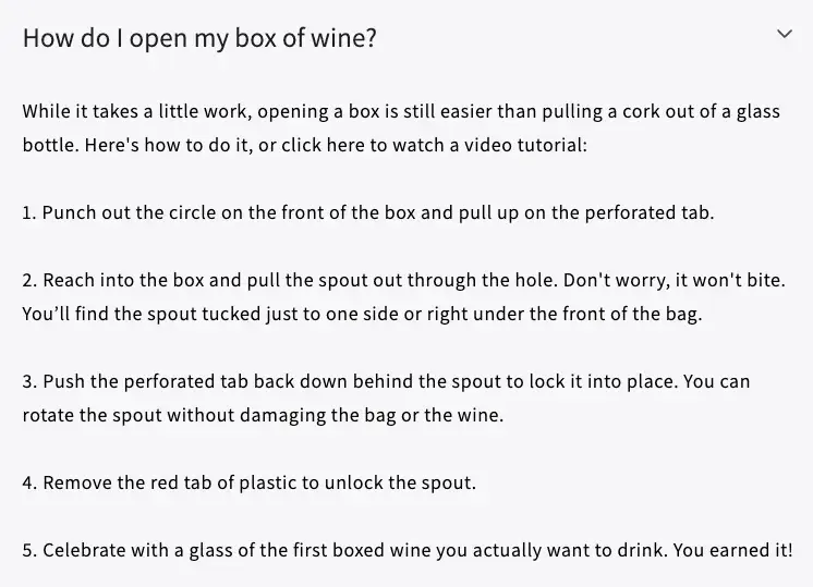
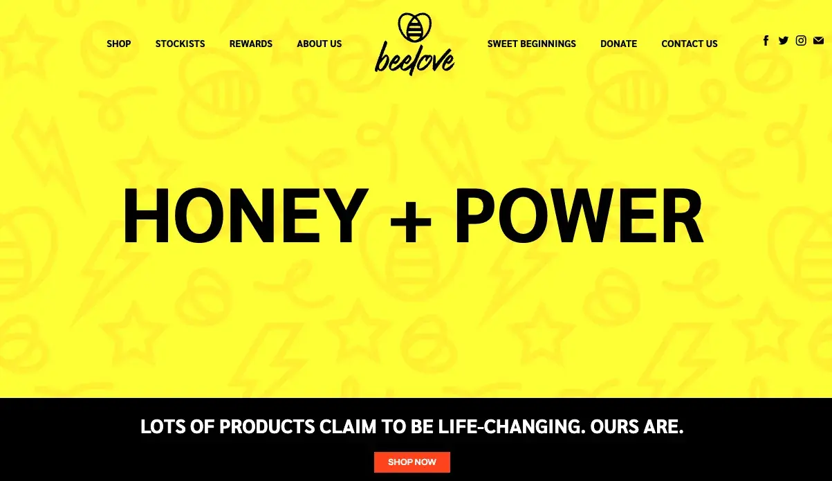
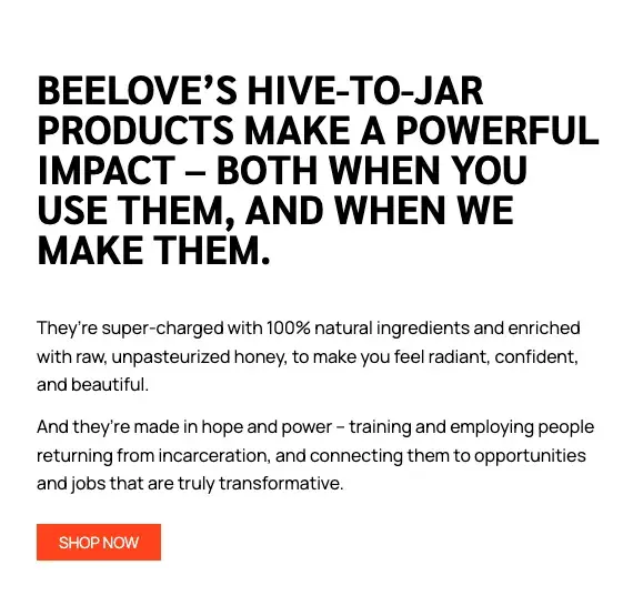
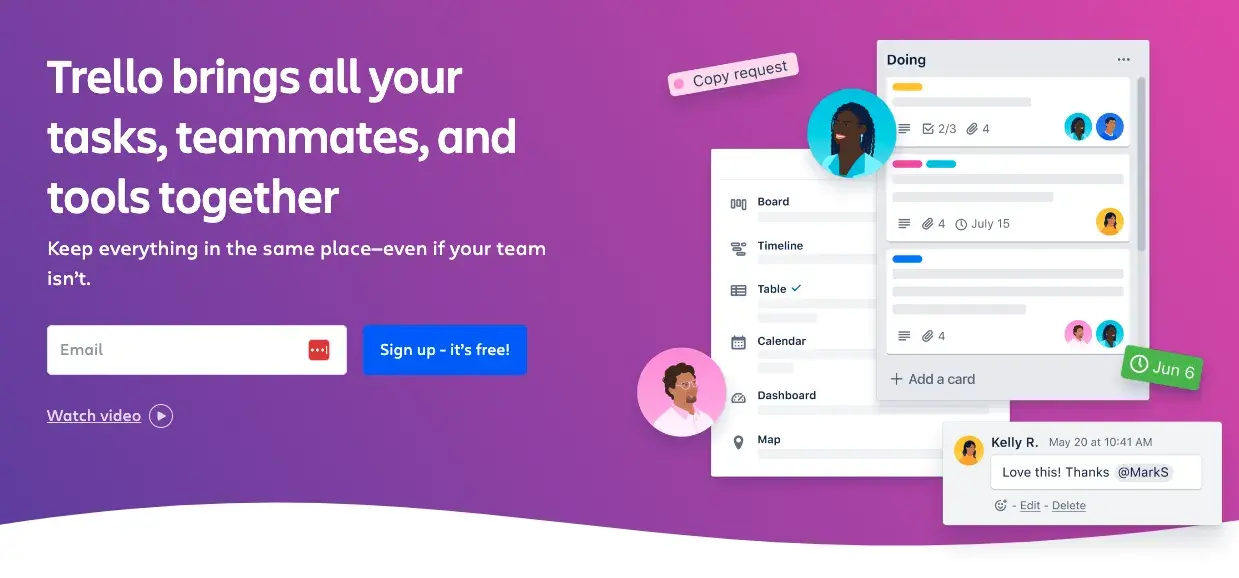
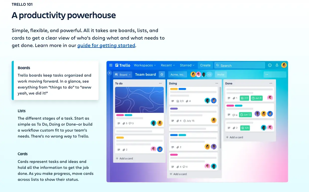
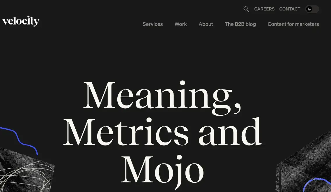
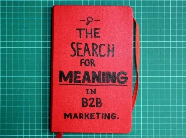
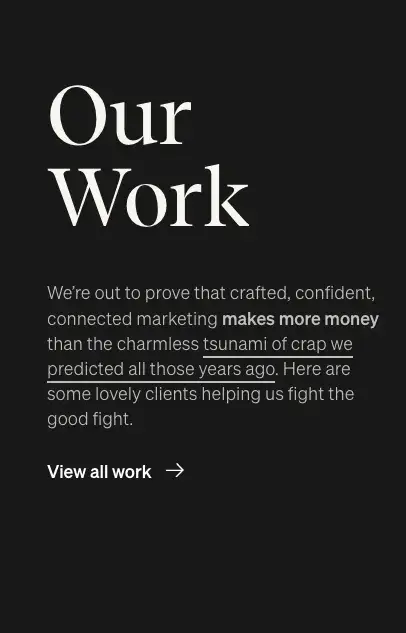
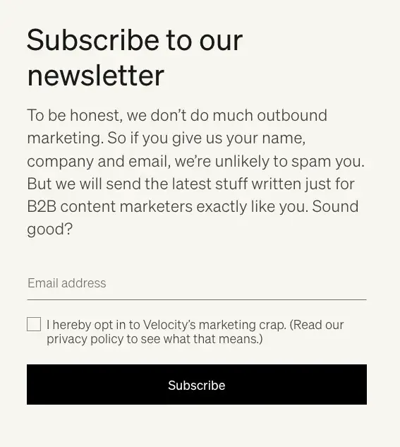
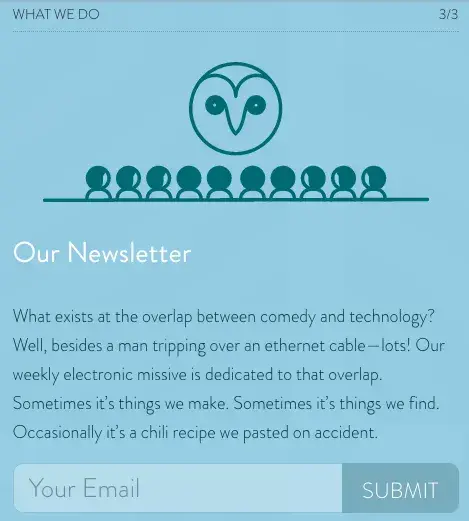
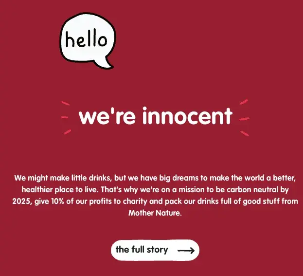
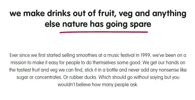
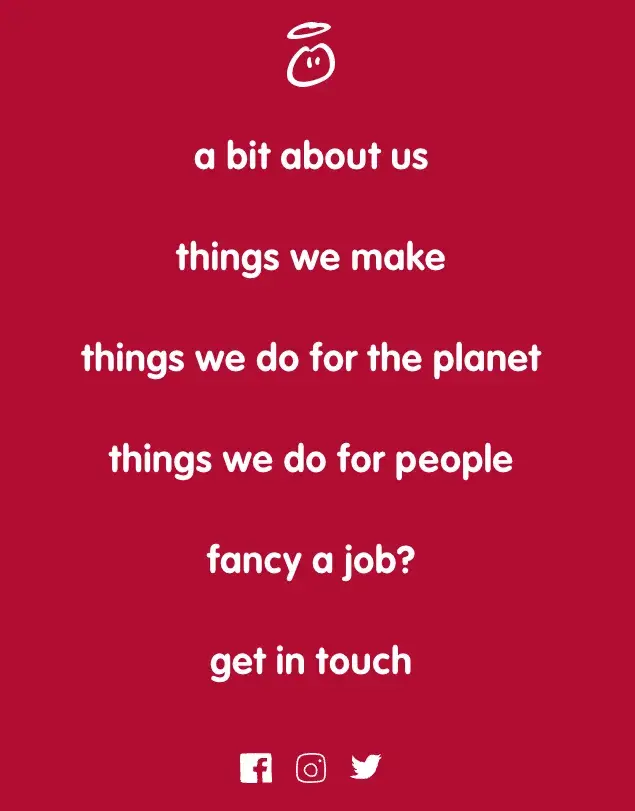
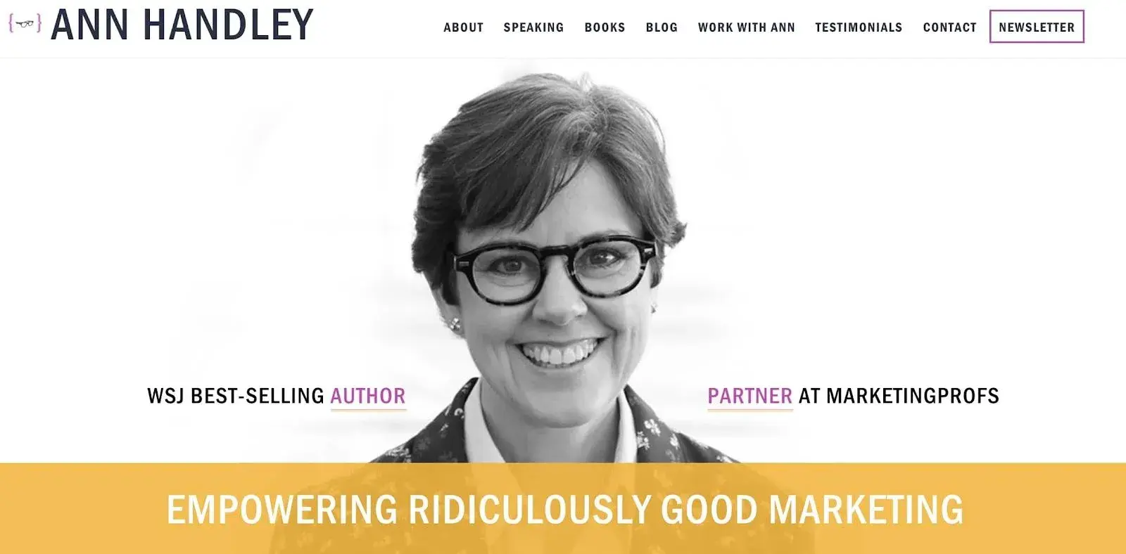
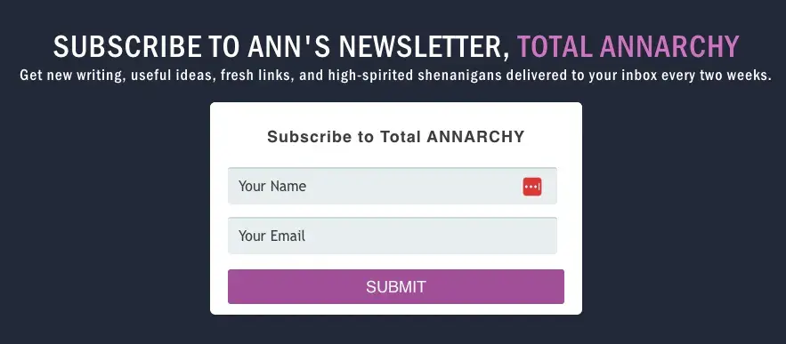
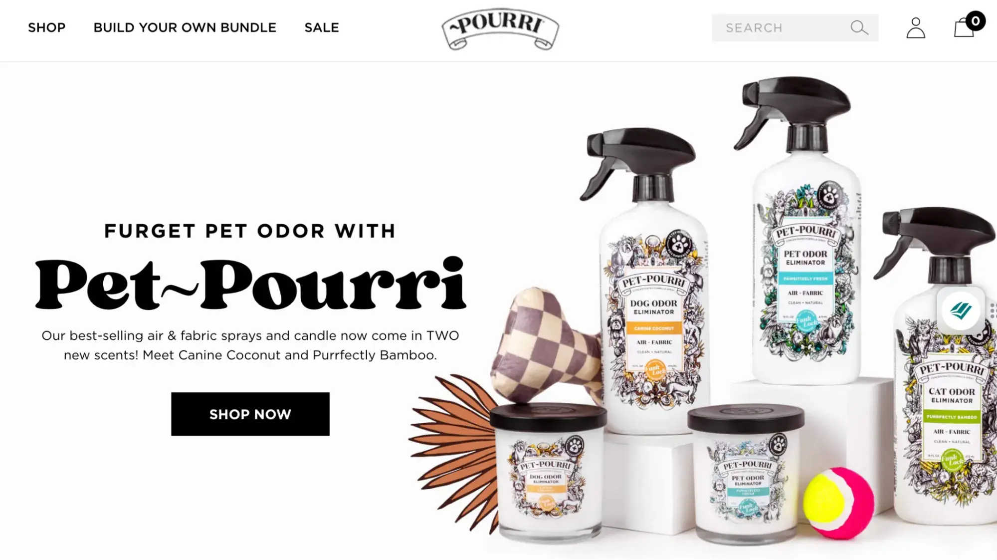
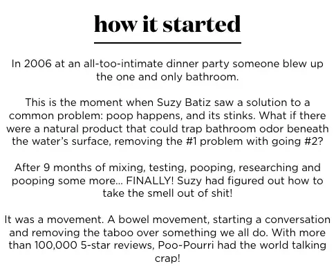
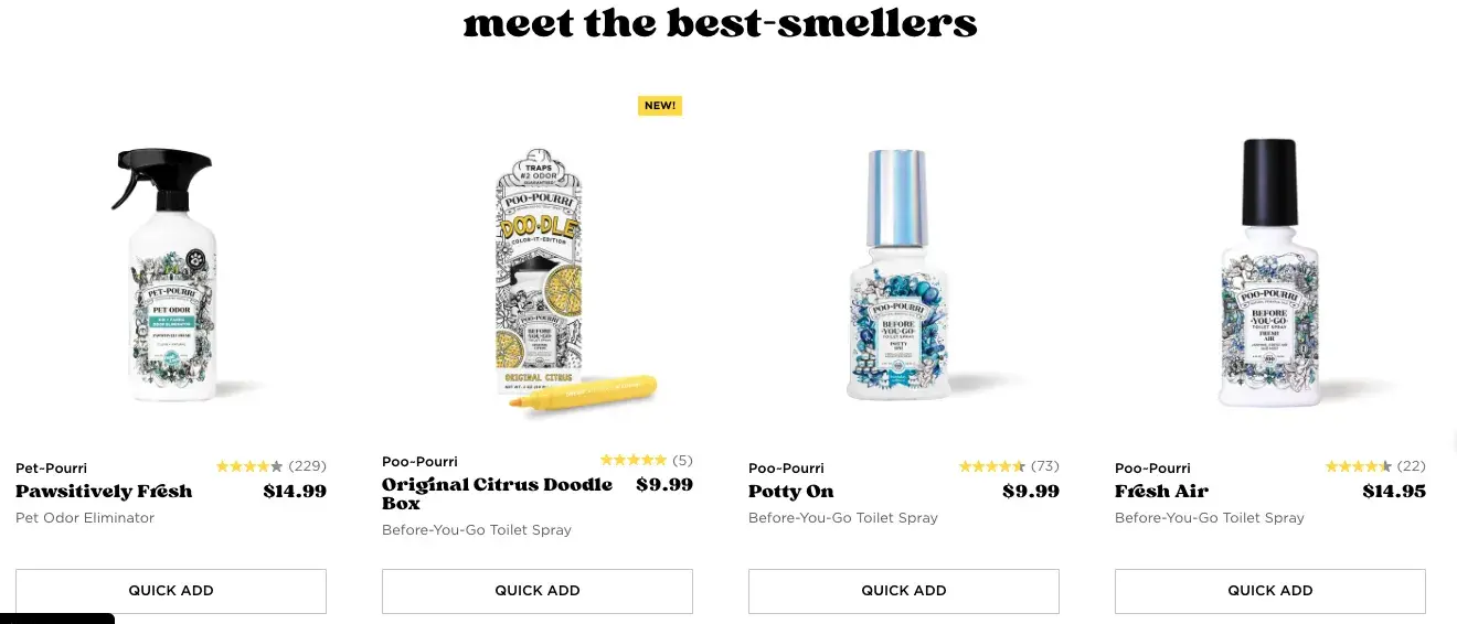
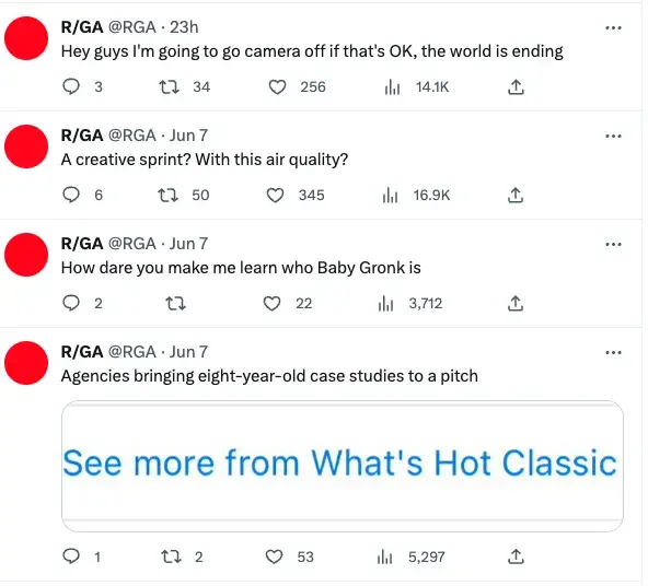
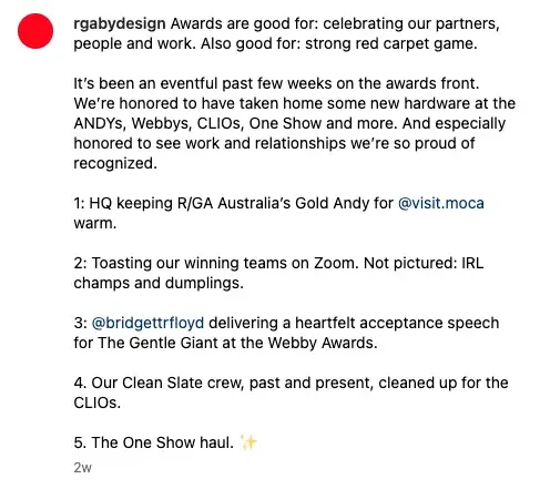
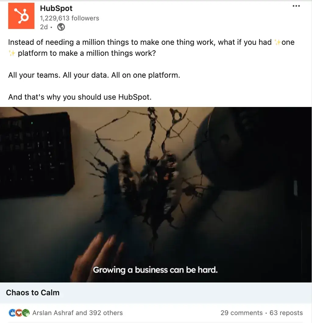
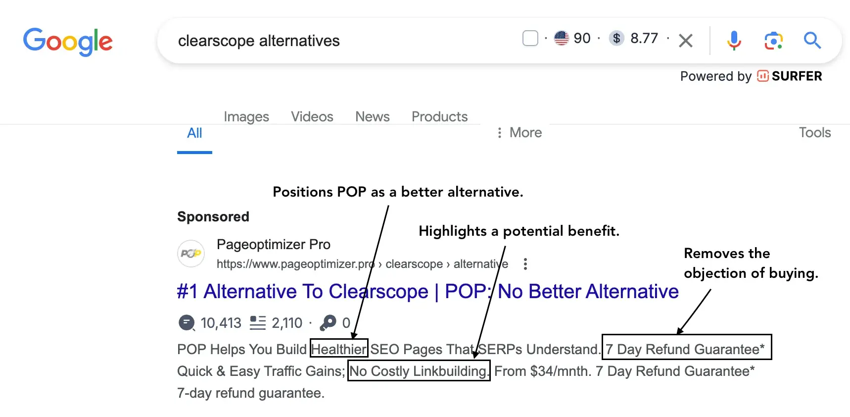
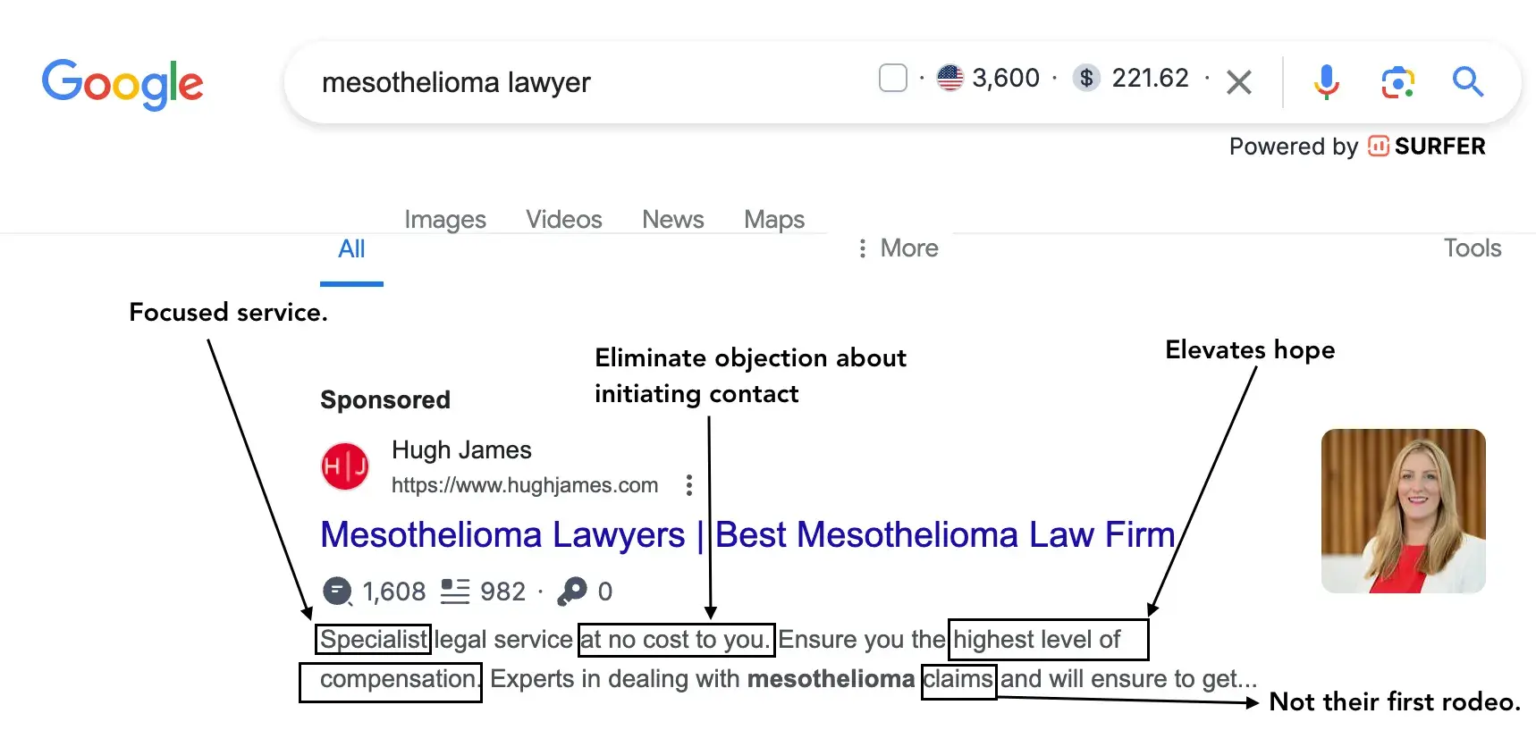
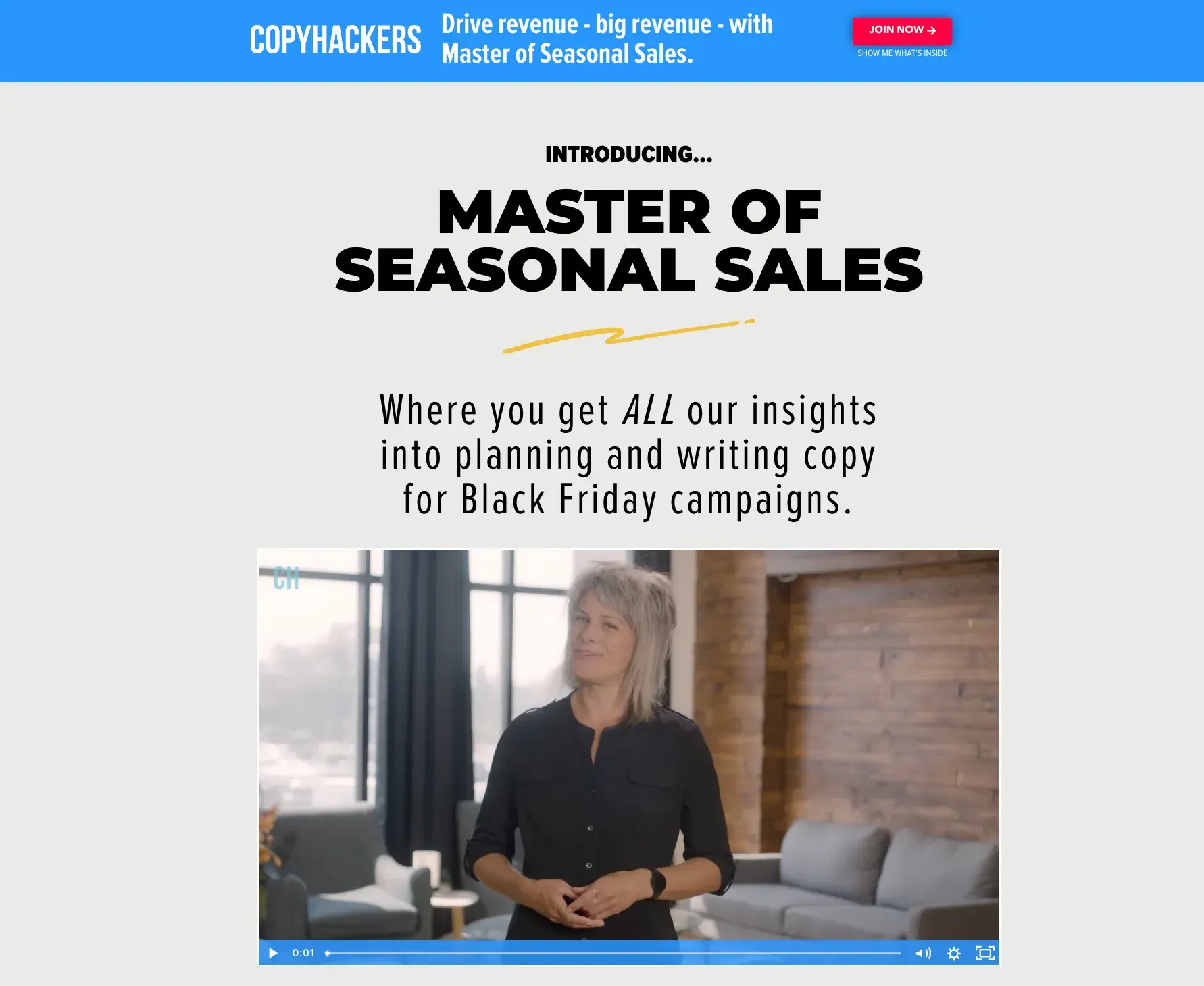
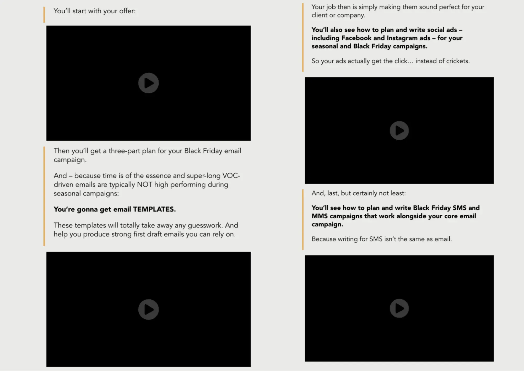
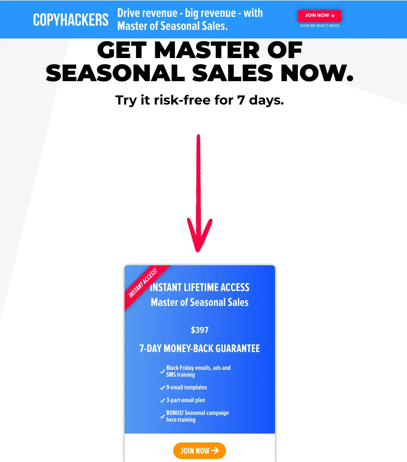
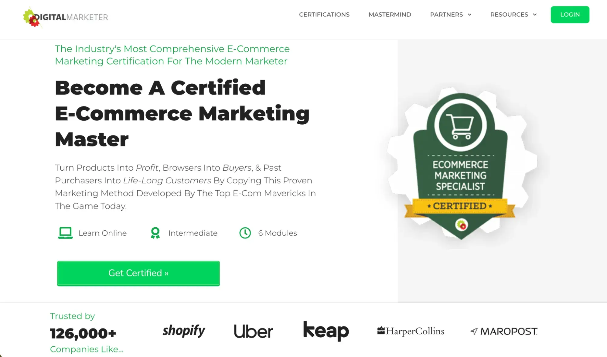
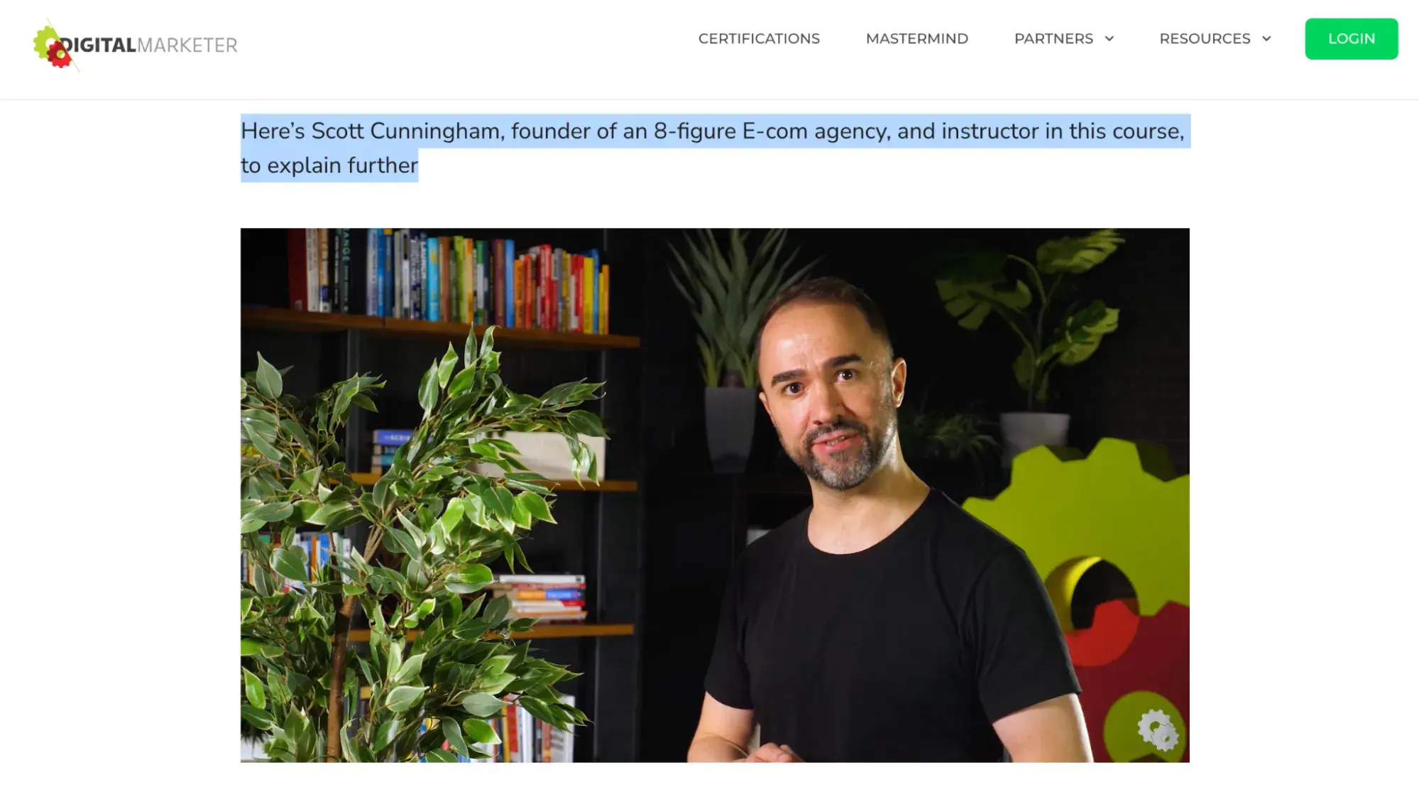
Knowing about copywriting is great, but nothing beats excellent copywriting examples at your fingertips. When I need to get inspired, it helps me to look at examples of great copy. This can help you smash any creative block and write fast – whether you need to crank out website updates, product copy, or blog posts. Below, I’ll show you 27 inspiring copywriting examples from businesses who hired incredible copywriters. Jump ahead to the examples you're looking for: Why we like it: Omsom‘s copy is playful and authentic. I like how the company founders, the Pham sisters, share a bit about their culture and cooking ingredients. This makes home cooking accessible and quick for visitors of all skill sets like me. I typically enjoy cooking, but I don’t always have the time. With Omsom, I have stepped up my game. Omsom’s ready-to-use starter pouches of spices and sauces help me churn out Asian dishes quickly. It has also made me avoid the hassle of store-hopping and buying larger quantities than I need. Still, I always buy more than intended when I'm on their site because it looks delicious, and the copy is a huge motivator to click “add-to-cart.” Right at the start, I like how the homepage (pictured above) invites me in with a “saucy” copy that works with the image. There's also plenty of wordplay used. The founders, with the last name Pham, have worked it into various spots on the site, including their note welcoming visitors to their “Phamily.” The language is the perfect balance of both playful — even calling out that the Pham sisters were rowdy youths in their definition of Omsom (above) — and no-nonsense regarding ingredient quality. Why we like it: Their copy is abrasive and a little offensive, which perfectly lines up with their brand voice and audience. You may or may not be familiar with Cards Against Humanity, the self-declared “party game for horrible people.” It‘s a card game — one that’s simultaneously entertaining and inappropriate. The copywriting on the cards themselves will definitely make you laugh. The brand voice is very distinctive, seems abrasive, and even a little offensive. But that‘s their whole shtick: They’re not trying to appeal to everyone, and that's perfectly okay. What they do is a great job of appealing to their target audience. One look at their FAQ page and you'll see what I mean: Here‘s a sneak peek into some answers to these questions. You’ll see they make fun of both themselves and the reader — which is exactly what the card game is about. Why we like it: GymIt truly gets its users and expresses it with funny advertising about pretending to move to get out of a contract. The company knows their audience and knows just what to say to hook them and make them smile. I‘ve always loved the copy at GymIt. In fact, I check their site and social profiles all the time to see if they’ve freshened anything up. Luckily, they are not a one-trick pony. They continue to keep their site fresh with captivating copy. Here’s one of my favorites, which hit the pain points of gym-goers. GymIt’s copy rolls up to their philosophy and is espoused on their "About" page: that gyms should just be about working out: Talk about understanding their core audience. The copy, both in its value proposition and across its marketing materials, reflects a deep understanding of its customers. Why we like it: Primary does a fantastic job of speaking to parents who want their kids to grow up well-adjusted, and they make their mission clear on the homepage. They do an exceptional job of illustrating that they're a different company and show customers two great ways to shop — by color or age. The next section of their homepage explores clothes for different age groups in bright colors. The empowering language of Primary continues on the About page. This page focuses on why the founders were unhappy with the kids' clothing industry and what they set out to change. By relating to the common concerns of parents, they establish a standard people can expect when shopping with Primary. Fun and empowering language aside, Primary's copywriters entice users to sign up for their email list by giving 20% off for first orders. Why we like it: Articulate has nailed the pun game. It's cheesy in a good way and makes them more relatable to job seekers and clients. Most people don‘t want to just be a cog in a company’s machinery, so by adding some humor, Articulate sets itself apart from other corporate competitors. Articulate is a HubSpot Agency Partner based in the United Kingdom. Though the company is an inbound marketing agency, I like how they infused witty and confident copy on their web pages. Here‘s exhibit ’A': The copy above introduces Articulate‘s "Meet the Team" page — not a page you’d think can pull off witty copy, right? Well, Articulate's page goes beyond employee photos and their job titles. The copy also takes on a farm theme, assuring visitors that employees are “free-range, artisanal” and “funny good eggs.” Funny on the surface but helpful to clients who want to know where their work comes from and how it's made. Why we like it: No round-up of exceptional copywriting is complete without a discussion of BarkBox. With playful web copy, they nail exactly the kinds of words people use to talk about their dogs, like “good doggies.” Throughout their site, they continue this casual, friendly language worthy of any pet lover, including this language that makes their users feel special: “Dog people get it.” And for anyone subscribing, they have some fun ways to get information about the pup the box is for: However, while their website copy is fun, their social media copywriters truly take the cake dog biscuit. Their social content alone is fantastic, but this (and their emails) is where they talk the most about their clever toy names. Check it out in this example: Why we like it: A site that teaches copywriting to copywriters had better nail its copy. For this, CopyHackers doesn’t disappoint, and that’s why it makes my list of the best sales web copywriting examples. What I really love about this page is how well it speaks to some of the biggest pain points and concerns of copywriters today, alluding to the fear many writers have of being starving artists. Even more well done, they take AI tools head-on. Sure, “with the help of AI, everyone can be a copywriter,” but that doesn't make them a great copywriter. So while there's a plethora of AI copywriting prompt examples out there, few people are addressing the elephant in the room — AI copy still needs great human oversight, just as CopyHackers explains. Unsurprisingly, the clever, yet clear copy is exceptional every step of the way, including in their newsletter sign-up. The headline is clear, and the sub-headline adds a dose of fun while showing that their emails are so valuable that 89k other people are on the list. Why we like it: Moosejaw's humor builds an emotional connection with site visitors — delighting them while providing useful information. Not many brands are brave enough to touch the products they‘re selling with an unconventional copy, but Moosejaw isn’t afraid to have a little fun. The outdoor apparel outlet store uses humor to sell its products without being overly forward about it. By appealing to people‘s emotions, they’re more engaging and memorable. Here are a few examples: Plus, with quirky one-liners scrolling across the screen, you want to hang around their site for longer just to see what they say next. If you think the brilliant copy stops at their homepage, think again. They extend it to their return policy, too. Here, they do a great job of not sacrificing clarity for humor. I like how their copywriters successfully made people laugh while still being helpful. Why we like it: The team at Going positions themselves as travel industry insiders with their handy pro tips and down-to-earth lingo. Going is known for finding discount airfare, but they've branched out with various offerings, including guides. Adding a personal touch, the team at Going has also offered some pro tips on their “Meet the Team” page. Members feel like they're getting information from seasoned experts, and they can pair these tips with photos of the employee who gave them. This small but useful addition builds a connection with site visitors and improves the company's credibility. Why we like it: ModCloth is delightfully quirky and whimsy. Their copy speaks directly to their buyer personas with product copy that helps buyers envision their lives with the item. ModCloth is a brand that has always had an excellent grasp of its buyer persona, and it comes through in its pun-filled copywriting. All of their products are silly plays on words — check out this screen grab of some of their new arrivals, for example: Dive into their product description copy, and it‘s equally joyous, evocative, and clever — just like their customers. Often, it’ll also tell the story of what you'll do while wearing their items: After reading their descriptions, one can imagine what their life would be like if they owned this product. That's Copywriting 101, but so few brands can actually pull it off like the folks at ModCloth do. Why we like it: Few copywriters could set out to make toilet paper heartwarming yet funny, but the folks over at Who Gives a Crap have succeeded. From the name of this brand of toilet paper on a mission to change the world to the clever copy woven throughout their site, these copywriters excel at capturing people's attention and bringing a smile. Their tongue-in-cheek approach makes them relatable from the first few lines of copy. Instead of coming off as self-promoting, chest-thumping heroes, they take a surprisingly humble approach: “Who knew changing the world could be as easy as changing their toilet paper? (Ok, we did.)” That continues onto their About page, where they poke fun at “traditional” dating app profiles and highlight why they do what they do with this delightful intro: Their brand story even calls out the brand's penchant for jokes further down the page. And while their copy is exceedingly clear, they weave in clever plays on words throughout their website, including their product pages. Take this section from their 100% recycled toilet paper page, with a playful yet subtle joke: “beyond the bottom line.” Why we like it: Surveys and questionnaires are a part of life — one that makes many people groan. Typeform is doing its best to change all of that with their “make forms worth filling out.” What really stands out about their website copy is that they speak to the possibility of a better kind of form (or quiz) right away with clever copy that also shows the benefit of “getting more data.” I also love that they show what's in it for new customers who switch to Typeform. Typeform’s refreshing, simple, and fun copy goes beyond the website. They carry it through to social media with posts like this: Why we like it: In the wine world, boxed wines are treated like outsiders. Really Good Boxed Wine is on a mission to change that perception with high-quality wines that are more environmentally friendly and fun. Their copywriters kick things off right away with the headline “Embrace The Unexpected” to get users curious right away. And they smash preconceived notions about boxed wines in all of their copy, addressing common objections in a fun way that draws the reader in. It's not just about busting myths and misconceptions about their product. They also offer ideas for maximizing the Really Good Boxed Wine experience. And as if that weren't enough to bust any pretentious wine snobbery, they poke fun at how easy their product is to use in their FAQs, ending the not-so-rigorous box opening with “Celebrate with a glass of wine.” Why we like it: Not all copywriting has to be catchy or tongue-in-cheek to be memorable or good. BeeLove does both with succinct, powerful words that seek to inspire. This passage on their about page has a fun bee-based play on words: “hive-to-jar” instead of the more commonly used “farm-to-table,” while also speaking to their mission and how the customer can “bee” part of making a powerful impact. BeeLove's copywriters thread the words “hope,” “power,” and “honey” throughout the copy while using impactful language that drives home the meaning. Why we like it: First Round Capital uses language to empathize with its readers. Starting a company is challenging, and First Round Capital understands that and conveys they are there to help. While a sign of great copywriting makes people smile, another is making people feel understood. The copywriters at First Round do a phenomenal job at letting the value of their offerings for their customers sell themselves. Right off the bat, they speak to the challenges their target audience experiences to build empathy while sharing names of companies they've worked with to build credibility. Why we like it: Trello‘s copy is clear, which is exactly what users need to learn how to use the product. Switching project management software can be a challenge. Trello’s copy makes sure new users don't get left behind. Do you know what Trello is? If the answer is no, then behold the copywriting on their website. Like most of the copy on their site, their product description is crystal clear. And check out how clear this explainer content is: Some of the use case clarity can be attributed to how smart the product is, but copywriters deserve some credit for communicating it clearly, too. They call it like it is, making it easy to grasp. Why we like it: For David Kessler of Velocity Partners, less is more. His use of “word economy” delivers engaging, powerful content concisely. No post about excellent copywriting would be complete without mentioning the folks at Velocity Partners. We‘ve featured co-founder Doug Kessler’s SlideShares (like this one) time and again on this blog because he's the master of word economy. What is “word economy”? It's taking care that every word you use is the right word. It means getting your point across concisely and not dwelling on the details when you don't have to. This is the ultimate goal when communicating your message in a world of shortening attention spans. And since we‘re talking about word economy, I’ll shut up and let you check out one of Kessler's SlideShares for yourself: Whereas SlideShares are typically visual, Kessler's focuses heavily on copy: The design stays constant, and only the text changes. But the copy is engaging and compelling enough for him to pull that off. Why? Because he uses simple words so his readers understand what he's trying to say without effort. He writes as he speaks, and it reads like a story, making it easy to flip through in SlideShare form. The copy on Velocity Partners' homepage stood out to me, too. Check out, for example, how humble they are when introducing their case studies: I also like how casual and honest they kept their email subscription call-to-action while showing how they deliver value. Why we like it: Cultivated Wit's site copy is very on-brand — humorous. What better way to convey what you can offer visitors than by demonstrating it in real time? The copywriters over at the “comedy company” Cultivated Wit do a great job embracing their brand of quirk throughout their site. They already have one of the game's best “About” pages, but their delightful copy is spread throughout their site — sometimes in the most unexpected places. For example, look at the copy around contact information at the very bottom of their homepage: This section of the homepage is an afterthought at best for most companies. But it was an opportunity for these folks to have a little fun. They also have two unique email subscription CTAs on different pages of their website. They‘re very different, but both equally funny and delightful. Here’s one from the homepage: And another: Why we like it: Like Velocity Partners, Innocent‘s copy proves simple language can be effective as its descriptive counterparts. There’s no need for long paragraphs; Innocent gets straight to the point. Innocent, the U.K.-based drink makers, use language, style, and tone that matches their philosophy, product, and even their branding and design. It's all just clean, straightforward, and simple. Believe it or not, simple is a really, really hard thing to nail in copywriting. This stands out most on their "Things We Make" page. (Isn't that page name even beautifully simple?) This same straightforward but charming copywriting philosophy extends to their site navigation: Their meta description is pretty awesome, too: Why we like it: Despite an impressive portfolio and list of accomplishments, Ann Handley makes her site copy relatable instead of just reading like a resume. It's the perfect balance of personality and professionalism. When building up your own personal brand, it’s easy to get a little too self-promotional. That's where the copywriting on your site can make a big difference. On Ann Handley‘s personal website, she added bits of microcopy that show that despite her many accomplishments (like being a best-selling author and award-winning speaker), she still doesn’t take herself too seriously. Check out her email subscription CTA, for example: Why we like it: Pourri is a fun brand that solves problems that people don‘t like to talk about because they’re often embarrassing. With a fun name that's based on home-freshening potpourri, their first product Poo-Pourri set out to reduce bathroom stink. And their brand “Story of ~Pourri” explains this with humor: They‘ve expanded to de-stink personal, home, and pet odors, which Pourri’s delightfully fun homepage copy alludes to in a few places: By taking a playful approach to uncomfortable topics, Pourri's copywriters do a great job of reducing stink stigma and creating a fun experience for customers. And it's not just the copy on the page that delights. Look at these product names: Unsurprisingly, the delightful copywriting carries through to the product descriptions as well: Access now: Free Guide on how to build a consistent brand Why I like it: B2B companies aren't typically known for being humorous. R/GA bucks that trend with hilarious hot takes via social media. This light approach makes them more relatable and helps build brand awareness. I've been focusing a lot on site copy so far, so I wanted to check out some examples of excellent social media copywriting. I know you all would like to see some more B2B examples in here, too, so I surfaced one of the best examples of the holy grail: X copy, from a B2B company, that's funny. Behold, some recent highlights from the R/GA X account: And this one from Instagram, celebrating an award while also poking fun at themselves: Why we like it: The engagement and 63 reposts of this LinkedIn post says a lot. As a small business owner, I can relate to every word of this social media copy. I don’t want to jump from one software to another, so summarizing my pain points in the first sentence gets HubSpot a pat on the back. I also like how HubSpot used the “Before After Bridge” copywriting framework. Before is the problem. After is the experience once the problem goes away. Bridge is the how to get to the solution. Here’s how this plays out in this post: Why we like it: Search engines like Google are not short of competitive sales ad copy. For example, when I searched for an alternative to Clearscope, I found Page Optimizer Pro (POP). As a marketer, I know how these tools work and that makes it tougher for POP’s copy to convince me to try out their software. The claim about building “healthier” pages may be great for a non-marketer. However, experience has taught me that this claim may be bogus because these tools function similarly. The next big claim is the “no costly link building.” I think this claim is out of place because even if you do the best optimization, you may still need backlinks to rank. The part of the sales ad that caught my attention is the “7-day refund guarantee.” As someone looking for an alternative to a similar tool, POP may be unclear about what’s driving my decision. So it makes sense that they are lowering the barrier to trying out their tool. Within 7 days, I can decide if this tool is right for me and switch to a paid plan if everything checks out. Why we like it: About 3,600 people search for “mesothelioma lawyer” in the US every month. The high cost per click of $221.62 shows the term is highly competitive. With claims reaching up to $1 million, every conversion for this term will be a hit for a law firm. So it’s no surprise that Hugh James tries to make every word count in its sales ad copy. If I needed a mesothelioma lawyer, I would pick my phone and dial Hugh James for lots of reasons. Using the word “specialist” makes me believe that this law firm specializes in mesothelioma cases. I’d take a specialist over a generalist any day, especially when they tell me it is at no cost to you” — this removes the objection of “lawyers may be expensive.” Elevating my hope of getting the highest level of compensation makes me trust Hugh James. The icing on the case is, I don’t think this is their first rodeo because they mentioned they are experts in dealing with mesothelioma “claims.” Why we like it: I like CopyHackers’ long-form sales page because it deviates from the norm of using mostly text. The beginning of the page has a bold subheading, followed by a video. Several surveys and experiences have taught me that videos build trust. With this video, the audience knows what to expect from this page. What I like even more is that CopyHackers includes four video previews to give prospects a taste of their course. But with all these, some prospects won’t bite. CopyHackers knows this, causing them to eliminate buyer hesitancy by allowing a 7-days risk-free trial of the course. Why we like it: The long-form sales page of the Digital Marketer is the epitome of excellent copy. I like their use of social proof by showcasing the number and type of companies that trust them. Further down, the Digital Marketer posits a contrarian opinion about a common mantra in the e-commerce industry. If I were an e-commerce marketer, this would intrigue me because it disrupts what I thought I knew, compelling me to keep reading. Reading more, I find the page is well-formatted, uses enough whitespace and bullet points, and includes a video of one the course creators. As mentioned before, videos build trust. But what I like about this video is the copy that shows Scott Cunningham is an 8-figure e-commerce agency founder and instructor in the course. This can compel me to buy the course because I’d prefer to learn from a millionaire who has walked the path I want to tread on. Anyone can be a successful copywriter with the right brand voice — and a little editorial guidance along the way. Get inspiration from the brands above or start compiling your favorite examples. Editor's note: This post was originally published in January 2019 and has been updated for comprehensiveness.
Examples of Marketing Copy
1. Omsom
2. Cards Against Humanity



3. GymIt

4. Primary
Examples of Sales Web Copywriting
5. Articulate
6. BarkBox
7. CopyHackers

Examples of Sales Product Copywriting
8. Moosejaw


9.Going.com
10. ModCloth
11. Who Gives A Crap


12. Typeform
13.Really Good Boxed Wine
14. BeeLove
Examples of Sales Brand Copywriting
15. First Round Capital

16. Trello
17. Velocity Partners
18. Cultivated Wit


19. Innocent

20. Ann Handley
21.Pourri (formerly Poo-Pourri)

Examples of Sales Social Media Copywriting
22. R/GA
23. HubSpot
Examples of Sales Ad Copywriting
24. Page Optimizer Pro
25. Hugh James
Examples of Sales Page Copywriting
26. CopyHackers
27. Digital Marketer

Flex Your CopyWriting Muscles

 Konoly


