50 Unforgettable Color Palettes to Help You Design Your Own
Choosing a color palette for your design project is an important decision that affects every aspect of your design’s performance, from visual impact to user experience.

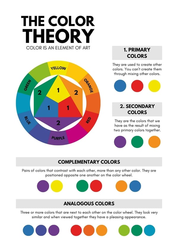
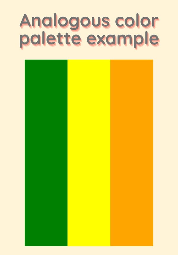
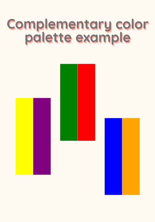
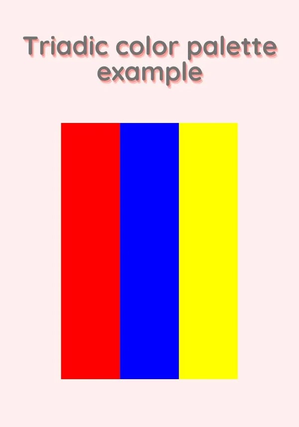
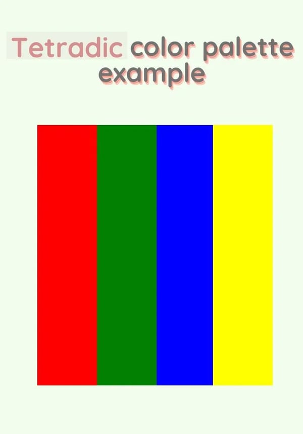
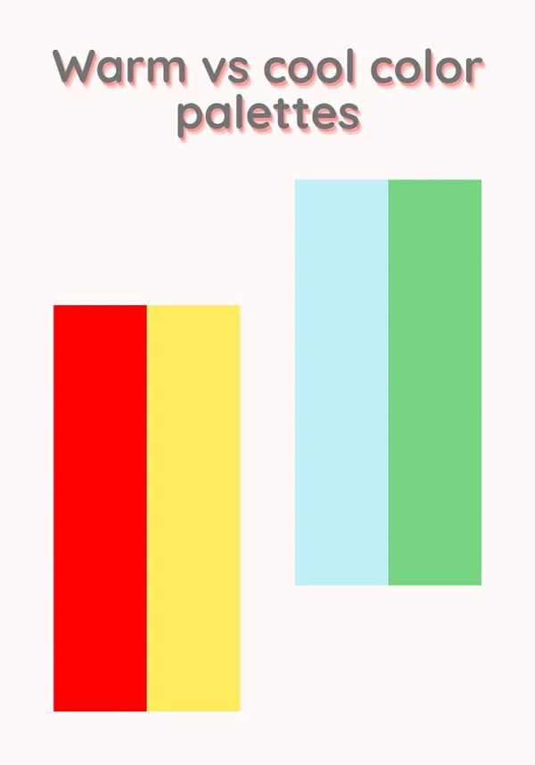
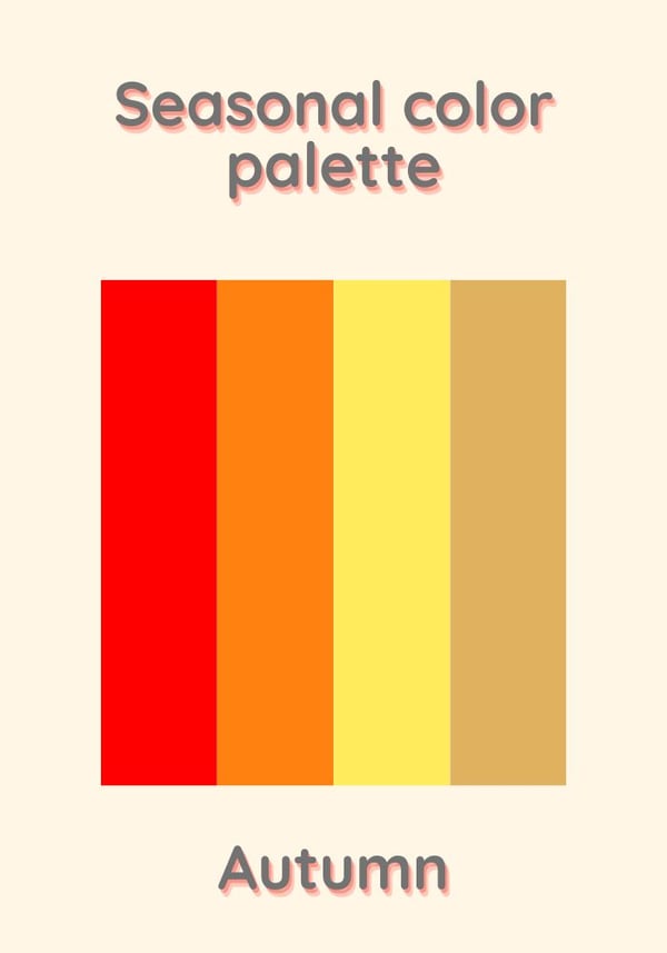
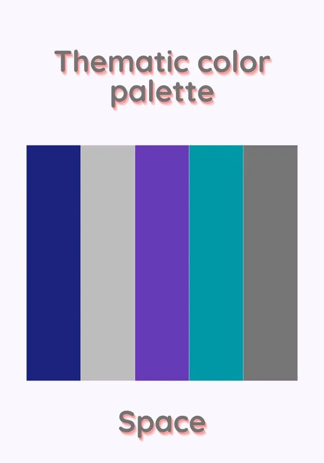
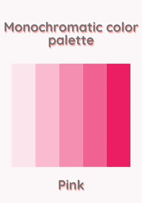
Choosing a color palette for your design project is an important decision that affects every aspect of your design’s performance, from visual impact to user experience. In this post, you'll find abundant color palette inspiration and, more importantly, learn how to choose the right palette for your unique project. Table of Contents While selecting a color palette without much consideration might be tempting, you must understand that your color choices must be intentional and informed. Colors are much more than aesthetics. Choosing colors that achieve the desired impact and communicate the intended meaning requires careful and thoughtful selection. The question then becomes — how do you find a color palette that aligns with your design needs and preferences? A great starting point is to establish a framework for understanding and organizing these palettes through categorization. Understanding color palette categorization allows you to identify palettes that align with your design requirements and broadens your creative horizons beyond your habitual preferences. While there aren’t any hard or fast rules about categorizing the near-infinite number of possible color combinations, we can approach this in two ways — creating color palettes based on the color wheel or based on inspiration. Each has unique advantages. Note: Most palettes will belong to more than one category across both categorization methods. This method categorizes color palettes based on how the colors within the palette interact with the color wheel. For context, the color wheel is a circular illustration where the position of one or more colors relative to others depicts their relationships. Here are some color palette categories based on this method. An analogous color palette, or related color scheme, is based on colors directly beside each other on the color wheel. For example, in a basic color wheel that consists of primary and secondary colors, an analogous palette might consist of green, yellow, and orange. These palettes are great for achieving color harmony and smooth transitions between the colors in your design. A complementary color palette, or contrasting color scheme, is based on colors opposite each other on the color wheel. For example, in a basic color wheel that consists of primary and secondary colors, the complementary pairs would be green/red, yellow/purple, and blue/orange. These palettes are great for achieving contrast in your designs while maintaining balance. As an additional tip, consider using your key color as the dominant hue while the others serve as complementary or accent colors. A triadic color palette consists of three evenly spaced colors along the color wheel. A simple way to find colors that fall within this category is to draw an equilateral triangle on the color wheel and select the colors at each point of the triangle. For example, the primary colors on a basic color wheel (red, blue, and yellow) form a primary triad, while the secondary colors on a basic color wheel (orange, green, and purple) form a secondary triad. These palettes are great because, if done right, they allow you to create versatility and depth in your designs without sacrificing harmony. A tetradic, or double complementary, color palette is similar to the triadic color palette; however, this palette consists of four colors evenly spaced out on the color wheel. The easiest way to find these colors is to start by selecting a base color and then choose three other colors equidistant from the base color on the color wheel. For example, in a primary color wheel, if the base color is red, the other three colors in the tetradic palette would be green, blue, and yellow. Tetradic palettes are great because they help you create vibrancy and visual interest through high contrast levels between the colors. Another approach to categorizing color palettes is referencing the external sources of inspiration the palettes draw from. Rather than starting with colors, this method observes objects, locations, events, etc., and uses the most prominent colors associated with them to form a palette. Here are some categories based on this method: The categorization of warm versus cool color palettes is based on the perceived temperatures of colors derived from how they are naturally observed. For example, red, orange, and yellow are considered warm colors due to their natural association with heat, warmth, and fire. The meanings attributed to these colors extend beyond their natural occurrences and evoke sensations related to them, such as passion, anger, and energy. On the other hand, cool colors are naturally associated with colder elements like water and sky. And similar to warm colors, these are also associated with certain feelings such as calmness, tranquility, and even elegance. Some examples include colors like blues and greens. So, these palettes can then be used to help designers pass across a visual message that evokes these associated feelings. Seasonal color palettes are unique combinations of colors inspired by specific seasons of the year. These palettes incorporate colors naturally associated with particular seasons to capture and evoke the period’s mood, atmosphere, and emotions. With this category of color palettes, the geographic context of where the designs will be displayed is crucial because the audience’s familiarity with the referenced season determines their ability to relate to and resonate with the design. For example, a palette that uses “autumn colors” (orange, red, yellow, and brown) will only be relevant in locations where the audience experiences and values the changing autumn leaves. Thematic color palettes are palettes inspired by a specific theme or concept. While these palettes allow for endless creative possibilities, selecting a palette that resonates with your audience and effectively communicates the design’s narrative requires a deep understanding of your audience and project. It's also important to note that these palettes often have to be used in collaboration with elements related to the referenced theme. Some examples of thematic color palettes include retro-inspired, space-inspired, and even minimalistic. A monochromatic color palette modifies a base color using shades, tones, or tints to create variations of that single color. For example, a monochromatic color palette might use the color pink as a base color and then incorporate other shades of pink by adding varying degrees of white, black, or gray. Now that you understand how to think about color palettes, here are some palettes to consider for your next creative project. These palettes have also been categorized to help you quickly determine whether they fit your design project. Please note that while some of these palettes may fall into multiple categories, they have been assigned a maximum of two primary categories for simplicity's sake. Categories: Analogous. Thematic. Hex Codes: Categories: Analogous. Thematic. Cool-toned. Hex Codes: Categories: Analogous. Seasonal. Hex codes: Categories: Analogous. Seasonal. Hex codes: Categories: Analogous. Thematic. Hex codes: Categories: Analogous. Thematic. Hex codes: Categories: Analogous. Seasonal. Hex codes: Categories: Complementary. Thematic. Hex codes: Categories: Complementary. Thematic. Hex Codes: Categories: Complementary. Hex Codes: Categories: Complementary. Thematic. Hex Codes: Categories: Complementary. Thematic. Hex codes: Categories: Complementary. Thematic. Hex codes: Categories: Complementary. Thematic. Hex codes: Categories: Triadic. Hex codes: Categories: Triadic. Thematic. Hex codes: Categories: Triadic. Thematic. Hex codes: Categories: Triadic. Thematic. Hex codes: Categories: Triadic. Seasonal. Hex codes: Categories: Triadic. Hex codes: Categories: Triadic. Thematic. Hex codes: Categories: Tetradic. Hex codes: Categories: Tetradic. Thematic. Hex codes: Categories: Tetradic. Thematic. Hex codes: Categories: Tetradic. Thematic. Hex codes: Categories: Tetradic. Thematic. Hex codes: Categories: Tetradic. Hex codes: Categories: Tetradic. Thematic. Hex codes: Categories: Seasonal. Hex codes: Categories: Seasonal. Hex codes: Categories: Seasonal. Hex codes: Categories: Seasonal. Hex codes: Categories: Seasonal. Hex codes: Categories: Seasonal. Hex codes: Categories: Thematic. Hex codes: Categories: Thematic. Hex codes: Categories: Thematic. Hex codes: Categories: Thematic. Hex codes: Categories: Thematic. Hex codes: Categories: Thematic. Hex codes: Categories: Thematic. Hex codes: Categories: Thematic. Hex codes: Categories: Monochromatic. Cool. Hex codes: Categories: Monochromatic. Cool. Hex codes: Categories: Monochromatic. Warm. Hex codes: Categories: Monochromatic. Warm. Hex codes: Categories: Monochromatic. Cool. Hex codes: Categories: Monochromatic. Cool. Hex codes: Categories: Monochromatic. Warm. Hex codes: Categories: Monochromatic. Warm. Hex codes: To gain further inspiration or create unique color palettes for yourself, consider using an online color palette generator. Color palette generators are extraordinarily helpful — they suggest colors that look good together and even provide the hex color numbers, so you can plug the colors directly into a program like Photoshop. Before you begin your next design project, you might want to try generating different palettes of your own using one of these free online tools: Every design project is different. This means your project will have unique requirements, objectives, and creative direction. So, while you could pick a palette from this post, another approach is to consider these color palettes as guides. Use this post as a starting point and reference these examples to create a color palette that is truly and uniquely tailored to your design.
Choosing The Right Color Palette for Your Design Project
Color Palette Categories
Categorizing Color Palettes Based on the Color Wheel
1. Analogous Color Palettes
2. Complementary Color Palettes
3. Triadic Color Palettes
4. Tetradic Color Palettes
Categorizing Color Palettes Based on Inspiration
1. Warm vs. Cool-Toned Color Palettes
2. Seasonal Color Palettes
3. Thematic Color Palettes
Bonus category: Monochromatic Color Palettes
50 Color Palette Examples to Inspire Your Next Project
1. Sunset Serenade
2. Ocean Breeze

3. Spring Meadow

4. Autumn Harvest

5. Candy Store

6. Desert Sands
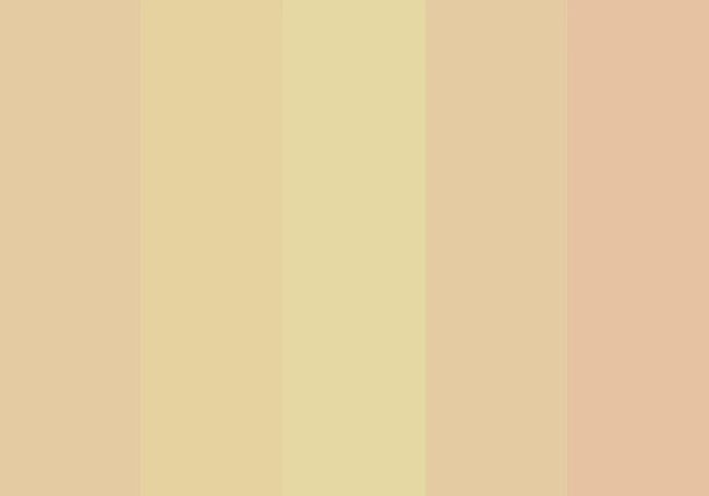
7. Winter Chill

8. Fiery Passion

9. Fresh Citrus
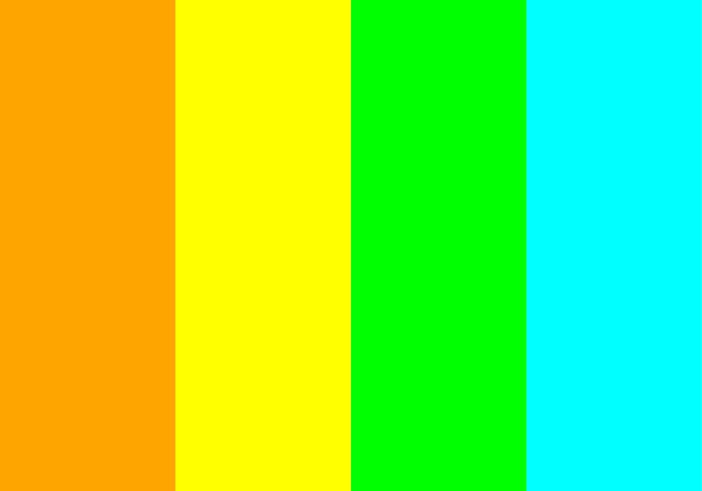
10. Bold Harmony

11. Nature’s Delight
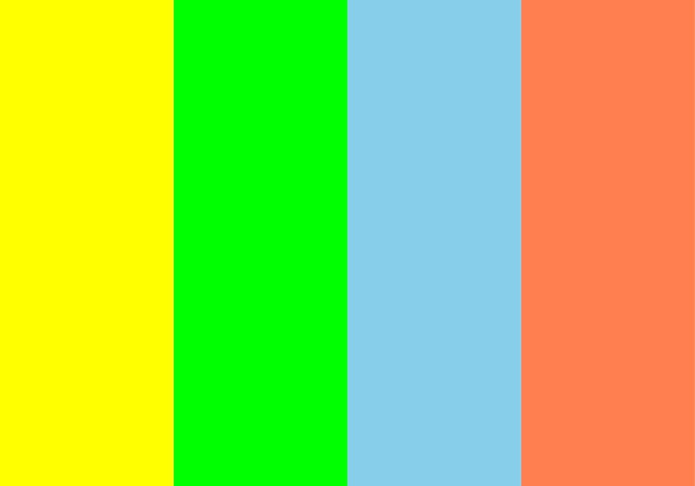
12. Tropical Paradise

13. Vibrant Energy
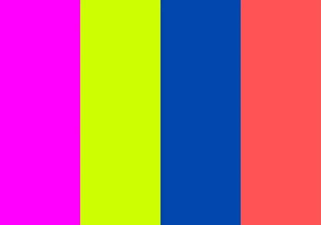
14. Dynamic Sunset
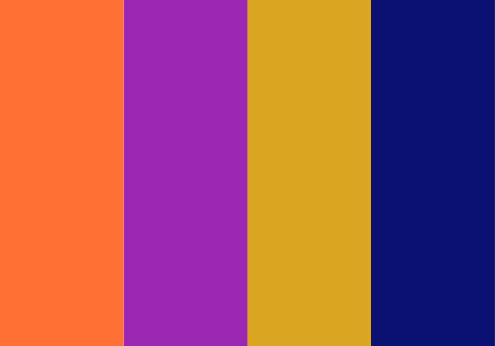
15. Vibrant Trio
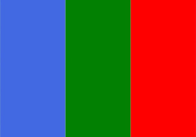
16. Citrus Burst
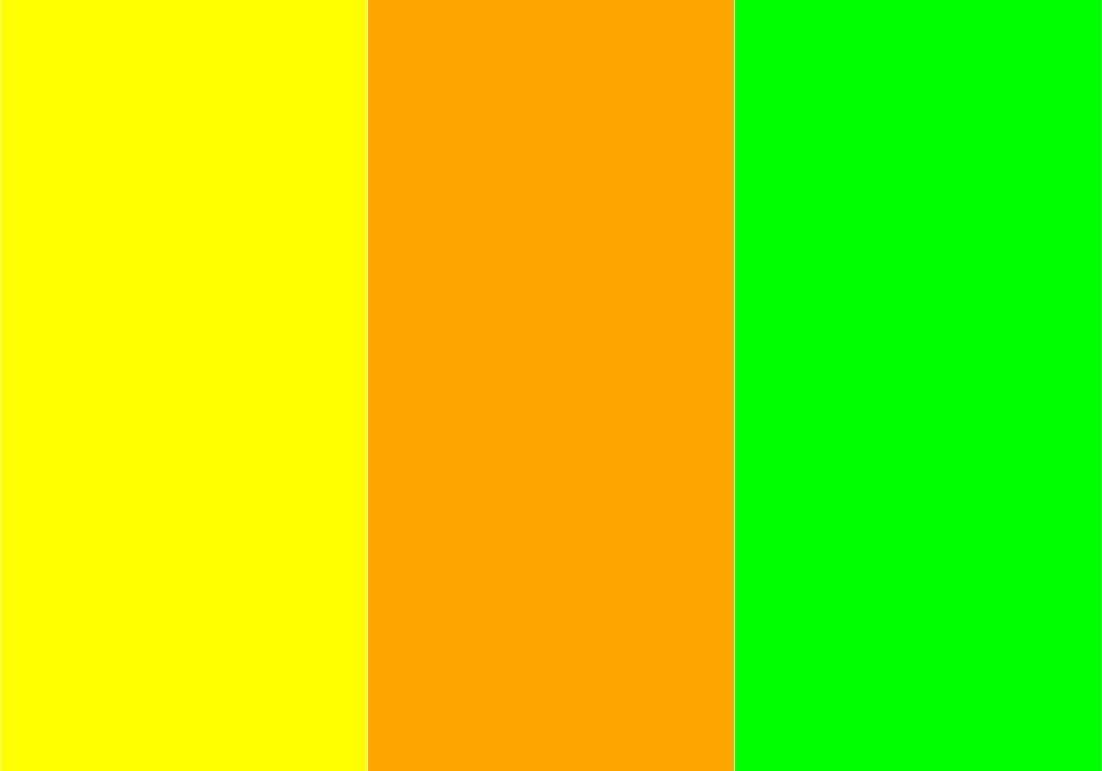
17. Pastel Dream
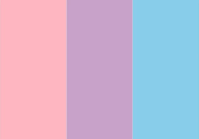
18. Tropical Sunset
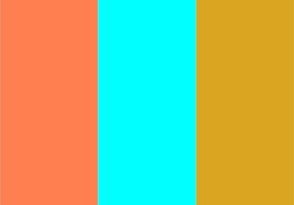
19. Spring Blossom

20. Electric Harmony

21. Earthy Tones
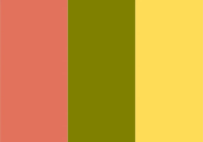
22. Radiant Quartet
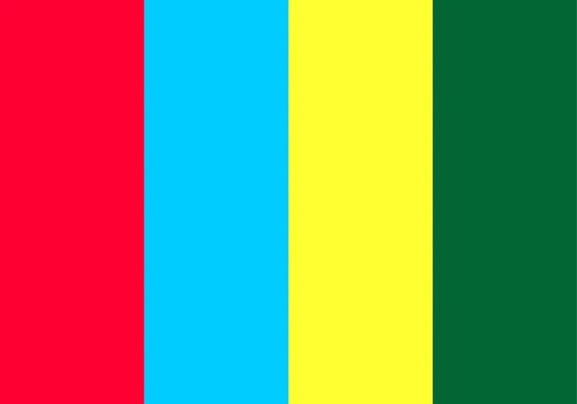
23. Tropical Fusion

24. Citrus Zing

25. Sunset Radiance

26. Earthy Harmony
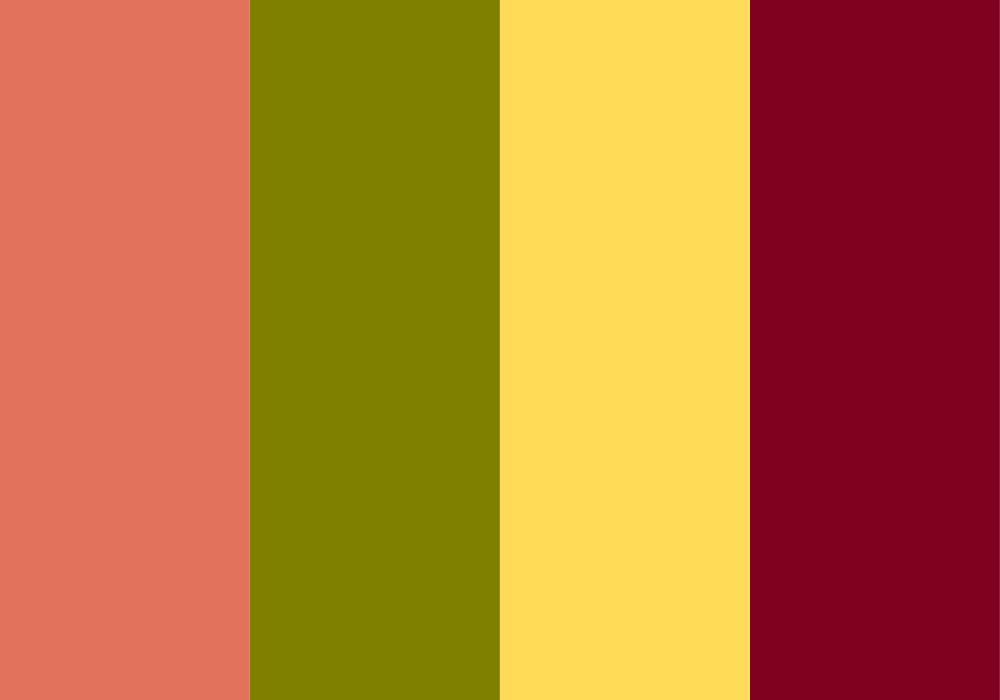
27. Electric Dreams

28. Jeweled Opulence

29. Spring Awakening
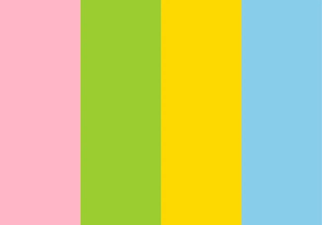
30. Summer Breeze

31. Autumn Splendor

32. Winter Frost

33. Meadow Serenade

34. Tropical Oasis

35. Fireside Coziness

36. Enchanted Forest

37. Oceanic Depths

38. Vintage Elegance
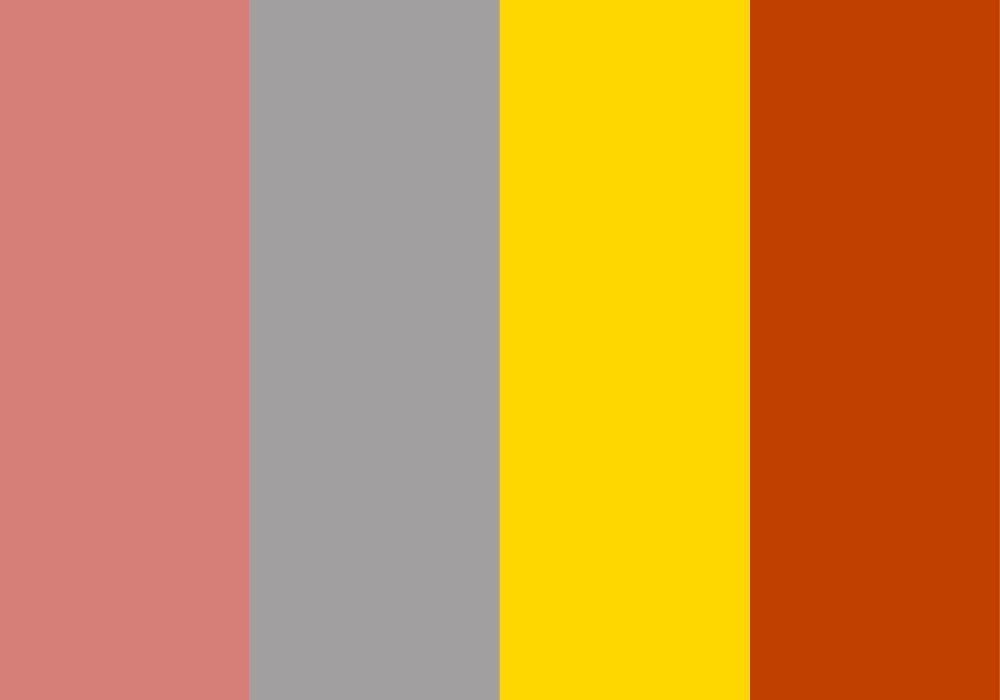
39. Urban Chic
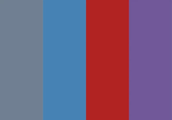
40. Fiesta Celebration
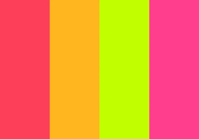
41. Serene Oasis
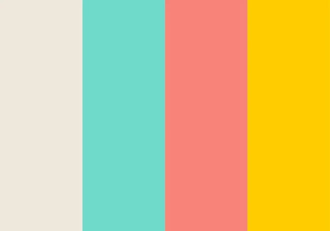
42. Galactic Adventure

43. Tranquil Serenity

44. Lush Greenery

45. Subtle Blush

46. Warm Sunrise

47. Midnight Sky

48. Soft Lavender

49. Earthy Taupe
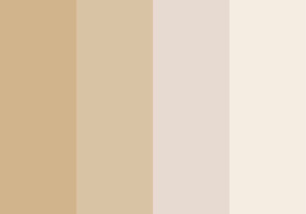
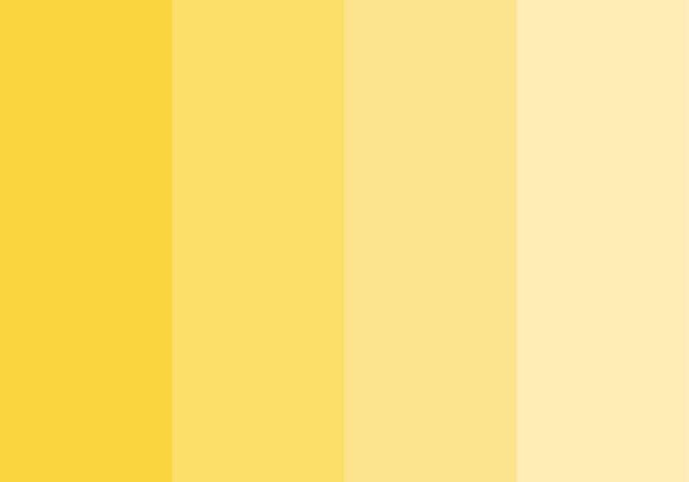
50. Sunny Yellow
Color Palette Generators
Creating A Color Palette

 Konoly






_23.jpg)

