6 Tips That Work to Onboard Ecommerce App Users
DEC. 30, 2020 Rami Al-zayat / Unsplash User onboarding is a process that guides new users to find value with your app. It starts when users sign up to the moment when they realize how your app improves their lives....

DEC. 30, 2020

Rami Al-zayat / Unsplash
User onboarding is a process that guides new users to find value with your app. It starts when users sign up to the moment when they realize how your app improves their lives. In other words, app users will learn not only how to use the app, but also how to use it in a way that provides benefits and helps them achieve their goals.
App onboarding in e-commerce is essential because if users don’t understand your app, they most definitely won’t use it and thus, they won’t make a purchase. The onboarding process is so important because it makes a customer’s first impression of your app, it can lead to successful adoption and is also a step to building solid relationships with users.
In this article, you will find six tips to make onboarding your app users very successful.
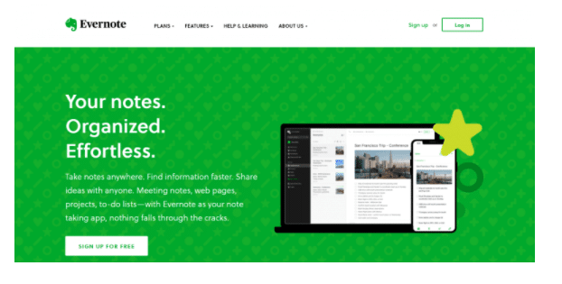
Your welcome screen should convey your value proposition.
The welcome screen needs to express your value proposition in only a few words, so it’s important to keep it short and simple. A good recommendation would be to keep a balance between building anticipation and communicating your unique selling point very clearly to entice users to find out more about your app.

Context is also important when we talk about opt-in. This translates into combining push message value that is connected with the recent activity such as
Viewed item Number of sessions with your app Articles read Tie your opt-in permission request to your app’s value Use time-sensitive app messaging and updatesThe sign-in has to stay an easy process to improve retention rates
Usually, signing in is a long process, but it needs to be simple because at this stage many potential app users give up, which leads to a significant amount of drop-off in usage. Fortunately, if this stage is well-executed and if the e-commerce UX for the mobile experience is also fine, it can make a huge difference and increase the activation and retention rates.
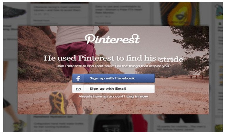
Offering users the possibility to sign in to your app by using their social media accounts such as Twitter, Google, or Facebook, builds trust in the users’ minds and also makes the process extremely fast and simple.

A good idea is also to test and find out if it’s better to build a signing in with various login options such as using their email address or via social media or maybe both of them.
Timing is also very important, so you will need to test with this as well. For example, you will need to test and discover if you want to ask users to sign in once the app is launched or at the end of the onboarding process.
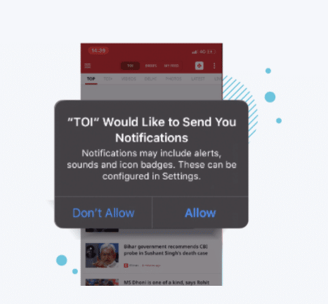
Ask users to opt in to push notifications.
In order to build a great user experience, as well as value, many apps send push notifications that will allow users to share updates, as well as discounts, offers, and upcoming sales.
By only asking users to opt in to push notifications without briefly explaining how that will benefit them, it will make it more likely for them to give up. With the help of push notifications, your brand visibility increases, and you will be able to add new subscribers with a single click. If users will have the choice to deny or accept the permission to receive push notifications and if the opt-in message lets them know exactly what kind of details they will receive, it will increase retention.
Let’s say a new customer downloads an app. Usually, the first question that he sees is “Do you want to sign up for push notifications?” without allowing the user to first interact with the app and build trust. As a result, he most probably will turn off the alerts, a decision of which very few customers change their minds about it.

A better way is to not ask about push notifications until the user has already used the app several times and has managed to get a feel for the way it works and if he can trust it enough to receive messages.
Once he gets at that point, the above question: “Do you want to sign up for push notifications?” will be more likely to get a positive answer.
Make it easy for a first time user to find your offers.
If you want your app to be profitable and thus, successful, you need to understand your customers and know what they want. Their browsing history will help you understand what they are searching for without actually making a purchase.
Based on that, you will know what type of offers to provide them. Implementing a customer loyalty program is a good idea as it is designed to keep users coming back or, you can offer them a discount after five transactions, for example. Thus, it is more likely they will spend more money.
Tracking your app users’ behavior through your mobile app helps you offer them a more personalized shopping experience. However, even if you have the most appealing offers and discounts, you need to keep the first conversion easy. This means that aside from relevant offers, it’s important how to enable users to explore them very easily, such as listing all the offers on a single page, so keep everything simple, short, and intuitive.
It’s important to:
Use progress indicators Avoid text-heavy, long explanations Use app screenshots and illustrations Avoid what is obvious Make it easy to sign up for offers, awards, or various discountsProvide cues to help users get started faster.
A new user has to be quickly convinced by the value of the app and the benefits that it can bring, and the first step to achieving this is to know how to hire a mobile app developer to help you get the most out of your app. Once you managed to do that, focus on how to provide a very good impression right from the start by offering tips and cues to help users get started faster and easier at the same time.

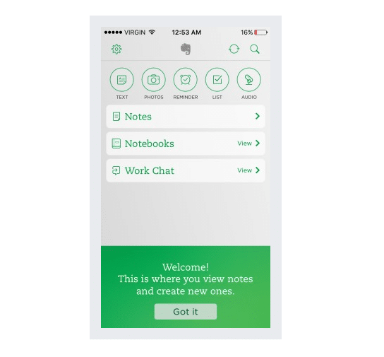
There are several ways to help you simplify the process:
Display the number of steps to complete in order to avoid frustration Set a welcome screen and include a link to a FAQ (frequently asked question) section or tutorials Require just enough information to increase retention, meaning that users won’t enjoy the entire app experience immediately Use colors to guide users such as higher contrast colors and bright hues against space Include pulsing visual cues which once clicked on, they will explain the onboarding steps Use the turn off option of the tutorial for users Provide clear success messages as users progress, reiterating the value of the app throughout the way Build motivation and excitement that will lead to that “aha” moment when users realize the value of the appCreate and send well-crafted welcome emails
With effective onboarding, you get higher retention rates, greater revenues, and up to a 500% increase in customer lifetime value.
Although email might seem an outdated way to onboard app users, it’s still one of the tools that do deliver results. For example, open rates for onboarding welcome emails are 57.8%. But what makes it so effective?
The fact that users expect to add their email address on your app and thus, they anticipate a welcome email immediately. This welcome email might make him feel primed to engage with your first messages and willing to explore the app.
Also, welcome emails are an external channel that reminds app users to start engaging with the app, and thus, they will start building usage patterns. The best practices for email onboarding are the following:
Set a specific goal for each email Segment your users and adapt the welcome email messages to their experience Remind users about your app’s core values and benefits Make the email engaging, catchy, and fun Make sure the focus is on benefits, not features Keep the email messages simple Optimize for mobile: adjust the CTA, button size, subject line length A/B test and optimizeAfter sending the welcome emails it’s important to also send several emails that nurture your app users. By perfecting the onboarding email flow will help you create new user habits, build long-term engagement, and turn free users into paying subscribers.
Onboarding app users in e-commerce is an essential process. It is the most important as it helps to gain users’ trust and it influences them to purchase within your app. As apps are becoming more and more popular, the competition is also higher and higher.
Under these circumstances, your app users’ first impression of your app users is essential as 80% of an app’s active users abandon it within the first 3 days after they have installed it. Apply the above-mentioned tips for your app and be sure that your users will turn into long-term users.
Keep in mind that what is obvious for you, it may not be obvious to your first-time app users, so test, optimize and always keep an eye on the best practices and apply what suits your business needs.
By Romy Toma-Catauta
Comments
comments

 MikeTyes


_1.jpg)


