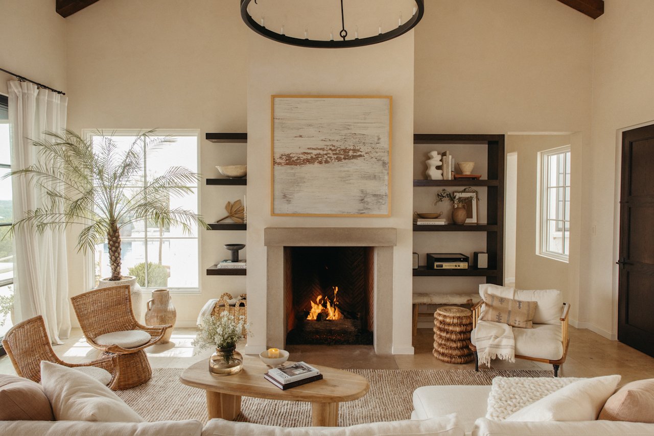
8 Decorating Mistakes You Might Not Know You’re Making
Elevate your home effortlessly. The post 8 Decorating Mistakes You Might Not Know You’re Making appeared first on Camille Styles.

Decorating your space should be an enjoyable process that allows you to express your creativity. Part of having your own home or apartment means that you can go full-on grandmillennial or finally embrace boho style without anyone preventing you from doing so.
However, you can’t simply throw every design rule out the window when making a home your own. To ensure that your home looks as cohesive and stylish as possible, you will want to be sure to avoid some of the most common decorating mistakes that designers frequently encounter when helping clients revamp their own spaces.
Featured image by Michelle Nash.
8 Sneaky Decorating Mistakes That Could Be Compromising Your Space
Read on to learn more about these eight pitfalls and how to avoid or remedy them so that your home truly shines. (And for proof that we all start somewhere, Camille reflects on the design mistakes she’s made over the years.)
Ignoring Scale and Proportion
Just because you’ve fallen head over heels for a gorgeous 86-inch sofa doesn’t mean it’s the right pick for your place. (I’d know—my small apartment layout means that anything over 70 inches or so in length simply appears too substantial, which is why I’ve settled on a loveseat instead, as pictured below)
“Using furniture or decor items that are too large or too small for the space can make a room feel off-balance,” explains Marie Cloud, the founder of Indigo Pruitt. “For instance, a large sofa in a small living room can overwhelm the space, while tiny accessories can get lost in a larger area.” To avoid running into these issues, you will always want to measure your space prior to shopping and consider the ceiling height as well, Cloud instructs.
Pushing All of Your Furniture Against the Walls
You may think that you’re saving space by pushing all of your furniture against the walls of a room, but Cloud disagrees with this technique. “This common arrangement can make a room feel disconnected and less intimate,” she says. “It often results in a lack of flow and can make the space feel larger than necessary.” Instead, the designer recommends pulling furniture away from the walls while also laying down a rug or two to define various spaces within a room.
Underdecorating Your Space
We all know that there’s such a thing as placing too much stuff in a given room, but underdecorating is also an issue you will want to avoid, according to Cloud. “Underdecorating can result in a lack of personality and warmth,” she says, encouraging individuals to better curate their decor. “Choose pieces that have meaning or purpose, and edit regularly to keep the space feeling fresh,” she says. “Don’t be afraid to showcase your personality through your decor.”
Not Layering Your Lighting
Your space should not solely contain a “big light” and nothing else. “Relying solely on overhead lighting or not incorporating enough light sources can leave a space feeling flat and uninviting,” Cloud says. “Poor lighting can create shadows, make colors appear dull, and fail to highlight the room’s best features.” Instead, work to incorporate a designer-approved mix of general lighting, task lighting, and accent lighting, opting for a mixture of floor lamps, table lamps, sconces, and more, Cloud suggests.
Hanging Artwork Too High
No room is complete without artwork, but you will want to make sure it is hung at an appropriate height. “Hanging art too high is a common mistake,” says Amy Switzer, the founder of Amy Switzer Design. “Art should be at eye level, around 57 to 60 inches from the floor. If it’s too high, it can make the space feel disconnected and awkward.”
Not Establishing a Focal Point
Designers like Switzer note that every room should have a focal point. “Without one, a room can feel disjointed,” she says. The good news is that you can choose what exactly to use as a focal point in your space, whether that is a fireplace, window, or art piece, the designer adds.
Opting for a Matchy Matchy Look
Too much matching in a space isn’t a good thing, says Carly Moeller, the founder of Unpatterned. “Don’t get me wrong, matching has its place, but more often than not, you don’t need the matching loveseat to that sofa,” she says. She encourages people to stop purchasing matching sets and instead branch out further, noting, “The coffee table and end table shouldn’t look like mom and baby.” Rather, experiment with a variety of finishes, textures, styles, and more. “Don’t be afraid to mix metals and woods,” the designer says. “The best rooms have a mix of finishes and something old and something new.”
Using Too Small of a Rug
When in doubt, go larger, rather than smaller, when selecting a rug. “If your rug isn’t at least under the front legs of your sofa or chairs, if not all legs, it is too small,” Moeller says. “Floating rugs drive me bonkers because they don’t do justice to the rug, which is basically hidden under a coffee table, the room, or the furniture in terms of proportion or comfort.”
To make sure you’re purchasing a piece that will fit your space properly, measuring like a pro is key. “ When sizing a rug, tape the corners of it out in your space if you need a visual,” Moeller suggests. “Ideally your furniture should sit on top of your rug, not next to it. A rug should feel like it’s filing a space, not floating in the middle of it.”

 AbJimroe


