9 Breadcrumb Tips to Make Your Site Easier to Navigate [+ Examples]
Have you ever lost your phone, keys, or wallet? If so, you’ve probably been advised to retrace your steps. Breadcrumb navigation helps visitors to your site do just that, but instead of searching the kitchen, bathroom, and front door...
![9 Breadcrumb Tips to Make Your Site Easier to Navigate [+ Examples]](https://blog.hubspot.com/hubfs/breadcrumb-navigation-tips.jpg#keepProtocol)
Have you ever lost your phone, keys, or wallet? If so, you’ve probably been advised to retrace your steps. Breadcrumb navigation helps visitors to your site do just that, but instead of searching the kitchen, bathroom, and front door area only to find their keys in the refrigerator, breadcrumb navigation shows users their current location and the steps taken to get there. Breadcrumb navigation gets its name from the fairy tale Hansel and Gretel, where the brother and sister duo leave a trail of breadcrumbs behind them as they traverse the forest in order to show their return path home. Effectively implemented breadcrumb navigation on your website will ensure that your visitors never get lost in the woods. Breadcrumbs are a navigational aid that allows users to keep track of their current location on a website or interface. A breadcrumb trail displays the page a user is currently on and its relation to the pages they visited before it, or the hierarchy of higher level parent pages above the current page. Breadcrumb navigation provides the user with ability to quickly navigate back to their starting point or earlier pages from their visit. Breadcrumbs are typically displayed as a horizontal list of hyperlinked website pages separated by a greater-than sign (>). Breadcrumbs navigation is often situated near the top of the page somewhere underneath the main website navigation. Before we move on to tips and best practices, it is important to note that breadcrumbs come in a few different flavors. Location or Hierarchy based breadcrumb navigation is the type you'll come across most often. A location based breadcrumb shows the user the current page they are on and its relation to the website's hierarchy above it. Think of it like the folders where you store documents on your computer. The first folder is the most broad and each folder within gets more specific until you arrive at your document. In the above example, the breadcrumb shows the current page the user is on, and each successive parent page leading back home to the Knowledge Base. Hierarchy based breadcrumb navigation makes it easy for the user to get back to the main page or any of the parent pages above where the current page is located. Path based breadcrumb navigation represents the unique path a user took before arriving on the current page. Although the path is not typically displayed in its entirety, path based breadcrumbs are often implemented as a form of back button, which brings the user to the previous page of their visit. The above example shows the 'Back to Results' link on Bloomingdale's website, which is a path based breadcrumb that allows the user to navigate back to their previous page with their unique query intact. History based breadcrumbs are common on eCommerce sites with many different categories and varieties of items to search through. Attribute based breadcrumbs display the attributes or tags a user has selected in order to filter their search on a webpage. Attribute based breadcrumbs are useful on eCommerce websites where users can select different attributes to narrow down the items on a page and find that perfect pair of jeans, for example. Attribute based breadcrumbs can also be implemented as tags for categorizing blog posts and types of content. Now that we've covered the different varieties of breadcrumb navigation, let's move on to 9 tips for implementing breadcrumb navigation on your site to improve site navigability and reduce bounce rate.
What is breadcrumb navigation?
Types of Breadcrumb Navigation
Location or Hierarchy Based Breadcrumbs

Path or History Based Breadcrumbs
Attribute Based Breadcrumbs
Breadcrumb Navigation Tips and Examples
1. Only use breadcrumb navigation if it makes sense for your site's structure.
Breadcrumb navigation is only appropriate if your site's structure necessitates it. If you have lower-level pages that are accessible from multiple different landing pages, using breadcrumb navigation could confuse readers who access the same pages from different starting points. Additionally, breadcrumb navigation might not be necessary at all if you have a small website with only a few top level pages.

Goshi is an example of a website that doesn't need to implement breadcrumb navigation. They offer a single product and their website only contains a few essential pages. In this case, the main navigation covers everything the site has to offer and there are no additional pages nestled within the parent pages.
2. Don't make your breadcrumb navigation too large.
Breadcrumb navigation is secondary to your website's main navigation. Best practice is for your breadcrumbs to appear smaller than and somewhere below your site's main navigation. If your breadcrumbs appear too large, it could mess with visual balance of the page and cause confusion when navigating the site.
OXO's website is a good example. Their primary navigation bar is large and cleanly situated at the top of the page, with categories like "Cooking & Baking" "Beverages" etc. Their breadcrumb navigation sits below the main navigation in a smaller and thinner font.
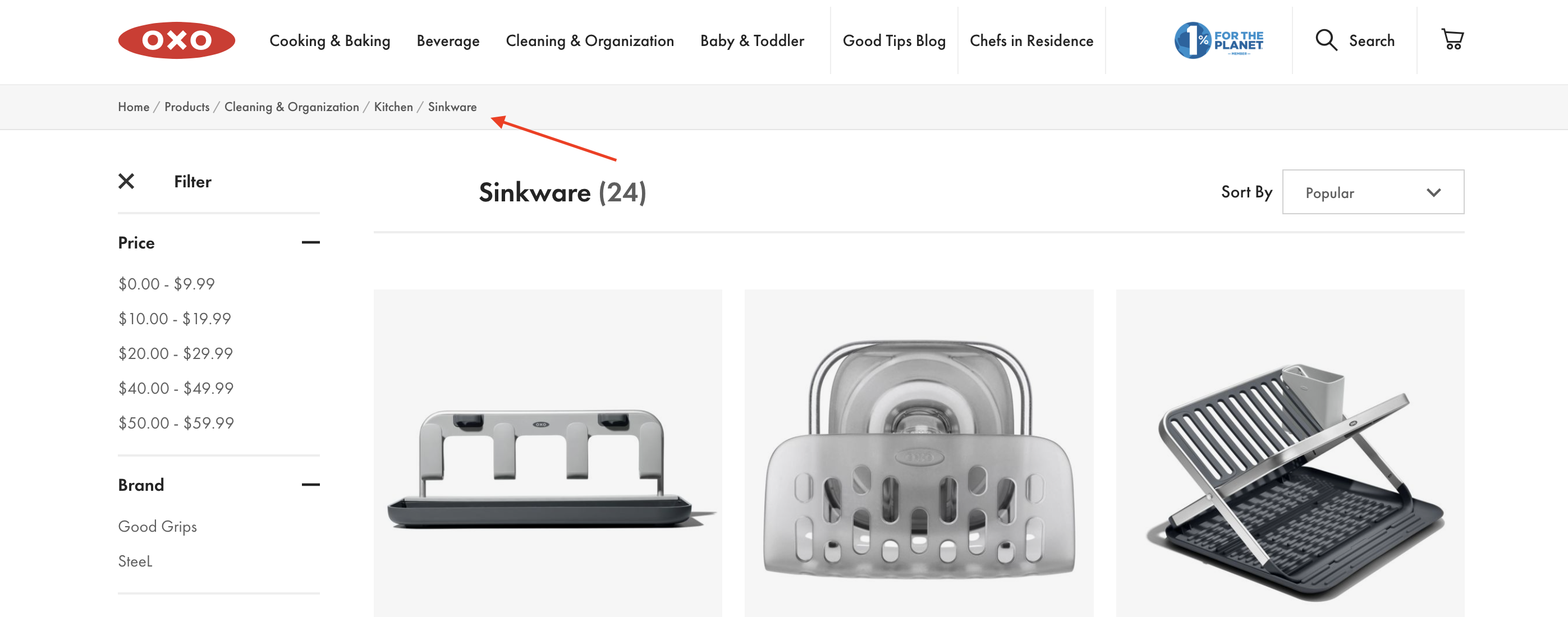
In Oxo's example, it is clear that the breadcrumb trail is secondary to the site's main navigation bar above it. The gray bar where the breadcrumb navigation lives is a nice touch as well.
3. Include the full navigational path in your breadcrumb navigation.
It's likely that some visitors will discover pages on your site via search instead of starting at the home page and navigating through. I Googled "Elon University Non-Degree Students" to reach this landing page. Elon is smart to include the full navigational path, including "Home" and "Admissions" in the breadcrumb navigation.
If you leave out certain levels, you'll confuse users and the breadcrumb path won't feel as helpful. Even if users didn't begin on the home page, you want to give them an easy way to explore your site from the beginning.

4. Progress from highest level to lowest.
It's important that your breadcrumb navigation reads left to right, with the leftmost link being your homepage, and the rightmost link being the user's current page. A study by Nielsen Norman Group found users spend 80% of their time viewing the left half of a page and 20% viewing the right half, making a strong case for left-to-right design. Plus, the link closest to the left will appear as the beginning of the chain, so you want it to be your highest-level page.
5. Keep your breadcrumb titles consistent with your page titles.
It's important to remain consistent with your page and breadcrumb titles. Not only will this avoid confusion, but it also offers another place to land your targeted keywords. You also want to clearly link your breadcrumb titles to the page. If the breadcrumb title doesn't have a link, make it clear. Sony effectively labels its breadcrumb titles to match the page titles. "Environment, CSR, and Quality," for instance, reads the same in the breadcrumb navigation as it does on the page.
Sony also does a good job differentiating links from non-links. The links are underlined, while the non-links like the current "Environment" page remain undecorated.

6. Get creative with design.
Breadcrumb navigation is traditionally styled as a horizontal list of links separated by a greater-than sign (>) However, you don't need to follow the traditional path if a different design is more consistent with your site's look and feel.
For example, Hoka uses a "/" to separate the items in their breadcrumb navigation. In this case, the subtle design variation makes sense for their site and brand aesthetic.
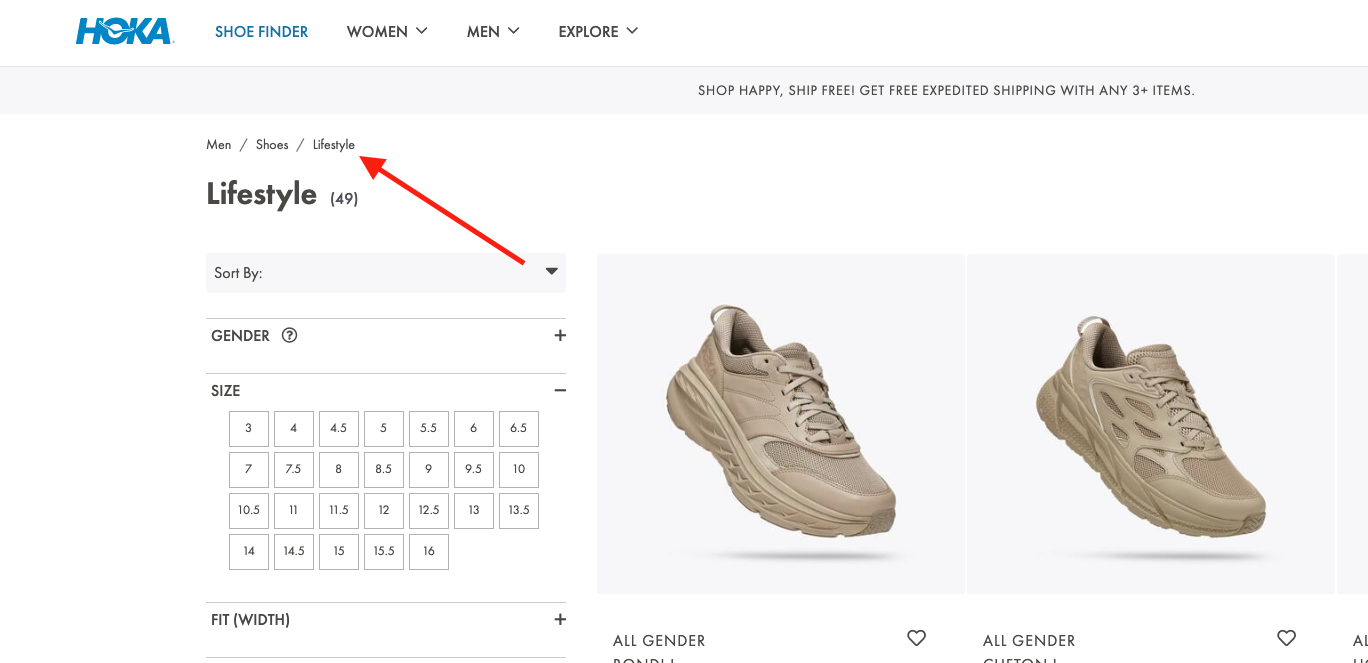
7. Keep it clean and uncluttered.
Your breadcrumb navigation is an aid to the user and should't draw unneeded attention unless the user is looking for it. For this reason, you don't want to clutter your breadcrumb navigation with unnecessary text or clunky design.
Eionet, for instance, could do without the "You are here" text in their breadcrumb navigation. While meant to be helpful, the text clutters the page. With the right design, breadcrumb navigation should be noticeable enough without an introduction, but not stick out like a sore thumb.

8. Consider which type of breadcrumb navigation makes the most sense for your site.
As discussed at the beginning of the article, there are a few types of breadcrumbs to consider -- location-based, attribute-based, and history-based breadcrumbs. Location-based breadcrumbs show the user where they are in the site's hierarchy. Attribute-based breadcrumbs show users which categories or tags their page falls under. Finally, history-based breadcrumbs show users the specific path they took to arrive at the current page.
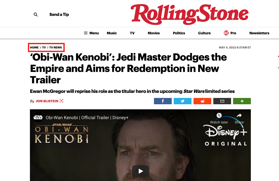
Rolling Stone uses location-based breadcrumb navigation to show users which section of the site the content they are viewing falls under. This type of breadcrumb navigation is most effective for Rolling Stone users, so they can easily navigate back home or to a broader category page. When you're creating a breadcrumb navigation, consider what's most useful for your site's visitors.
If your website offers products with many different options and styles, attribute based breadcrumbs are helpful in allowing your users to narrow down their search and easily jump to pages within a selected attribute. Verishop uses attribute based breadcrumbs to display the users selections as they narrow down their towel search by brand and color, for example.
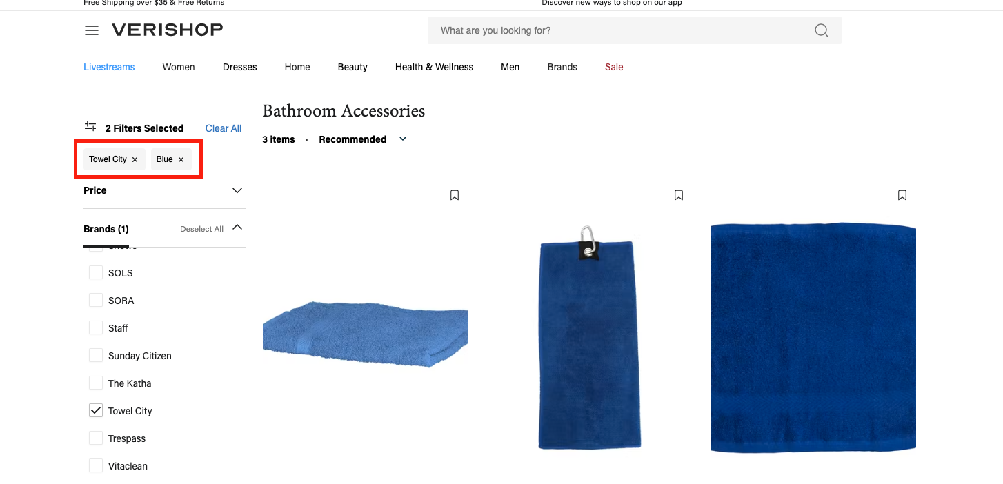
When deciding what type of breadcrumb navigation is most appropriate for your website, you should consider your site's structure, the type products or services you offer, and the manner in which you expect users to interact with your pages.
9. Know your audience.
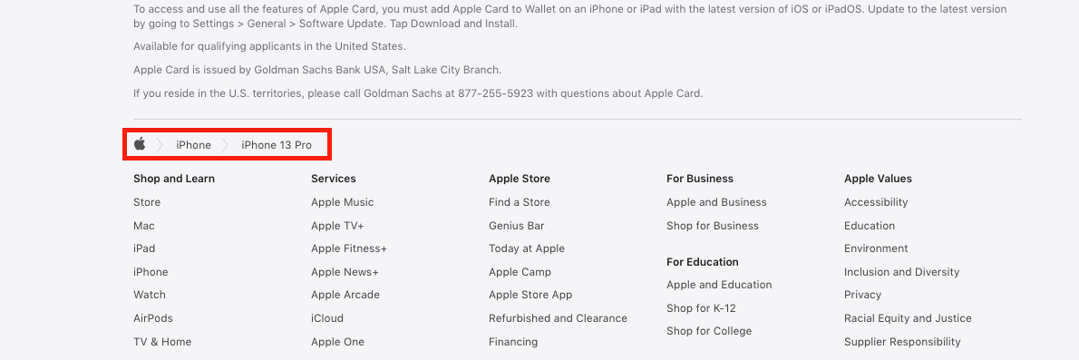
Best practice in breadcrumb navigation is to place the breadcrumb at the top of the page, below the main navigation. However, Apple, one of the most valuable companies of all time, defies this logic by putting their breadcrumb navigation in the footer, at the bottom of the site. Ultimately, it's critical you know your audience. Apple's customers are typically tech-savvy, and would likely find the navigation if they needed it. Consider your customers' needs, and implement A/B testing if you're unsure.
Breadcrumb Navigation in HTML and CSS
Not only are breadcrumbs useful — they’re also easy to add to your website with a bit of HTML and CSS code.
Let’s start with the HTML, which we’ll use to make the links themselves. The easiest way to do this is to organize your links in an unordered list (<ul>) element, with each list item (<li>) comprising a link in the breadcrumb series until the final item, which denotes the current page.
Here’s an HTML template for breadcrumbs that you can use:
See the Pen Breadcrumbs in HTML and CSS by HubSpot (@hubspot) on CodePen.
Notice how I’ve also enclosed the unordered list in an HTML <nav> (navigation) element, and added a class and an ARIA label to its opening tag. This is optional, but helps make your page more accessible to screen readers and search engines.
Of course, this HTML alone isn’t enough — right now, we just have a bulleted list of links. By adding CSS, we can achieve the breadcrumb look that we’re looking for. Apply the following CSS to the HTML above:
See the Pen Breadcrumbs in HTML and CSS by HubSpot (@hubspot) on CodePen.
Together, this code generates a basic breadcrumb navigation area that can be used on any site — see the final result below. I’ve also added some additional styling for a cleaner look. To see how the breadcrumbs look without this styling, comment out the code at the bottom of the CSS tab.
See the Pen Breadcrumbs in HTML and CSS by HubSpot (@hubspot) on CodePen.
Breadcrumb Navigation in Bootstrap CSS
Bootstrap CSS also offers a way to create breadcrumbs without needing to add custom CSS. To do this, use the Breadcrumb component like so. Here’s an example from the Bootstrap 5 documentation:
See the Pen Breadcrumbs in Bootstrap CSS by HubSpot (@hubspot) on CodePen.
This is just the basics of breadcrumb navigation in Bootstrap — see the Bootstrap breadcrumb documentation to learn all the details.
Design to Help Users Navigate Your Site
Ultimately, breadcrumb navigation is an effective tool to make your site easier to navigate, but it's important to consider best practices to ensure you're getting the most out of your tasty morsels (breadcrumbs). For additional UX advice, check out our Ultimate Guide to UX Design.
Editor's note: This post was originally published in September 2018 and has been updated for comprehensiveness.
{{slideInCta('3b85a969-0893-4010-afb7-4690
Originally published Sep 13, 2022 7:00:00 AM, updated September 13 2022

 Astrong


![8 Tips For Writing Effective Email Subject Lines [VIDEO]](https://www.digitalmarketer.com/wp-content/uploads/2022/04/YOUTUBETHUMB_EmailSubjectLines_1.jpg)


![35-year-old American moved to Chengdu and lives on $30,000 a year: '[It's] poverty in America, but in China I'm living large'](https://image.cnbcfm.com/api/v1/image/108167583-1751548516689-chinacelia1.jpg?v=1751549197&w=1920&h=1080)


