9 Email Header Examples I Love (For Your Inspiration)
Whenever I receive an email, my eyes immediately scroll to the bulk of the email. And why not? The branding, the copy, and sometimes the promise of juicy discounts draw us like moths to a flame.
 Troov
Troov

Whenever I receive an email, my eyes immediately scroll to the bulk of the email. And why not? The branding, the copy, and sometimes the promise of juicy discounts draw us like moths to a flame. But — it’s also super important not to gloss over the email header. There are two types of headers: technical and design-based. The design-based header is usually a part of the email content, while the technical part tells you the sender’s and recipient’s email addresses, the path the email has taken, and various identifiers and timestamps. Definitely not as glamorous as the content, the technical email header is your first line of defense against scams and phishing attempts. At the same time, it’s also important for brands to configure headers for deliverability and trust. In this article, I’ll share my favorite email headers, why they work, and how you can make your own. The email header is just one part of email design. But picking out the perfect email header can feel like trying to find a needle in a haystack — especially if you’re not quite sure what you’re looking for or what makes one stand out. It’s tough to nail down the right mix of elements that make your email pop and ensure your recipients don’t click the “Mark as spam” button. In this section, I’ve rounded up nine of my favorite design-based email headers with their technical counterparts that serve as great benchmarks for your own designs. When you glance at the technical header, you’ll notice it clearly states the email is coming from Evernote’s communications team and that it has standard encryption to add a layer of trust and transparency. It’s a prime example of how minimalism can pack a punch. What I like: What makes the design really interesting is how the icons emerging from the megaphone represent play, stop, and check actions, similar to tasks you might manage within Evernote itself. It subtly reinforces the app’s core functionality and how insights from the newsletter might help you perform those actions. With the subject line “The New Now: The sartorial combo,” the technical header complements this blend of utility and allure. What I like: Even in their email headers, Mango conveys its brand’s essence — sophisticated, modern, and customer-focused. This consistency reinforces their identity to me and builds a reliable and stylish image in my mind. It shows that even in the smallest details, staying true to your brand matters. Apart from this, the technical header details, such as the subject line “Wisereads Vol. 23 - Noah Kagan’s Million Dollar Weekend, Dan Wang’s 2023 letter, and more” offer detail about the content of the email. Plus, bounce-back addresses and encryption reinforce the email’s security. What I like: The one-liner summary in the header is brilliant. It strikes the perfect balance between providing enough detail to intrigue and inform without overwhelming me. This approach respects my time and attention and invites me to explore the newsletter with just the right amount of teaser. The technical header also clearly displayed the subject: “Season’s Greetings from Warwick” and the sender’s address, “alumni@warwick.ac.uk” to show that this message was specially tailored for graduates like me. What I like: The header’s emotional connection and familiarity were great. This one-liner summary in the header, paired with a familiar face, turned a simple seasonal greeting into a warm, personal message for me. The email reminds me of my cherished time at Warwick and reinforces the bond between the university and its alumni. A personal touch and direct engagement are what make it stand out. The clear call-to-action (CTA) button in red, saying “Download Now,” provides direct access to the report with just a click. The technical header provides enough detail to pique my interest and perfectly balances the delivery of information with intrigue. What I like: The header sparks my curiosity. A sneak peek of the report and a direct invitation to learn more draws me into the topic. This strategy of creating anticipation and providing immediate value makes Proofpoint’s email stand out. What’s great about this approach was how effortlessly it allowed me to dive deeper into their products. With just a click on tabs like “Lipsticks” or “Eye Shadows,” I was browsing its latest collections in no time. What I like: The email felt like Tarte was extending a personal invitation to me to discover all the beauty treasures they have in store. This kind of direct, user-friendly link in an email is a small detail, but it makes a world of difference in how we experience and interact with a brand. Here’s why this header works so well: It contains a visual preview of the report and includes a direct CTA to “Get Your Report.” The header also features both brands’ logos. All the elements work really well together and, despite a lot going on, don’t detract from each other. What I like: Even though the email is from SEJ, the header still complements both brands. It features both logos and brand colors. It drives home the fact that the report is a collaboration, which enhances the content asset’s credibility. The header is a great example of how to feature brand partnerships in your email. The technical header is like any other except for the subject line, which actually offers a preview of the kind of discussions I might be interested in as a Glassdoor user. The choice of discussion is most likely based on my history on the app. This little tidbit makes the email personalized and shows this email is unique for me. What I like: The header has a very calm and warm feeling. As a result of the light blue background and cheerful visual, Glassdoor Bowls evokes exactly the kind of impression it wants people to have of the company. While Meltwater does mention the event’s details at the top left, the focus is clearly on the urgency. It’s a great way to drive action from recipients and increases the chance of conversion. What I like: Of course, the moving clock in the header GIF. It’s dynamic, different, and catches the eye right away. It also literally shows how time is running out, which adds to the urgency factor and makes the email more engaging. Email headers require a balance of design and technical aspects. Compromise one, and the header won’t get your audience to take action. Find the right mix of design elements for your audience (and different segments). You might get better results with bold, attention-grabbing headers, while others prefer something more subtle. At the same time, technical requirements like using proper code, optimizing for different screen sizes, and including text versions also matter for headers to pass through spam filters. So what do you do? Test-and-learn. Try different styles, fonts, colors, and layouts to see which perform best with your audience. And most importantly, keep track of these results and pivot to continuously improve your email design and header strategy.
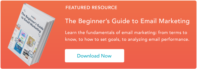
![The Beginner's Guide to Email Marketing [Free Ebook]](https://no-cache.hubspot.com/cta/default/53/53e8428a-29a5-4225-a6ea-bca8ef991c19.png)
The Best Email Headers
1. Evernote
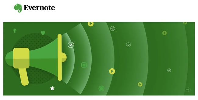
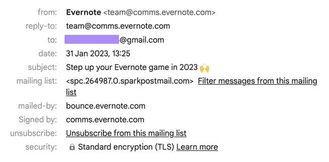 Note-taking app Evernote’s approach to their newsletter header is as no-fuss as it gets, and yet, it speaks volumes. It features a sleek megaphone set against its recognizable brand colors. The design is straightforward, without any unnecessary clutter.
 2. Mango
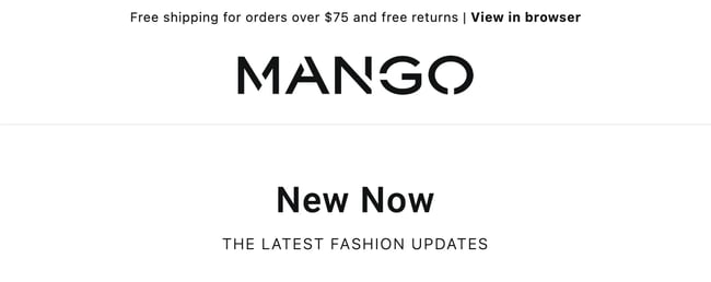
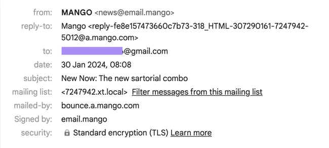 Mango’s email header design is a beautiful example of minimalism in black and white. It straightforwardly mentions an enticing offer — free shipping for orders over $75 and free returns, and also announces its latest collection with the catchy tagline “New Now | THE LATEST FASHION UPDATES.”
 3. Readwise
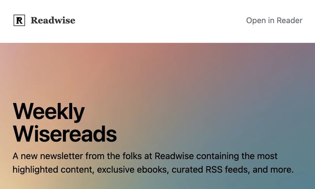
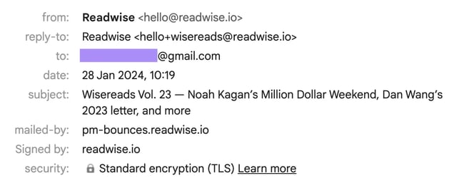 This colorful gradient background catches my attention, yet doesn’t overshadow the text in Readwise’s newsletter. The header text (“A new newsletter from the folks at Readwise containing the most highlighted content, exclusive ebooks, curated RSS feeds, and more”) is great, too, and outlines what subscribers like me can look forward to. The newsletter’s name, Wisereads, is a clever twist on the brand’s name that also makes sense.
4. The University of Warwick

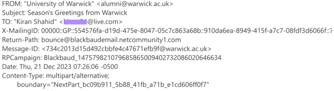 Who doesn’t love a wave of nostalgia? I really liked this email from my alma mater, The University of Warwick. The header featured a screenshot from a video message by Professor Stuart Croft, which made the email feel quite welcoming and personal.
 5. Proofpoint
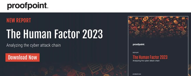
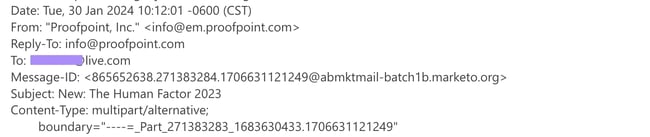 Proofpoint sent me a really cool email promoting its new report, “The Human Factor 2023: Analyzing the cyber attack chain.” The header also includes an eye-catching preview of the report.
6. Tarte
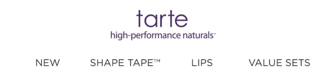
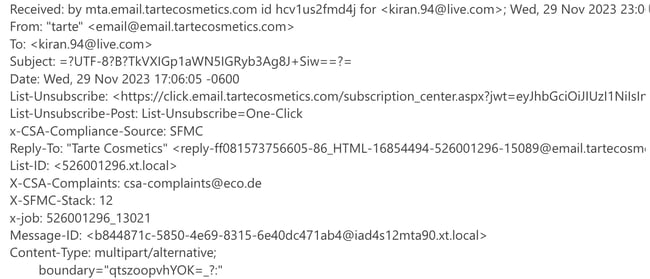 An email I received from Tarte featured a simple header with clickable categories that led straight to their website. It was clear and to the point: The brand wanted me to explore more of what they had to offer.
 7. Search Engine Journal
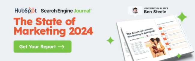
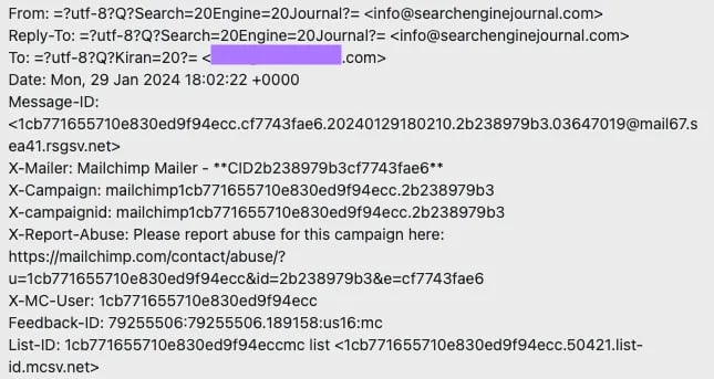 Search Engine Journal (SEJ) recently sent an email promoting its collaboration with HubSpot on The State of Marketing 2024.
 8. Glassdoor

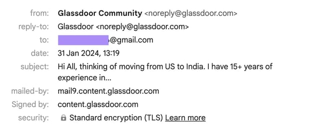 This header is from a Glassdoor email that highlights interesting discussions from the platform’s Bowls (conversation spaces that allow users like me to discuss different topics). I love the visual — it’s friendly and simply shows different people discussing something amusing in an office space. It’s a great representation of the way people have conversations on the Bowls and how it’s no different from real-life interactions.
9. Meltwater
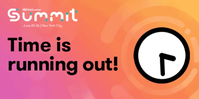
.webp?width=650&height=364&name=meltwater-2%20(1).webp) Media, social, and consumer intelligence app Meltwater’s email header is brilliant. The email is about how the chance to get an event’s early-bird prices is ending soon, and Meltwater pulls out all the stops to drive the urgency. The “Time is running out!” creates anticipation and is the main focus of the email.
Media, social, and consumer intelligence app Meltwater’s email header is brilliant. The email is about how the chance to get an event’s early-bird prices is ending soon, and Meltwater pulls out all the stops to drive the urgency. The “Time is running out!” creates anticipation and is the main focus of the email.Creating Email Headers that Work