Avoid These Two Insurmountable Email Signature Design Mistakes
As a designer, level-setting expectations are of critical importance if you wish to avoid the uncomfortable situation of creating a beautiful email signature design, only to discover later that it’s frequently failing in the, always messy, realm of email. ...
 Koichiko

As a designer, level-setting expectations are of critical importance if you wish to avoid the uncomfortable situation of creating a beautiful email signature design, only to discover later that it’s frequently failing in the, always messy, realm of email. The first step in this process is to take certain design concepts off the table before they ever see the light of day. This article will focus on two such design concepts – ones that are sure to cause unresolvable aggravation if pursued…
Compromise is almost always the key to effective email signature design. Why? Because the medium is not standardized and varies widely in its ability to render the desired result. As an analogy, consider designing a print ad, but throw in a twist – your ad will be printed on:
Premium machine-finished coated (MFC) paper Newsprint CardboardImmediately you can see that the beautiful artwork, vibrant colors, and small text that you’d love to use (and could for MFC paper), isn’t going to translate so well onto newsprint or cardboard. Your options are clear:
Make it appear great in one case, but poor in the other two. Compromise on the design so that it’s pretty good in all three.This is, unfortunately, what we’re stuck within the world of email signatures. Rather than MFC, newsprint and cardboard, we’re stuck with:
Computer screen vs. mobile phone screen Standard view vs. dark mode HD / Retina Display vs. standard resolution Outlook desktop vs. Outlook Web vs. Gmail vs. all other email programs iPhone vs. Android Image blocking turned on vs. image blocking turned off Etc.These can be combined in an almost infinite number of combinations, making the compromise solution challenging. Frequently this results in leaving behind your most visually appealing designs, opting rather for more “work-a-day” design concepts. Sad as this may be, it’s necessary if you are to create a functional email signature that survives the rather crude environment it will exist in.
As a designer, level-setting expectations with yourself, and with your client, is of critical importance if you wish to avoid the uncomfortable situation of creating a beautiful email signature design and working through the implementation process, only to discover that it’s frequently failing in, always messy, realm of email. The first step in this process is to take certain design concepts off the table before they ever see the light of day.
This article will focus on two such design concepts – ones that are sure to cause unresolvable aggravation if pursued.
Design Mistake #1: The Left / Right Alignment Trap
It’s an undeniable aspect of email rendering – spacing between lines of text will not be consistent from one email program to another. With any multi-column design, this will manifest as either a slightly poor result or as a very poor result, depending on your initial design concept.
Here’s an example of a two-column design that looks good when rendered properly, but breaks badly when the right-hand column (the text portion of this signature) expands vertically:
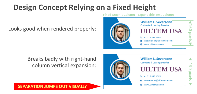
The visually evident separation illustrated above is certain to attract the client’s attention and will likely require the total reworking of the design itself (as the problem shown cannot be fixed).
Be wise and avoid this problem upfront by introducing the client to a revised design concept that’s somewhat less visually appealing, but much more robust. The following graphic illustrates a reworking of this design where the vertical expansion of the right-hand column is not easily perceptible to the casual observer (the signature fails gracefully).
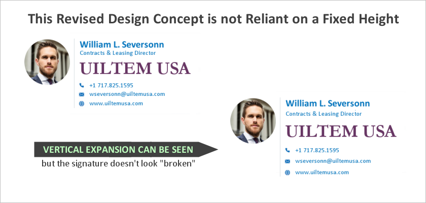
While the client may notice the lack of consistency in rendering, they’re likely to accept the explanation of variance between email client programs, and unlikely to view the problem as significant enough to require the entire reworking of the signature.
Design Mistake #2: Designing to a Symmetrical Shape
When creating a mock-up or proof to present to the client, it’s human nature to put your best foot forward. This can quickly lead to misleading results.
In the case of symmetry, there are two primary problems:
The same inconsistencies in vertical spacing are discussed above Failure to consider the possibility of exceptionally long strings of textHere’s a good example of a design mockup that looked great, but unfortunately could not work properly in practice:
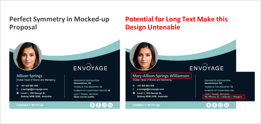
In this case, it’s the middle table row of the signature that is expanding – horizontally rather than vertically (although vertical expansion would occur as well, it’s just not illustrated here). Open-ended data fields are subject to longer strings of text that are often anticipated and can wreak havoc with designs if not planned for during the design phase.
Level-Setting Expectations
A great deal of angst can be avoided by never showing the client a design that has either of these fundamental flaws in its layout. Once the client has seen your beautiful design, it will be stuck in their head and the compromised design that you ultimately have to provide (to make the signature actually work) will thus be disappointing.
If you are unsure whether a design is technically feasible, ask an expert – someone who understands the ins and outs of email signature programming can identify any fundamental flaws in seconds, saving you a great deal of time, effort, frustration, and disappointment down the road.
Final Thoughts: A Conceptual Framework for Thinking About Layouts
While it’s a bit difficult to concisely articulate a guiding principle for design, the one word that comes to mind is “loose”. An analogy may work better…
Consider a room, decorated with square and rectangular furniture, rugs and paintings, everything arranged “just so”. Now imagine twisting and turning everything slightly, just a few degrees. The room will suddenly look terribly messed up to almost any observer. Conversely, consider a room decorated with organically shaped furniture (think bean-bag chairs), oval rugs and freestanding sculptures. Now twist and turn everything a few degrees. It’s unlikely that anyone would even notice the difference. This is how email signatures should be designed – loose and allowing for small movements in their elements.
To accomplish this, avoid the temptation to use colored backgrounds and/or borders for email signatures. The “framing” effect that these provide creates an expectation of placement, while their absence creates no expectations at all. Individual elements – logos, sections of text, icons, etc. – “floating” on a white background (or black for dark mode) can move around slightly relative to one another without visually upsetting the design. Delivering an email signature that fails gracefully will lead to a customer who’s satisfied over time, versus a customer who has no end of complaints about how the signature is working (with some of the problems, such as the two highlighted in this article, being unfixable).
If you’re not confident in your ability to design and code an email signature that will withstand the rigors that await it, using an email signature service like Dynasend is an easy way to ensure that the deliverable will be robust and trouble-free. The Digital Agency Network’s Email Marketing Blog is also a great resource for finding tips on how to maximize the effectiveness of your email signature program.