Best Digital Agency 404 Pages for Your Inspiration
When you are surfing on the internet, you may accidentally type a wrong address or stumble upon a page that is no longer available. Ordinary “404 – Page Not Found” pages leave you frustrated. However, there are some outstanding...
 Koichiko
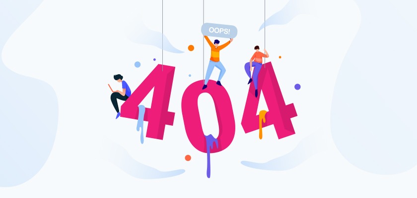
When you are surfing on the internet, you may accidentally type a wrong address or stumble upon a page that is no longer available.
Ordinary “404 – Page Not Found” pages leave you frustrated. However, there are some outstanding examples of 404 pages by digital marketing agencies out there.
A 404 page is a standard HTTP error message code caused by a non-existing webpage on your site. It is a must to have on the website.
It is not a happy ending for the visitor and it does not have to be an ordinary page asking the visitor to try again. You can turn it into an advantage. A 404 page can be a mini showcase of what your company offers. It can be creative, playful, and surprising.
We have compiled a list of the best digital agency 404 pages for your inspiration:
Takt
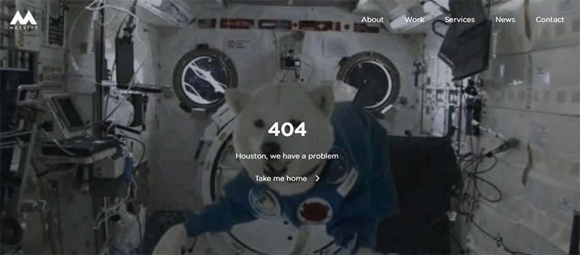
This webpage gives strong vibes of David Bowie’s Space Oddity here! Existing as the cutest 404 Error page, the witty joke of “Houston, we have a problem” tells the sense of humor that Takt has.
We’re assuming that the floating-on-air dog will make the users laugh and don’t want to refresh the page.
Lounge Lizard
A spilled glass, flying ice cubes, and liquid splashing everywhere is the ultimate visual definition of “Oops, something went wrong!” It taps into a universally understood visual moment of chaos.
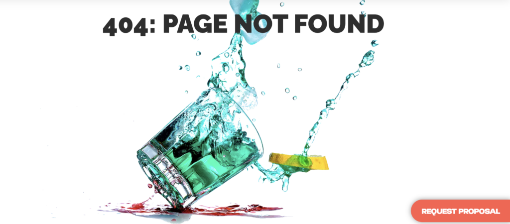
The bright teal liquid, red splash on the table, and pop of lemon add a lot of color and motion to the screen. It certainly isn’t boring!
Major Tom
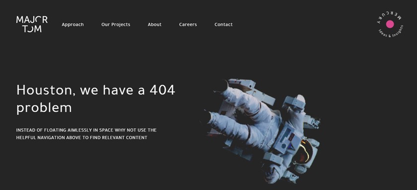
Major Tom has a similar sense of humor as Takt. In their “not found” page you will see a man floating in the space.
The page says, “Houston, we have a 404 problem. Instead of floating aimlessly in space why not use the helpful navigation above to find relevant content”. It kindly shows the direction to go with humor.
Punchcut
Punchcut’s 404 page takes minimalist design and actually gives it intent, personality, and UX value.
Leading with “OH, SNAP” immediately injects human tone and conversational charm. It breaks the coldness of standard browser errors and turns a moment of frustration into a lighthearted interaction.

What’s more, dark backgrounds feel modern, intentional, and high-end. It moves completely away from looking like a default framework page. The massive, condensed sans-serif header commands immediate attention, while the smaller subtext naturally guides the eye downward in a logical reading flow.
Clay
This is how you execute premium, agency-grade minimalism. It takes the stark simplicity of the first example and fixes every single design and UX issue it had.
Clay’s 404 page, “Don’t worry — you’re in good hands,“ is fantastic copy. It instantly diffuses the mild annoyance of hitting an error page and instills confidence in the brand.

The subtle, monochrome 3D hemisphere at the top adds just enough depth and sophistication to feel bespoke and expensive, without creating visual noise. Also, the sans-serif headline is bold, clean, and perfectly proportioned against the body copy. The generous use of negative space lets the page breathe.
Victorious
This is our favorite because of the little guy!
Victorious’ 404 page leans heavily into personality and warm aesthetics. And honestly, putting a dog sticking its head out a car window on a 404 page is practically a cheat code for winning over lost site visitors!

The body text acknowledges the broken link while turning it into a lighthearted, memorable interaction. The brand voice feels human, friendly, and approachable without trying too hard.
Finally, the split-screen presentation gives it structure; copy on the left, high-energy photo in the middle, and subtle contoured line-art on the right to frame it nicely.
Luminary
Just because you want a creative 404 page doesn’t mean you have to come up with a completely innovative idea…
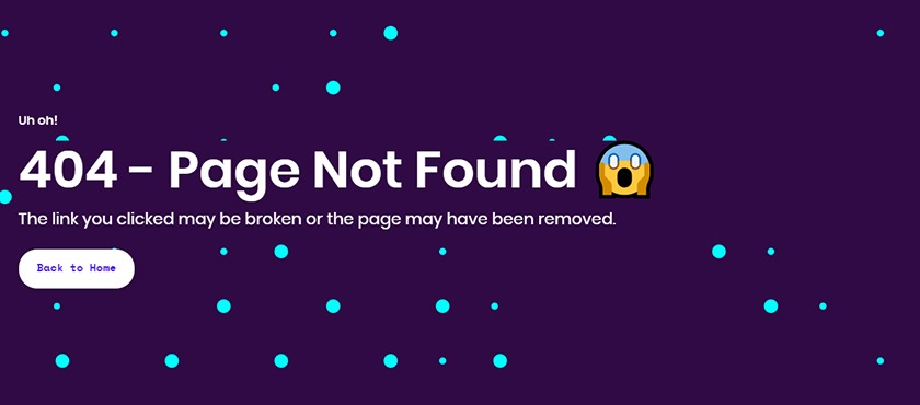
Luminary kept it simple but stylish. They didn’t forget to add an emoji and small touches from their logo design which makes the page catchy and directs visitors to the home page.
Mobikasa
When static, graphic elements can easily look like a flat template, but thoughtful motion design completely changes the dynamic.
On Mobikasa’s 404 page, the 0 digit is animated: Motion captures attention and redirects the user’s focus toward playful execution, making the error feel less like a mistake and more like a moment of visual charm.
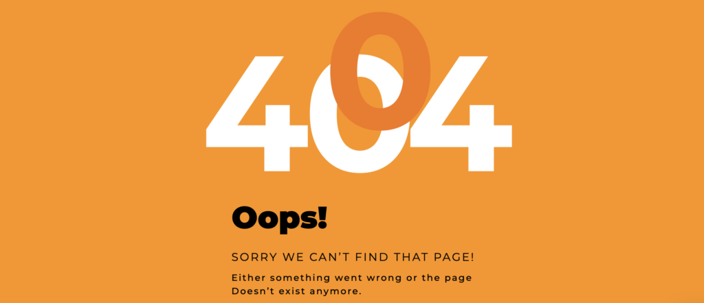
What’s more, the warm, golden-orange background gives it an inviting, friendly energy compared to the stark black-and-white options.
Trevant
Let’s talk about texts! Trevant’s example gives the page a distinct editorial personality, making it feel more like a stylish magazine headline than a generic web error. Starting with an honest, self-deprecating line immediately humanizes the brand, softening the disruption of a missing page with genuine humility.
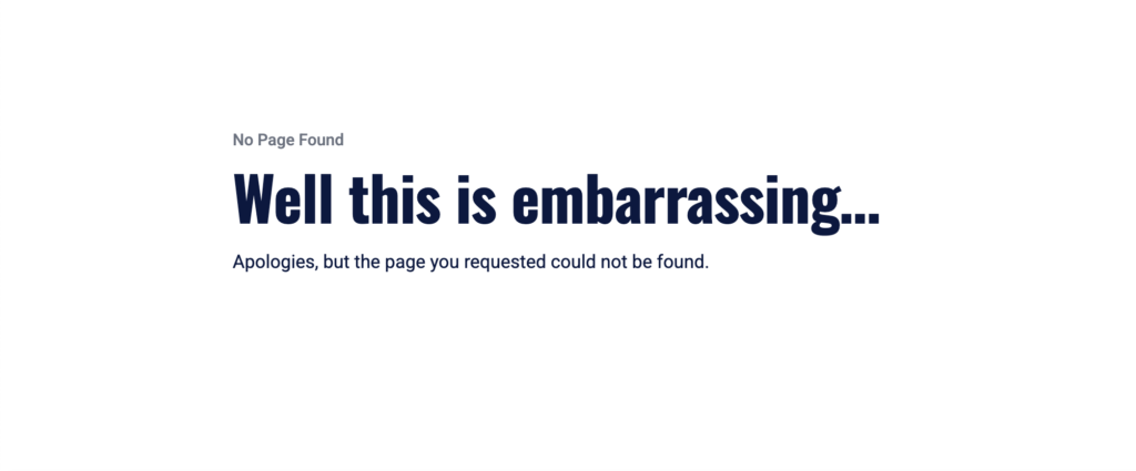
Off-centering the text to the left relies on modern, Swiss-inspired grid principles, creating a bold layout that feels expansive, quiet, and uncluttered.
Isadora Agency
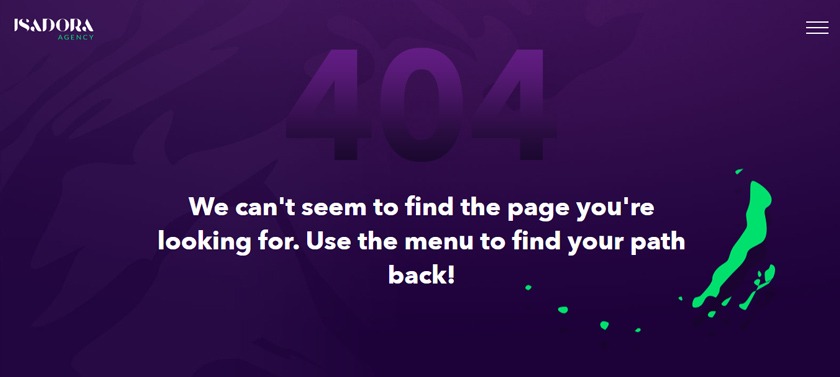
When a visitor reaches a 404 page, it’s nice to give them direction on what to do next.
When you come across the error page of Isadora Agency, feel free to follow their path with paint to the menu so as to find what you are looking for.
Redonk Marketing
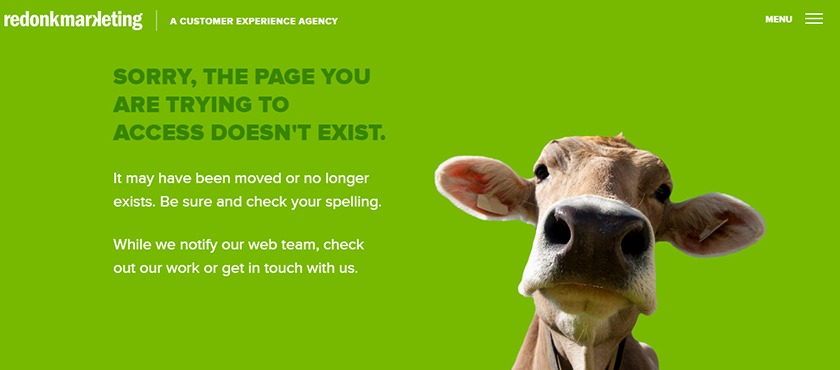
How can you not crack a smile at such an amazing look?
Redonk knew it and they decided to make visitors smile when they experienced a problem with the page they’re looking for.
Their 404 page calls visitors to get in touch with them and discover more about their works while they are notifying their team about the 404 error.
Propeller
Here is an example that embraces the “less is more” philosophy to the absolute extreme, letting typography and stark white space do all the talking.
With no heavy assets, custom illustrations, complex scripts, or video backgrounds, Propeller’s 404 page renders instantly on any device or connection speed. It delivers the precise status code and information immediately. There are no distractions, no misleading links, and no visual clutter.

The layout follows a timeless, Swiss-style typographic grid—a bold numerical indicator paired with a clean, sans-serif explanation. It is readable, accessible, and universally understood.
Vivian Agency
This one hits that trendy, high-end “branding agency” design language. It leans into bold grid structures, experimental typography, and high impact.
The oversized, repeating “404” pattern cropped off the left edge gives it a striking poster-like quality. Using a warm cream background paired with a punchy coral/orange accent carries the agency’s color palette seamlessly into the error state.

Unlike most 404 pages that hide the agency name, placing “vivian agency” prominently alongside the clear “home” button ensures instant brand recognition while providing a clear exit path for the user.
There you have it! The best digital agency 404 pages we’ve discovered. Get inspired by these “error” pages, make your visitors stay on your website and motivate them to continue exploring your digital marketing services and projects.
If you’re looking for some more inspiration to improve your digital agency’s online presence, here you can also explore the best creative digital agency Instagram accounts!