How macOS Sonoma could fix widgets — or make them even worse
Apple has been experimenting with Mac widgets for years and is giving them another go in macOS Sonoma. I’m excited -- but there’s a lot that could go wrong.

 Apple
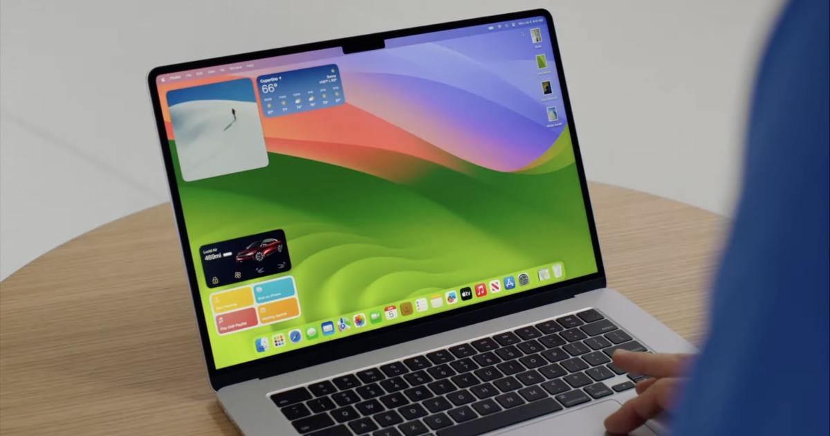
AppleAt its Worldwide Developers Conference (WWDC) earlier this year, Apple revealed that interactive widgets would be coming to macOS Sonoma. That probably sounds like a tiny new feature, and sure, it’s not as earth-shattering as the Vision Pro announcement. But it could turn out to be one of the most divisive new features in the Mac operating system.
In macOS Sonoma, you’ll be able to plant widgets on your desktop instead of hiding them in the Notification Center. Many widgets will be interactive, letting you tick off to-do list items without opening the widget’s app, for example. And you’ll be able to run iOS widgets right on your desktop, even if that app isn’t installed on your Mac. It’s a pretty comprehensive overhaul. Depending on how well these interactive widgets work, though, we could be left with a bunch of annoying distractions or a set of super-helpful timesavers. The way Apple handles them is going to be vital.
We’ve been here before

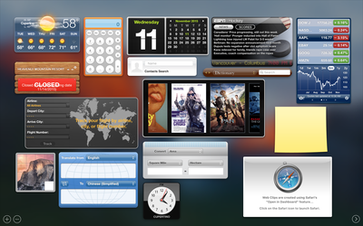
This isn’t the first time Apple has redesigned how widgets work on the Mac — in fact, it’s always been in flux. Apple used to offer widgets in OS X as part of its Dashboard feature, which put a few handy tools just a swipe or a shortcut away. But the company eventually ditched Dashboard and shunted everything into the Notification Center in a sideways move that left widgets out of sight and out of mind.
You probably won’t be surprised to hear that I’ve never really used macOS widgets — whether in Dashboard or the Notification Center — simply because they’ve never felt all that useful. I don’t use the Notification Center much anyway, so most of the time I just forget the widgets are even there.
Is Apple’s latest idea — letting you put widgets on your desktop — a better idea, or will we just end up getting bored of them the way we did with every other Mac widget attempt Apple has made? Will they just clutter up our desktops like the bad old days of Windows Vista, with its ugly sticky notes and performance widgets constantly getting in the way? I shudder at the thought, but there’s certainly promise here if Apple can pull it off.
Porting widgets
 Apple
AppleThere’s a potential ray of hope in the fact that Apple is opening up its macOS widgets to third-party developers, just as it did with iOS and iPadOS widgets. As on those platforms, we could end up with a huge array of fun and interesting widgets, only this time with delightful interactive elements. It’s a great opportunity for developers to flex their creative muscles.
Yet here, too, is a potential stumbling block. Right now, you can run iPad apps on your Mac, and there are some beautifully thought-out iPadOS ports that work flawlessly in their new home. But just as often I’ve come across lazy box-ticking exercises that feel absolutely jarring and out of place on a Mac, complete with oversized text and weird resizing glitches. When that happens, it’s an unpleasant experience.
We’ve got to hope we don’t get the same treatment with widgets, and that Apple encourages developers to port them thoughtfully and in ways that make sense for a desktop operating system. Apple already provides extensive guidance to devs when it comes to app design, and the Apple community is full of amazingly talented developers who will no doubt cook up plenty of superb widgets. Let the good outweigh the bad.
Naturally interactive
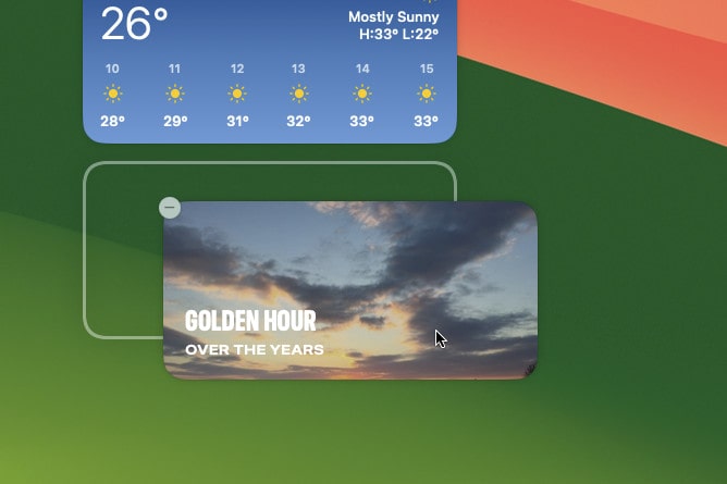
 A widget being moved into place in macOS Sonoma. The placement grid is shown beneath the widget. Digital Trends
In the end, it’s a different piece of the puzzle that could end up saving widgets in macOS Sonoma: their interactivity. I’ve tried a few widgets in the macOS Sonoma beta that have interactive elements, and every time using them feels so completely natural that, perversely, it’s almost unremarkable. After all, it feels like this is the way widgets should be.
You could say that’s great news for Apple’s new widget features. If using them feels utterly intuitive, people are more likely to give them a go and stick with them. Ticking off checklist items or running shortcuts right from the widget saves time and makes far more sense than having to open the app before interacting with it.
That could be the killer feature of widgets in macOS Sonoma. You might think that interactivity is such a small feature that it almost feels unnecessary to highlight it. Yet at the same time, it could be exactly what helps widgets take off on the Mac.
There’s still plenty of time for Apple to refine widgets’ rough edges and add new features to the public beta, and macOS Sonoma won’t launch until the fall. By then, we’ll know for sure whether Apple’s latest operating system has gained another brilliant feature — or another half-baked flop.
Editors' Recommendations
Apple just gave Mac gamers a big reason to be excited This critical exploit could let hackers bypass your Mac’s defenses Apple’s next MacBooks and iPads could be in serious trouble The next MacBook Air could come with a major disappointment The one thing the next version of macOS needs to addressIn ancient times, people like Alex would have been shunned for their nerdy ways and strange opinions on cheese. Today, he…
Here’s why WWDC could be a ‘critical event’ for Apple
Apple is planning a packed line-up for its Worldwide Developers Conference (WWDC) on June 5, which could become “one of the most critical events in the company’s history.” Aside from the company’s upcoming Reality Pro headset, there will be major updates to Apple’s software systems, including the biggest watchOS revamp since the Apple Watch launched in 2015.
That’s according to a new report from Bloomberg journalist Mark Gurman, who has a history of accurate predictions and leaks surrounding Apple products. It suggests that WWDC will be a chance for Apple to set out its future ambitions for a “post-iPhone era.”
Ranking the best (and worst) versions of macOS from the last 20 years
Apple’s macOS operating system is known for its stability and features, but it wasn’t always this way. Throughout the history of macOS (and OS X before it), there have been some real stinkers that Apple would probably rather we all forgot about. Yet there have also been some classic versions that still live fondly in the memories of Mac users new and old.
In this article, we’ve picked five of the best versions of Apple’s Mac operating system, as well as five of its worst, presented in chronological order. We’ve started with the launch of OS X 10.0 in 2001 and continued right up to the present, past the operating system’s rebranding as macOS in 2016. If Windows is your speed, we've also ranked the best Windows versions of all time. Let’s explore Apple’s greatest hits -- and some of its worst howlers.
Worst: OS X 10.0 Cheetah (2001)
This critical macOS flaw may leave your Mac defenseless
Apple’s macOS operating system has such a strong reputation for security that many people mistakenly believe Macs simply aren’t affected by malware. Well, Microsoft has served up a reminder that that’s not true, as the company has identified a serious vulnerability that affects one of macOS’s most important lines of defense.
According to Bleeping Computer, the bug was first reported by Jonathan Bar Or, Microsoft’s principal security researcher, who named the flaw Achilles. It is now tracked as CVE-2022-42821.

 ValVades


