LinkedIn Experiments With an Updated Top Navigation Bar
A new look for LinkedIn's UI?
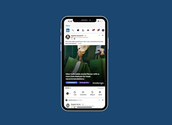
Would this be a better UI for LinkedIn?

As you can see in this example, posted by app researcher Radu Oncescu, LinkedIn is currently experimenting with a new UI, which would place all of your in-app navigation options at the top of the screen, as opposed to having them along both the top and bottom bars.
That would mean that all of your notifications would be up along the top of the app, as opposed to having some down the bottom, and your inbox alerts up top. Moving them all onto one line could make it a little easier to navigate each section. Though where the post composer option is in this new set up, I’m not entirely clear.
To clarify, right now, your profile, search, composer, and inbox shortcuts are all along the top bar of the LinkedIn app. Down on the bottom banner, you have your home feed link, along with the "My Network” tab, notifications, and the jobs shortcut (also, the “Video” tab for those who have it).
This new UI would merge all of these together into a single stream up top. That would then mean that you would be able to scroll down the feed without the bottom function bar over your view. Which could be a better visual format, but again, the post composer is seemingly gone, while the icons have been reduced in size to fit into a single row.
That could reduce usage, and original posts. But I also don’t think that LinkedIn would roll out an update with the composer not present, so that seems to be an oversight, or something I’m missing, at this stage.
So, would that be a better view for your LinkedIn app?
In some ways, I can see the benefits, as noted above, but it would also be a significant habitual shift for LinkedIn users. Depending on how LinkedIn looked to roll this out, that could be problematic for the app, in terms of maximizing engagement, but I can also see why they would be looking to re-align the app around a more integrated notifications stream, and a less cluttered feed.
It’s only in the experiment phase right now, and it may not ever see the light of day. But it’s an interesting consideration for the future of the app.

 JimMin




![Mastering SEO with Jena Apgar [VIDEO]](https://www.digitalmarketer.com/wp-content/uploads/2022/05/Copy-of-FACULTY_KasimAslam-1920-×-1080-px-1.png)

