Nothing Phone 1 review: something else
A good midrange phone underneath a whole lot of hype Continue reading…

A good midrange phone underneath a whole lot of hype
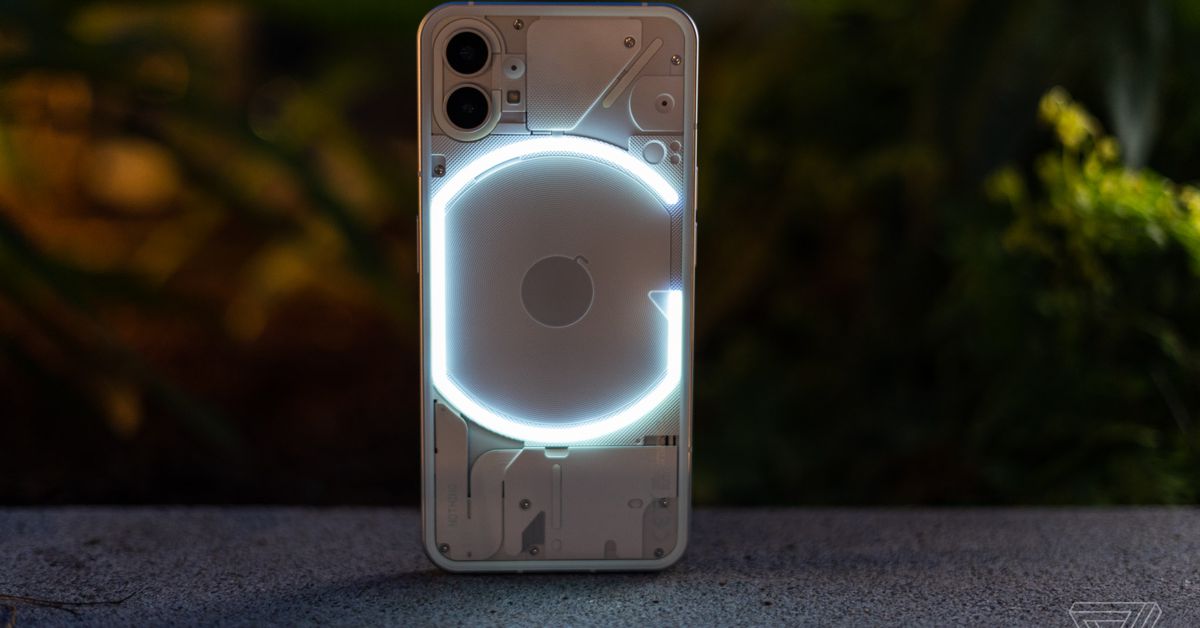
Nothing claims its new Phone 1 can “Bring us back. To us” with “deeper interactions” and “brave simplicity.” It’s not the life-changing phone that Nothing makes it out to be; it’s just a good midrange device with flashing lights on the back.
The Phone 1’s unique light-up notification “glyphs” are somewhat useful, but more than anything, they’re a fashion flourish. Given that it’s backed up by solid performance and fair price, there’s nothing wrong with that at all.
One important note: Phone 1 is not coming to the US. When it goes on sale on July 21st, it will cost £399 (that’s about $475 US) for a model with 8GB of RAM and 128GB of storage. A version with 12GB of RAM and 256GB of storage (the version I tested for this review) will go for £499 (around $593). It will be available in the UK, parts of Europe, India, and Japan, among other markets. Nothing doesn’t rule out bringing a future product to the US, but it definitely won’t be Phone 1 since it lacks FCC certification.
:no_upscale()/cdn.vox-cdn.com/uploads/chorus_asset/file/23759786/ajohnson_220708_5332_0001.jpg) Phone goes blink.
Phone goes blink.
The light strips that make up Phone 1’s most attention-grabbing feature blink in combinations that the company calls “glyphs.” There are 20 total in two sets, each tied to a corresponding sound: 10 glyphs for notifications and 10 for ringtones. (You can enable one without the other — lights-only for silent notifications or sounds without lights, but you can’t change which tone each glyph is assigned to.) On a high level, you can set a glyph for all incoming notifications and one for all calls and leave it at that, or you can get more granular by going into individual app settings.
Because the glyph lights are tied to specific tones, you can use them for any app or feature that lets you customize alert sounds. You can assign specific glyphs to individual contacts, though you’ll only see (and hear) the glyph you picked when that contact calls you, not when they message you, which is a bummer — who talks on the phone?
:no_upscale()/cdn.vox-cdn.com/uploads/chorus_asset/file/23759798/ajohnson_220709_5332_0012.jpg) You can preview the glyph pattern and corresponding sound in the settings menu.
You can preview the glyph pattern and corresponding sound in the settings menu.
You can also assign different glyphs to different app notifications — even different kinds of notifications from the same app, depending on the app. To do this, you need to head to that app’s notification settings, where you can reassign the notification sound to the glyph of your choice — this changes the alert sound, but it also means you’ll see the corresponding glyph even when the phone is silenced. You can set a glyph for any app notification that lets you assign a custom notification sound — one glyph for work emails and a different one for personal emails, for example, or separate glyphs for Instagram likes and comments.
In theory, it’s a less obtrusive way to have your phone tell you whether a notification is worth interrupting whatever you’re doing — a modern revival of the good-old-fashioned multicolor notification LED (remember those?). With some time and a little fine-tuning, this is a feature that some people might find genuinely useful, especially if you want to triage notifications without details flashing across the screen. Personally, I didn’t exactly find it transformative.
For starters, I’m in the habit of putting my phone down with the screen facing up when I’m not using it, so I didn’t see the glyph flashing most of the time. I’m sure that’s a habit I’d be able to change without much trouble if I gave it some time, but it hasn’t happened in the couple of weeks that I’ve been using the phone. Probably because there’s another part of the phone that lights up and tells me what kind of notification I’m getting: the screen.
:no_upscale()/cdn.vox-cdn.com/uploads/chorus_asset/file/23759790/ajohnson_220708_5332_0005.jpg) All of the lights.
All of the lights.
Glyphs also require some memorization to recognize the difference between certain light patterns. Was that “squiggle” or “beak”? Is the big blinking “C” an email or an Instagram DM? The system worked best for me when I set specific glyphs for one or two important apps rather than a bunch of different glyphs for different apps. That got a little chaotic.
There are a couple of other uses for the lights outside of notifications. When the battery is charging, the little exclamation mark on the bottom of the back panel illuminates periodically. It’s neat but a little more distracting than just tapping the screen to check the charge level. You can also use the glyph lights as a fill light for the camera. It’s a nice option and a bit less intense than using the flash, though with a cooler tone. And there’s an unadvertised bonus feature: if you want a young child to look at the camera, they will definitely do the trick.
The glyph lights are also very bright at their default setting. You can adjust the brightness, and I turned them down to about 30 percent. If you’re going to be outside in direct sunlight, you might want to keep the brightness cranked up; otherwise, they’re very hard to see — unfortunately, the brightness doesn’t adjust automatically to reflect ambient conditions. They’re also disabled automatically when the battery is low. Once the battery is sufficiently charged, you need to turn them back on manually in the glyph settings menu.
As a differentiating feature, the glyphs are maybe a little useful, probably mostly gimmicky. But it’s smart. It stands out and makes a statement to anyone else who sees it, and it doesn’t take anything away from the experience of using the phone if you’re not into it. If anything, it will motivate you to keep your clear phone case clean — Nothing will sell accessories tailored to the Phone 1, but I didn’t get to test them out for this review.
Most importantly, it doesn’t feel like something that needlessly drove up the cost of the phone. That’s a point I keep coming back to as I use the Phone 1 — if this was a $1,000 flagship phone built around this supposedly life-changing, blinking notification system, I’d feel cheated. But this is a $500-ish phone, and if the lights are only sometimes useful, then it feels more like a bonus feature, not a rip-off.
:no_upscale()/cdn.vox-cdn.com/uploads/chorus_asset/file/23759787/ajohnson_220708_5332_0002.jpg) It’s a perfectly average-looking phone from this angle.
It’s a perfectly average-looking phone from this angle.
On the more conventional side, Phone 1 includes a 6.55-inch 1080p OLED with an adaptive refresh rate up to 120Hz, which are great specs in the mid-tier class where high refresh rates aren’t too common. The Galaxy A53 5G matches its 120Hz refresh rate, but the OnePlus Nord 2 manages just 90Hz, and the Pixel 6A will include a standard 60Hz screen. The Phone 1 screen sticks to that top refresh rate most of the time, too, making for a very smooth scrolling experience. It offers 1,200 nits of peak brightness, which keeps it usable even in direct sunlight. The under-display fingerprint sensor is reliable and quick; it rarely misread my fingerprint, even with wet hands or in direct sun.
The Phone 1 uses a midrange Snapdragon 778 chipset with 5G connectivity. Don’t expect to be able to import a device and toss your SIM card in it — Sascha Segan at PC Mag tried it out on a couple of US networks and didn’t have much luck. My review unit with a healthy 12GB of RAM handles daily tasks without a problem — the phone feels very responsive, and apps load quickly. Haptics are reassuringly strong but not “buzzy.” Combined with the fast refresh rate, it all feels like it should cost more than $500 or $600.
There’s no headphone jack or MicroSD card slot; Nothing is following in the flagship OEMs’ footsteps by not including them. The Phone 1 does have an IP53 splash and dust resistance rating, which is better than — wait for it — nothing, which is common among midrange phones.
:no_upscale()/cdn.vox-cdn.com/uploads/chorus_asset/file/23759792/ajohnson_220708_5332_0006.jpg) An official IP53 rating for splash and dust resistance is better than... well, you know.
An official IP53 rating for splash and dust resistance is better than... well, you know.
Battery life is one area where the Phone 1 falls behind other phones around the same price — or even less. The £399 (around $475) OnePlus Nord 2 lasted a bit more than a day with lots of screen-on time in our testing, and the sub-$300 Nord N20 easily gets through a full day of heavy use. In my experience, the Phone 1 is able to get through a full day but no more than that. It seems to drain a surprising amount when the phone is in standby — I’d pick it up in the morning to find the battery down by double digits overnight.
The glyph lights don’t appear to be totally responsible, either. Nothing claims that keeping the lights illuminated continuously for 10 minutes only drains the battery by an extra 0.5 percent. In regular use, they light up for such a short period of time at such infrequent intervals that I can’t imagine they’re contributing to the problem much at all.
But the good news is that the 4,500mAh cell in the Phone 1 supports 33W fast wired charging. Qi wireless charging at up to 15W and 5W reverse wireless charging are also included — not something you find in most midrange phones. There’s no charger included with the Phone 1, which means you need to budget another $30–40 for a fast charger if you don’t already have one, so I tested fast charging with an adapter from a company that does include one with its phones: OnePlus.
A 65W charger (overkill but got the job done) took the Phone 1 battery from totally flat to 100 percent in a bit over an hour. For a midrange phone that also offers wireless charging (i.e., not OnePlus’ midrange models), that’s very good. The phone’s battery performance isn’t among the best for the money, but at least a quick 20-minute charge in the middle of the day will go a long way.
:no_upscale()/cdn.vox-cdn.com/uploads/chorus_asset/file/23759789/ajohnson_220708_5332_0004.jpg) Not a single useless 2-megapixel sensor in sight.
Not a single useless 2-megapixel sensor in sight.
Nothing makes a big deal about only including two rear-facing cameras on the Phone 1 rather than the excess depth and macro sensors on so many Android phones (looking at you, Samsung A series) that really aren’t worth anyone’s time. I wish this was a norm rather than a differentiator, but here we are.
The main rear-facing camera is a 50-megapixel sensor with an f/1.9 lens that includes optical image stabilization. OIS isn’t unheard of on a midrange phone — the Samsung Galaxy A53 5G and Pixel 6A both have it — but it’s definitely not guaranteed below the flagship class. The other rear camera is a 50-megapixel ultrawide with an f/2.2 lens; around front, there’s a 16-megapixel selfie camera. There’s no telephoto camera anywhere, but that’s a scarce feature in phones that cost less than $800. Video recording is available at up to 4K/30p.
Photos with the two rear-facing cameras in bright light are detailed and vibrant — a little heavy on the saturation but usually not too heavy-handed. There’s a slightly cool color cast that can make shadows look a little blue, but it’s the kind of thing that you only notice in a side-by-side comparison with another camera. Portrait mode photos in good light look fine with subjects that aren’t too complicated; in very low light, they’re a grainy, noisy mess.
HDR on the Phone 1 camera is a little squirrely. One photo of a high-contrast scene shows a blue sky, while the sky in another photo of the same scene taken from a very slightly different angle is blown out. In dim lighting — and in very dim lighting with night mode — the Phone 1’s photos are well detailed, if a little saturated, though a little color detail gets lost in shadows. Optical stabilization seems to help out most in moderately dim light when shutter speeds dip below 1/30 of a second. It’s not as helpful as I’d hoped it would be with portrait mode shots in these lighting conditions — out of seven photos I took of my husband in a moderately well-lit bar, only three are sharp.
Video clips are generally good, with a steady combination of optical and electronic image stabilization. There’s a bit of a crop jumping from 1080p to 4K (and a little more with stabilization enabled versus without), but it’s nothing severe. Clips at 30p can use HDR, but it’s unavailable at 60p. There’s a fun, bonus glyph feature for video, too: a small, red recording indicator light that blinks when you’re filming. How’s that for nostalgia?
:no_upscale()/cdn.vox-cdn.com/uploads/chorus_asset/file/23759796/ajohnson_220709_5332_0010.jpg) Widgets, but retro.
Widgets, but retro.
The Phone 1 ships with Nothing’s light-touch take on Android 12. It’s refreshingly clean — no duplicate apps and few pre-downloads. There are a few nods to retro tech throughout the interface, including Nothing’s preferred dot-matrix font on menu page headers and an audio recording app styled like a vintage tape recorder. There are also four Nothing-designed homescreen widgets for time and weather, plus a widget to display your NFTs. It’s a small thing and not enabled by default, but it tells you a lot about who Nothing is designing this phone for.
In any case, the company has promised three years of OS platform upgrades and four years of security updates, which is among the best software support policies for Android phones — if Nothing makes good. Considering this is the first device from a new company with no track record, that’s a big “if.”
Nothing says it wants to allow third parties to bring controls for their products right into the phone’s OS, and for a start, it’s working with Tesla. The company says you can unlock your car doors and start the AC within the system settings. If you live in a hot climate and own a Tesla, that would be handy. As someone who lives in the Pacific Northwest and drives a Honda Fit, I can’t say it has the same draw for me.
:no_upscale()/cdn.vox-cdn.com/uploads/chorus_asset/file/23759799/ajohnson_220709_5332_0013.jpg) Party in the back.
Party in the back.
When Nothing started up its hype machine and began revealing details about its first phone over the past few months, one particular spec raised a few eyebrows: the Snapdragon 778 chipset. Specifically, it was surprising that the phone wouldn’t use the latest and greatest processor from Qualcomm.
The choice to include a less expensive (but still highly capable) chipset has helped shape the Phone 1 as something worthy of a different kind of hype: a very good, reasonably priced phone backed up with a solid software support policy. It’s exactly the kind of phone we could use more of in the US, so it’s a real shame that it won’t be available here.
The Phone 1’s marquee feature, the glyph notifications, are kind of a gimmick — but they’re ultimately harmless. It’s part of the phone’s unique style, which some people (maybe the kind who own NFTs and drive Teslas) will find appealing. Others won’t, and that’s fine. As it is, the Phone 1 doesn’t live up to Nothing’s marketing hype because no consumer tech product possibly could. It’s just a phone — and that’s okay because it’s a good one.
Photography by Allison Johnson / The Verge

 Fransebas


