Podcast app Overcast is getting a big design overhaul
The new design changes up the home screen, icons, and more. (And lets you customize the UI’s colors.)Overcast, a popular podcast player for Apple devices, is getting an update that brings a major design overhaul to its main screen,...

Overcast, a popular podcast player for Apple devices, is getting an update that brings a major design overhaul to its main screen, as well as a new theming system that lets you pick the colors used throughout the app. For Overcast users like me, the update is a fresh coat of paint to a well-made app, and power users will likely find plenty of new tweaks and settings they can use to make the app work even better for their use case.
In a blog post, the app’s developer Marco Arment says that the 2022.2 update, available to download Friday, is “the largest redesign” the app’s ever gotten, and promises some exciting future updates.
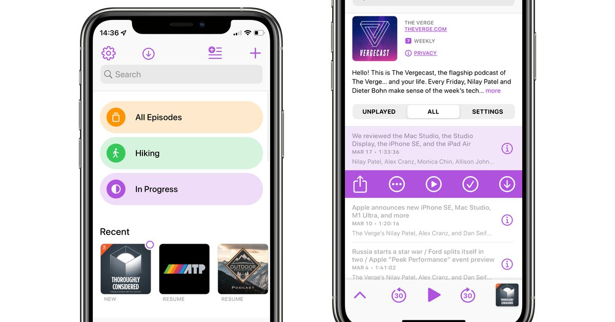
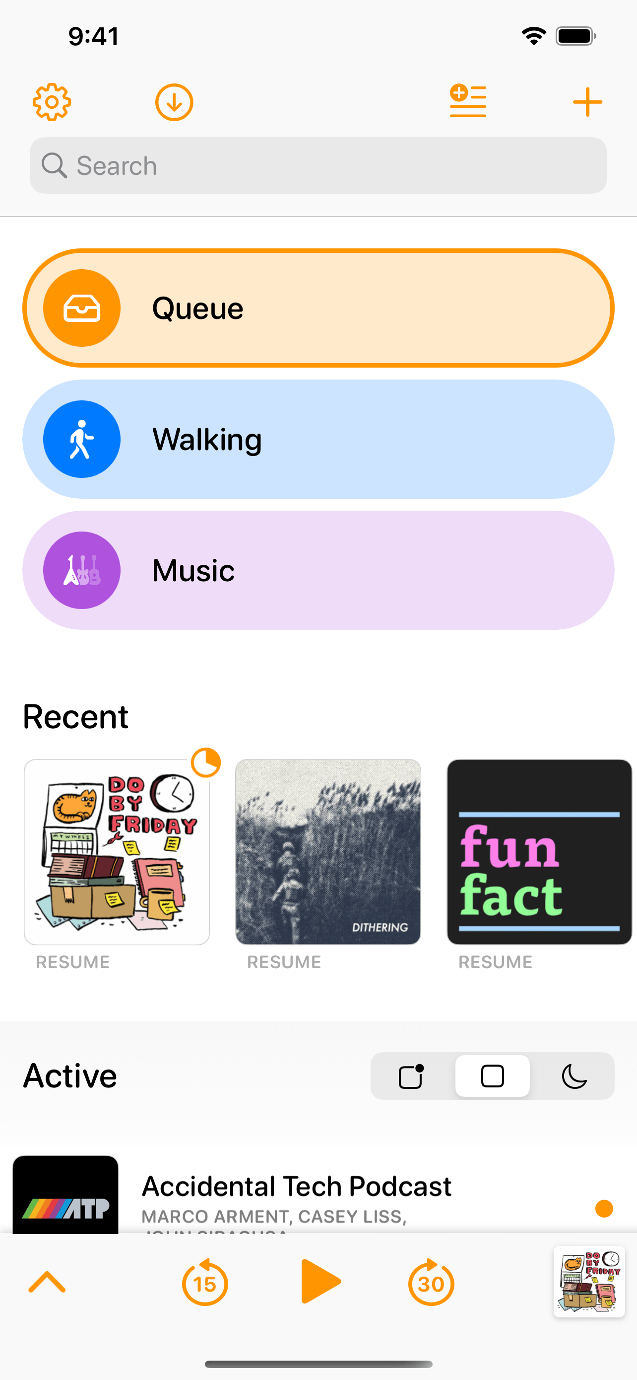
The changes are obvious from the moment you open the app — there’s a new Recent carousel, which lets you quickly resume episodes you were listening to and see which podcasts have new episodes (you can even long press on the tiles for more options), and the interface is full of updated icons. Playlists, which live at the top of the screen, have gotten a major overhaul: they now show up as customizable colorful bubbles with icons, rather than grey rectangles like they were before, and you can now make playlists that show you all your queued, starred, downloaded, or in progress episodes.


Overcast’s old home screen, left, versus the new one, right.Image: Marco Arment and Image: Marco Arment
If you want any of those pre-made playlists, you can easily add them to your home screen through the Add Playlist menu — and if you don’t want them, you can entirely ignore them. (The Add Playlist menu also includes the option to hide and show the recent bar, if you’re not a fan.)
Below the playlists and the Recent section is your list of podcasts. In the previous design, the home page had sections for Playlists, Podcasts, and Played Podcasts. The latter two have been replaced with a list that lets you switch between three modes: Unplayed, Active, and Inactive. Unplayed shows you podcasts with unplayed episodes, active shows all your followed podcasts, and inactive is for “podcasts you’re not following and have no added episodes, or seem to be inactive.” (Those podcasts also get a cute little moon icon throughout the UI.) You can also pin shows, which keeps them at the top of the list.
Beyond the new functionality, the app also just looks nicer. I wouldn’t say that Overcast has ever looked bad, but to my eyes the update makes it feel a lot more modern. Arment mentions that he’s updated the typography and spacing of the app, but probably the most exciting thing is the addition of a new theming system. You can keep Overcast’s light-mode orange and dark-mode blue if you want, but I imagine a lot of people will enjoy getting to look through the palate of available colors and select something different — and yes, you can have different colors for when the app is running in light or dark mode.
:no_upscale()/cdn.vox-cdn.com/uploads/chorus_asset/file/23343332/Screen_Shot_2022_03_24_at_13.14.14.png) The app lets you choose from 12 different colors, and the one you select will be used for pretty much every button in the interface.Image: Marco Arment
The app lets you choose from 12 different colors, and the one you select will be used for pretty much every button in the interface.Image: Marco Arment
There’s also some minor tweaks, like a redesign of the menu that pops up when you tap on a podcast episode in a playlist. Now there will be a button that lets you mark an episode as played, which Arment says was user’s most requested feature “by far.” You can also mark an episode as played by swiping right on it and tapping the icon.
:no_upscale()/cdn.vox-cdn.com/uploads/chorus_asset/file/23343436/ocredesign2022_2_after.png) A list of podcasts in a playlist, showing off the font and menu updates.Image: Marco Arment
A list of podcasts in a playlist, showing off the font and menu updates.Image: Marco Arment
Friday’s update is focused mainly on making the experience of managing your podcast library better — once you go to actually play one, the design is going to be largely the same as the previous version, except the theme color you choose will be used throughout. Arment does promise that the now playing and individual podcast screens will be getting their own fresh coat of paint in a future update, though, so there’s something to look forward to.
After trying out the update for a bit, I’m impressed. In the year or two I’ve been using Overcast, I’ve never really clicked with the playlist or queue system, but the new design makes me want to at least give it a shot.
And while I haven’t gotten to use it long enough to see how much of a difference some of the bug fixes and background notification improvements will make, I have enjoyed some of the small quality of life tweaks (nitpicky details, as they’re labeled in the Overcast settings menu) as well. I’m excited to see what Arment has in store for the new play screen, since that’s the interface I end up using the most.

 JaneWalter


.jpeg)
![X Shares Key Data on Holiday Season Planning [Infographic]](https://imgproxy.divecdn.com/Kc6zrj99YXrKnxNO-WxZsG1vR_j7DF9xMfUjKBrwM0I/g:ce/rs:fit:770:435/Z3M6Ly9kaXZlc2l0ZS1zdG9yYWdlL2RpdmVpbWFnZS94X2hvbGlkYXlfc2Vhc29uX2luZm9ncmFwaGljMi5wbmc=.webp)


