The MacBook notch has been redeemed
The NotchNook app turns your Mac’s notch into something you’ll actually want to use, with tools and features that make it like a Dynamic Island for macOS.

I’m still chugging along on an iPhone 12 Pro, which means I don’t get much hands-on time with the Dynamic Island on a day-to-day basis. Or at least I didn’t, that is, until I discovered a little app called NotchNook. But instead of bringing Apple’s pill-shaped notch utility to my iPhone, it instead lives on my Mac. And it has the potential to change how I use my Apple computers for good.
I’m not the only one at Digital Trends who is intrigued by NotchNook — my colleague appreciated the concept when annoucned, too — and the idea for the app is pretty simple. Hover your mouse pointer over your MacBook’s notch and you’ll see it expand slightly. Click the notch or do a two-finger swipe downward and the notch expands further, revealing a black box (the “nook”) containing controls for various apps and tasks.
I wanted to try it out for myself, though, and see if it really could redeem that annoying little notch and become a must-have Mac app.
Widgets and workflows
 Alex Blake / Digital Trends
By default, NotchNook starts with a few basic controls in place. On the left of the nook is a space for a “now playing” widget, which connects to either Spotify or Apple Music. In the center there are workflows loaded from Apple’s Shortcuts app. And on the right is a button to toggle your MacBook’s front-facing webcam (NotchNook calls this the “mirror” control).
You can also add Live Activities to the notch. These show information on apps you have currently running, and it all happens while the notch is in its normal shrunken position. The Spotify Live Activity, for example, shows a miniature album cover and a moving graphic of your music’s levels. Click this and you can play or pause without needing to expand the notch at all.
That’s a pretty good place to start, but the app offers an awful lot of customization options too. Delve into its settings, and you can swap out the existing widgets for a calendar, with notes, to-dos and “quick apps” coming soon. Each widget can be moved to a new position in NotchNook and have its dimensions changed so that you can fit more or less into the app’s container. It feels a little unpolished right now — it would be helpful to be able to drag and drop a widget into place rather than repeatedly clicking arrows to move it — but it’s a good start.
It’s not only the widgets that can be changed but also NotchNook itself. You can add or remove dividers between widgets and adjust their size and padding, change NotchNook’s transparency, alter its height, and more. There’s a surprising amount of control over how the app looks and feels.
The Files Tray
 Alex Blake / Digital Trends
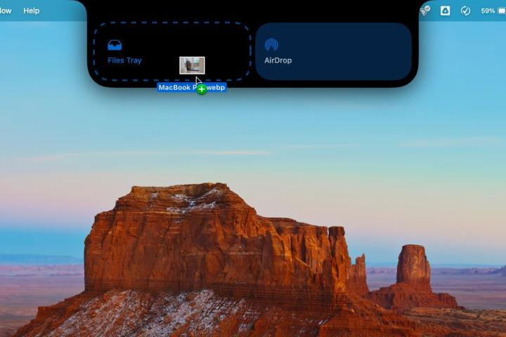
All of these features pale in comparison to my favorite part of NotchNook: the tray. It’s one of the most useful parts of the app, and, like many aspects of NotchNook, it’s full of promise.
When you drag a file from the Finder over the nook, it opens up to present two options: Files Tray and AirDrop. Release your dragged item into the Files Tray and it’ll remain there for easy access, letting you pull it out and into another app or Finder window whenever you switch apps or desktop spaces. To delete the file from the tray, just hover over it and select the small X in its top-right corner. Or instead drop it into the AirDrop area and the sharing window appears, making it quick and easy to send files to other people.
The Files Tray works very well, although only having two options means it’s a little limited for now. But NotchNook’s developer says there’s a lot more on the way. For instance, you’ll soon be able to zip and unzip files and compress images, all by dropping them into the tray.
NotchNook calls these workflows “pipelines,” and they’re reminiscent of a feature I’ve seen in BetterTouchTool. One of the best Mac apps around, BetterTouchTool is an all-in-one app for souping-up your trackpad gestures, window management, user interface controls, and more. One of its abilities is to create mini-apps and widgets that work with the notch, and among them is a drop zone tool that can convert files that are moved into it. If NotchNook is able to compete with the kind of capabilities exhibited by BetterTouchTool, it’ll be well worth your time.
Looking and feeling great
 Alex Blake / Digital Trends
Part of the beauty of NotchNook lies in its animations. Mouse over the notch and it lightly pulses outward, with a drop shadow giving it a sense of presence on your display. Open it up and its dimensions expand before gently bouncing back into place. When you move your mouse away, the notch quickly returns to its former shape, getting out of your way when you no longer need it. This slickness extends to other parts of the app, such as Live Activities — start playing a song and the notch’s edges move smoothly outward, for instance. It’s a small touch, but one that I really appreciate.
These animations suggest that a lot of care has been put into not only how NotchNook works but how it feels too. It’s not too dissimilar from the experience you get on an iPhone with the Dynamic Island, and while I wouldn’t quite go so far as to say it feels like Apple could have designed NotchNook, it’s not too far off.
You might be wondering what happens if your Mac doesn’t have a notch. On my Mac mini connected to an external display, NotchNook doesn’t have a built-in notch to work with, after all. Instead, it creates a “handler” that looks like a notch and functions in much the same way as the nook does on a MacBook. It’s a little smaller and less intrusive than a standard notch, but otherwise has all the same functions as NotchNook on a notch-toting MacBook.
All these features mean that right now, NotchNook is off to a good start, but what really interests me is what’s planned for later. It seems clear that the developer wants to keep adding functionality to NotchNook, and that could help take it from a useful utility into a real Mac essential.
If you’re interested in NotchNook, it costs $3 a month for an ongoing subscription, or $25 to buy it outright. The subscription enables it to work on two devices, while the full purchase grants you access on up to five devices. There’s also a 48-hour free trial, which I recommend trying out to see if the app suits you.

 KickT
KickT 


