This Bold New Design Trend Might Make You Rethink Your Neutral Home
Incoming (home) identity crisis. The post This Bold New Design Trend Might Make You Rethink Your Neutral Home appeared first on Camille Styles.

Having a bold and dramatic design aesthetic may not come easily for some, but this year’s interior trends are daring us to be a little more playful at home. While creating spaces that ooze calm and serenity is one thing, there’s also something to be said about a home that screams personality and style. You can do both with one of the biggest paint trends of the year: color drenching.
I got the scoop on this bold design aesthetic from Sarah Stacey of Sarah Stacey Interior Design, as well as Mark Schubert, founder and lead designer of Phillip Harrison Interiors. Read on for their expert tips on how to incorporate color drenching in your own home, no matter your design preference.
What is color drenching?
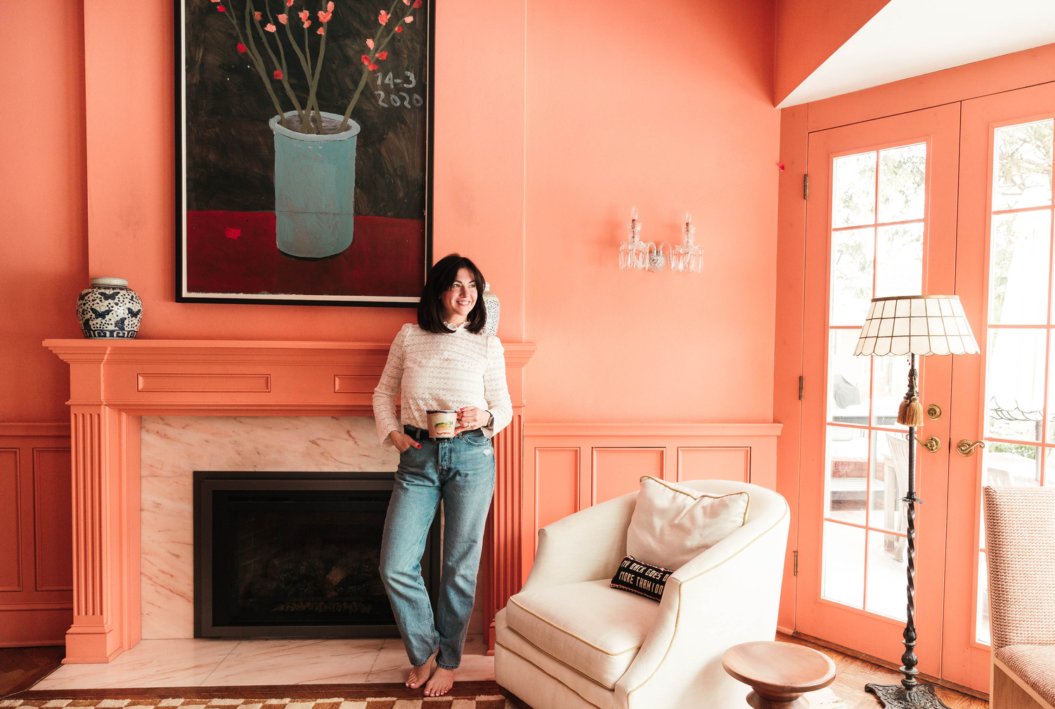
This moody and contemporary paint trend is all about enveloping yourself in one shade. “Color drenching is about fully covering a space in color—with minimal contrast and no white at all,” Stacey explains. “This approach applies color everywhere, from walls and ceilings to trim and furnishings, creating a cohesive, calming atmosphere.”
Color drenching can be seen this year in monochromatic spaces—think one color everywhere. This look is anything but boring—a color-drenched room incorporates many different textures to keep the space captivating and comfortable. It can even include different shades of the same color. A color-drenched room is, in short, stunning.
How do you know what color to pick?
Color drenching a room goes beyond just loving a certain shade or hue. Before you choose your drenching color, decide how you want to feel in your space. “Consider starting with a rich, deep color that resonates with the mood you want to create, such as a calming blue or a dramatic green,” Schubert recommends. “Apply this color not only to the wall but also to the ceilings, baseboards, doors and even furniture. This uniformity creates a cocooning effect that envelops the space in color.”
Color drenching an office in a vibrant hue like pink or orange could be an excellent choice for creativity and energy. However, you definitely want to go with a more serene color like blue or green for a bedroom. A powder room is a great place to experiment, so don’t be afraid to go bold with your choices here. It can also be helpful to know which pieces of furniture and decor you’d like to use in your space as well. Choosing a paint color that’s complementary to the pieces you want to incorporate will keep the design plan cohesive.
Color Drenching Design Tips
Not playing it safe can be daunting. If you’re considering trying this paint trend out yourself, remember that color drenching can evoke many different vibes and feelings—it all depends on how you style your space. Here are a few design tips from the pros.
Layer shades and textures
Just because a room is all one color doesn’t mean creating a cohesive look is as easy as painting all the walls. A well designed room consists of lots of different layers, and Schubert suggests playing around with various textures and finishes within the same color family. “For a cohesive look, try using matte on the walls, glossy or satin finishes on the trim, or velvets for furniture items,” Schubert suggests. “Incorporating contrasting accents subtly through metallics or wood tones will break up the monochrome without diluting the impact.”
He also suggests tonal variations of the same shade through accessories like throw pillows, rugs, or artwork. Once you have your paint color, be on the lookout for accents that are slightly lighter or darker to give your space plenty of visual interest and balance.
Consider lighting
A major tip for painting a room is knowing what kind of light you get in your space. Paint can appear to magically change color depending on the time of day, or what kind of light bulbs you use in your lamps. Be sure you try a paint sample before color drenching and notice what it does in the light.
“Lighting plays a crucial role,” Schubert says. “Selecting a warm color temperature for your light fixtures will make the space feel cozy and comfortable. Ensure that natural light interacts harmoniously with the chosen color, enhancing the depth and dimension of the space.”
Use timeless patterns
Even though color drenching is currently trending, there are ways to style your space that will keep it timeless. “Select patterns and materials that are lasting, such as a gingham or plaid, floral prints, and even stripes tend to lean toward that elevated, timeless feel.” Schubert says. Stacey also mentions that even though color drenching is currently popular, it’s not entirely new.
“Color drenching has been around for years, but its recent surge in popularity has finally given it a name,” she shares. “It’s exciting to see this concept resonate with so many people.” If you’re still wary about your home eventually falling out of fashion, stick with smaller spaces like a powder room or Butler’s pantry. That way, it will be easier to switch up the style, more so than a kitchen or living room.
Incorporate black
Another way to add visual interest to your color-drenched space is to add pops of black. “Incorporating black elements can add depth, balancing the room without making it feel too sweet,” Stacey shares. “This strategy creates a stronger visual impact and results in a more sophisticated, curated design.”
It’s also worth mentioning that you can absolutely color drench with darker hues. Darker spaces will make you want to wind down and relax, so a color-drenched bedroom or den would be ideal. Navy, charcoal, or even deep green or burgundy are great choices.
Pick an accent color
Color drenching tends to focus on one color, but Stacey suggests incorporating accent colors into your design plan. “While the trend often leans toward using a limited range of colors, like all pinks, I recommend keeping it fresh and timeless by layering two or three colors that complement a dominant, more saturated ‘punchy’ hue,” she shares. “Used sparingly, this punchy color adds just enough energy and interest to make the space feel special without overwhelming it.”

 Tfoso
Tfoso 


