Web Design and the Science of Colors
Over the decades, the responsibilities of a web designer have expanded. Web designers now have to represent a brand using their finished product, i.e., a website. That’s where colors in web design become important. Web designers must understand website...

Over the decades, the responsibilities of a web designer have expanded. Web designers now have to represent a brand using their finished product, i.e., a website. That’s where colors in web design become important.
Web designers must understand website color psychology and implement it in their designs. This blog post discusses three crucial things you must remember when choosing colors to design a website.
3 Things to Consider When Choosing Colors for Your Website’s Design
Colors in web design play a vital role as it’s the brand’s first impression on its audience. In today’s fast-paced digital world, colors are important to identify a brand uniquely. These colors are all around social platforms, too, to create consistency in the brand identity.
Here are the three most important things to remember when choosing colors to design a website.
1. Brand Identity
For any business, creating a unique brand identity is essential. What are the company’s values, and why should a customer do business with that particular brand, all communicated via the brand’s representation? These include physical or visual manifestations such as color.
A color chosen for web design will be the first way of communicating what the brand’s about. The colors help communicate the brand’s purpose and which things lie at the core of the brand. Moreover, colors hint to the audience about what they must expect from a business.
Hence, you must understand what each color signifies when working with website color psychology. You can use this information to align the colors with the brand’s identity. Here are some commonly used colors in web design and what each represents.
| Red | Perfect as an accent shade for creating energy and excitement | Too harsh or overwhelming | Any business that’s exciting, such as sports and entertainment, delicious food, or dangerous such as emergency services. |
| Yellow | Use brighter shades for CTAs to attract customers and make them joyous | Causes anxious thoughts or lowers self-esteem | Retail businesses, especially for athleisure products, and fast food joints for instant attention |
| Blue | Use various shades on the brighter or darker side to create confidence, dependability, and trust | It looks unwelcoming, and therefore, food businesses must avoid the color | Perfect for businesses in the healthcare and banking sector to create trustworthiness |
| Orange | Works well as an accent color to grab the audience’s attention immediately, such as with CTA buttons | It seems overpowering and somewhat exhausting | Businesses in e-commerce, sales, childcare, and food can make the color work well. |
| Green | Perfect for representing harmony, growth, and support | Creates boredom and lethargy, which can affect customer’s decisions to prompt buying | Best for businesses operating in the environment sector or human resources |
| White | Ideal for creating trustworthiness and safety while ensuring minimalism | It can seem bland and visually displease people | Businesses working in the healthcare and technology sector can use the color well. |
| Black | Some shades used tactically can give a luxurious and modern feel to the website | It looks overpowering and can reduce customer’s energy | Luxury brands and fashion houses can use the color to enhance the regalness of their products |
| Purple | It gives royal and feminine energy while seeming mysterious and sophisticated | Creates a distraction for the customers | Ideal for businesses working around spiritual practices, feminine products, and beauty brands |
Only some colors are well-suited for a particular brand. Hence, you must first identify the company’s purpose, its values, and the message it wants to communicate to its audience. Then, you can decide which colors you want to use for the company’s website.
2. Target Audience
Every business approaches a particular population to turn them into regular audiences or loyal customers. The ways to capture this ideal customer base include tactically using colors in web design. You must have a detailed buyer persona to understand which colors might work well for a specific business.
You’d need to understand the gender and age of the audience to choose a color. For instance, the color purple works well in attracting a more feminine crowd or people looking for luxury products. However, the color might not work well with people constantly looking for new fast-food joints.
Furthermore, it’s vital to remember that the audience of a business’s website isn’t always customers. Prospective partners are also looking at the brand through the lens of color. Hence, focusing on and understanding the target audience’s needs can help businesses go a long way.
3. Competitor’s Approach
Certain colors are so popular in an industry that all the brands in this sector have similar brand colors. For instance, most of the businesses in the healthcare sector use blue to create dependability. While it looks good, it doesn’t stand out from the crowd.
Hence, when using website color psychology, know the competitor’s approach. If there’s an observable trend, you can break it in subtle ways. The best way is to introduce another shade as an accent color that also signifies the brand’s values.
A business can be viewed distinctly and identified as a brand through unique colors and combinations.
You can go for a monochromatic palette for a harmonized look or try a complementary color opposite the base color on the color wheel. Using complementary colors creates high contrast and looks visually appealing. Businesses working with kids’ wear can use this approach to attract parents and create a playful environment to reduce stress. Moreover, contrasting colors can help customers easily find the CTA button for prompt purchases.
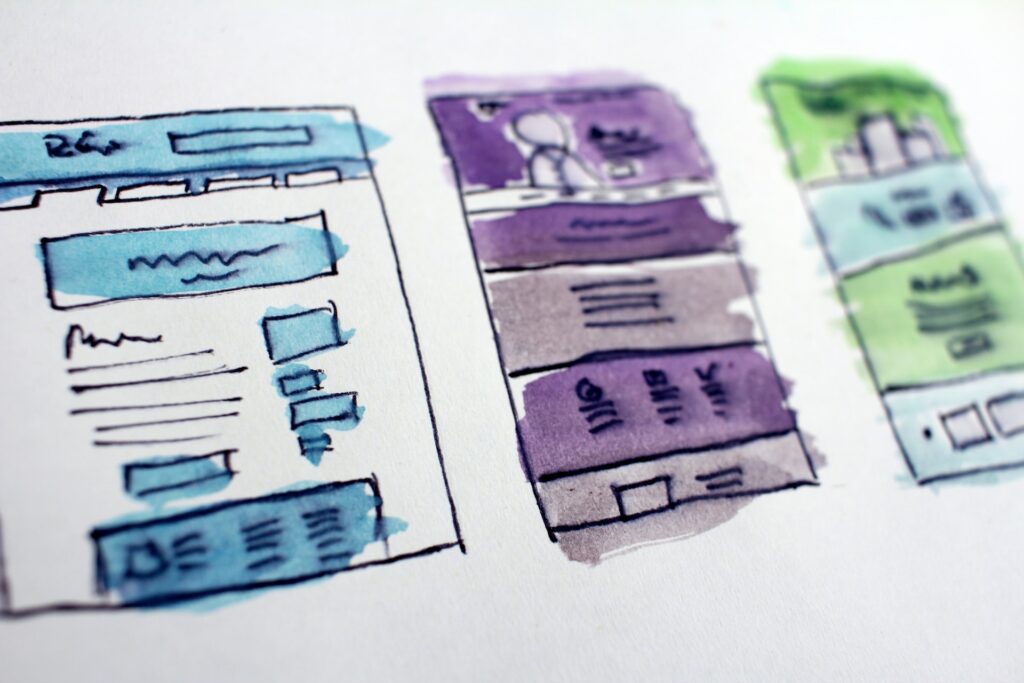
 Image courtesy Hal Gatewood on Unsplash
To Sum It Up!
Understanding website color psychology is a handy trick for web design. Colors have a direct impact on the user experience. While some can energize customers and take prompt action, others can tire them.
Every company providing top-notch web designing services follows color psychology. A clear brand purpose, audience, and competitor’s approach are also essential in deciding which colors to use for the website.

 ValVades


