WordPress Releases Gutenberg 13.7 – Focused on Workflow and Better UI via @sejournal, @martinibuster
Gutenberg 13.7 offers more design options and improvements to the user interface that should make the editing experience feel more natural The post WordPress Releases Gutenberg 13.7 – Focused on Workflow and Better UI appeared first on Search Engine...
WordPress unveiled Gutenberg 13.7 which contains numerous refinements that improve the workflow, provide more granular control within the full site editor, and numerous improvements to the user interface.
Like any other release from WordPress, this is a cumulative update and not a whole new experience.
That said, the editing experience should feel more intuitive and natural.
Block Locking Offers More Granular Control
13.7 contains further improvements to the ability to lock block elements to prevent them from changing.
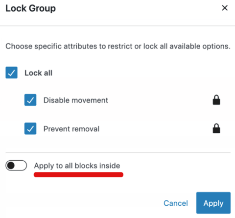
The newest improvement is that users now have the ability to apply the lock feature to block elements contained within a block that is being locked.
By selecting a toggle, the lock feature that’s applied to a block can be inherited by the blocks that it contains.
Block Locking Menu
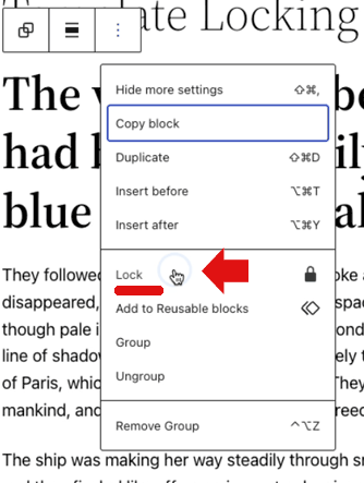
Selecting to lock a block spawns another menu that provides options for more granular locking control over the blocks contained within the block that is being locked.
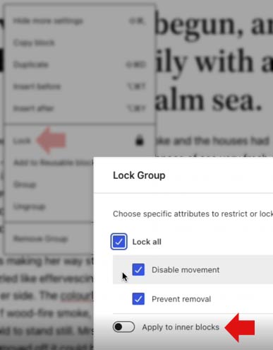
Closeup of Block Lock Modal
Improved Popup Modal Menus
Popup menus, called Modals, can spawn on top of the page that is being worked on from which various changes can be made, like updating preferences.
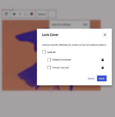
What this change does is to apply a blur to the document that is beneath the menu.
Blurring the page underneath the modal popup menu improves the focus.
A concern was raised about this new feature (while it was still under development) that was concerned with the potential for the user to lose context of what was being changed because of the blurring.
They suggested that in some instances, blurring the background would cause the user to be unable to see what was being changed, thus removing the context.
The person wrote:
“I just encountered a potential usability issue where there is an element outside of the modal that is contextually related to the content of the modal.
For example, if you go to adjust an item in the List View to apply or remove a Lock, with the modal open, you can no longer see which (particular) block you have highlighted…”
The resolution to that issue was the observation that if the context needed to be kept in view then the modal (popup) menu is not the best user interface. This meant that blurring won’t be a problem because modals aren’t used in situations where the underlying document needs to be referenced by the user.
“…generally speaking if you need to observe both the modal contents and the rest of the UI together, then a modal is probably not going to be the best choice.”
Example of Blur Behind the Modal
Template System Offers More Design Control
This change provides the user with the ability to create more templates that can be specific to individual categories, tags, pages, and custom post types.
According to WordPress:
“For instance, you can use a different template for all personal blog posts, a second one for all developer related blog posts, and a third one for all travel posts.
If your site registered additional post types, like books, or products, your editor instance will automatically list them in the selection box for the Add New template button.”
This is a welcome addition because it removes a glaring limitation and extends the ability to make better websites when utilizing the Gutenberg full site editor.
Improvements to Workflow
There are other improvements that are intended to improve and streamline the workflow by providing additional options.
Among these changes is the ability to select a featured image from the media placeholder instead of uploading or choosing from the media library.
Screenshot of Featured Improved Modal
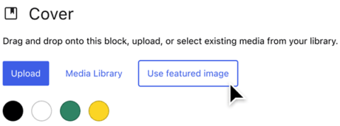
The reason for this improvement is documented in the pull request:
“This PR allows supporting media blocks to offer users the option to start with featured image from the placeholder state.
Why
To avoid having to pick another media to only then get the option and because the featured image is now hidden behind the “Add media” block control in the media replace flow.”
New: Time to Read
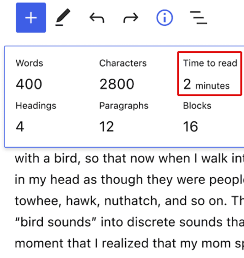
The ability to check how long it will take to read the document is also a new feature that was added.
This new feature is added to the information bar in the Post Editor screen that currently provides feedback on the number of words, characters, heading elements used, number of paragraphs, and number of blocks.
The amount of time it takes an average reader to read a document is highly useful information.
Screenshot of Updated Information Bar
Sidebar Settings Panel User Interface Improved
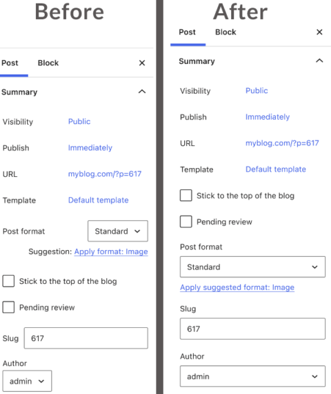
Another example of the improved user interface is in the sidebar settings panel, which gets an update to make it easier to use.
The layout of the settings panel is more intuitive and easy to scan and choose from the menu selections.
Screenshot of Before and After
WordPress described the improved interface:
“The result is a cleaner, more organized display that should help you more readily access all the important information about your post/page at a glance.”
So Many Improvements
The new Gutenberg 13.7 is a cumulative update and not a radical change from the previous version. The improvements might not jump out but they will contribute to a more natural editing experience.
This update touches on nearly every area of the Gutenberg editor, from new components like a color picker, improved document settings, a better full-site editing experience, and numerous bug fixes.
Citations
Read the Full WordPress Announcement
Read the Block Lock Pull Request
Block Locking: Add the ‘Apply to inner blocks’ option #41876
Background Blur on Modals
Update the modal design #40781
Start With Featured Image Pull Request
Start with featured image in media placeholder #41722
Featured image by Shutterstock/Vulp
Modified by author

 ShanonG


