6 Tips For Giving Your Reporting Dashboards A Makeover via @sejournal, @amyppc
Turn clunky digital marketing and SEO reporting dashboards into useful analysis powerhouses with these tips for better charts and data visualizations. The post 6 Tips For Giving Your Reporting Dashboards A Makeover appeared first on Search Engine Journal.
 MikeTyes

In their new book ‘Making Numbers Count,’ co-authors Chip Heath and Karla Starr explain that our brains have not evolved to easily understand large numbers.
We really only have an instinct for small quantities – as in, five and fewer.
Beyond that, it’s just some vague notion of “lots.”
But with 2.5 quintillion bytes of data being created every day, dealing only with the numbers 0 to 5 in our reporting is a luxury we don’t have.
Data visualizations serve to transform and compare large amounts of data, but most reporting dashboards today are still like 1990s websites.
We put up with them, but they’re ugly and awful, and we wouldn’t trust them with our credit cards.
Non-strategic reports – dashboards that are too cluttered or too sparse to comprehend – make it harder for your clients and stakeholders to understand the data and take smart action.
Here’s how to turn those clunky dashboards into useful analysis.
1. Get Rid Of Charts That Have No Purpose
Not every chart in your dashboard deserves to be there.
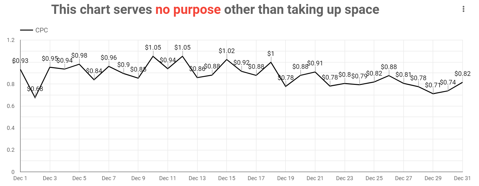 Image created by author, January 2022
Unnecessary charts distract and compete for attention with graphs that do matter.
They can also derail meetings, encouraging your client to focus on minutia and natural variance rather than the essential.
Not all data breakouts are useful. Some are just useless, and some are anti-useful.
Make each chart earn its place in the dashboard by removing everything that doesn’t:
Tie back to objectives. Provide context. Aid comprehension.2. Get Rid Of “Unnecessary Ink”
Statistician and dataviz pioneer Edward Tufte explains,
“…clutter and confusion are failures of design, not attributes of information.”
Tufte introduced the “data-ink ratio,” which tells us to strip all decorative or extra “ink” from charts until we’re left with only the essential.
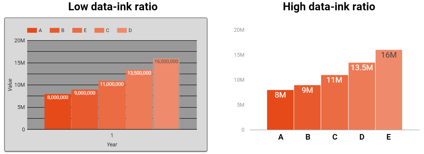 Image created by author, January 2022
Improve your data-ink ratio by minimizing or removing:
Any bevel or 3D effects. Gridlines. Redundant chart legends. Chart borders and shadows. Background color fills.Tables are inherently busy, showing a lot of data all at once.
To make your tables easier to read:
Remove pagination and row numbers. Use compacted numbers (12M instead of 12,000,000). Remove truncation (“…”) by expanding the column width or wrapping text. Remove decimals (when numbers are >1).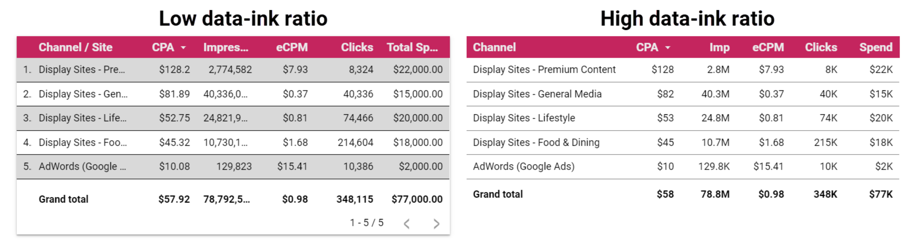 Image created by author, January 2022
When you introduce white space and eliminate chartjunk, your reports tell a clearer story.
3. Fix Misleading Axes
Sometimes charts are so intentionally misleading that they end up making headlines.
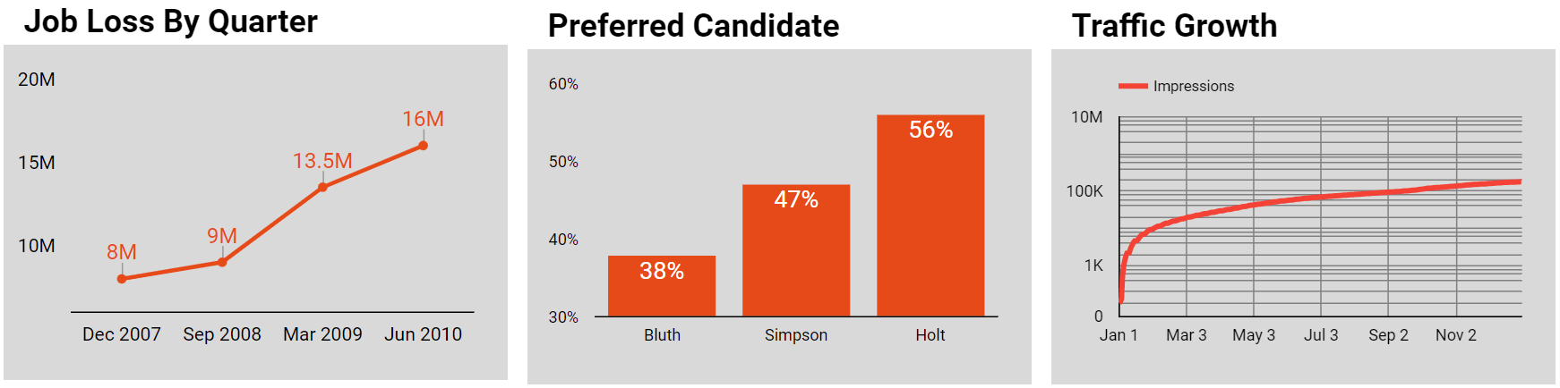 Image created by author, January 2022
More often, though, charts that mislead do so unintentionally.
Here’s how to find and fix common data visualization mistakes.
One common mistake is using a “truncated graph,” where the y-axis doesn’t start at 0.
Truncated graphs are so common that Google Data Studio uses them by default in some of its chart options.
The fix for this is easy.
Just set any “axis minimums” from auto to zero.
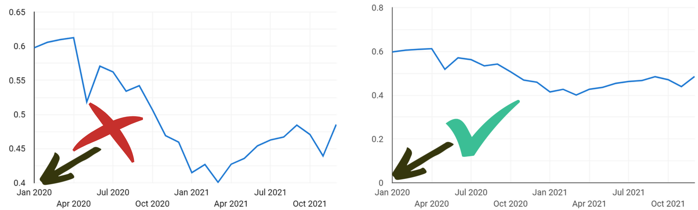 Image created by author, January 2022
While less common, charts can sometimes have an inappropriate maximum.
This can happen when you’ve hardcoded the max axis based on a previous data set, and you forget to update it when it’s using a different data range.
Also a very easy fix.
Another issue is using a “logarithmic scale” for your charts.
When you’ve tried to get a chart to look a certain way and nothing else worked, you may have switched over to log scale for better visualization.
Unless you’re truly working with logarithmic data though, that’s not okay.
Change it back to linear.
4. Fix Poor Chart Selection
Chart selection is not as easy as just changing an axis. But it’s arguably more important, and easier to get wrong.
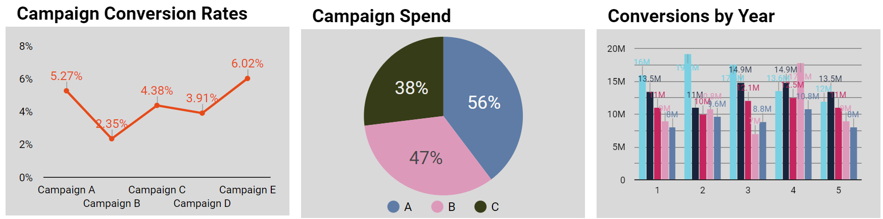 Image created by author, January 2022
Have you ever tried to use a chart selection guide, only to be asked whether your data is nominal or categorical?
If you’re not fluent in data visualization, then it can feel easier to just stick with trial and error until you land on something that looks okay.
Marketer’s Crash Course In Chart Selection
This is not a complete guide, but it covers a lot of dashboard mistakes:
Use scorecards for your big KPIs, even if the same data is in tables and other graphs in the report. It emphasizes what’s most important. Use line charts to show trends over time. If your x-axis is anything other than a time series (continuous data), don’t use a line chart. Only use pie/donut charts to show the composition of a whole, ideally with five or fewer categories. Need to compare pie charts to each other to show a change in composition? You probably need a different chart type. A stacked bar chart could be a good choice. Map charts are a good way to visualize data across regions, and clients seem to like them. Be sure that you’re not just mapping population data though, which is generally not helpful in making business decisions. Bar charts work well to compare category performance for a single metric. Think sales driven by (campaign, landing page, etc).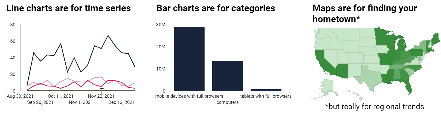 Image created by author, January 2022
5. Add Contrast
Removing “unnecessary ink” from your charts puts you on the right track.
This next step is to layer on “necessary ink” that focuses your reader’s attention and makes your chart even easier to interpret.
These three charts all use an identical data set:
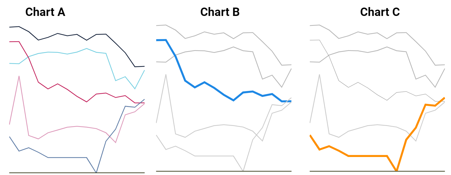 Image created by author, January 2022
Chart A has no focus and feels “noisy.”
Charts B and C vary line thickness and color to draw your attention to a single line.
Even though you don’t know the actual metrics or dimensions in Charts B and C, you immediately know where to focus.
This is an example of using “pre-attentive attributes,” which our brains process instantly on a subconscious level.
When you want to emphasize a key point, you can increase contrast with preattentive attributes like:
Line (length, width, orientation). Color (hue, value, saturation). Grouping and position.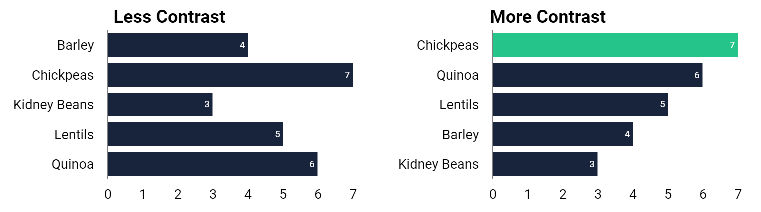 Image created by author, January 2022
Don’t leave your audience asking “what am I looking at?”
Help them out with contrast and preattentive attributes.
6. Add Context
Context is another type of “necessary ink” that clarifies the meaning of your visualizations.
As a marketer and subject matter expert, you know what your charts are about.
You can survey all your dashboards and quickly identify trends and outliers.
For your clients and stakeholders, that’s probably not the case.
The people on the receiving end of your reports are likely not intimately familiar with the acronyms and shorthand that’s obvious to you.
They need more context in the form of:
Chart titles and descriptions. Acronyms that are spelled out and defined. Annotations and microcopy.Your audience also needs a better understanding of the factors driving the trends and data changes in the report.
The metric is the “effect,” but what is the “cause”?
 Image created by author, January 2022
Look beyond the metrics themselves to find the narrative.
What are the internal and external forces that contribute to performance? What backstory might they be missing (historical, seasonality, competition, buyer preference)? Given current and projected trends, what needs to happen next?Finally, don’t assume that your audience knows the targets, even if they were the ones who set them.
Help them out by comparing performance to goals and not just previous time periods.
Conclusion
‘Presentation Zen’ author Garr Reynolds said,
“…you can achieve simplicity in the design of effective charts, graphs and tables by remembering three fundamental principles: restrain, reduce, emphasize.”
Remove what is unnecessary, fix remaining problems, and add context and meaning to make your charts and dashboards as powerful as possible.
More resources:
8 Tips to Make Your Data Visualization More Engaging & Effective 14 Essential Data Studio Visualizations for Paid Search Marketers 10 Most Important PPC Trends To Know In 2022Featured Image: Saklakova/Shutterstock


.jpg&h=630&w=1200&q=100&v=6e07dc5773&c=1)