Ecommerce Conversion Rates Across Industries (And How to Raise Yours)
Ecommerce conversion rates are the ultimate top-line metric for online store owners. With this data, you can see if the changes you make to your site positively or negatively impact how many visitors become customers.

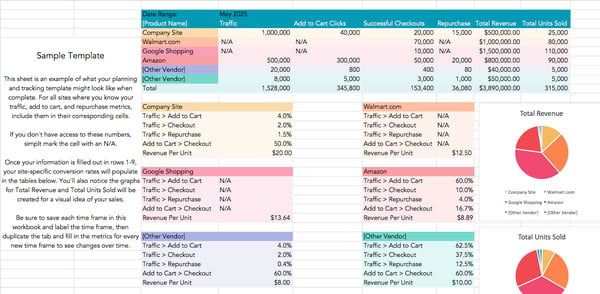
Ecommerce conversion rates are the ultimate top-line metric for online store owners. With this data, you can see if the changes you make to your site positively or negatively impact how many visitors become customers. Although crucial, there’s often confusion around what’s considered a reasonable conversion rate. Before you evaluate if your ecommerce conversion rate is good or bad, you must evaluate how your performance measures against your industry’s standard. In this article, you’ll learn the ins and outs of ecommerce conversion rates, conversion rate benchmarks across industries, and how you can improve your results. Let’s dig in. An ecommerce conversion rate (CVR) is the ratio of the total number of people who make a purchase on your site compared to the total number of site visitors you have. For example, suppose 30 out of 1,000 visitors to your online shop made purchases. To calculate your ecommerce CVR, take the total number of people who completed checkout (30) and divide that by the total number of site visitors in the same time frame (1,000). In this case, your ecommerce CVR would be 30/1000 = 0.03 = 3%. Today, many ecommerce retailers sell across multiple platforms. You’ll need to aggregate your site visits and conversions in one place. You can leverage a tracking spreadsheet or find a technology solution to keep a pulse on your performance across platforms. We’ve put together a free ecommerce conversion rate tracker that you can download here, along with an ecommerce marketing and sales plan template in our Ecommerce Planning Kit. Your ecommerce conversion rate is crucial to the success of your online shop. For example, you could bring in 50,000 views per month to your website through ads. If the user experience on your website is poor or your product descriptions aren’t effectively communicating value, you might only end up with a small percentage of that traffic converting into customers. Ecommerce CVR is also a valuable metric to track over time to see how the improvements you’re making to your website, product categorizations, product descriptions, checkout process, or any other aspects of your online store are actually impacting your business’s bottom line. Don’t compare your ecommerce CVR to an overall benchmark that aggregates CVRs across industries. CVRs vary wildly across ecommerce sectors. Try to find conversion rates for your category or industry to use as a benchmark. Looking at numbers isn’t all you need to do. Conduct a cost-benefit analysis and ensure that you make more money than you spend by selling your products online. From there, focus your time on optimizing your site beyond where it currently stands. If you have one category of items with an excellent conversion rate, you can also aim to bring all categories up to that standard. With that approach, you can count on the CVR benchmark reflecting your specific target persona, not anyone else’s. If you’re starting from scratch, see below for industry-specific benchmarks backed by recent research. The numbers below come from IRP Commerce, which constantly collects data across many industries and ShippyPro. The numbers were most recently updated in December 2022. It can be challenging to get a sense of sizing, fit, and material quality from photos. Video tends to demonstrate more detail. Add videos that show your product from various angles and allow people to see them in action. You’ll also want to account for the increasing number of people who prefer to consume video over text. There’s nothing more frustrating than wanting to look at the small details of the item you’re considering buying online only to find out that you can’t zoom in. Your ecommerce site should include images of your product from different angles and allow prospective buyers to zoom in on the product images. Doing so allows these potential customers to have a more accurate sense of your product before purchase. Ensure your product descriptions are grammatically correct, easy to understand, and properly structured. It’s vital to keep your ideal buyer in mind as you write your product description. In some cases, retailers may have a couple of identical products that are differentiated only by size. While the product specifications should reflect the different product dimensions, it’s okay to leave the copy describing the product's use as is. On the other hand, if you’re selling something like body care products, you might write an entirely new copy to describe who each product is suitable for, the different sensory elements of the product, and the look and feel of each. At a baseline, always include product measurements, material specifications, warranty information, and any other information that would be crucial for buying your product. With this information, you won’t lose a prospective customer who is wondering about a key detail. You simply can’t answer every question that anyone will ever have in your product description. However, since you want to do everything you can to convince someone to buy your product while they’re already on your site, consider chat as another avenue. Chat can be a powerful tool for bridging the gap between your product descriptions and the information an individual needs to buy. Customers can ask questions about your brand, shipping policies, and anything else non-product-specific without leaving the web page of the product they’re close to buying. Altering your CTAs is a classic method of optimizing a website’s conversion rate. Switching up the copy within your CTAs, the options people have for the next place they can go, or the prominence of those CTAs can be low-effort, high-impact ways to encourage people to buy. Studies have found that while the majority of CTA tests don’t produce statistically significant results, the ones that do create enormous impact, with on-page conversion lifts averaging 49%. You won’t know what conversion rates you’ll see until you start experimenting with each little aspect of your site. It’s becoming increasingly easy for companies with cheap, low-quality products to deliver comparable on-site experiences and images. This convinces buyers that their products are the same as the others in the market, just less expensive. However, the one element that’s hard to fake is customer reviews. Allow your customers to leave reviews of your products to prove their quality. If you’ve got great reviews, consider moving them higher on the product pages. Social proof can positively impact prospective customers’ buying decisions. If you don’t have a solution that allows customers to leave reviews automatically, collect quotes from people who’ve bought from you before. Add several to each of your product descriptions. Remember that you can always run A/B tests by tweaking your testimonial’s design and placement. You’ll soon find out what works best. We’ll admit that offering free shipping isn’t the cheapest option. However, the ROI can be enormous. Many people choose to go to a local store when it’s significantly cheaper to drive 15 minutes than pay $5-10 for shipping. Free shipping reduces the perceived barriers to ordering something online. That means that you likely end up with more people making purchases. The revenue from those additional customers may compensate for the losses incurred by paying for their shipping. You can also set a minimum purchase amount before free shipping applies to an order. You’ll incentivize your customers to spend a little more on products to avoid paying the shipping costs. You can make dozens of small changes to the user experience of your checkout process. Two of our favorites are eliminating unnecessary fields and adding a progress bar. While collecting additional information about your buyers during the checkout process is tempting, additional questions lengthen the amount of time it takes to buy. Many people might not be that patient. Progress bars can have two advantages. Allowing people to create an account makes sense for repeat buyers. But if you require people to make an account to make their first purchase, you may lose potential customers. Additionally, some people are averse to saving personal information online. Trustpilot reports that requiring account creation at checkout is the second-biggest reason why people abandon carts, coming in just below having to pay for shipping. Those who become repeat buyers will create an account eventually if they feel comfortable saving their information. In the meantime, don’t add extra steps to the checkout process for people ready to buy. A study from the Merchant Payments Ecosystem revealed that 50% of consumers would end a transaction if they couldn’t find their preferred payment method. Consider running a survey to understand your customers’ preferred payment methods and add the one that’s most convenient for them. By meeting your customers where they are, you’re potentially removing a nuisance (i.e., walking to another room to get a different credit card) or a complete blocker (i.e., not having access to any of the available payment methods). You’ll also create an easier user experience. By tracking relevant website metrics, you can discover what your current conversion rate is. Find the right tools to help optimize your conversion rate. Then, experiment to see what yields results.

Ecommerce Conversion Rate
Featured Resource: Ecommerce Conversion Rate Tracker
Why is your ecommerce conversion rate important?
What’s a good ecommerce conversion rate?
Ecommerce Conversion Rate Benchmarks by Industry
Ecommerce Conversion Rate Optimization
1. Put explainer videos on your product pages.
2. Give your visitors a clearer set of product images.
3. Tighten your copy.
4. Add a chat feature to your website.
5. Test different call-to-action (CTA) placements, options, and wording.
6. Add social proof with stellar customer reviews.
7. Offer free shipping.
8. Tweak your checkout process.
9. Allow guest checkout.
10. Add additional payment options.
Improve your conversion rates.

 Kass
Kass 


![3 Tips for Hiring Team Members for Your Marketing Agency with Jeff Hunter [VIDEO]](https://www.digitalmarketer.com/wp-content/uploads/2022/05/SAVAGE_MARKETING_THREE_TIPS_THUMBNAIL.jpg)






.jpg)


