Google Docs Resume Templates: 10 Best Templates to Land Your Next Job
Creating a resume from scratch can be frustrating and tedious, especially when you have limited design experience. If you want a professional but interesting-looking resume, you're in luck. In this article, we'll explore different Google Doc resume templates you...

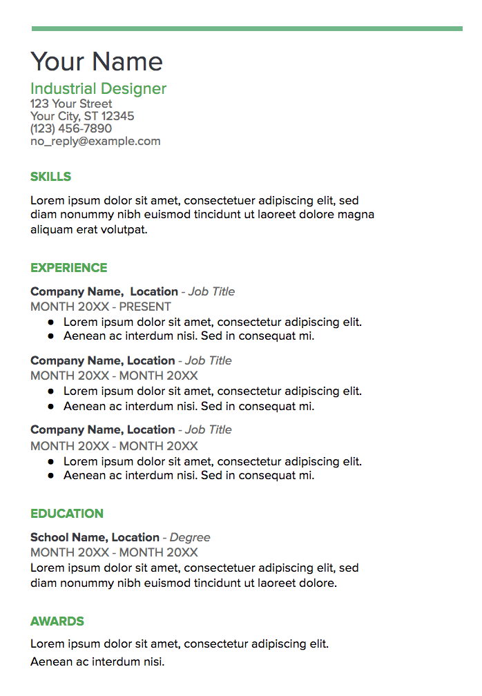
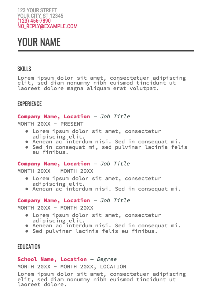
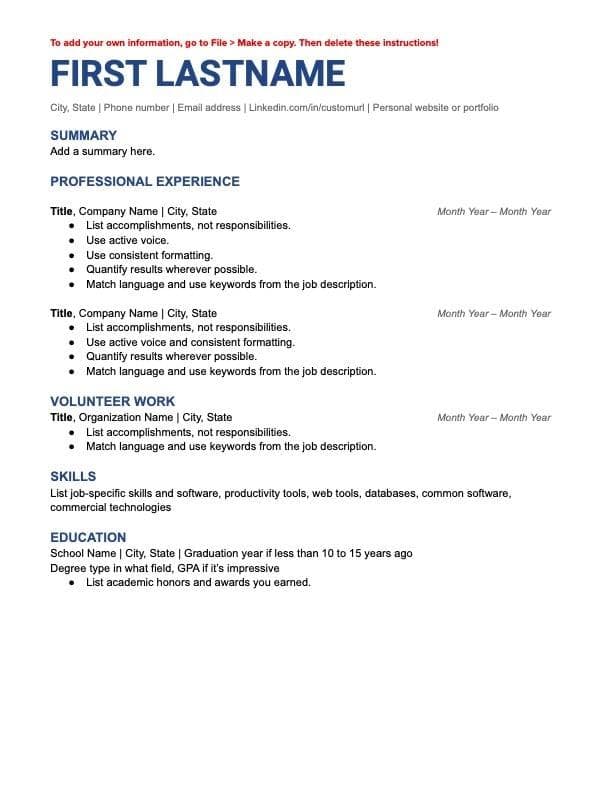
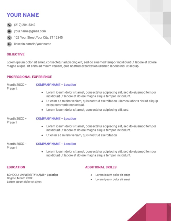
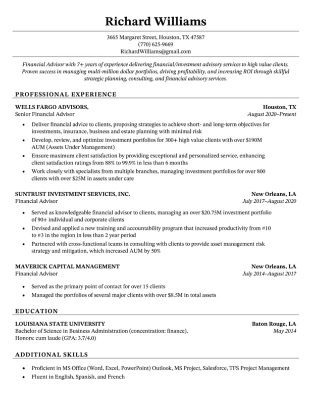
Creating a resume from scratch can be frustrating and tedious, especially when you have limited design experience. If you want a professional but interesting-looking resume, you're in luck. In this article, we'll explore different Google Doc resume templates you can use to nab your next job. 10 Google Doc Resume Templates 7. ResuStudio's Google Docs Resume Template 10. ResumeGenius' Chicago Resume Template Google Docs offers five templates with impressive design elements to help you portray professionalism and originality in your resume. These templates are included in this list, as well as five additional templates from other sources that you can easily edit in Google Docs. Even if you have the design all set, these templates provide formatting inspiration and fill-in-the-blank sections to ensure you don’t forget critical information, like your address or prior awards. Take a look at these Google Doc resume templates to choose one best suited for your desired role or to get some inspiration before designing your own. The Swiss resume template is primarily traditional in style, but the color and bold lines make it appear more modern and impressive. The dark lines above and below each segment organize your sections effectively, and the small lines above each section title add some unique style. What We Like: The simple color right below your name suggests you’re someone who pays attention to detail. This template is a solid option if you need a resume for a conservative role but also want to showcase some personality. The colors used for each headline and the two parallel columns with plenty of white space in between suggest that you're organized and creative. This resume template is a good option for high school or recent college graduates with less work experience since the template provides categories to showcase accolades and accomplishments outside the workplace. What We Like: This template allows young professionals to make up for their limited experience by highlighting their awards and projects. The formatting, with all the information left-indented in one column, looks clean and straightforward. This option is ideal if you’re applying for a corporate job but want to seem fresh and unique. What We Like: The color used in the coral template isn’t overbearing or immature but still spices up an otherwise basic resume. With the bold green line at the top of the page, this template conveys someone who’s spirited and artistic. Spearmint is a fantastic option for anyone applying for a creative role, such as a web designer or creative director. What We Like: The consistency of the title colors is appealing and polished. You’ll only want to choose the statement-making Modern Writer as your template if you’ve got a good reason for it — for instance, if you’re applying for a web developer role, the font (which looks a bit like code) makes sense. The bold pink and Source Code Pro font are less ideal for a traditional role, but Modern Writer is a good option if you’re applying for a role that applauds uniqueness. What We Like: The code-like font is a clever and unique touch that will capture the attention of recruiters. The Muse made its own resume template on Google Docs for users to plug their information into. The template is very straightforward and shows users exactly what information they should plug in and where in the template it should go. What We Like: The blue heading font is an eye-catcher. If you're willing to pay a few extra dollars for a sleek, classy, and professional resume template, then ResuStudio's template may be perfect for you. This template is also available in two pages for those further along in their career. Pro Tip: Make sure to remove the "References" section — employers know they can ask for references if interested, so a section like that only wastes valuable space. This template neatly divides each section of your resume, making it easy for a recruiter or employer's eye to follow along and read. This resume is excellent for anyone applying to a job at an office that is professional but enjoys a bit of creativity. What We Like: This template is well-organized and includes a section to highlight any awards you received throughout your career. This resume is clean, organized, and sure to make you stand out. Its distinct technical look is excellent for job seekers applying for opportunities in tech. Pro Tip: While the pink and purple font colors combined with the geometric patterns make for a unique resume, it's important to remember that these features can disrupt ATS scanners. Sometimes less is more, and choosing to forgo bright colors and unique patterns can make it easier for employers to focus on the actual content of your resume. This resume may be your best option if you're applying to a traditional office position or a Fortune 500 company. What We Like:This resume's simple design gives ample space to flaunt your experience, especially if you're a seasoned professional with a long career. You're ready to create an excellent resume to get your next big gig. Good luck with your job search!
10 Google Doc Resume Templates
1. Swiss
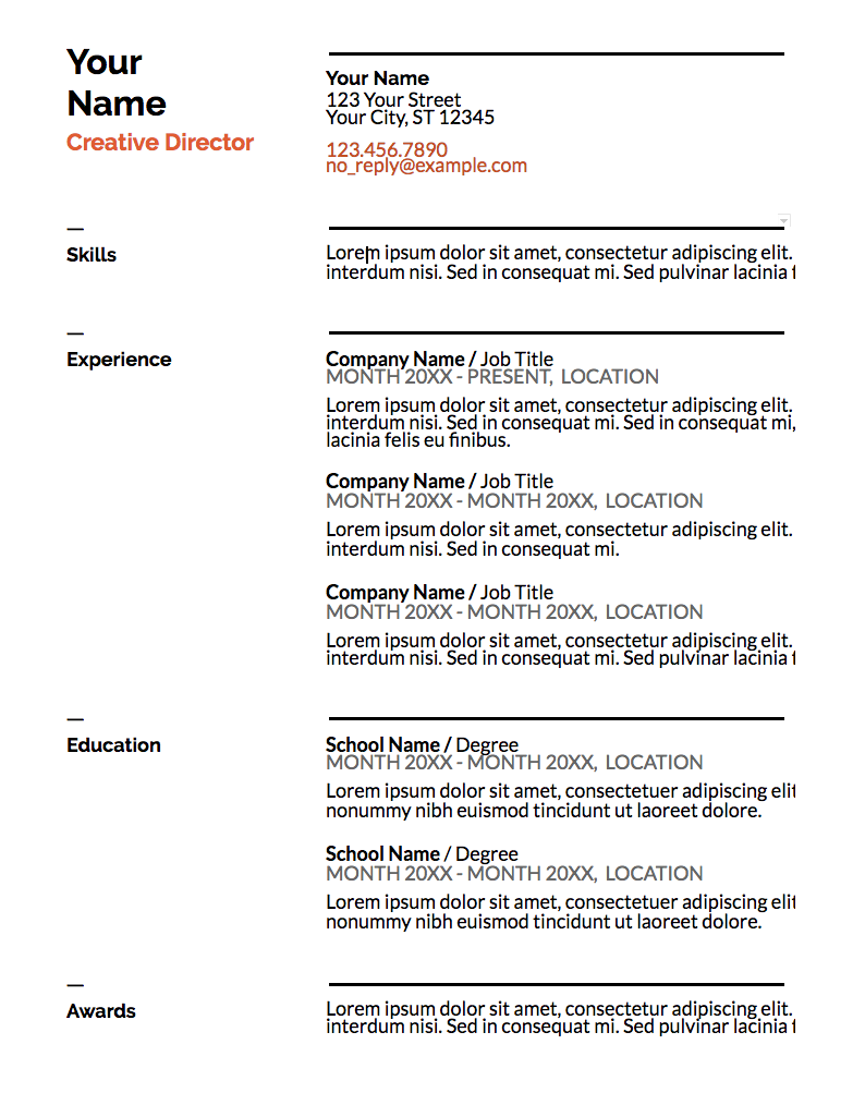
2. Serif
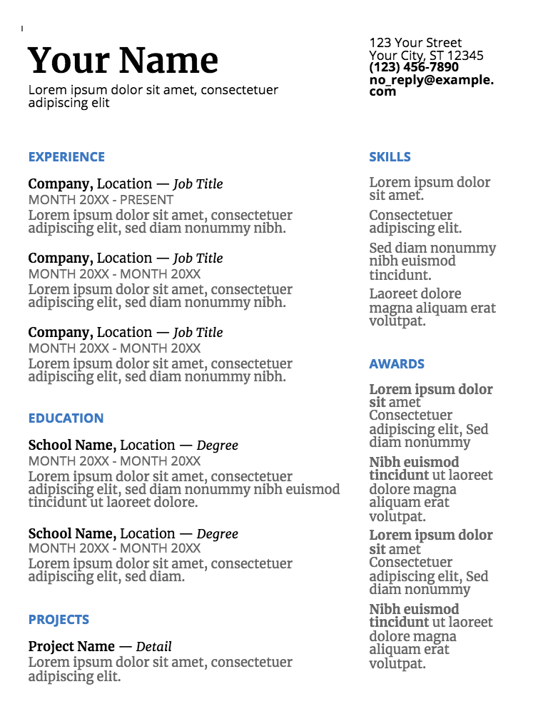
3. Coral
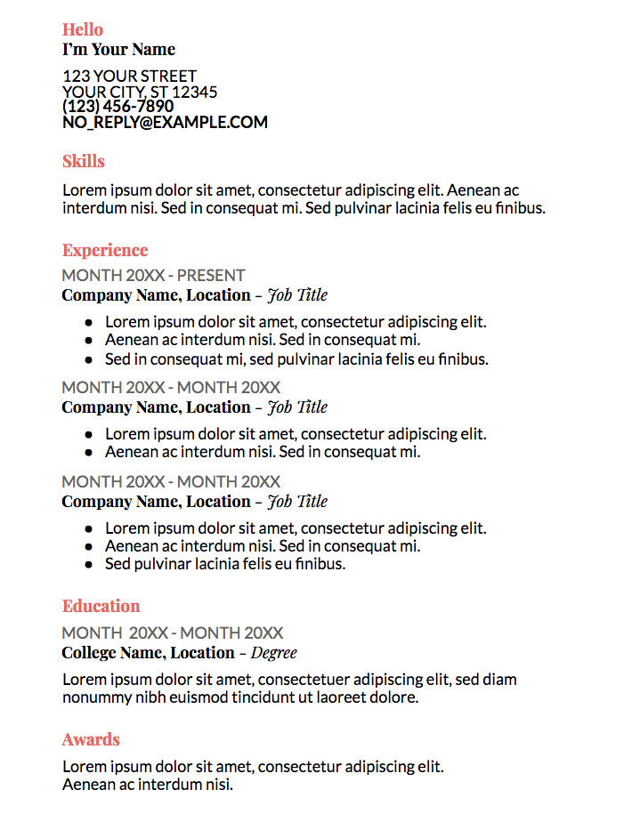
4. Spearmint
5. Modern Writer
6. The Muse's Resume Template
7. ResuStudio's Google Docs Resume Template
.jpg?width=633&height=634&name=ResuStudio%20Template%20(1).jpg)
8. Canvas Resume Template
.jpg?width=615&height=808&name=canva%20resume%20template%20(1).jpg)
9. Geometric Resume Template
10. Chicago Resume Template

 ShanonG
 ![12 Resume Templates [Free Download]](https://no-cache.hubspot.com/cta/default/53/4ec95757-585e-40cf-9189-6b3885074e98.png)


_1.jpg)
