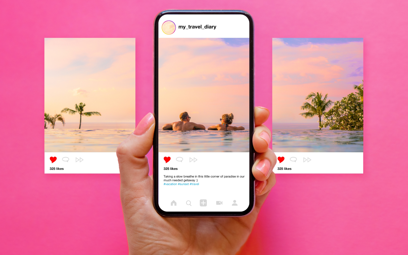
How To Create Engaging Instagram Carousels via @sejournal, @annabellenyst
Looking to get a little more engagement and have more impact on Instagram? A carousel may be exactly what you need. Here's how. The post How To Create Engaging Instagram Carousels appeared first on Search Engine Journal.

No Instagram strategy is complete without carousels.
Why? Because they’re powerful storytelling tools that generate outsized engagement among Instagram audiences.
But how do you make carousels effective?
Creating engaging carousels can help you increase your reach and engagement on Instagram and build a stronger relationship with your followers.
Plus, they’re easy to create if you have a plan and the right tips. Lucky for you, we have all the tips you need right here in this article.
Let’s get started.
Start With A Story
When designing an Instagram carousel, starting with a clear theme or story is crucial in helping you select images or videos that create a cohesive post.
Like any social media content, think about the message you want to convey and the content you want to showcase.
Consider your brand identity and target audience.
What content would resonate with your followers and align with your brand message? This could be a theme based on your industry, your brand values, or a particular aspect of your products or services.
For instance, if you’re a food blogger, you could create an Instagram carousel featuring a step-by-step recipe, with the first image being a shot of the finished dish.
Then, follow it up with images of each ingredient and each step in the cooking process. This way, your carousel tells a story while providing followers with value.
You can also showcase your products or services in action.
For example, if you run a fitness brand, create a carousel of exercises or workout routines featuring your products – like this apartment and travel-friendly workout routine from fitness influencer Kayla Itsines.
A fashion brand, on the other hand, might create a carousel showcasing different ways to style a particular item of clothing.
Another effective carousel format is to share behind-the-scenes content or personal stories, such as photos of your team at work, personal stories about your brand journey, or the inspiration behind your products.
This helps to humanize your brand and build a stronger connection with your followers.
Whatever you choose, the key is to pick a theme or story that is both relevant to your brand and interesting to your audience.
Content Order
The order in which you display your content is crucial to creating an effective Instagram carousel.
The first image or video is typically the most important, as it will set the tone for your content, capture your audience’s attention, and encourage them to swipe through the rest of the carousel.
It’s typically the first frame that people see (though occasionally, they may see the second frame first – so bear that in mind when creating your content).
Use subsequent images or videos to tell a story or provide additional context.
How you do this will depend on your carousel’s goal. What is the one thing you want a follower to “leave” with?
No matter what type of content order you choose, it should create a logical flow between slides, making it natural for audiences to swipe through.
Here are some examples of common Instagram carousel structures:
Narrative Structure
What It Is: The images are arranged logically to tell a story or share a message. When To Use It: This method can be particularly effective for product launches or brand campaigns where you want to build excitement and engagement around a specific theme. It’s great for explaining specific concepts or breaking down stories linearly. This is why list style carousels are so popular. Why You Use It: Narratives and stories get followers emotionally engaged in the content.Here is a great example of narrative structure from Later.
Random Structure
What It Is: The images have no specific narrative or message. When To Use It: This structure is ideal for showcasing various products or services or sharing behind-the-scenes content that doesn’t necessarily follow a specific sequence. Why You Use It: Not only can a random structure be fun, but curiosity and spontaneity can be extremely helpful, particularly if you want to build up some buzz around an event.This carousel from National Geographic is a nice example of a random structure.
Comparative Structure
Still trying to figure out how to present your images? Consider the visual appeal of the images and how they will look when viewed as a group.
You can alternate between different image types, such as close-ups and wide shots, or use consistent color schemes or filters to create a cohesive look and feel.
What It Is: The images are offered in pairs. Or half of the images will differ from the other half. When To Use It: Comparative structure is excellent for demonstrating before-and-after, us-versus-competitors, or with-and-without. Why You Use It: Choose this structure to show how your product solves a problem or emphasize the impact of an experience.Here is an example of a comparative carousel showing before and after visuals from HGTV.
Use Visuals That Say The Right Thing
An engaging Instagram carousel starts with aesthetically appealing, eye-catching, high-quality images or videos. These will help grab your audience’s attention and encourage them to swipe through the entire carousel.
It’s important to choose visuals that have exceptional clarity and decent resolution, though you should also bear in mind that recent trends show audiences value authenticity over perfection.
Here’s an example of a carousel from Airbnb that leverages beautiful imagery to pique the attention of audiences.
You should also consider using consistent color schemes or filters. This will help create a cohesive sense of visual unity across the entire carousel and make sure your brand is present in the content.
In short, you want the carousel to feel like an experience, not just a collection of pictures.
Your Instagram carousel plan should also include the type of visuals you want to showcase in it.
Will you only have product images and videos? Would lifestyle shots, behind-the-scenes footage, or user-generated content (UGC) be more effective?
Another option is to mix up the type of content in each carousel to keep things interesting and varied.
You could alternate between videos and images and try out different approaches, but the key here is to choose visuals that align with your brand message and resonate with your audience.
Once you’ve selected your content, you can think more about the composition of the carousel itself and how you’ll order it. You might want to experiment with different layouts, such as grids or collages, to create a unique and striking post.
Finally, keep the context of your post in mind. Instagram users scroll quickly through their feeds, so you’ll need bold, bright colors or to incorporate text or graphics that interrupt this habit and stop them long enough to swipe and consume the content.
Text Overlays, Captions, And Music
Text, captions, and now even music are important aspects of creating engaging and effective Instagram carousel content.
These components work together to convey your message, build excitement around your products or services, and encourage your audience to take action.
Captions
First, keep your captions concise and engaging. You want to capture attention quickly and communicate your message efficiently, so use short, punchy sentences and clear language. If it makes sense, include some emojis to catch people’s eye.
Second, consider the tone of your captions and how they align with your brand identity.
If your brand is playful and lighthearted, your captions should be the same: fun, humorous language. Use an informative and educational tone if your brand is more serious or professional.
Third, use your captions to contextualize the story or experience you present in your images. This will help bring your audience along for the journey and encourage them to engage with your brand.
Finally, include a call to action (CTA) to increase engagement and drive more traffic to your website or other digital channels.
This could be as simple as encouraging your audience to swipe through the carousel, asking them a question, or prompting them to visit your website for more information.
Text Overlays
Your use of text goes beyond captions. Text overlays can be highly effective in adding context and additional information and can enhance the visual impact of your carousels.
Here are a few tips:
Choose a legible and visually pleasing font that matches your brand aesthetic. Remember that users will be viewing it on small mobile screens. Keep your text concise and to the point. Instagram users scroll quickly through their feeds, so your text needs to be easy to digest and understand. Only include essential information and ensure that each overlay only has one job. For example, to provide more information about a product or provide context to a narrative. Ensure that overlay text doesn’t obscure important parts of your images and is visually balanced with the other elements in your carousel.Don’t make the mistake of thinking of text overlays as extra ad space, however. Use them strategically to add value to your content.
For example, you may want to use text overlays to provide additional context or details about your products or services or a CTA that encourages your audience to engage with your brand.
Music
A newer feature to the platform, adding music to Instagram carousels has become a dynamic way to enhance engagement with your content.
We know that music can evoke emotions, set the tone, and add another layer of storytelling to your content. However, it bears mentioning that business accounts are typically more restricted in the songs that they can use.
Here are a few tips for effectively adding music to your carousels:
Choose music that aligns with the theme or message of the content within your carousel. Leverage music that reflects your brand’s personality and tone. Where possible, utilize music that can enhance the narrative of your carousel. If you’re (legally) able to, engage your audience by including songs that are trending or popular.By thoughtfully integrating elements like text, captions, and music, you can take your Instagram carousels to a whole new level and significantly enhance their performance and engagement.
Design Instagram Carousels With Mobile In Mind
Instagram is primarily a mobile app, so you must prep and design your content for mobile users.
If you’re designing an Instagram carousel featuring a long infographic, for example, break it down into several slides so that it’s easier for your audience to view on a mobile screen. You might also need to use larger text or adjust the font size.
But it’s more than that.
You should consider the quality of the images you’re using and how they will appear to a mobile viewer. Make sure that the resolution and specs fit with Instagram’s guidelines and that the details of the image will be viewable on mobile.
You may even want to consider arrows, buttons, ribbons, or other elements that run off the right side of the image to push users from one image to the next.
Conclusion
Once you’ve posted your Instagram carousel, engage with your followers by prompting them to like, comment, or share your post.
Encourage them to leave comments or questions about the product they see or the story you’ve presented.
Just remember to respond to these comments promptly and continue the conversation by answering questions or addressing concerns.
And if you follow the tips we’ve provided for you here, there will be many of them!
More resources:
How To Create Your Instagram Content Plan 8 Engaging Infographic Types & How To Create Them (+ 5 Free Tools) Social Media Marketing: A Complete Strategy GuideFeatured Image: Kaspars Grinvalds/Shutterstock

 Konoly


