Pogo-Sticking in SEO: What It Is & What to Do About It
It’s a situation dreaded by some SEOs. They believe this user behavior is tracked by Google and results in websites being penalized. But is Google actually penalizing pogo-sticking? And should you really worry about it? In this article, you’ll...

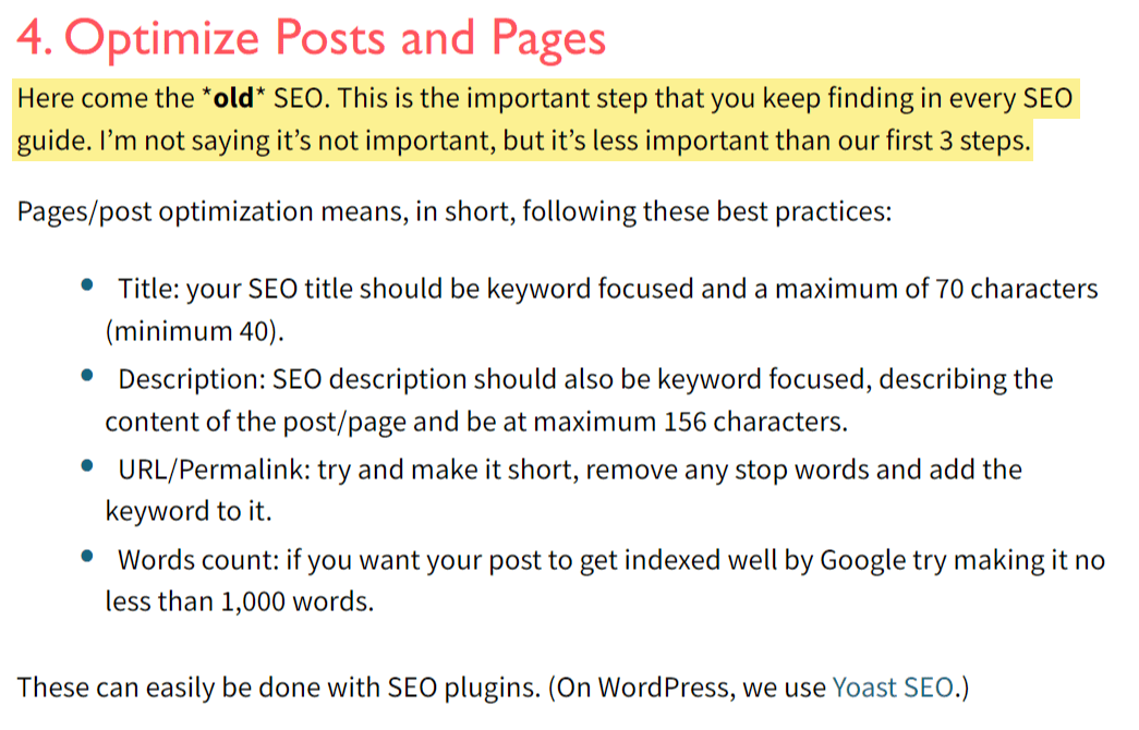
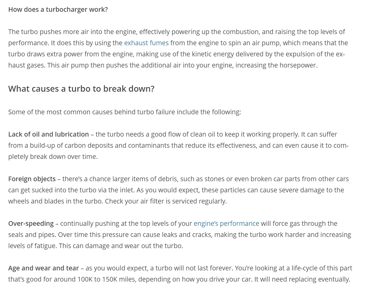
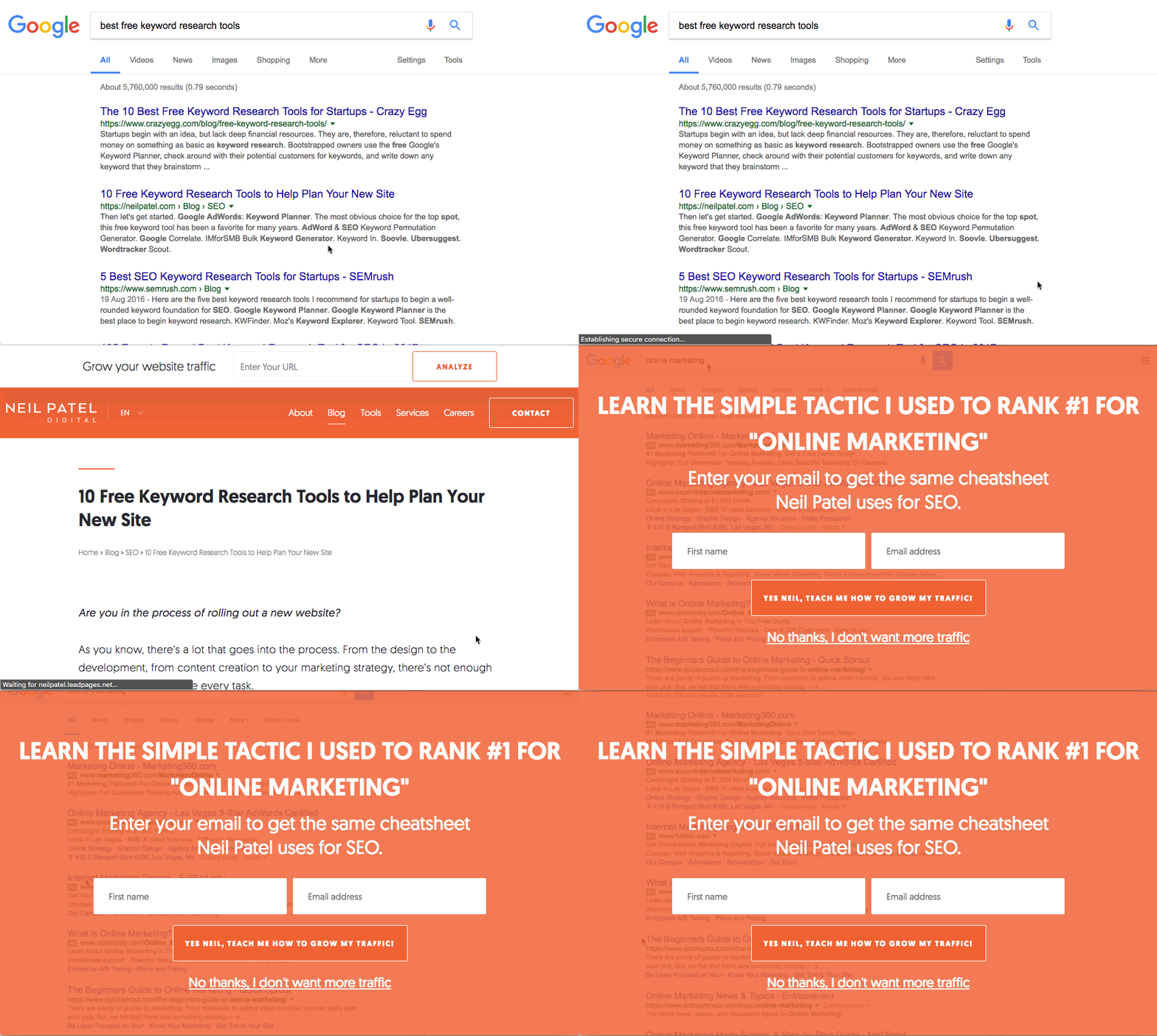
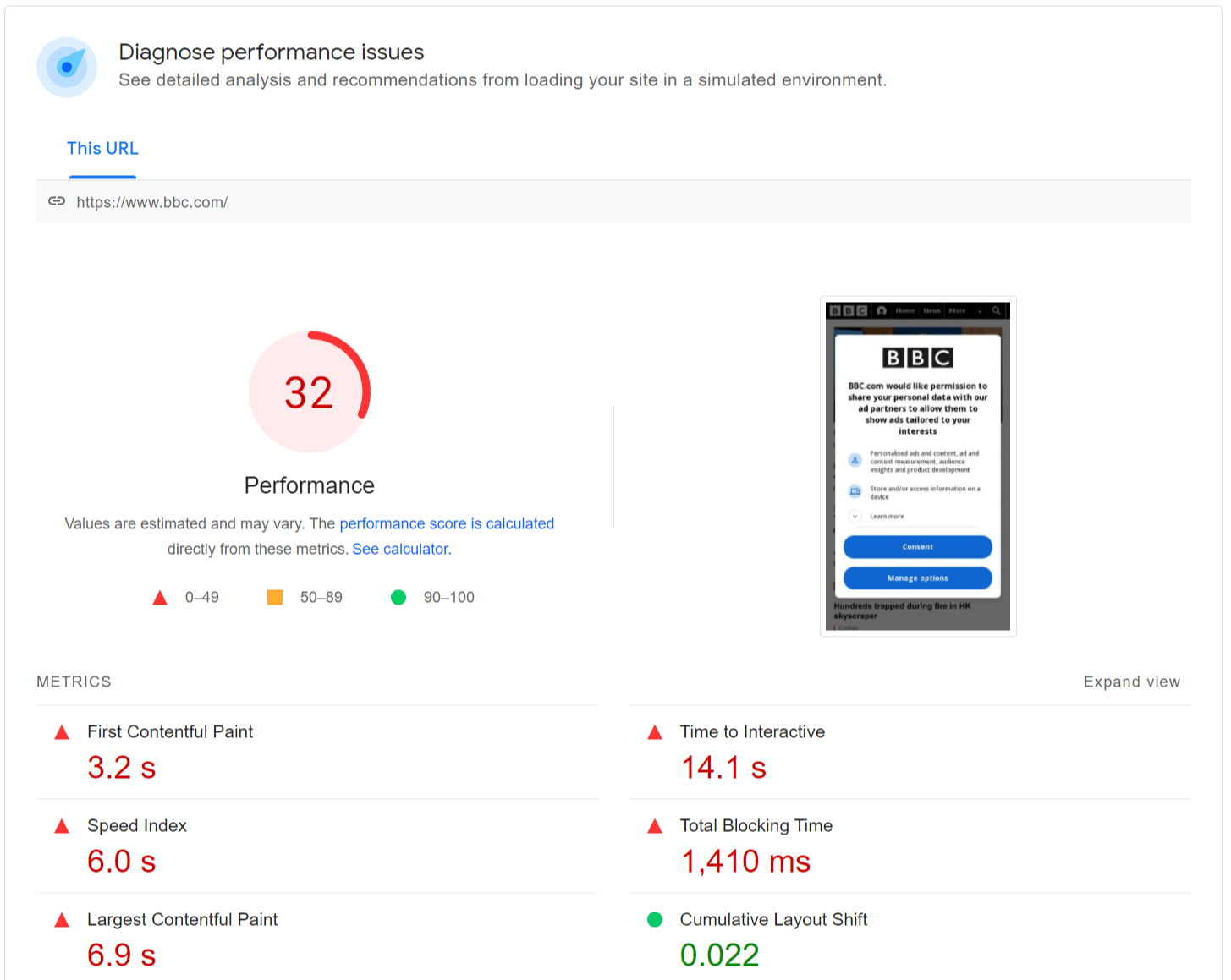
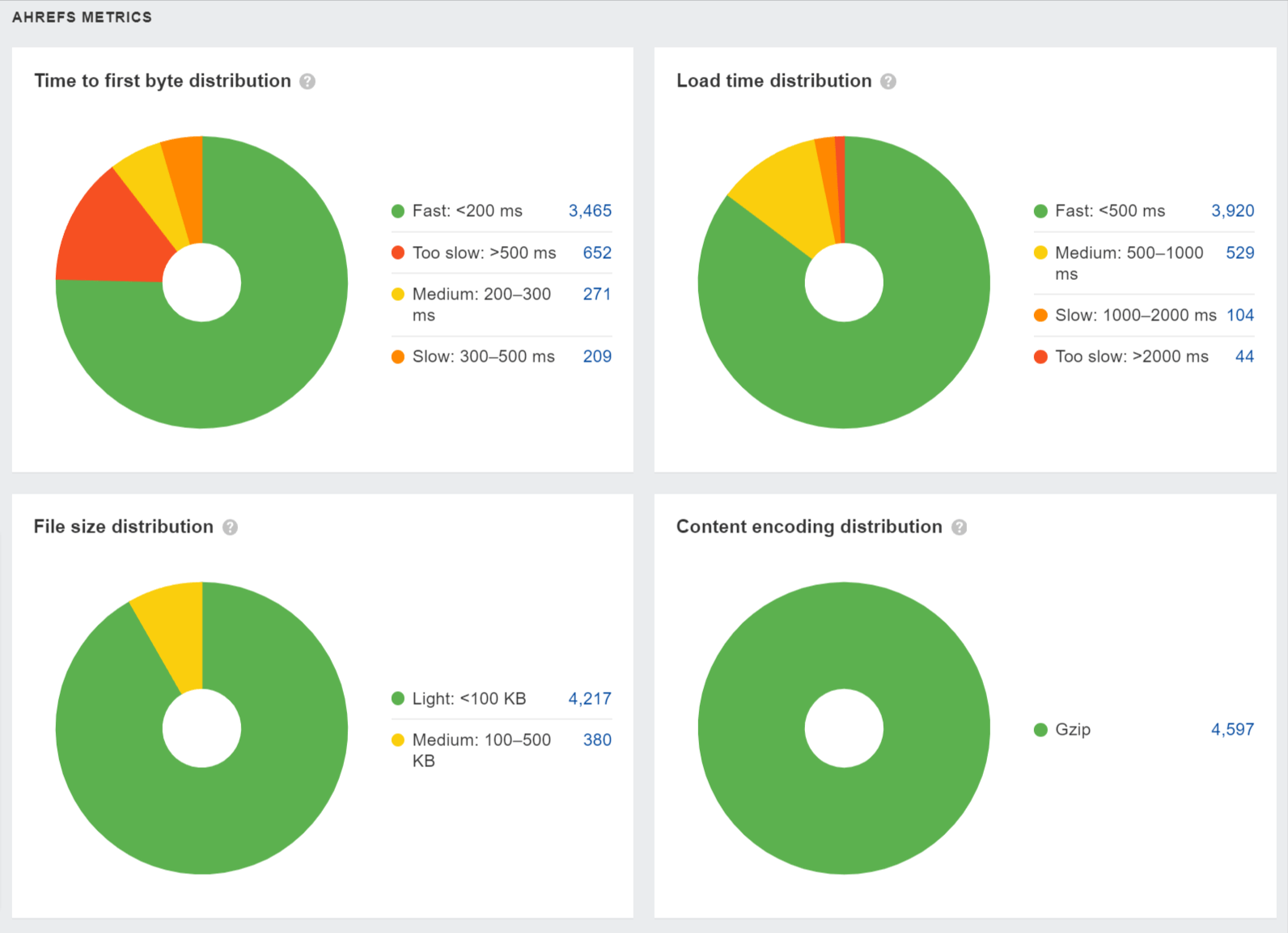
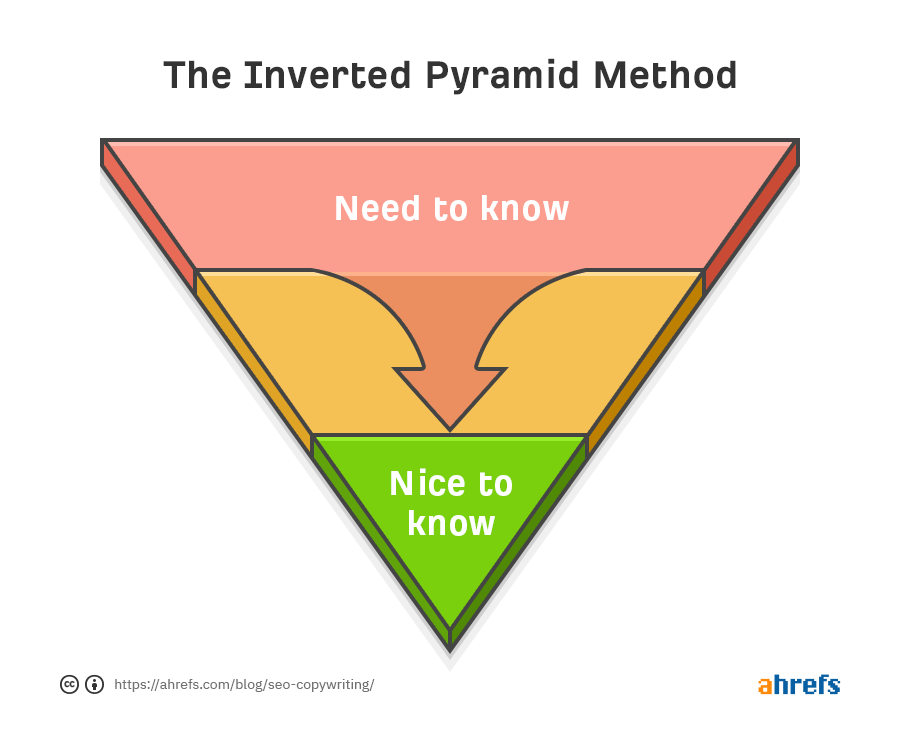
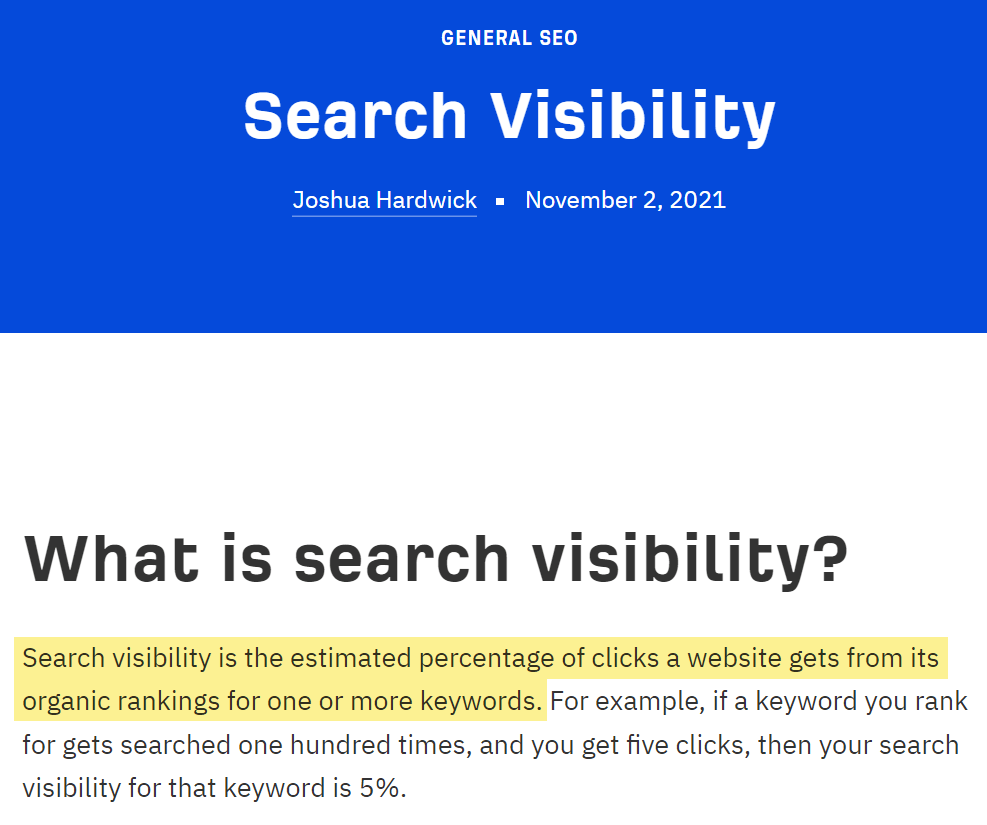
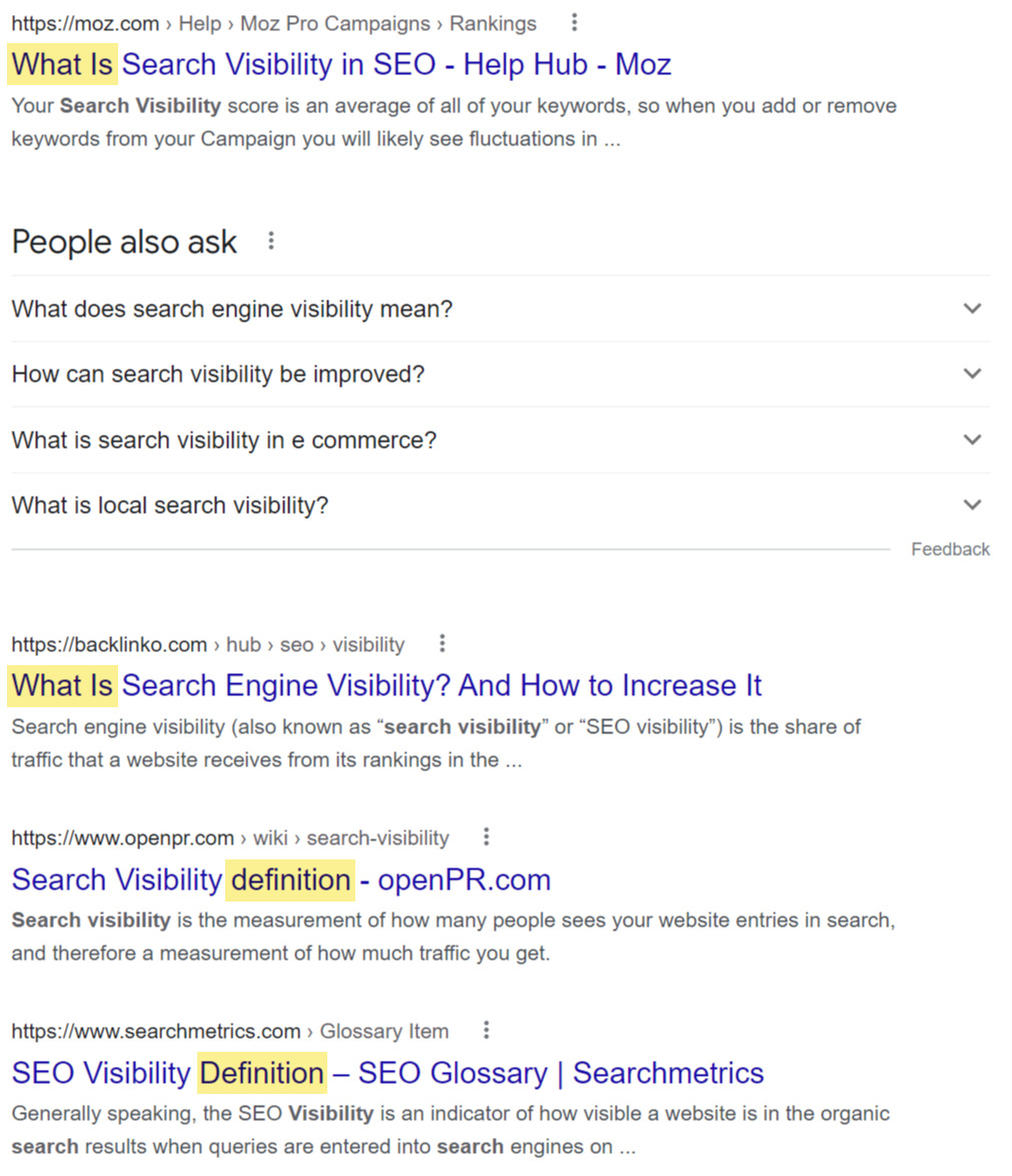
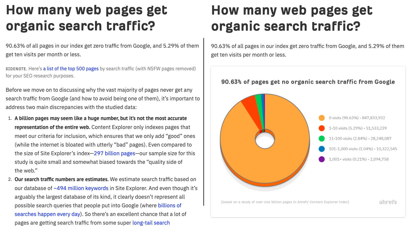
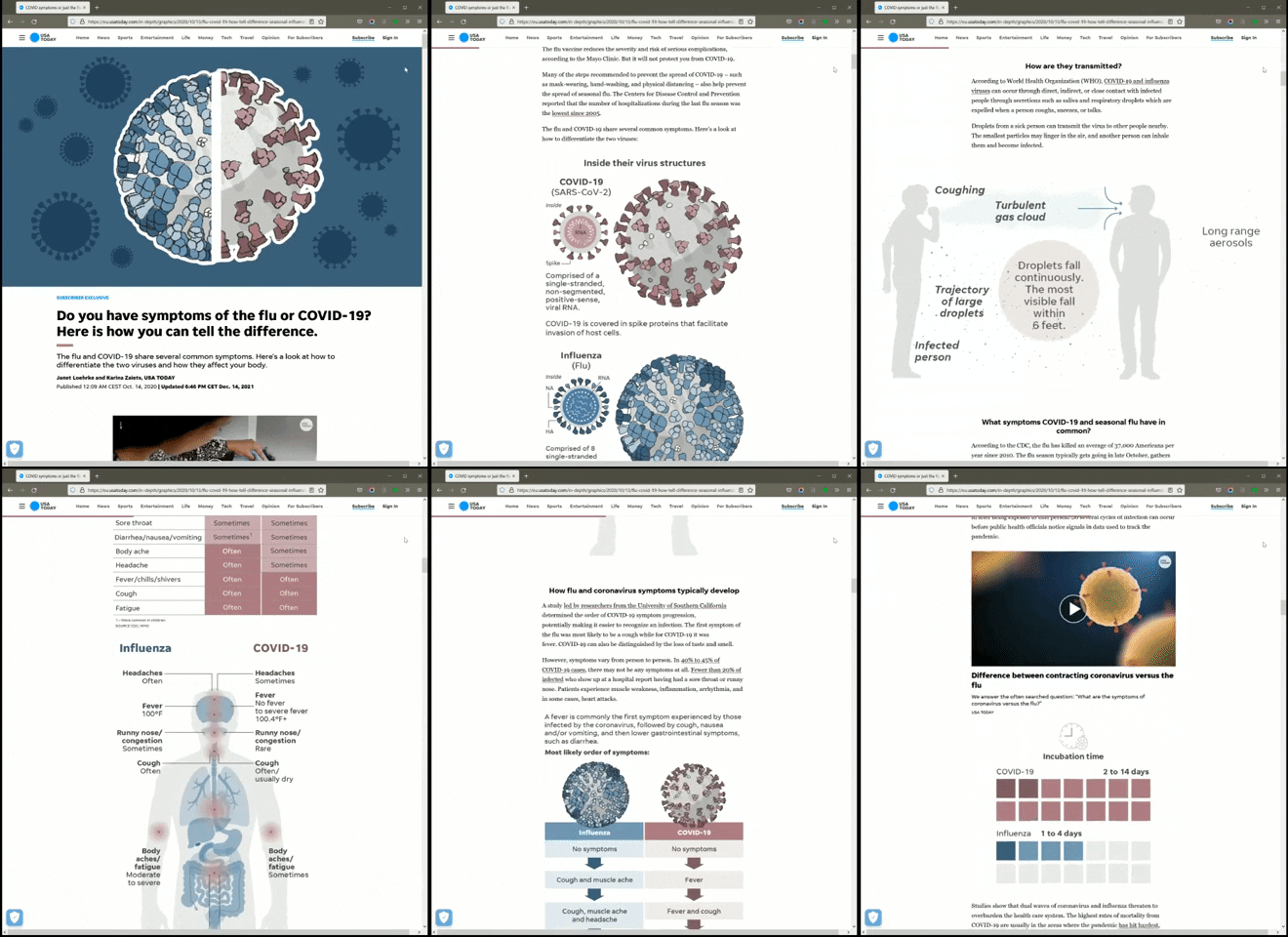
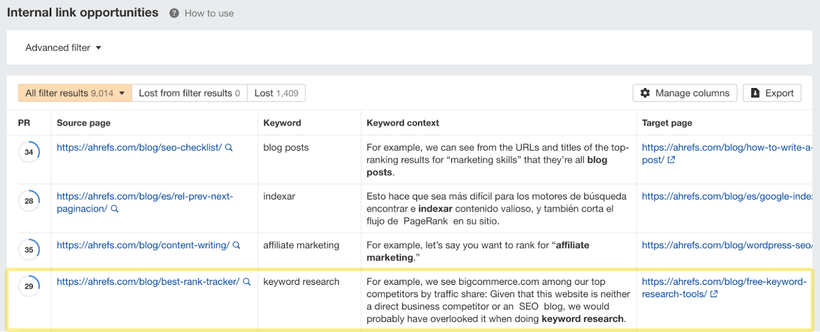
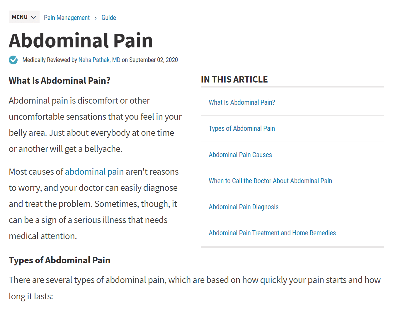
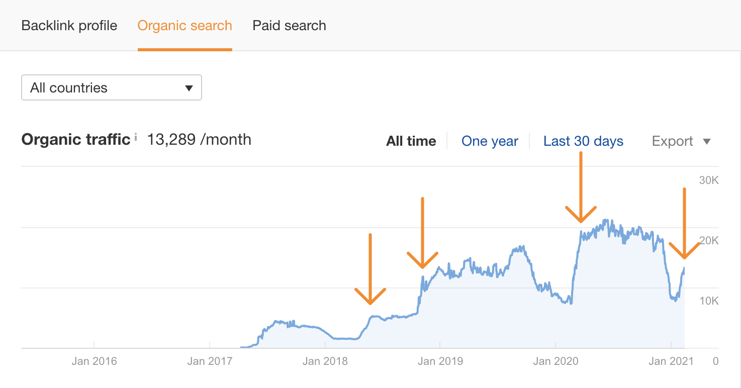
Pogo-sticking is an SEO term used to describe a situation where a searcher quickly navigates back and forth between pages in search results. It’s a situation dreaded by some SEOs. They believe this user behavior is tracked by Google and results in websites being penalized. But is Google actually penalizing pogo-sticking? And should you really worry about it? In this article, you’ll learn the following: First, let’s make things a bit clearer and draw the line between pogo-sticking and bounce rate, as people often get them confused: Recommended reading: What Is Bounce Rate? How to Interpret and Work With It There are many possible causes of pogo-sticking. Do note that not all of them are caused by poor content or bad UX (user experience). In this scenario, a searcher enters a site that overpromises and underdelivers. In other words, the searcher comes across clickbait content. We’ve all seen such content on the web, and we all instantly regret clicking on them: “You’ll Never Believe This (…),” “Do This One Thing for 6 Weeks and (…),” “They Don’t Want You to Know This (…),” and so on. And when we do, we feel tricked, so we “pogo” back to the SERP. To illustrate, let’s assume you want to check what the internet has to say about the opinion that SEO is dead. You come across something like this: OK, let’s learn about the “new SEO” then. So SEO seems to be dead. This sounds like big news. And instead of a 10-step course on “old SEO,” this site offers a five-step course on “new SEO.” But to your surprise, you discover that “old SEO” is not that dead after all. That’s clickbait—you’d want to leave as soon as possible and never come back. In other words, the searcher can’t find what they are looking for even though the information may actually be there. The problem is the information is buried under tons of text, obscured by confusing language, or unavailable to some users. Here’s an example. This screenshot comes from a webpage that was one of the top results for “turbocharger failure symptoms.” We’ve got a wall of text of probably valid information. But there’s no mention of the symptoms. Well, the symptoms we want to see are actually there but way lower on the page. Before you can get to the symptoms, you are expected to read about how a turbo works and a list of causes of a turbo breakdown. Since there is no immediate solution to the query, the searcher simply goes back to the SERP to try some other page. A similar thing happens when the content is only available to signed-up users or put behind an “email wall.” The website may be good and offer the information the searcher needs. But since it’s not immediately available, the searcher returns to the SERP. In this scenario, the searcher gets immediately frustrated (or suspicious) by how the site looks and works, so they return to the safety of the SERP. Let’s see an example. Here, not only does the website load slowly, but we also get a pretty annoying interstitial pop-up. Poor UX can be caused by a number of things: Pogo-sticking may also happen when the searcher is simply browsing around; they may not intend to stay long on one particular page. They could be looking for some inspiration, comparing prices, or trying to recall a site they saw the other day. It is irrational to penalize these sites just because the searcher was quickly looking around for something that could catch their attention. To further illustrate the complexity of scenarios that can lead to pogo-sticking, let’s consider this situation. Let’s say someone told you that you can put WD40 on car door seals in winter to prevent them from freezing. Logically, you’ll want to verify that information. So you Google it. So… which website offers the best advice here? Just by reading the descriptions under the blue links, you can see the searcher gets different answers. This may “trigger” pogo-sticking but for different reasons. And sometimes, that could be kind of Google’s fault. Now for the big question: Is pogo-sticking a ranking factor? Tl;dr: Pogo-sticking is almost certainly not a ranking factor. A few years back, John Mueller confirmed that in a Google Webmaster Central hangout, saying: We try not to use signals like that when it comes to search. So that’s something where there are lots of reasons why users might go back and forth, or look at different things in the search results, or stay just briefly on a page and move back again. I think that’s really hard to refine and say ‘well, we could turn this into a ranking factor.’ So I would not worry about things like that. When we look at our algorithms overall, when we review which algorithm changes that we want to launch, we do look into how users react to these changes. But that’s something we look at across millions of different queries, and millions of different pages, and kind of see in general is this algorithm going the right way or is this algorithm going in the right way. But for individual pages, I don’t think that’s something worth focusing on at all. From an SEO perspective: not necessarily. Since there can be many reasons why searchers may jump between sites, Google almost certainly doesn’t treat pogo-sticking as a ranking factor. So don’t worry about it specifically. From a business perspective: It may be something to look into. Ranking factors or not, you probably want your readers to stick around longer than a few seconds and engage with what you offer. Here are a few tips that can help you help your readers. Not every website has to participate in design contests. If you want to provide the best experience for the reader, just keep things simple with minimum distraction. Everything that is not the content the searcher is looking for should support the reading experience. In practice, this means it should stay out of the way. A direct way to improve your site’s UX is to fix the UI (user interface). Here are some ideas: Obviously, nobody likes to wait for a site to load. But more importantly, some people will just leave if loading takes too long or if your site is slow in general. Some people will likely avoid slow pages if there are competitors that provide content faster. And in this competition, every second matters. Moreover, if you want your content to rank high in SERPs, you need to provide users content as fast as possible. That’s because one of Google’s ranking factors is site speed. You can check the loading time for any webpage using services like PageSpeed Insights. For checking multiple webpages at scale (even for third-party websites), you can use Ahrefs’ Site Audit. Apart from showing metrics like Time to First Byte, it also supports Core Web Vitals (through Google’s PageSpeed Insights API). The numbers in blue indicate the pages that fall into the categories shown in the reports. Clicking those numbers will direct you to a report showing those pages with additional data. The inverted pyramid is a tried and tested journalistic method that puts the “need to know” before the “nice to know.” Following this rule will help your readers find information quicker. It will certainly help the website about turbocharger failure symptoms, which we discussed earlier. For example, if you’re targeting a keyword where searchers are primarily looking for a definition, you’ll probably want to lead with that. That’s what we did for our article on search visibility. This is because it is clear from the SERP that most searchers want a definition: Nobody likes a wall of text, especially online where most people skim content. Use these best practices to make your content easier to digest: You should also consider using visual elements to break up text where relevant, especially in educational content. In fact, one study found that people following directions with text and illustrations do 323% better than people following directions without illustrations. To illustrate: Which version of the below article is more likely to get the reader’s attention? The one with the graph or the one without? Below is another great example of how to captivate the reader’s attention with visuals while making the content easy to skim and comprehend. Notice how the form of this article follows its function: telling the difference between the flu and COVID-19. Some search queries are meant to solve a single problem fast. Others are the beginning of a learning journey about a complex topic. And usually, one single piece of content can’t possibly cover such a topic. For these kinds of queries, you can create a whole series of content and interlink it to guide the user in the right direction. For example, this guide on SEO for startups is over 4,500 words long. But even though this is a rather lengthy content format, we can’t possibly explain everything there is to know about the topic. However, we can link to articles that explain certain problems of SEO in detail, such as keyword research or technical SEO. You can automate the process of finding internal linking opportunities to a large extent for free using Ahrefs Webmaster Tools. Just sign up, crawl your site with Site Audit, and go to the Internal link opportunities report. This will show you relevant internal linking opportunities across your site. For example, you can see in the screenshot below there’s an opportunity to link the words “keyword research” in our post about the best rank trackers to our post on free keyword research tools. E‑A‑T stands for expertise, authoritativeness, and trustworthiness. It comes from Google’s Search Quality Rater Guidelines, a document used by human quality raters to assess the quality of Google’s search results. E‑A-T is a concept from the SEO world. But demonstrating expertise, authoritativeness, and trustworthiness is always a good idea when it comes to content. It’s a signal to the user that your content is worth reading (or watching). It’s even more important if your content revolves around YMYL (Your Money or Your Life) topics, such as money, health, and safety. But what does it mean to demonstrate E‑A-T exactly? To illustrate my point, which of these pages is a better source of information for the query, “What to do when your stomach hurts?” The top one or the one below? There are a few more things you can do to demonstrate E‑A-T that are more about SEO than good content creation practices. If you want to learn more, check out our article on E‑A-T and why it’s important for SEO. Freshness is more important for some queries than others. After all, who wants 2011’s best headphones when they can have this year’s best? A snapshot of the query “best headphones.” Note the year in most of the titles. Updating your content every year (or more often) to serve fresh content is a good idea if that’s what your readers expect. This tactic is something that you can repeat each year, just like what Digital Trends magazine does: Digital Trends has regularly updated the headphones ranking every year since 2016. At Ahrefs, we update content regularly too. Just look at the organic traffic spikes after we repeatedly refreshed one of our blog posts: Don’t worry about pogo-sticking for SEO reasons. According to John, the so-called pogo-sticking is not a ranking factor. His statement makes total sense when you consider the possible reasons for searchers to jump back and forth between SERPs and websites. If you really want your users to stick around longer on your website, try one of the tips listed above to make your content more engaging. Some of those tips may even help you rank higher in the SERPs. Got questions? Ping me on Twitter.Clickbait content


Buried or locked information

Poor UX
The searcher is just browsing around

Other reasons

Fix site UX. Also on mobile
Keep your site fast
Use the inverted pyramid method
Use clear formatting and visual elements
Use relevant internal links
Demonstrate E‑A-T

Keep content up to date


Final thoughts

 Tekef
Tekef 


