The Impact of Color Psychology on Signage Design
As individuals, our innate attraction to colors influences us in various ways. This inherent connection to colors forms the basis of color psychology, a fundamental aspect in shaping effective marketing and branding strategies. The strategic choice of colors in...
As individuals, our innate attraction to colors influences us in various ways. This inherent connection to colors forms the basis of color psychology, a fundamental aspect in shaping effective marketing and branding strategies. The strategic choice of colors in signage design can impact a business’ success. The profound influence of color psychology in signage design provides valuable insights on leveraging this knowledge to enhance your business strategies.
Red – The Powerhouse Color
Red is widely recognized as one of the most powerful colors in the spectrum, symbolizing energy, passion, power, and excitement. Its vibrant nature evokes a sense of dynamism and urgency. However, an excessive use of red can inadvertently create an atmosphere of urgency that might deter specific customers from seeking a more relaxed dining experience. Businesses should balance leveraging Red’s persuasive qualities while ensuring it resonates positively with their target audience.
Blue – The Trustworthy Color
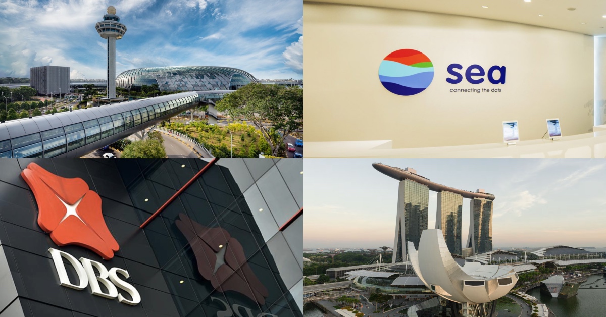
Blue represents trustworthiness, stability, serenity, and intelligence. It is a color that resonates with honesty, reliability, and professionalism. Financial institutions and healthcare facilities frequently choose blue for their branding due to its ability to evoke trust and security in their clients and patients. Moreover, this color is associated with logic, communication, and wisdom, making it an ideal choice for conveying a sense of credibility and expertise. The calming effect of blue on individuals is well-documented, which explains its everyday use in environments where a sense of peace and clarity is essential, such as emergency exits and informational signage.
Green – The Eco-Friendly Color
Green is a color that embodies the essence of nature, health, growth, balance, and harmony. It symbolizes freshness and renewal, evoking feelings of tranquility and vitality. Its association with eco-friendliness has led many sustainable businesses to incorporate green into their branding strategies, reflecting a commitment to environmental stewardship. Moreover, green’s calming effect on the eyes makes it a popular choice for outdoor signs, providing a sense of serenity and connection with the natural world.
Yellow – The Attention-Grabbing Color
Yellow is a vibrant color that symbolizes happiness, optimism, warmth, and attention-grabbing qualities. Its bright and cheerful nature makes it popular for conveying positive messages. In addition to its use in warning signs and cautionary messages due to its visibility, yellow can also be strategically employed to highlight essential details on signage without overwhelming the viewer. The versatility of yellow in communication allows it to evoke a sense of joy and energy while effectively drawing attention to essential information.
Purple – The Creative Color
Purple is a color that symbolizes creativity, luxury, royalty, and sophistication. It’s a hue that exudes elegance and creativity, making it a choice for beauty and fashion brands. However, it’s important to note that an overabundance of purple in a design can sometimes give off a vibe of being outdated or unapproachable. It’s all about finding balance when incorporating this regal color into your visual identity.
Color psychology plays a role in signage design, influencing customers’ behavior and buying decisions. By understanding the meanings behind different colors and how they affect people’s emotions, businesses can use signage to create a powerful brand identity that resonates with their target audience. When designing your next sign, consider the impact of color psychology on your customers and choose colors that will best represent your brand.

 ShanonG


