The Unexpected, but Totally Game-Changing Detail That’s Transforming Zuma Beach House
A peek behind the curtain. The post The Unexpected, but Totally Game-Changing Detail That’s Transforming Zuma Beach House appeared first on Camille Styles.
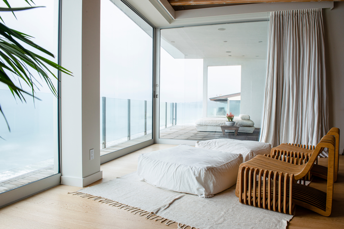
When Camille renovated her Austin home two years ago, window treatments were one of the unexpected, but totally game-changing details that truly transformed the space. Well, perhaps not entirely unexpected—window treatments play an important role in the look and feel of any room. But they can also be difficult to navigate. Because when it comes to selecting window treatments, the options abound. Why go with sheer shades when you can opt for blackout? Do you invest in blinds or pick curtains? So, when it came time to select the window treatments for Zuma Beach House, Camille knew she’d be teaming up with Graber again to help her nail the final look.
Because we love a good behind-the-scenes, we’re walking you through the Zuma Beach House renovation from start to finish. We’re getting into the nitty gritty of choosing window treatments that match the aesthetic and support the needs of every room. Today, we’re kicking off the deep dive with a look into how Camille is building the vision for her Malibu home. Read on for all the inspiration and the mood boards guiding her design decisions, and follow her Pinterest board here. Let’s get into it.
Inspiration image above by Teal Thomsen at Ashley Merrill’s beach house.
Subscribe
Design obsessed?
Sign up to get monthly #ZumaBeachHouse updates delivered straight to your inbox.
Thanks for Signing Up!
Oops!
Looks like you’re already signed up or your email address is invalid.
Oops!
Looks like you unsubscribed before click here to resubscribe.
Let’s Recap: What’s The Vibe You’re Trying To Create For Zuma Beach House?
The design theme I’ve given the project is (get ready for it)… “Minimalist Beach Ranch.” If it wasn’t a thing before, it is now!
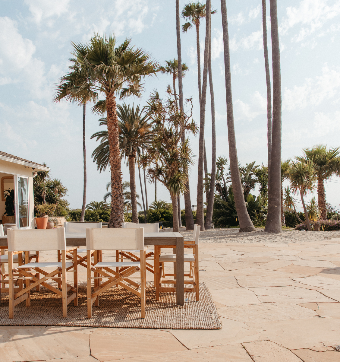
Our architect, Doug Burdge, designed the floor plans to make the most of the natural environment, whether it’s shifting the orientation to see the full view of the ocean, or adding protection to block the wind. To create the casual, warm aesthetic we’re envisioning for Zuma Beach House, we’ll be leaning into a lack of ornamentation to create a sense of calm. Decorative details will be kept to a minimum, allowing the clean lines and lush nature outside the windows to take center stage.
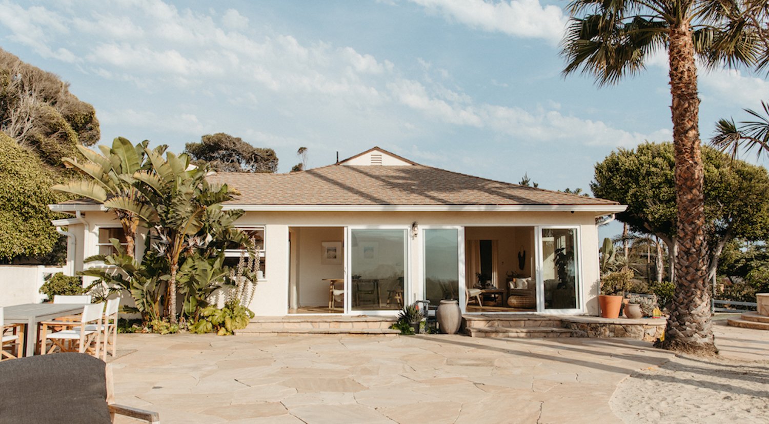
In keeping with the ranch-style qualities of the current house, we’re sticking with a one-story layout with an open floor plan, large windows, and sliding glass doors. And the “beach” comes into play with white walls, vaulted shiplap ceilings, planked cabinetry, and overall casual vibes.
No surprise that I’m embracing a bit of minimalism here as I do with most all of my design projects. My goal is to include just enough interesting elements and thoughtful details while avoiding anything overly trendy. I want it to feel timeless. The architecture and design will create a simple canvas, and then we can layer on interest with furniture, textiles, and decorative details.
I loved working with Graber on the renovation of our Austin house a couple of years ago. It was a seamless process, from using the online Graber Visualizer that lets you try out window treatments in your own space virtually, to working directly with a Graber Expert to walk through the entire process. Let’s just say I wouldn’t want to do a renovation without them!
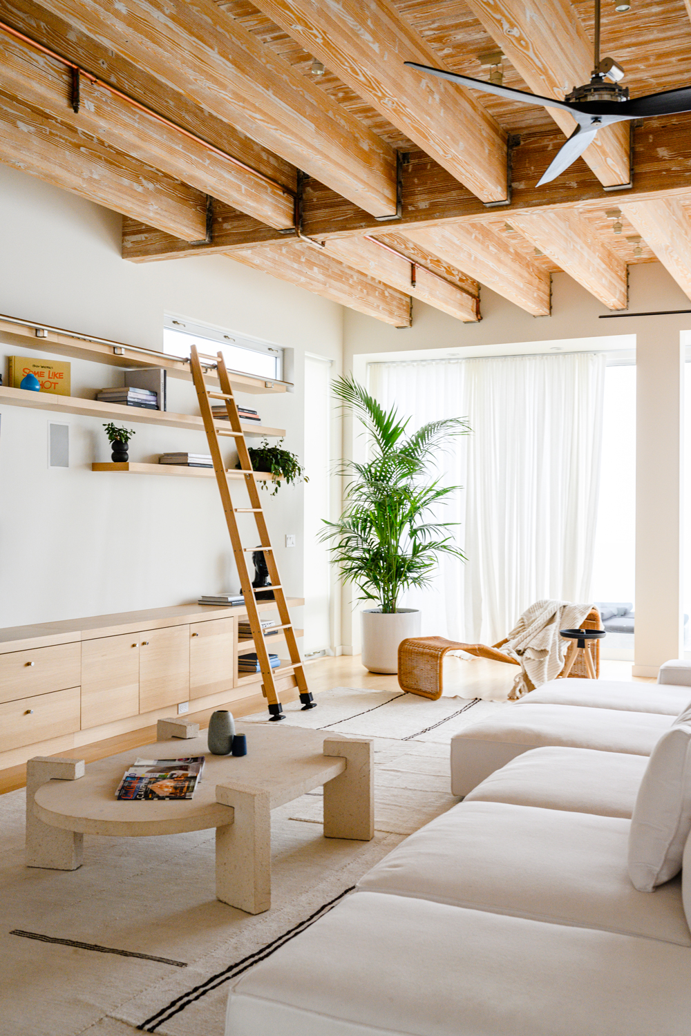
Inspiration image by Teal Thomsen at Ashley Merrill’s beach house
What practical window treatment considerations are on your mind with this renovation?
Great Room
The great room faces the ocean and will be one big open entertaining space. I haven’t yet decided if we’ll be incorporating window treatments here since we don’t face any other homes and landscaping will provide protection from the street. The one caveat is the afternoon sun. If it becomes too bright, we may add some shades that will still let in that beautiful light but filter and soften it.
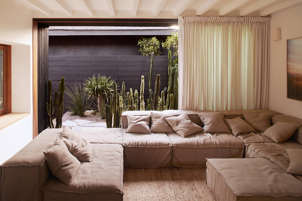
Image by Sam Frost of Jodie Fried’s home
Den
We’re designing the den to be the comfiest family room of our dreams, made for curling up with a book, playing board games, and yes—marathon games of X-Box. As such, we’ll need shades in this room that provide quite a bit of darkness to prevent glare on the screen and make it feel super cozy.
Guest Bedroom and Bunk Room
With its woven materials and tiny patio space, I want these rooms to have major surfer vibes. The window treatments will reflect that, with light and airy natural materials. But I also want it to be conducive to getting a great night’s sleep, which means the ability to totally block the light when it’s bedtime.
Primary Bedroom
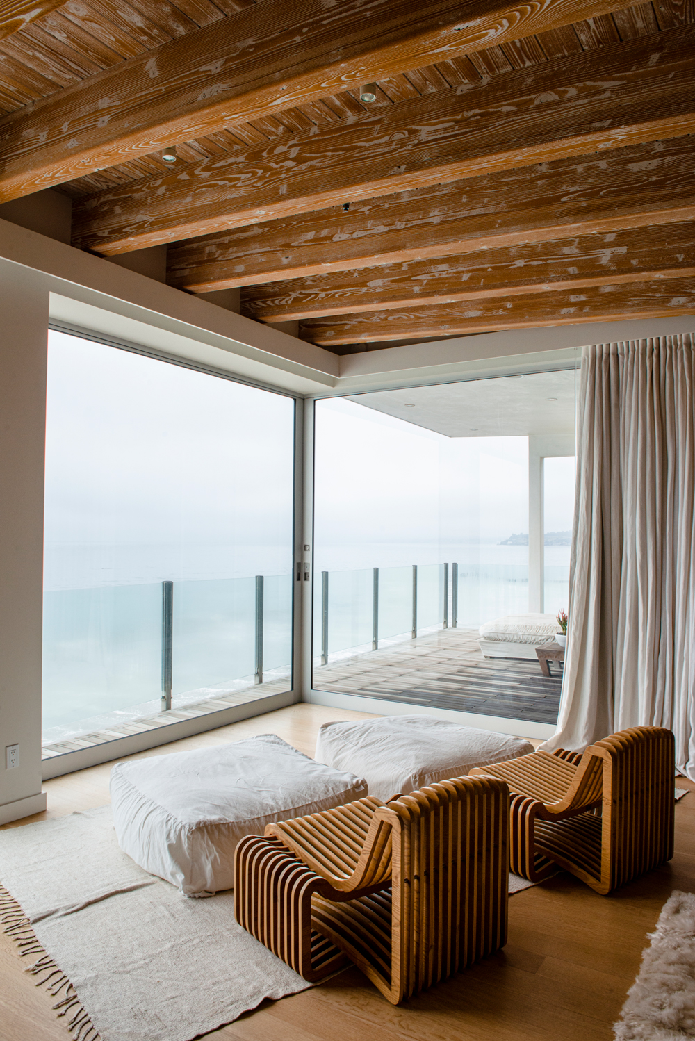
The goal? Make this room feel as spa-like as possible. The focal point to this room is the pocket doors that completely open up to the private patio. And because I’m one of those people that needs total dark to get a good night’s sleep, I’m determined to find a solution that will provide blackout in an aesthetically clean and simple way with these doors. This is a tricky one, and I’m relying on our Graber team to help me come up with the right solution.
Guest House
This small but mighty area will be our mini “boutique hotel.” I’m so excited to transform it into a place our guests will love to stay. We’re adding very large statement windows that face the ocean, so the goal will be to find window treatments that provide privacy and the ability to darken the bedroom at night, but then almost disappear during the day to align with the streamlined aesthetic we want for this space.
Since your two main priorities are aesthetic and function, can you give us a sneak peek at the Graber solutions you’ll be incorporating into the window treatments of this project?
As a first step in the process, I’ve been building my inspiration board! It includes the Graber swatches I’m gravitating toward most:
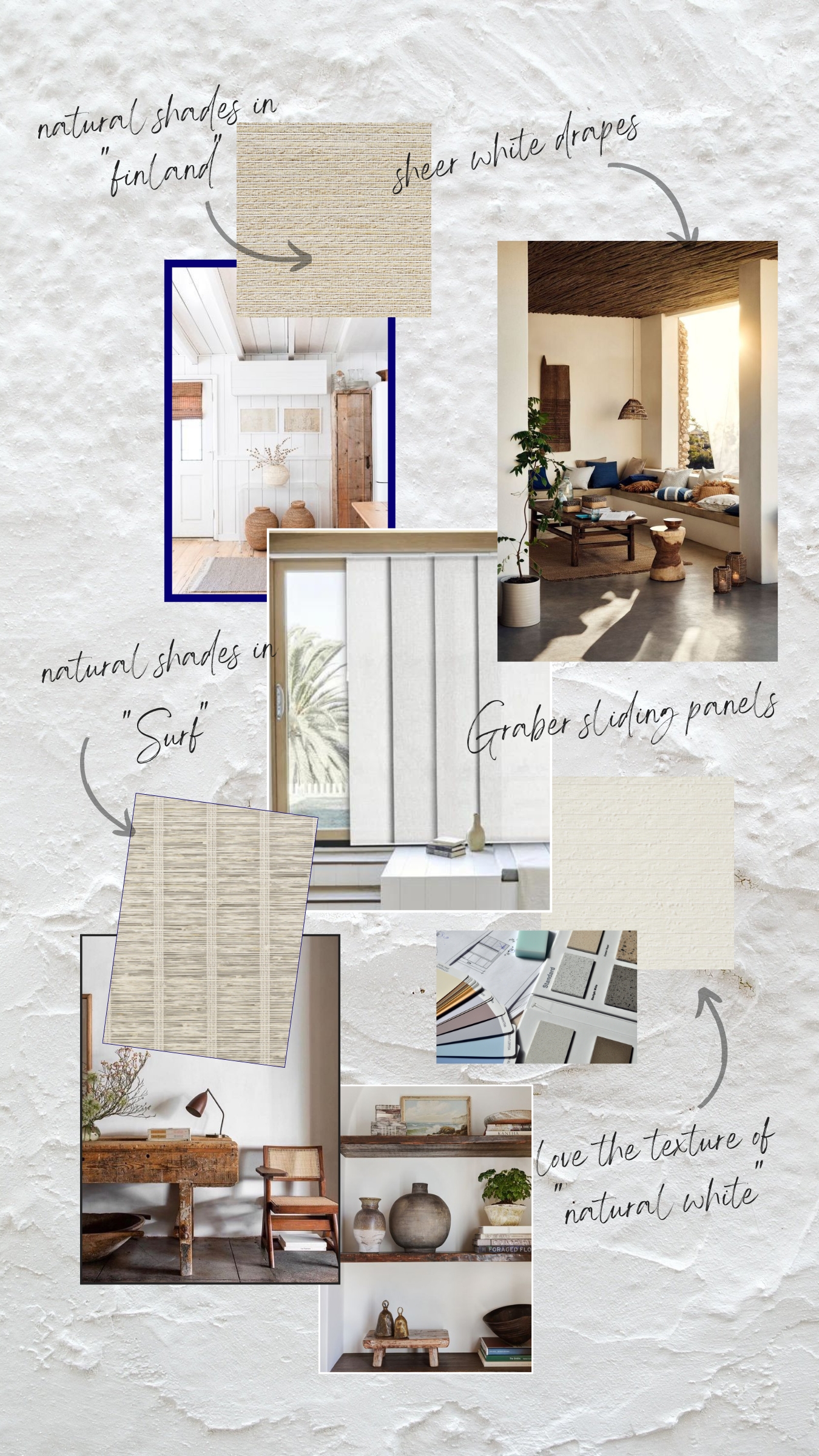
Featured above: Graber Natural Shades in Surf, Natural White, and Finland.
Because I currently have Graber Natural Shades and Sheer Drapes in my Austin house, I already know how much I love them. Both of these products will be used throughout the Malibu project. I am considering incorporating Graber Sliding Panels for the first time, either in the den or in the primary bedroom. Both of those rooms feature large pocket doors, but also need to have the ability to totally darken, so I’m excited to explore this a bit more! The sliding panels are a really sleek and smart solution for doors like ours.
Stay tuned for my final selections and to see the spaces begin to take shape. Although I have a strong vision for the look and feel of these spaces, I’m grateful that Graber will be there to take the reins on taking measurements and advising on the technical details. It frees me up from making an (expensive) mistake that ultimately won’t work at the final install.
***
Next up, we’ll be sharing expert tips and advice on how to select window treatments and sort through all the customization options available. Lining, hardware, valances—we’ve got you covered!

 ShanonG


