WordPress Gutenberg 14.2 Offers Better User Experience via @sejournal, @martinibuster
Newly released Gutenberg 14.2 features numerous improvements that make editing on WordPress a smoother experience The post WordPress Gutenberg 14.2 Offers Better User Experience appeared first on Search Engine Journal.

Gutenberg 14.2 is released and available for download. The latest version features user interface improvements including an easier workflow and performance improvements plus new header and footer blocks.
All of the new features are incremental improvements that together help to make Gutenberg a more polished and intuitive site editor.
Better User Experience
Smarter suggestions for Query Loop block variations
This improvement provides a smoother editing experience by only showing relevant Query Loop block patterns.
Improvements to Writing Flow
Gutenberg now features a more intuitive writing flow.
Three improvements:
“The sibling and line inserters now feature a more natural animation effect. Selecting multiple blocks is now more visually consistent. The block inserter is now hidden when the user is typing, reducing visual clutter.”Better Functionality
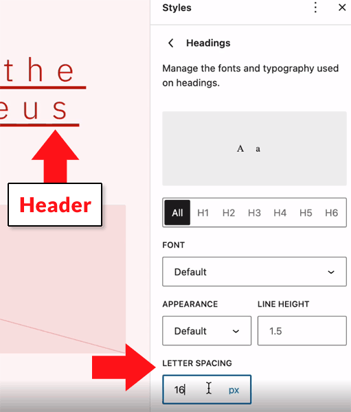
Letter Spacing in Headings
Letter spacing refers to the space that’s between each letter in a word.
Being able to adjust the space between letters is especially important for the heading elements because with some fonts the space can be too close together.
This new setting allows a publisher to adjust how much space their is using the Global Styles interface.

Better Calendar Block
The calendar block gains more ways to adjust how it looks and functions.
The background, link and text colors are now be set for the calendar block.
It can also now inherit text colors from the parent block and colors can now be styled through the global styles.
Editor Performance Improvement
A bug was fixed in the Enhanced List Block feature.
The feature which was introduced in August 31, 2022 for Gutenberg 14.0 contained a performance issue when list items were nested within each other.
WordPress explains the problem and the fix:
“So, if a List item was inside of a List that was inside of another List block, that block would re-render 3 times! This problem has now been fixed and the initial load performance of the editor should be improved.”
New Features
New Block Pattern Categories
Gutenberg now features two new block pattern categories that correspond to banners and footers.
Banners are described by WordPress:
“Banners” here refers to visually distinctive elements that help structure or contrast the contents of a page (including headings and “hero” elements).”
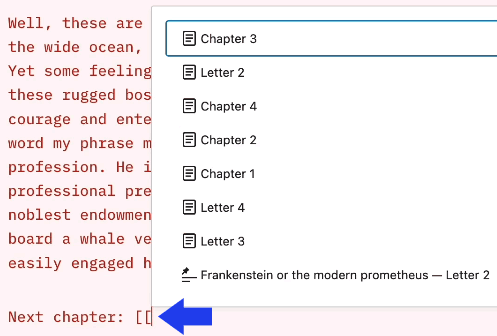
Autocomplete Links in Blocks
Another new feature is the link autocomplete feature is available in any block. This used to be a feature that had to be activated through an opt-in but now it’s available by default in all blocks.
The feature is triggered with the “[[” shortcut.

Bug Fixes and Improvements
Aside from the above improvements and additions there are many more bug fixes and additional features that all cumulatively make Gutenberg a better site editor to use.
There are no big standout features, just a lot of improvements that will making creating sites with Gutenberg a better experience.
Citation
Featured image by Shutterstock/Dean Drobot

 Hollif


