X Experiments With Upvotes and Downvotes on Posts
A new way to signal post interest in-stream.

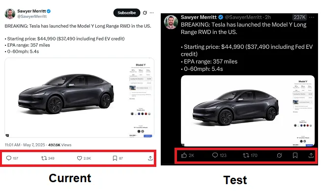
It seems that X is considering another UI update, this time focused on the Like icon, which may soon be changing to a thumbs up instead.

As you can see in this example, in a post from user Sawyer Merritt, some users are now seeing a thumbs up icon instead of the usual heart, while the icon has also been moved to the left-hand side.
Here’s a side-by-side comparison of what I’m seeing in the app versus this new format:

The engagement options have been rearranged along the bottom of the post, with the heart replaced by a thumb.
Which seems like an odd change, considering established habitual behaviors in the app. But then again, Elon Musk is keen to stamp his own imprint onto every element of what Twitter had once been, and he has proposed far more sweeping changes to the UI than this.
Like, for example, removing the post function buttons altogether, and reverting to a physical response-based engagement process.

Musk has suggested that he wants the feed to be “more clean,” with updates like this set to simplify and improve the process. And from a visual perspective, that makes some sense, however removing the function buttons will also likely impact overall engagement, because users won’t have that immediate prompt guiding them to react.
That’s likely why X backed off of its plan to make this the default for all users, adding this updated, “clean” display as an option instead.
But the switch to the thumb icon instead of the heart seems slightly different, in that it’s not simplifying or streamlining the UI at all, it’s just moving things around, and switching out the heart.
Unless, of course…

As you can see in this example, shared by X Daily News, some X users are also reporting that they have both thumbs up and thumbs down icons appearing below posts in the app.
Which would give users a simple means to signal both their interest or dislike of any post in-stream, via a direct, up-front option.
That could work as an algorithm training tool, helping to further customize and personalize your X experience. And with both, the switch to a thumb icon makes a lot more sense.
We don’t know, of course, because X hasn’t shared any official info on the test, and it doesn’t have a PR department to ask either. So we’re left to speculate, but it does look like it may be moving to an updated system designed to facilitate better customization in-stream.

 Aliver


![How Will AI Impact the Global Workforce? [Infographic]](https://imgproxy.divecdn.com/vhdGY5213MhIJV6-NnwNGwlYkeRCW5mkaDQGgpKM3Qs/g:ce/rs:fit:770:435/Z3M6Ly9kaXZlc2l0ZS1zdG9yYWdlL2RpdmVpbWFnZS9haV9qb2JzX2luZm9fMi5wbmc=.webp)


.jpg&h=630&w=1200&q=100&v=1be2781027&c=1)


