How to Structure Google Ads Reports for Clients: Tips & Examples
If you’re running Google Ads campaigns for clients, you already know how important performance reports are. They’re your chance to prove ROI, build trust, and keep clients at your agency. But too often, those reports live in static spreadsheets...
 Tekef
Tekef
If you’re running Google Ads campaigns for clients, you already know how important performance reports are. They’re your chance to prove ROI, build trust, and keep clients at your agency.
But too often, those reports live in static spreadsheets with bloated rows of data that bury the key results clients actually care about. They don’t show clearly which campaigns are working, which ads are under- or over-performing, and what steps to take next. But no worries, I’ve got you. Based on my 10 years of talking with agency leaders (and actually running an agency at some point), I break down how to structure Google Ads reports that are:
✅ Easy to understand for clients
✅ Holistic
✅ Actionable
In this article, I’ll share how to create such reports with Whatagraph—an automated reporting tool that makes it easy to bring in data from Google Ads and 55+ other marketing channels into a single, holistic report. You’ll also see tips from agency leaders and report examples.
We’ll first start off with the executive summary.
1. Executive Summary
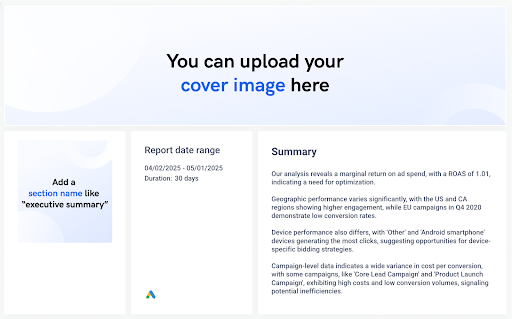
The executive summary sets the tone for the entire report. It gives clients a quick, high-level view of campaign performance and highlights where attention is needed—without diving into granular data just yet.
In this example, the summary was written using Whatagraph’s AI summary generator, which automatically analyzes the selected data range and surfaces the most relevant takeaways.
You can choose from four summary types:
Performance summary Wins Recommendations IssuesYou can also fully customize the tone, format, and language. Choose from English, Dutch, French, German, Portuguese, or Spanish, and pick between long-form or short-form content.
The generated text is also fully editable so it’s accurate and on-brand.
Best practices:
Include the reporting date range and duration for clear context Summarize key findings in plain language (e.g., ROAS, engagement trends, performance gaps) Group insights by themes such as geography, device, or campaign inefficiencies Keep it short but actionable—1–3 paragraphs is ideal Use this section to preview the story your report will unfoldExpert tip:
Stephen Samuel, CEO & Founder of NexFusion, a digital marketing automation agency, recommends structuring this section into three clear parts:
What worked last month What needs improvement What’s the action plan for the coming monthThis helps clients understand results quickly and builds trust.
2. Top-line KPIs
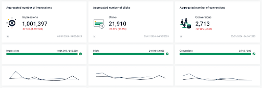
Before diving into specific campaigns, it’s important to provide clients with a snapshot of overall Google Ads performance.
A dedicated Top-line KPIs section surfaces key metrics like impressions, clicks, and conversions in one place, making it easy to assess whether goals are being hit and how performance is trending (up or down).
This section is especially useful for goal tracking and trend monitoring over time.
Best practices:
Use the See → Think → Do funnel to frame the three core stages: See = Impressions Think = Clicks Do = Sales/Conversions Place each KPI inside a distinct visual block with simple icons and short labels to guide the client through the funnel Display percentage changes vs. previous periods directly beneath each KPI in red/green to highlight trends Add a progress bar under each KPI (e.g. “16,369 / 1,000”) to show progress toward benchmarks or targets Use color indicators (e.g., green for on-track, red for decline) to highlight momentum or concernsExample KPIs to include:
Impressions: Total visibility generated across campaigns Clicks: Engagement volume with ads Conversions: Actions that matter (e.g., purchases, sign-ups, bookings) Conversion rate (CVR): Optional, but useful for benchmarking funnel effectiveness Cost per conversion (CPC/CPA): Efficiency of ad spendExpert tip:
Cheyenne Skye, Digital Marketing Analyst at Noise New Media, says it’s important to show the KPIs that align with the client’s actual goals.
“There’s a ton of metrics that we as marketers look at that would make no sense and probably overwhelm the clients,” she explains. “So we always try to be very specific about what the client’s goal is and then just show the metrics for that.”
3. Campaign Performance Overview
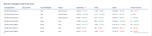
Once you’ve covered high-level KPIs, it’s time to break things down at the campaign level. This section gives clients a clear overview of how each active campaign is performing, without overwhelming them with raw numbers.
On Whatagraph, you can structure it as a sortable, scrollable table that includes impressions, clicks, spend, and total conversions for each campaign, along with comparison data from the previous period.
You can also further break down the campaigns by Account Manager and region.
Best practices:
Use a summary table to compare KPIs for all active campaigns Include percentage change indicators to show performance movement vs. the previous period (color-coded green/red for clarity) Break down campaigns by Account Manger who is responsible for each, and by region Make sure metrics align across columns, so clients can easily compare multiple campaigns side-by-sideExpert tip:
Chris Coussons, CEO & Founder of Visionary Marketing, an online advertising agency, suggests pairing high-level takeaways with detailed breakdowns. This makes sure the report meets the needs of both high-level decision-makers and more analytical stakeholders.
For example, you could add a performance summary right underneath the summary table like:
✅ “Campaign B generated strong engagement but a low conversion rate. We recommend testing a more relevant landing page.”
4. Granular Analysis: Devices, Locations, Keywords, and ad Groups
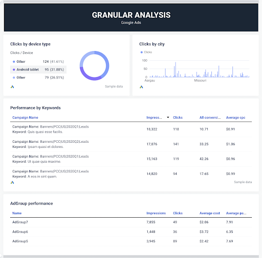
Once the big-picture results are covered, it’s time to dig deeper. The granular analysis section helps clients understand where performance is coming from—by device type, location, keyword, and ad group.
This section is especially helpful for identifying optimization opportunities, such as reallocating budget by geography, tweaking mobile experience, or pausing underperforming ad groups.
Best practices:
Use a pie chart to show click distribution across devices (e.g., Android tablet, desktop, mobile) Display a clicks-by-city chart to identify which locations are generating the most engagement. Organize keywords in a table under each campaign to show which ones are driving impressions, clicks, and conversions Include CPC and conversion metrics next to each keyword to quickly surface ROI drivers Show ad group-level performance to help pinpoint where optimizations or budget shifts are neededExpert tip:
Anton Kovalchuk, Founder of QliqQliq, digital marketing agency, recommends using granular data to surface friction points early. “If mobile CTR is strong but conversions are low, it could be a UX issue. Reports like this help catch those blind spots before they become bigger problems.”
5. Conversion Tracking and Channel Performance
If you’re running ad campaigns on other channels, like Facebook Ads, it’s not enough to just look at Google Ads numbers in isolation.
Have a section in your report which compares how each active advertising channel (e.g., Google Ads, Facebook Ads) is contributing to conversions.
This cross-channel breakdown helps clients make smarter decisions about where to invest more for the best ROI, where to pull back, and which channels are worth testing further.
Best practices:
Add a “Conversions by channel” pie chart to instantly show which platforms are contributing the most (e.g. Google Ads vs. Facebook Ads) Group performance metrics into a summary table that lets clients quickly compare how each platform stacks up Break down impressions, clicks, and spend by both channel and source to show how each channel performed in context Make sure time ranges are clearly labeled to avoid any confusionExpert tip:
Chris Coussons from Visionary Marketing, also recommends tracking first-click vs. last-click conversions to show clients how ads influence the entire funnel—not just the final interaction.
6. Best-Performing Display and Search Ads
Clients want to know what creative is working—and why. This section gives them a visual breakdown of top-performing display and search ads, so they can quickly see which messages, formats, or audiences are driving the best results.
It’s also a great opportunity to highlight the creative strategies that are paying off and inform what to scale next.
Best practices:
Display each ad as a visual tile, using real ad previews or sample images to make the results more tangible for clients Include key performance metrics under each ad, such as: Impressions Clicks (Optional: CTR, conversions if available) Add ad name and campaign name below the visual to make it easy to reference or locate in the platform Keep the layout clean and side-by-side so clients can easily compare creative performance across multiple ads Use icons (like the Google Ads badge) to show which platform each ad belongs toExpert tip:
Chris Coussons puts it simply: “Clients don’t just want metrics—they want to know what’s working and why.” Showing real creative results alongside performance data turns your report into a strategic asset, not just a numbers document.
7. Next Steps and Recommendations
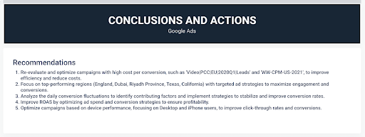
This final section turns insights into action. Instead of just showing data, it outlines exactly what to do next, based on actual campaign performance during the selected reporting period.
In this example, the recommendations were generated using Whatagraph’s built-in AI summary tool, which analyzes the connected data sources and time range selected.
Best practices:
Use short, actionable bullet points with clear recommendations (e.g., optimize high-cost campaigns, reallocate budget by region) Reference specific campaigns, regions, or device types for precision Keep the list focused—3 to 5 action items are ideal Let the AI generate the base copy, then tweak for voice and client alignmentExpert tip:
Stephen Samuel, CEO of NexFusion, says, “Clients love seeing a list of what’s next—without needing to decode the data themselves. A recommendation section like this makes your value as a strategist crystal clear.”
Final Thoughts
Creating Google Ads reports that actually impress clients doesn’t mean flooding them with every available metric. It means delivering a clear, strategic view of what’s working, what’s not, and what actions to take next.
With the right structure—and the right tools—you can turn reporting from a time-consuming task into one of your agency’s strongest value drivers.


![Anatomy of a Facebook Ad: How to Create Scroll-Stopping Campaigns [+ Examples]](https://www.hubspot.com/hubfs/anatomy-of-a-fb-ad.png)