How Two Designers Brought the Magic Back to a 1930s Hollywood Hills Estate
Moody, lived-in, and layered. The post How Two Designers Brought the Magic Back to a 1930s Hollywood Hills Estate appeared first on Camille Styles.
 AbJimroe
There’s a reason certain homes feel drab and stagnant. Even when a home is well-designed, it can still feel… off, in a way. That usually happens when a space lacks soul—when everything looks “right,” but nothing feels personal. Infusing a neglected space with style and personality is what turns a house into a home, and designers Amanda Leigh and Taylor Hahn of LA’s House of Rolison do this everyday.
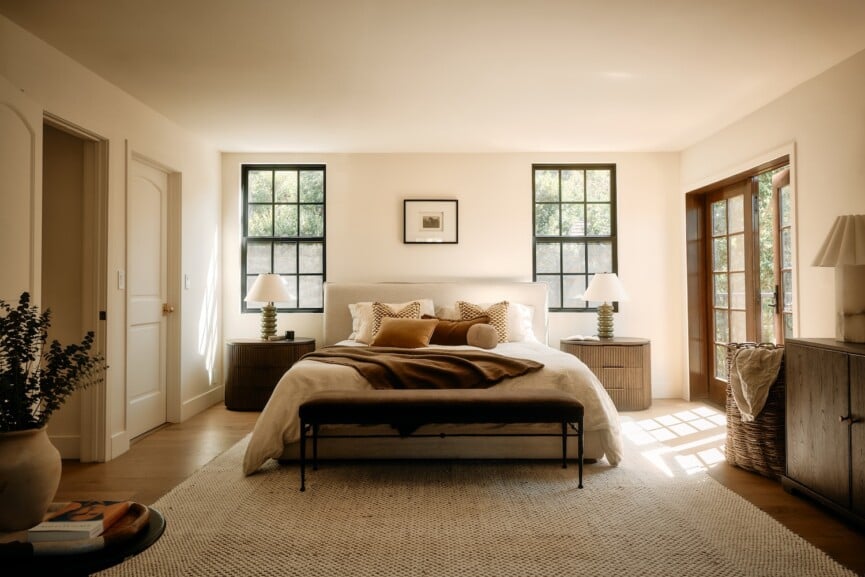
It was clear that their most recent project—a 1930’s Hollywood Hills estate—had lost something vital. The bones were there, but the allure was gone. What was left was a home that felt generic, and dare I say, a bit boring. That is, until Leigh and Hahn swooped in and transformed it.
With rich textures, a moody color palette and bold, intentional design, this home is now anything but boring. Ahead, we’ll take a tour of this once-muted home and chat with the design team about its bold reimagining.
Images by Nils Timm and Gavin Cater.

What inspired the renovation, and what did you ultimately envision the home to be?
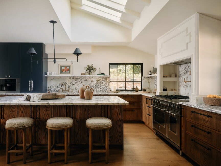
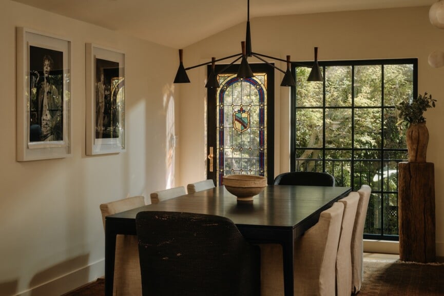
We wanted to bring the house back to life without making it feel like a replica of the past or a Pinterest board of trends. When we first walked in, it felt like someone had stripped away all the charm. The structure was still strong, but it was missing the heart. Our vision was to restore that sense of soul—using materials that had history, finishes that felt lived-in, and a palette that felt rich but grounding. The deep colors, textured walls, and vintage materials were all chosen to make the space feel warm, a little cinematic, and genuinely timeless.
How did you decide what to preserve and what to modernize in the home?
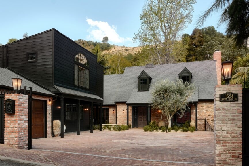
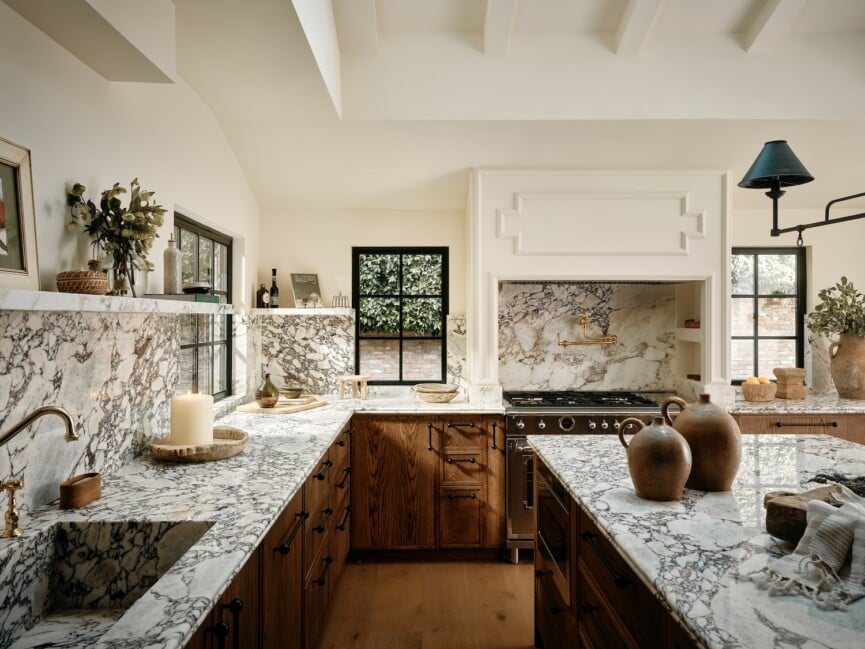
Honestly, there wasn’t a lot left to preserve, which gave us some creative freedom. But we did keep the original stained glass windows in the stairwell—it was one of the only hints of the home’s history—and we built around that spirit. We sourced vintage brick from Facebook Marketplace (a lucky find!) and used it on the façade and in the courtyard to give the home some age and texture. For the modern pieces, we focused on function—things like lighting, layout, and flow that would make the house feel fresh without erasing its roots.

This home feels bold in such an inviting way. What’s your approach to creating that kind of impact with color and design?
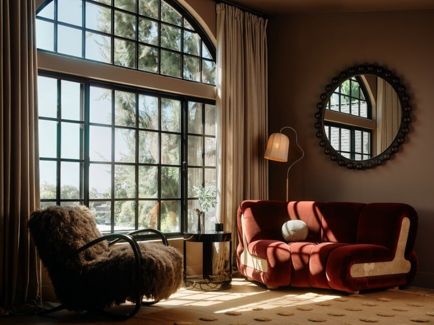
Bold doesn’t have to mean cold. We like to create tension—moody tones with soft textures, clean lines mixed with patina, high contrast that still feels cozy. It’s about layering in a way that feels rich but not overly formal. We want people to walk in and feel something—but also immediately know where they’d put their coffee down.

You’ve layered in such striking pieces and dark colors throughout the home—how do you think about choosing items that make a statement without overwhelming a space?
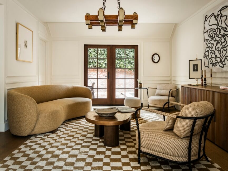
Every bold moment has to earn its place. We love saturated tones and sculptural pieces, but the key is to give them space to breathe. We approach it like curating a room, not decorating it—each element should have a purpose and a little presence, even if it’s subtle. Statement pieces don’t need backup dancers; they just need the right backdrop.
How did you approach mixing old and new elements to keep the design feeling grounded and timeless?
We’re always looking for that balance. Even in a more contemporary home like this one, we try to mix in pieces that have a bit of soul—something vintage, something raw, something unexpected. It keeps the space from feeling flat or overly polished. We want it to feel like it came together naturally over time… even if it was actually done on a tight deadline and a lot of espresso.
Did you face any challenges during this design process? How did you overcome them?
The biggest challenge was dialing in the bold palette without letting it overwhelm the architecture. We wanted every space to have impact, but not at the expense of cohesion. So we stayed incredibly focused on the edit—if something didn’t align with the vision, it didn’t make the cut. And we’re obsessive about the functional details too—things like cutting outlets into stone or tucking away storage where you wouldn’t expect it. Beautiful is great, but if you can’t live in it comfortably, it misses the point.
Looking back on the completed project, is there a particular feature or element that you’re especially proud of?
Definitely the exterior. It was a hodgepodge mess when we started, but we turned it into a whole experience—vintage brick underfoot, a shaded veranda, layered greenery, and a pool area that feels more New England meets European than L.A. It’s quiet, calm, and feels like a little escape. It’s one of those spaces where everything came together exactly how we pictured it.