Nothing’s first budget phone shows there’s nothing wrong with having only 2 cameras
We test the Nothing Phone 2a in this review to see how the mid-ranger performs in terms of its cameras and performance at its price point.
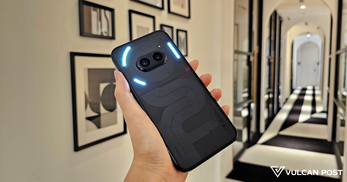
Knowing nothing about the Nothing Phone 2a prior to reviewing it, I had few expectations.
Sure, my colleague has reviewed (and raved about) the flagship Nothing Phone 2, and I’m a fan of the brand’s YouTube channel where Nothing CEO Carl Pei sometimes chats about criticism they’ve gotten or the tech.
But all I’ve really known the brand for are its funky LED lights (Glyphs, they call it) and transparent design.
So, what’s really in a Nothing phone, and a budget-friendly one to boot?
See Nothing, know Nothing
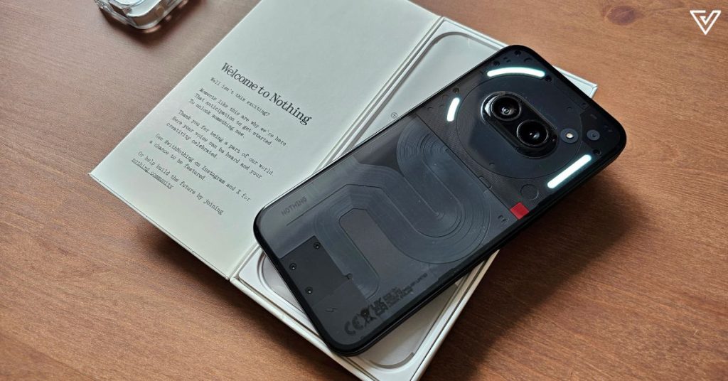
I’m not as swayed by the see-through design as my colleague is, although I do appreciate how visually different it is compared to the bunch of budget, mid-range, and flagship phones out there.
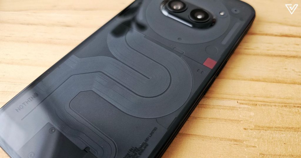
It certainly gives the brand its own identity—I’m confident I could clock a Nothing phone model in the wild, as opposed to wondering which generation of iPhone I’m looking at (bombastic side eye at iPhones 11 to 15).
And it’s not just the fact that I can see what’s under the hood of the phone (somewhat). Nothing has actually switched up its camera placement too.
The dual camera setup is now vertically smack-dab in the middle of the phone, and you’ll either love it or hate it.
One hater lovingly described it online, “Looks like a deformed cyclops that accidentally had two eyes grown side by side really close to each other, tf is this”.
Very imaginative, but anyway. The choice of just a dual-camera setup is a bold one in an age where a triple-camera setup is expected to be the norm.
Nothing previously explained this decision behind all their phones so far, saying that they didn’t want to follow the crowd and add more things just for the sake of having more.
Another point of note includes the curved plastic back (no wireless charging feature to be found here), so you’d want a case for that if you’re worried about durability.
On the front is a Corning Gorilla Glass 5, and the phone comes with a pre-applied screen protector too.
Nothing pleases in performance
As an Android user, the experience of using the Nothing phone feels pretty par for the course, but with more customisation than I’m used to on my Samsungs.
For example, you’re even able to adjust the size of your widgets, or change up the way your icons look (to a certain extent).
Whether you want your homescreen to look like the most organised thing in the world or scare/disgust anyone who so much as glances at your screen, the choice is yours.
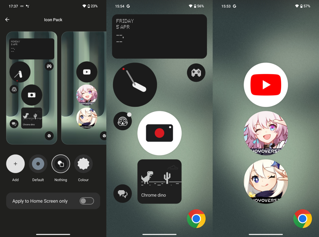 Rate my homescreen design, but don’t be too mean please
And now that my grotesquely huge Camera icon has caught your eye, here’s the low-down on the cameras.
You get a 50MP wide, 50MP ultrawide, and 32MP selfie camera, which are all pretty nice by my standards.
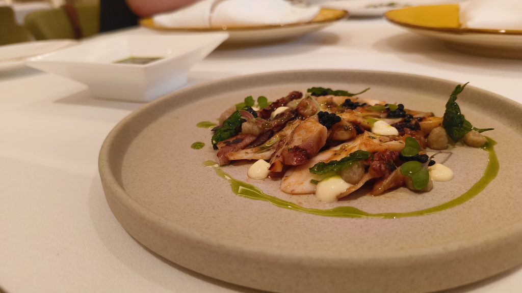 Taken in low-light
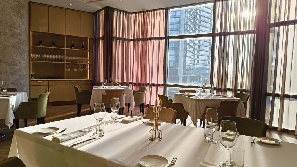
The HDR is solid, and the post-image processing gives each picture a pretty high contrast. In the image below, the picture to the left of the slider is non-HDR, and the right one is HDR.
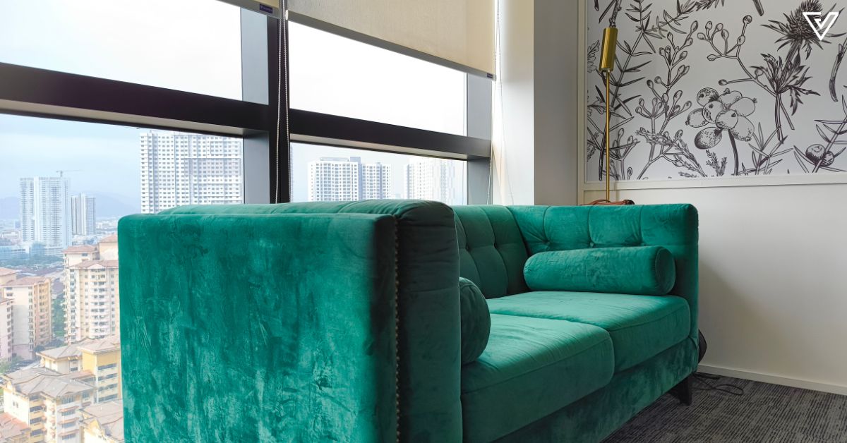
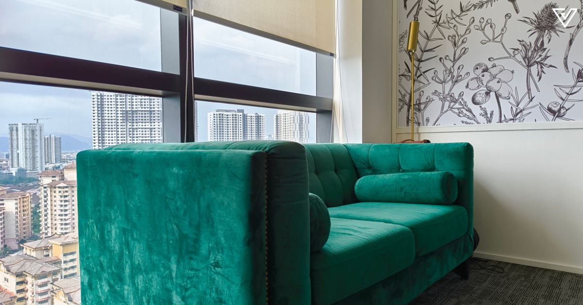
In my opinion, the photos are comparable to some flagship cameras.
Overall, no complaints here.
Equipped with a Mediatek Dimensity 7200 Pro chipset, I’m also impressed with how the phone handles casual gaming. I didn’t feel any significant heat-up even after an hour on the highest graphic settings.
Although there was some stuttering as I played Honkai: Star Rail, it didn’t ruin the gaming experience.
Battery life on the Nothing Phone 2a is another plus, as the 5,000mAh battery is enough to carry you well past a day if you’re not running battery-hungry apps on it.
Something to nitpick over
If I had to nitpick what I didn’t like about the phone, there would be two main things to point out.
First, the way YouTube’s UI looks in landscape mode while I’m watching a video on the Phone 2a. Look at the picture below and tell me that the way the settings icon is snuggled up against the border of the phone doesn’t bother you.
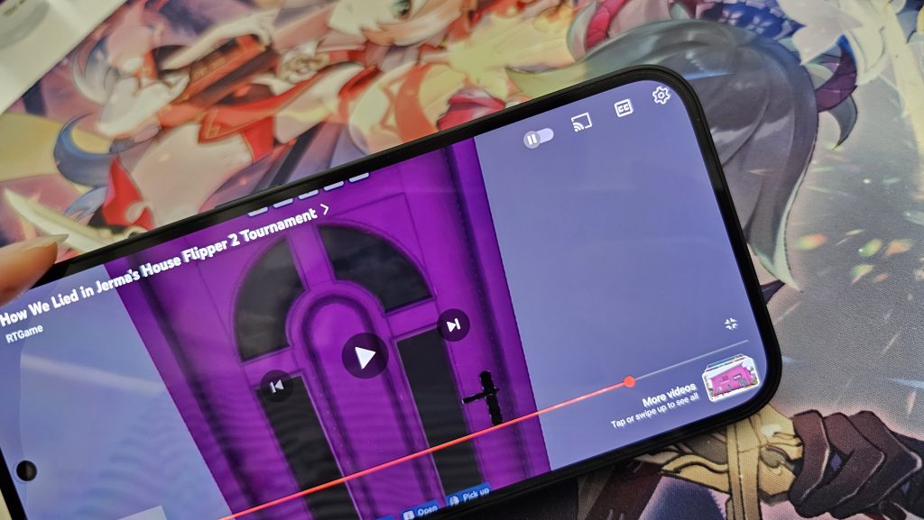
It’s truly odd, and it’s harder to press the icon too, especially if you have a thick phone case. As someone who spends quite a bit of my free time on YouTube, this is something that irks me, and I hope to see whatever this is addressed in the Nothing phone I review.
Another thing I don’t quite like about the Nothing Phone 2a is how there’s no native Gallery app for your photos. There’s only Google Photos, so by default, anything you snap or save goes straight to the cloud.
Some people may prefer this, but I do not. I don’t wish to have everything on the cloud, and I find it incredibly silly that once I use up my free 15GB of storage for my Google Photos, I might have to pay in order to keep more photos on my phone.
I did learn that you can access your images through Settings so perhaps the cloud storage thing isn’t as big of an issue as I think it is, but seriously, this method is equally as annoying.
Thankfully, it does seem like something may be in the works, but there’s still nothing official for now.
Verdict
The Nothing Phone 2a further builds upon the two things I think the brand stands for: simplicity, and identity.
I say simplicity in the sense that the phone cuts out bloatware and frills to focus on doing the basics well. You could take the lack of a native Gallery app as an example for this.
Rather than providing a Gallery app and Google Photos, you get just the latter, so that you can snap pictures and save them on the cloud simultaneously, rather than switch from app to app. Some people will love this, while others may hate this.
Identity-wise, the phone carries a branding that’s unmistakably Nothing, from the transparent design to the glyphs and the customisability it gives users.
I think it’s clear that Nothing is still a budding brand, and while the user experience isn’t perfect yet, it’s well-rounded enough. This one’s for those willing to look past its current shortcomings to have a reliable and familiar (yet different) phone.
The Nothing Phone 2a comes in two colours for Malaysia: Black, and Milk, and is priced at RM1,699.
| Great cameras for the price point | Transparent back gets fingerprint smudges too easily |
| Long-lasting battery | YouTube UI in landscape mode is not optimised |
| Lots of customisability for users | No native Gallery app |
VP Verdict is a series where we personally try and test out products, services, fads, and apps. Want to suggest something else for us to try? Leave a comment here or send the suggestion to our Facebook page.
Also Read: Why M’sians need to join this 2-day event in PJ that’ll boost your understanding of IPs

 KickT
KickT 


