X Users Can Now Activate Side-Swiping Likes and Replies In-Stream
X's new functionality for likes and replies is now active, though it's optional for now.

It seems like X has decided to take a more cautious approach with its plan to phase out all of the post function buttons in-stream. And its compromised approach could actually be one of the best updates that it’s rolled out in some time.
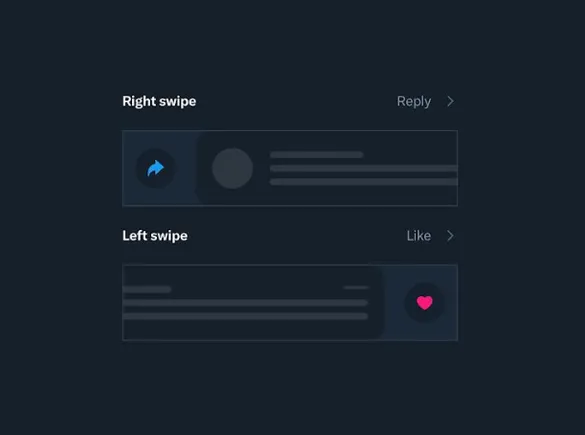
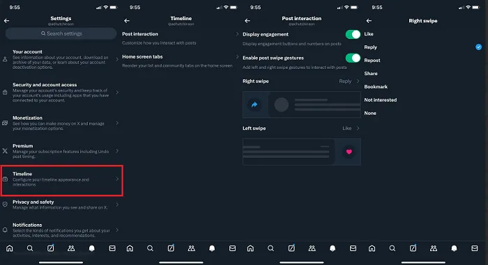
Today, X engineer May Ly announced that users on iOS can now choose to enable side-swiping like and reply options, by activating such in their app settings.
As you can see in this video, users can now switch on side-swiping functions, which are available within your “Timeline” options.

You can also hide the engagement buttons and numbers below each post, if you want.
So X isn’t imposing this as a new function and UI, as many had expected, and as X owner Elon Musk had said would be the case. But instead, X is giving users the opportunity to try this out as an option, which could lead to it eventually becoming a more habitual behavior.
Even more interesting is that as you can see in the last frame above, users can actually choose what function their side-swipes perform. So if you want to set your right-swipe as an easy bookmark option instead, you can, or you can even set a side swipe as no action if you want.
Which is a much more measured approach, which is very unlike how Musk has implemented most of his other preferred changes in the app.
Back in March, Musk reiterated his plan to remove all of the function buttons and engagement counts in-stream, in order to clean up the timeline.
Just time & viewcount in the upper right, nothing on the bottom.
Swipe right to reply, left to favorite, tap & hold for all other actions.
Very clean.
Which would leave posts looking something like this:

Many users raised concerns with this approach, noting that it will likely reduce interaction in-stream, and leave new users, in particular, confused as to how they engage.
Yet Musk seemed determined to push ahead with the plan, in order to improve the “esthetics” of the feed.
But now, it seems that X has revised this approach, in favor of a more measured, intuitive solution.
Will that eventually see all of the engagement buttons and counts removed in-stream? Well, maybe, and this could still be a step towards that eventual next stage. But it’s a much more collaborative one, which could also lead to new user behaviors that help to guide X’s thinking on this option.
I’m not sure that many people will choose to activate these side-swiping options, but it’s an interesting approach either way, which could be helpful for users.
And if X does decide to remove the buttons entirely, as per its original plan, it can still do so at a later stage.

 KickT
KickT 


![14 Best Types of Charts and Graphs for Data Visualization [+ Guide]](https://blog.hubspot.com/hubfs/types-graphs-charts.jpg#keepProtocol)


