You Won’t Believe This 1770’s Home Renovation in Hudson Valley (Psst… It’ll Be Available on Airbnb!)
You have to see the before & after. The post You Won’t Believe This 1770’s Home Renovation in Hudson Valley (Psst… It’ll Be Available on Airbnb!) appeared first on Camille Styles.
Where I Live
Home tours and stylish abodes of women we admire to discover their approach to design–and how they’ve created a sanctuary at home that feeds their soul each day. See All
We love a good house flip for a reason: there’s little more satisfying than a transformative home renovation. Perhaps it’s the beauty of a contained event—we get to see all parts of the process, from beginning to end. Or maybe it’s the realization of someone’s artistic dreams, bringing drawings and renderings into the physical realm. Whatever the pull, this love of the before-and-after is bred into our culture (there’s a reason the frantic house-cleaning montage is a mainstay in just about every rom-com). And though I’ve loved many a makeover, the latest Hudson Valley project helmed by Upstate Down has to be my favorite.
Upstate Down is based in New York state’s picturesque Hudson Valley, and combines brokerage, interior design, and a curated home goods store in the form of UD Studio, where visitors can browse the brand’s thoughtful, considered décor in person. Co-founders Delyse and Jon Berry inform the business with complementing backgrounds—she in rental management and he as a financial advisor at Morgan Stanley. With their dream of a holistic real estate and lifestyle brand calling, the duo pooled their expertise, and in 2021, Upstate Down was born.
Subscribe
Design obsessed?
Sign up to get monthly #ZumaBeachHouse updates delivered straight to your inbox.
Thanks for Signing Up!
Oops!
Looks like you’re already signed up or your email address is invalid.
Oops!
Looks like you unsubscribed before click here to resubscribe.
When I say you won’t believe this before and after—believe it. Oftentimes, the challenge of renovating a home built hundreds of years ago is that there’s history and character to preserve. But the best designers know: it’s those stories woven into the details that deserve the spotlight.
I sat down with Delyse and Jon to reflect on their most recent project: the complete renovation of a gorgeous 1770s home in Fall Kill, New York. Below, they speak to the home’s original architecture, the potential of the space, and how they bridged the beauty of the past and present. Let’s dive in—I guarantee you’ll want to add these pictures to your ‘dream home’ Pinterest board.
What initially drew you to this property and inspired the project?
When I first saw the house, I described it as having magic. The original charm was covered over by layers from the 60s-90s but the energy was special. I also loved how quiet the property was. Often homes of this era are built on roads which have become major thoroughfares over the years, but this one was still in a peaceful setting.
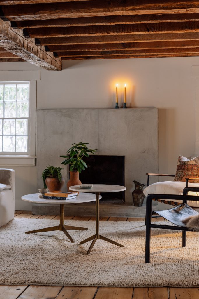
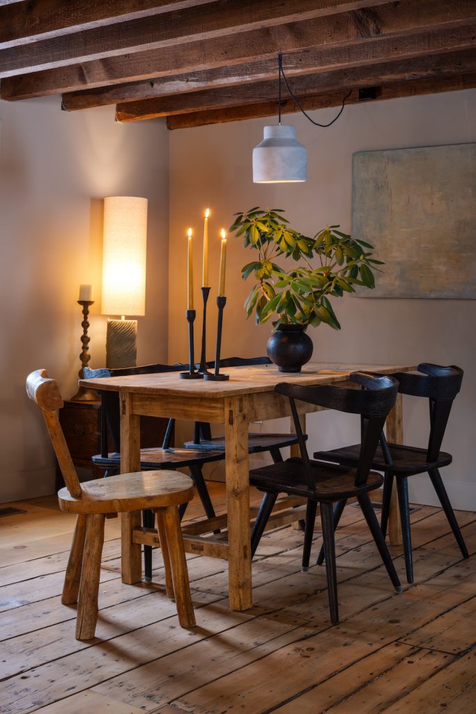
The house was dying when we bought it and we felt honored to be stewards that would assist in giving it new life.
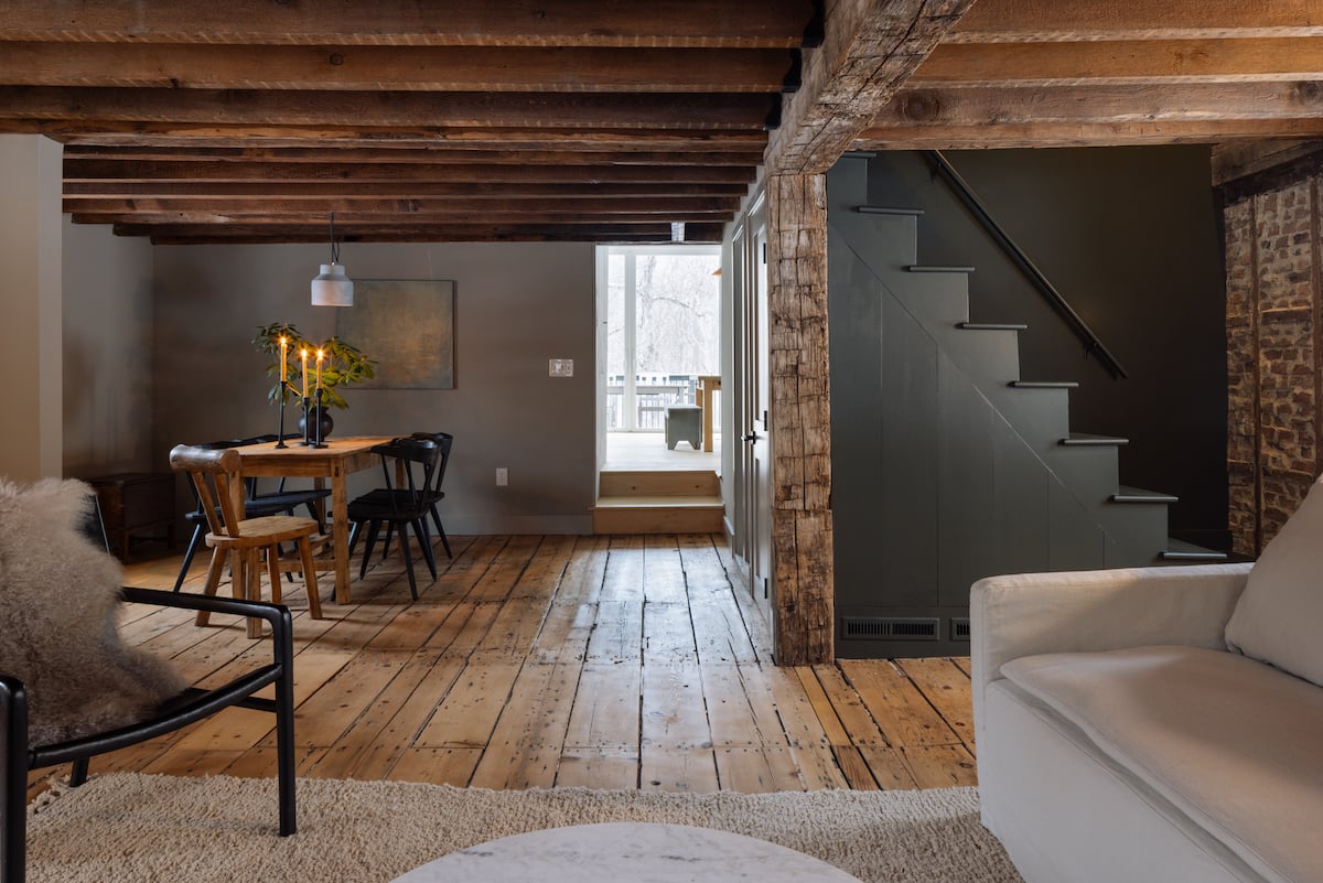
This home has such a presence. Take us through some of the unique elements of the original architecture.
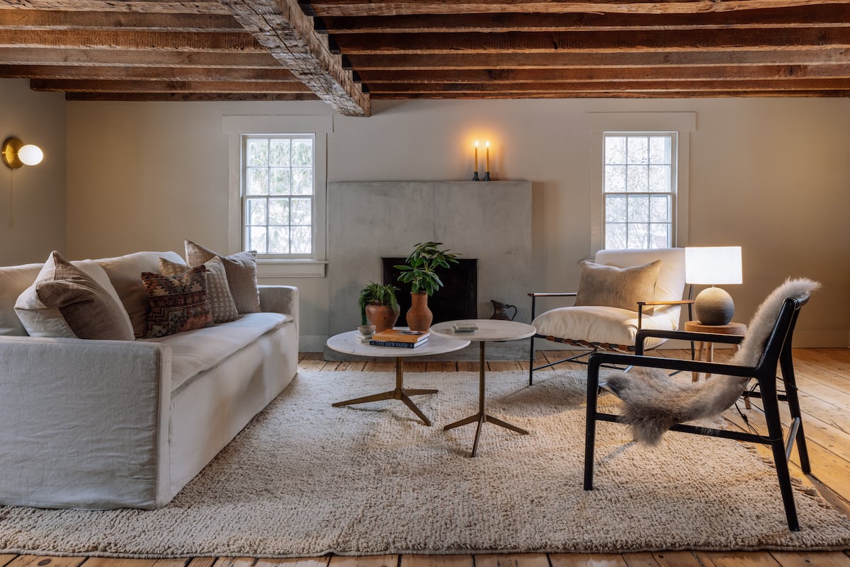
When we finally closed on the house (which took six months), the pipes burst which meant that the house needed to be restored even further than we thought. We had no idea what was behind the walls but when we started pulling things apart, we were overjoyed by finding the original floors, hand-hewn beams, hand-blown glass windows, original siding, and even the initials in the wall of the person who built it. Every inch of these findings needed to be restored but it was so worth it. The house was dying when we bought it and we felt honored to be stewards that would assist in giving it new life.
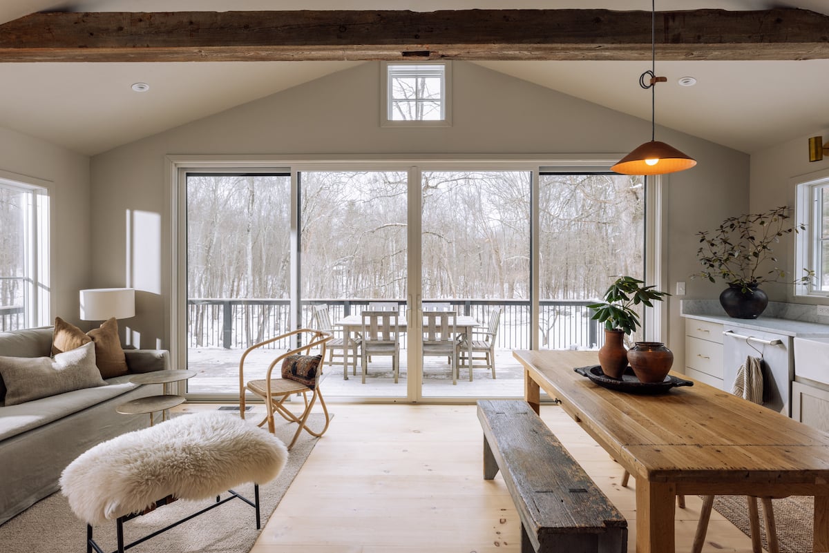
Working with a home of this age, I knew I wanted to honor it for what it is rather than make it something it wasn’t.
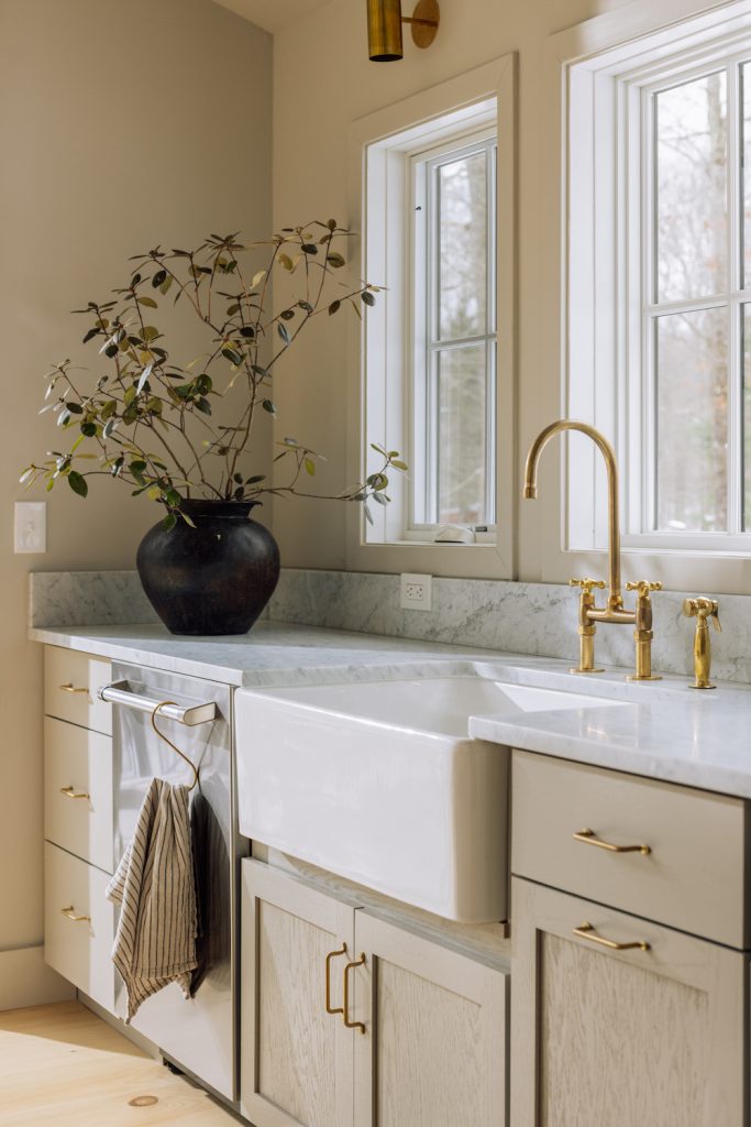
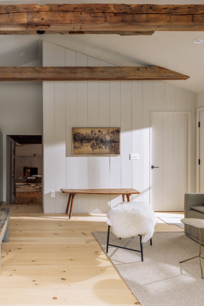
You featured an unbelievable before-and-after of the space on your Instagram. With low ceilings and small windows, how were you able to see the potential of the space and execute it beautifully?
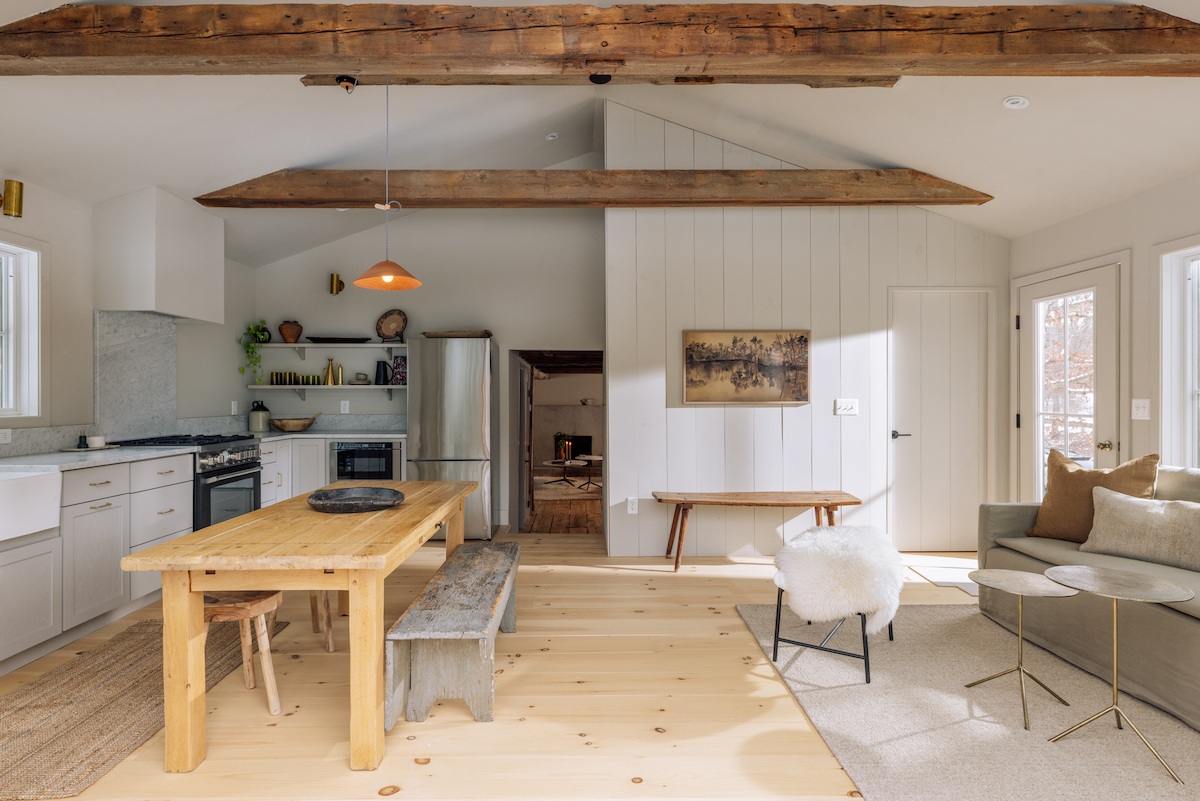
Working with a home of this age, I knew I wanted to honor it for what it is rather than make it something it wasn’t. Instead, I looked at things we would define as challenges and made them assets. To me, the low ceilings meant intimacy and the small windows meant moody. We painted the walls a rich color and made the space monochromatic so the architecture could stand for itself. We also then balanced the experience of the original part of the house with the light and bright addition which features a second living and dining space.
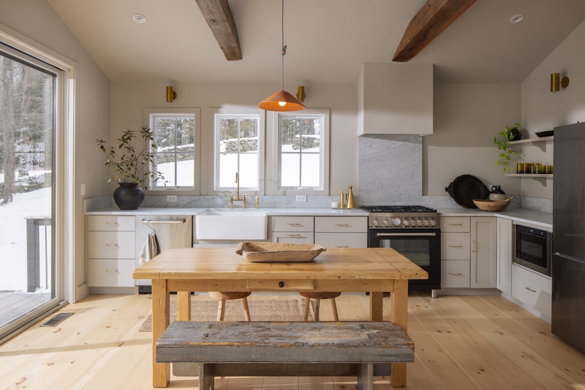
The house isn’t huge, but having two living spaces and two dining spaces allows for an easy transition into old and new as well as morning into night.
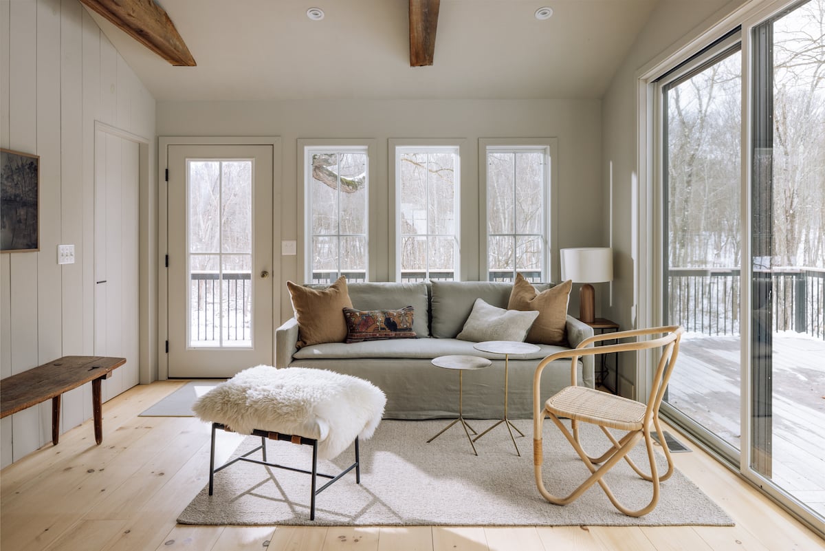
There’s a push-pull tension inherent in any renovation—wanting to honor the original bones while also bringing a space into the modern day. What were some of the major changes you focused on?
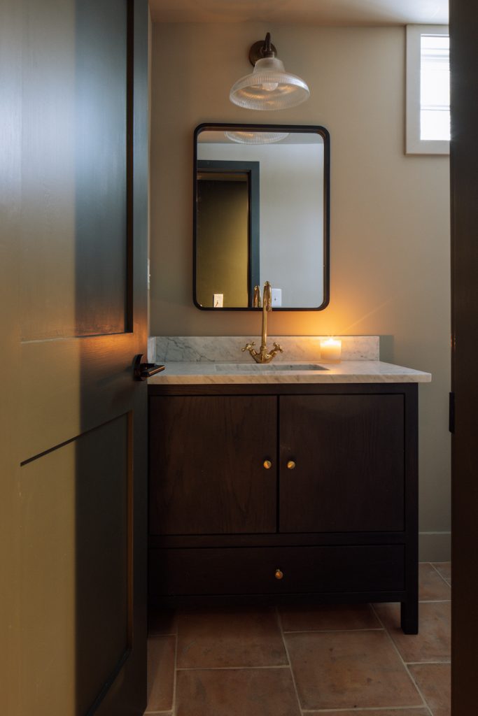
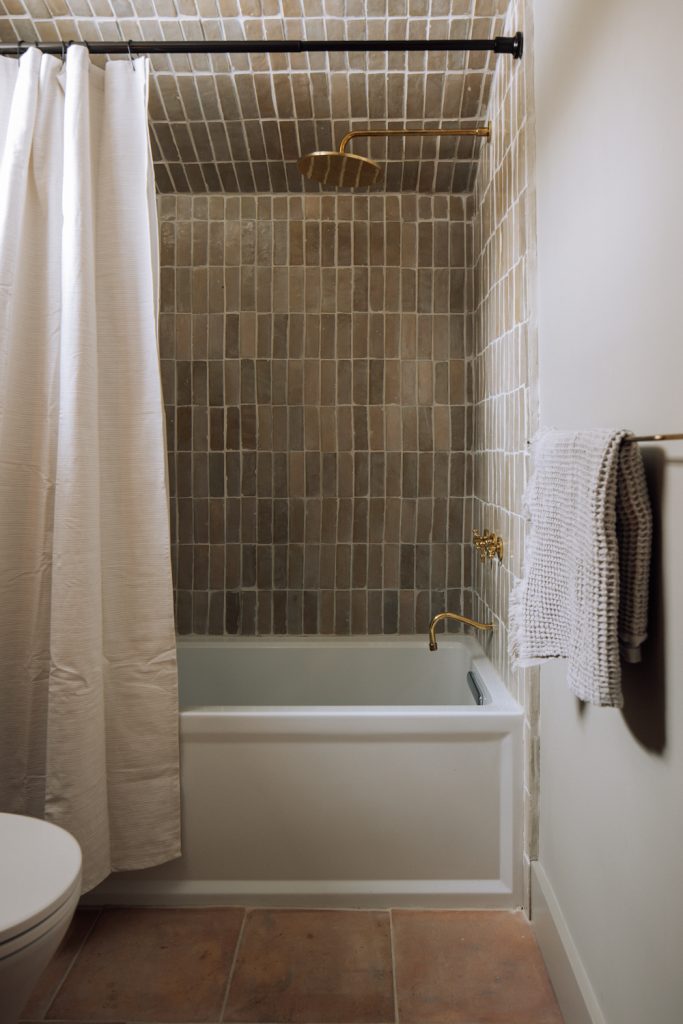
Everything original was restored and everything not original was replaced. This allowed us to blend the old and new while not losing the house’s integrity. When making new material decisions, we considered the original home and used the human hand in our material choices as much as possible. For example, all the tile and hardware are handmade and there are no white walls. We opted for a prep table rather than a kitchen island, and used materials that will patina over time (just like the house).
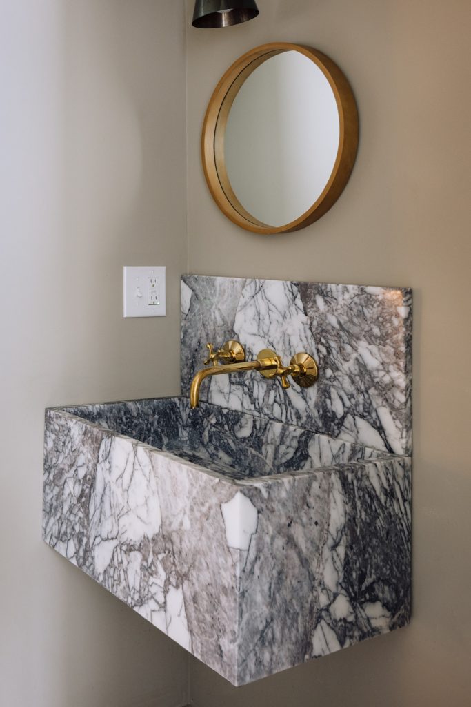
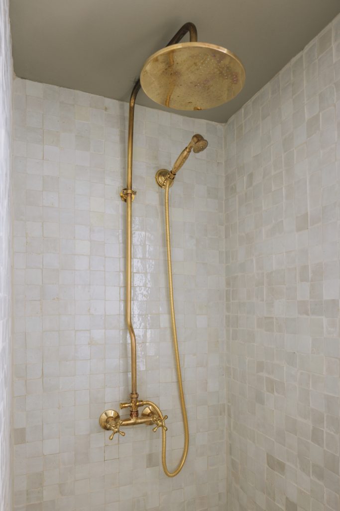
Building on that, how were you mindful of reconciling the past and present? How did that balance impact the final project?
We wanted people to walk through the house and feel the history of the home but also wanted to make it liveable. Bearing in mind how people live today really helped us accomplish a good flow and function in the house. The house isn’t huge, but having two living spaces and two dining spaces allows for an easy transition into old and new as well as morning into night.
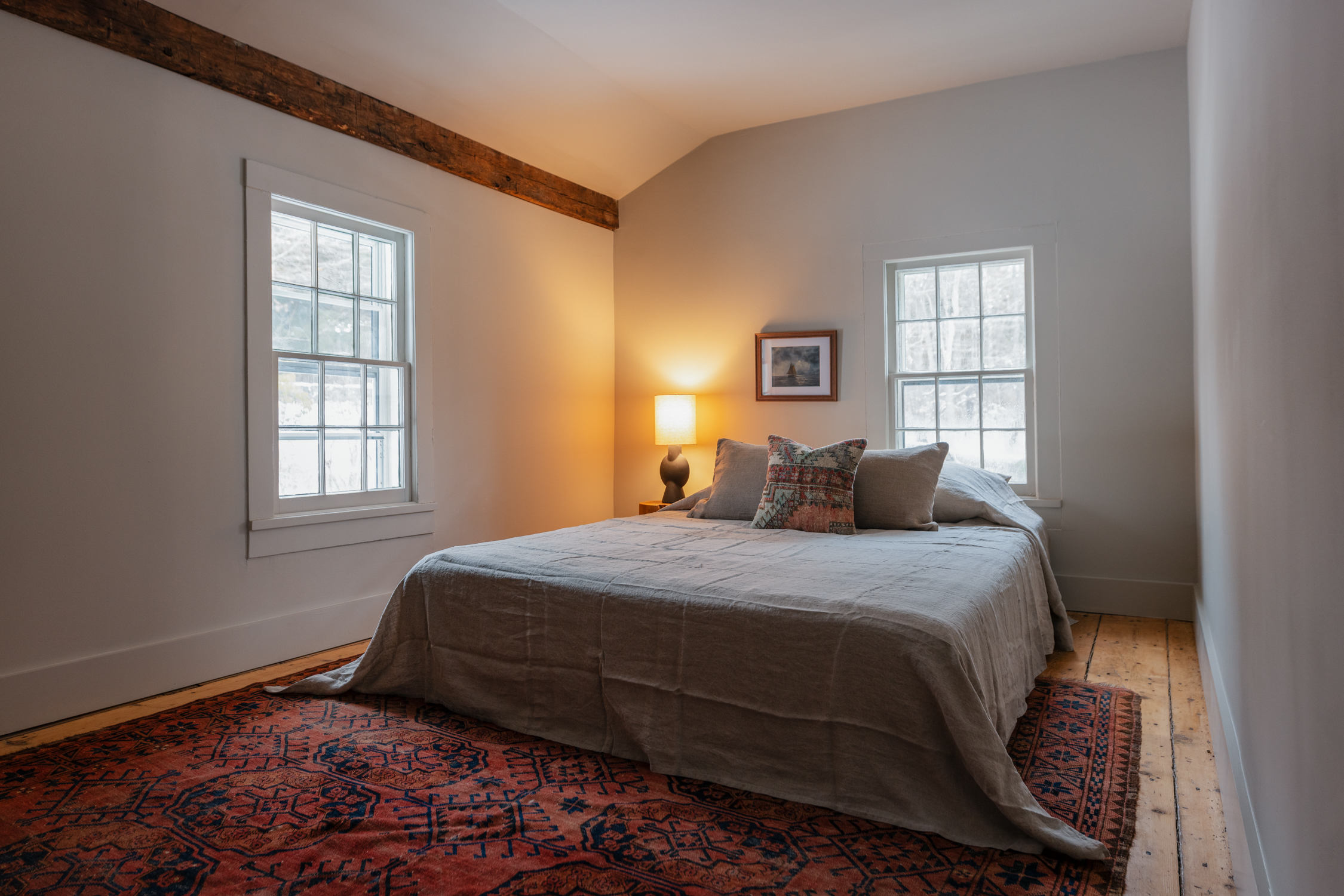
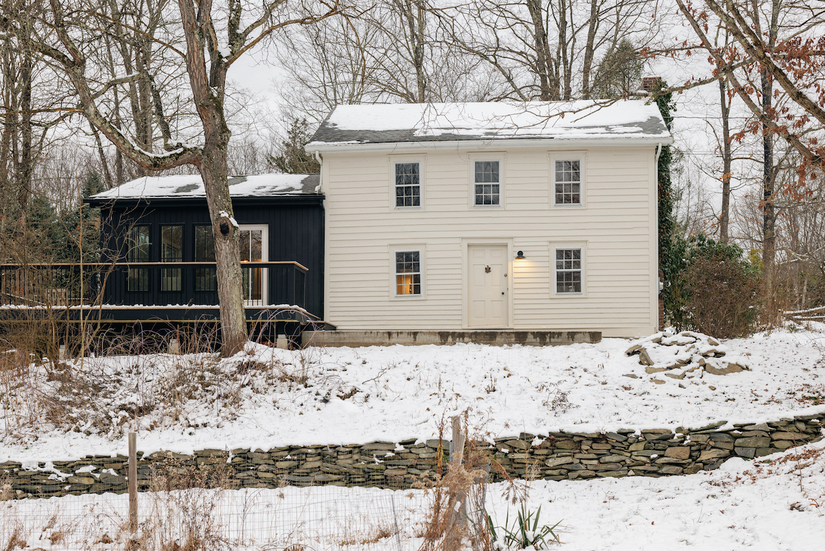
When you’re on the property, you feel connected to the land. The flowing stream, old barn, vintage stone walls… It feels as though they are all telling a story.
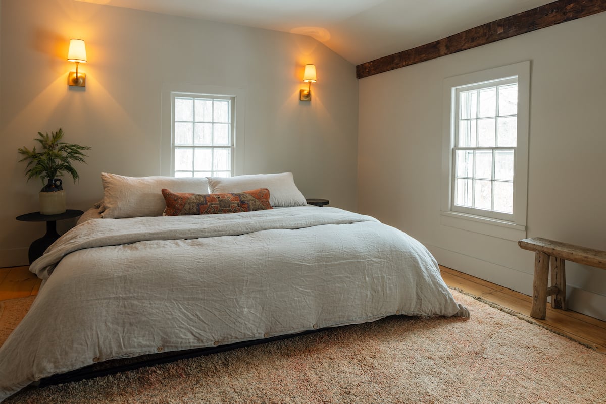
Exposed beams, light wood accents, organic shapes, and natural textures dominate the space. How did these elements and this aesthetic come into play in your design process?
The house is perfect in its imperfections. We wanted to make sure our design choices didn’t distract from the integrity of the home and therefore used the original treasures as our inspiration. Furniture stayed neutral and organic in order for it to connect to the structure and we elevated our final finishes to create some modern comforts.
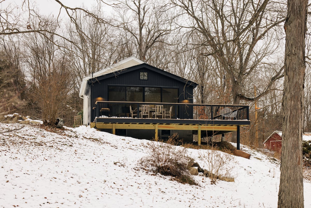
The Catskills are known for their stunning landscape and enviable natural elements. How did you seek to integrate your redesign into the surrounding environment?
When you’re on the property, you feel connected to the land. The flowing stream, old barn, vintage stone walls… It feels as though they are all telling a story. There is so much history in the area and while you feel that in the home, there is no doubt that you equally feel that on the property too.

 ShanonG


