Minimalist Email Design: Expert Tips and Examples to Nail this 2025 Trend
Some email marketers like adding bells and whistles to their email designs. While for some, well, it’s all about simplicity and minimalism. If you belong to the latter camp, congrats! You have already adopted the must-watch email design trend...

Some email marketers like adding bells and whistles to their email designs. While for some, well, it’s all about simplicity and minimalism. If you belong to the latter camp, congrats! You have already adopted the must-watch email design trend of 2025, i.e., minimalist email design.
Don’t get us wrong. We adore stunning, design-heavy emails. In fact, we often talk about tactics to create visually appealing email designs before.
While intricately designed email templates should always be part of your email marketing campaigns, experts hail minimalist email design as a key aesthetic sensibility to cultivate in 2025. Plus, with so much noise in consumers’ inboxes, a stripped-back email design can be a surprisingly high-performing design approach that can make your emails stand out!
Planning to leverage this email design trend and clear away the unnecessary clutter around your email message? You’re in the right place. Because in this blog, we are going to explain to you the why and how of minimalist email design for your next email campaign.
What is Minimalist Email Design?
Email Uplers, a leading email marketing agency, has identified minimalist email design as one of the 13 email design trends set to shape email marketing in 2025 in its latest infographic.
But what exactly is minimalist design?
An email design so simple and sleek, that it is practically deprived of unnecessary details and clutter is called a minimalist email design. The brilliantly simple styling, elementary typography, clean layout, and use of basic HTML elements are its hallmarks.
However, it’s not just about aesthetics. Minimalist emails are functional, too-
The elegant design makes it easier for your audience to concentrate on the email copy.Thanks to the sleek design, emails are faster to load and read, keeping your audience from bouncing out of frustration.Simplified designs lead to better engagement and higher click-through rates (CTR) and conversions.Plus, taking a minimalist approach to email design isn’t about following a certain fad. It’s about adopting an evergreen design practice that will also help you create winning email campaigns in the future.
Imagine how critical it is for brands and email marketers to create easy-to-navigate email designs that render well and fast with 71.6 % consumers using mobile devices to check their emails. When scrolling through complex emails on mobile phones becomes a task, minimalist email design can save the day.
But simple doesn’t have to be dull.
Rather, your best minimalist email templates are those that let readers focus on the main message without sacrificing creativity and engagement. Let’s explore how to achieve that balance in the next section.
How To Bring Minimalism To Your Email Designs? Top 5 Tips
1. Embrace White Space
One of the biggest misunderstandings email marketers have about white space or negative space in minimalist emails is that it is an “empty” or “unused” space.
The fact is exactly the opposite.
In minimalist email design, white space highlights key elements such as headlines, images, and CTAs. It brings balance and sophistication to the email and improves readability.
Get inspired by Glossier.

The popular beauty startup’s visual identity is simple and sleek. And that’s what makes this brand’s emails worth paying attention to. Their minimalist email designs are marked by white and soft pink color palette, a modern sans-serif font, and a playful email copy.
The email is strikingly simple, with barely any text except for the subject, header, CTA buttons, and a few reviews. The short, punchy copy is surrounded by ample white space, so you don’t feel visual fatigue.
Important>> To use white space effectively, you must use it thoughtfully.
Too much can leave your email looking sparse or disconnected. While too little can make it feel cramped.
To find the sweet spot and what works best for your audience, experiment. A/B test emails with varying amounts of white space. Use heatmaps to track engagement. And analyze how different designs impact metrics like click-through rates.
2. Simplify Typography
When typography is clean and purposeful, your readers focus on the message.
While choosing fonts for your minimalist email design, choose a clean font style that makes your message visually appealing and readable. Decorative or cursive fonts might look nice on desktops but fail on smaller screens.
Make sure it aligns with your brand identity. Modern, clean sans-serif fonts often work best.
Use no more than two font styles to avoid clutter and confusion. Keep text sizes consistent and readable.
As a general rule, don’t go below 14px to ensure legibility, even on mobile devices. Black text on a white (or light) background gives optimal contrast, prevents eye strain, and delivers a polished look.
Use grids for alignment to maintain balance and clarity throughout the layout.
Finally, test your email fonts across devices. Email-safe fonts like Arial, Helvetica, or Verdana are reliable for rendering well.
Email Uplers uses a similar philosophy of minimalist design in its email templates.

Image Source: Email Uplers
The header, “Are your emails mobile-friendly?” is bold and large and uses a high-contrast color, making it instantly eye-catching.
Subheaders and statistics are displayed in slightly smaller sizes but still bold. Notice how the clear hierarchy guides the reader through the content.
3. Go Easy On Text: Less Is More
For a truly minimalist email design, let your words need to work harder and say more with less.
Then what’s the ideal email length? Drip says emails with 75-100 words are enough to deliver your message without overwhelming your audience. If you go too low—say, below 25 words—you leave out essential information. On the flip side, too much text makes your emails clunky, especially on mobile devices.
To save on emails’ limited real estate, replace large chunks of text with visual icons. They save space and make navigation effortless,
But minimalism isn’t just a surface-level design choice; it should go deeper. Your copy should focus on one clear message. If you cram multiple ideas into a single email, there is every chance your readers will read neither option.
Use bullet-point style descriptions.Concise sentences that focus on key benefits.Strategic use of short, punchy CTAs.Use icons to replace lengthy explanations.4. Use Color Gradient
In pursuing minimalism, color gradients are quickly becoming a go-to design trend for 2025 and beyond.
The reason is sound. Gradients provide a dynamic way to infuse life into your minimalist email, They add depth and visual intrigue without overwhelming the reader.
Take a look at Sweaty Betty’s email design.
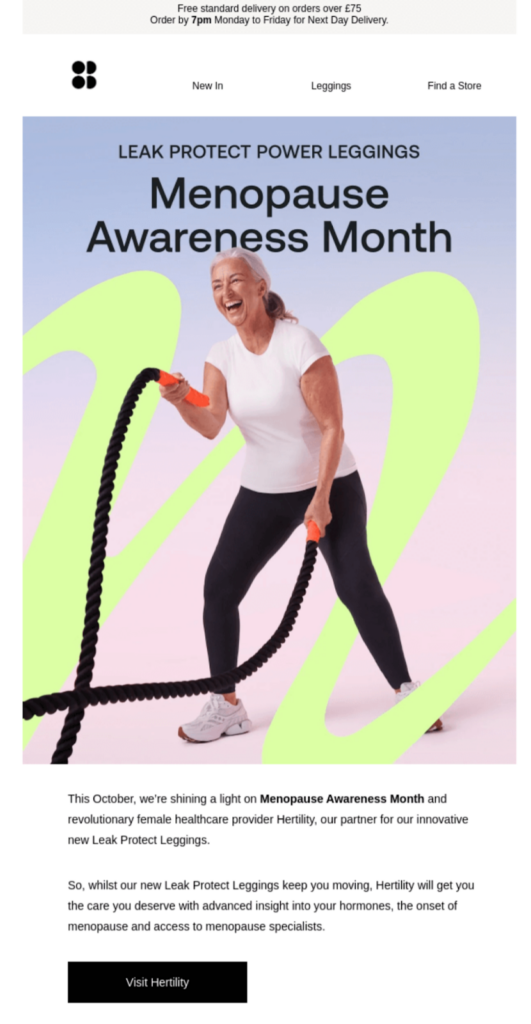
Image Source: Really Good Emails
The brand uses a gradient with two soothing color shades—pink and blue—applied subtly within the hero image. This uplifts the email’s visual appeal while keeping the layout clean and easy to navigate. The rest of the email content remains clear and simple, with as few distractions as possible.
Another takeaway for you is that the strategic use of gradients doesn’t have to take over the entire email design. Applying it to key elements like the header or hero image is often enough to create a powerful impact.
5. Make It Up-To-Date
To keep your email designs fresh and modern, it’s essential to strike the right balance between minimalism and innovation.
Minimalist but modern email design demands that you place standout features in your emails that engage and captivate your audience.
Such as interactive elements.
Interactive features, like buttons that change color or hover effects, encourage engagement and make your minimalist email more dynamic. Animated GIFs can add extra excitement while still maintaining a minimalist aesthetic.
For those looking for a more subtle approach, abstract illustrations, and powerful imagery can be the best options. They can add an artistic touch that elevates your design without overwhelming it.
Using these contemporary design elements in minimalist email designs will make your emails stand out and ensure they follow modern aesthetic trends.
Final Words
The email marketing landscape in 2025 is embracing minimalist email design. It’s sleek, visually appealing, engaging, and undeniably effective. If you plan to miss this trend, think again.

 Koichiko


![How CMOs Can Tell Stories To Manage Change [Case Study With Mondelēz International] via @sejournal, @gregjarboe](https://www.searchenginejournal.com/wp-content/uploads/2025/04/storytelling-634.png)





.png)
