Website Design Examples for Higher Education Institutions to Boost Enrollment
In a world where 94% of first impressions are design related, can a college or university truly rely solely on its legacy or word-of-mouth to fill classrooms? Gone are the days. Now, a student’s journey begins online, making the...

In a world where 94% of first impressions are design related, can a college or university truly rely solely on its legacy or word-of-mouth to fill classrooms? Gone are the days.
Now, a student’s journey begins online, making the quality of higher education website design a crucial factor in their decision-making process. A well- designed university website acts as the digital front door of an institution, welcoming prospective students into a world of possibilities. It’s where first impressions are formed and where interest can either be ignited or extinguished.
In essence, the effectiveness of a higher education web design can significantly influence a student’s choice, making it an indispensable tool in an institution’s arsenal to boost enrollment and stand out in a crowded educational space.
It is a fact that a standout digital presence is no longer just nice to have. It is in fact a make-or-break factor in attracting the next generation of learners. Thus, your institution’s website is a critical player in the game of first impressions, engagement, and ultimately, enrollment success.
So, we’ve brought together the best website design examples for higher education institutions below for your inspiration.
16 Higher Education Website Design Examples
In the quest to uncover the most compelling higher education website designs, we’ve scoured the digital landscape to bring you a curated list of institutions that are not just leading the way in innovative design but are also setting benchmarks for user experience, accessibility, and engagement. These universities are effectively communicating their unique qualities and strengths to potential students, fostering a stronger connection, by using innovative design elements like virtual tours and customized content.
1. College of DuPage
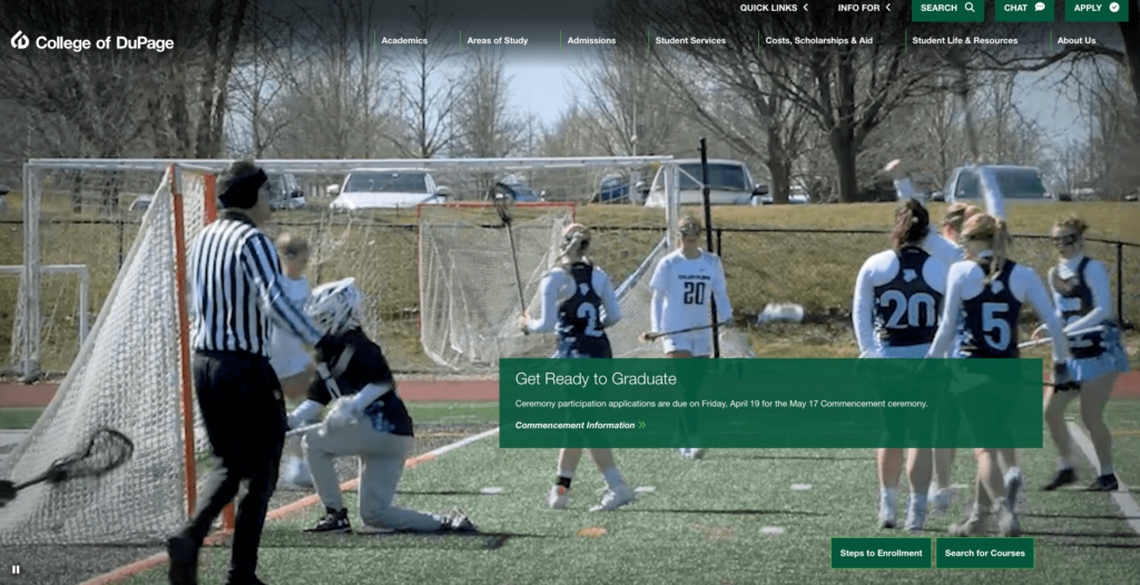
Upon entering the College of DuPage website, we’re greeted by a homepage dominated by shades of green. As you’ll notice, most other examples below use a white background. The colors used and the large visuals displayed set this website apart from other higher education website design examples.
As soon as you enter, there are CTAs that will direct you to your main purpose of visiting. Do you want to apply to this school? You can easily do that by clicking the “Steps to Enrollment” button. If you don’t want to apply immediately and want to get to know the school more, you can access detailed information about the departments, tuition and scholarship options, and student life by examining the detailed menu located above. Additionally, the ability to access success stories of former students by scrolling down helps prospective students set a goal while getting to know the school.
2. Duquesne University
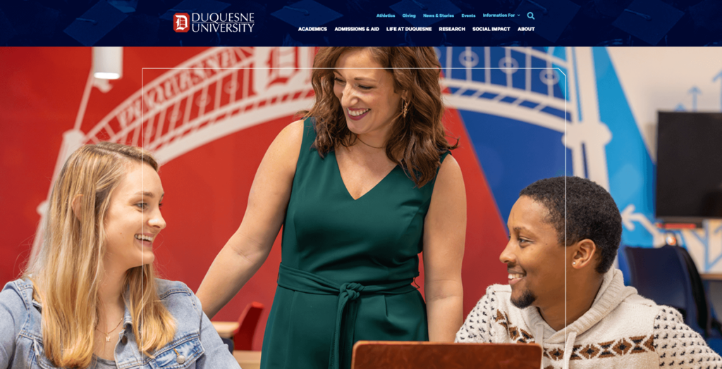
The Duquesne University website impresses with its modern aesthetic and focus on user experience. This website also has a design that is out of the ordinary. It gives the impression of a school that serves Gen Z, understands them, and speaks their language at first glance. Highlighting its vibrant campus life and academic excellence through compelling visuals and interactive elements, the site effectively communicates the university’s values and offerings to prospective students.
3. Ferris State University
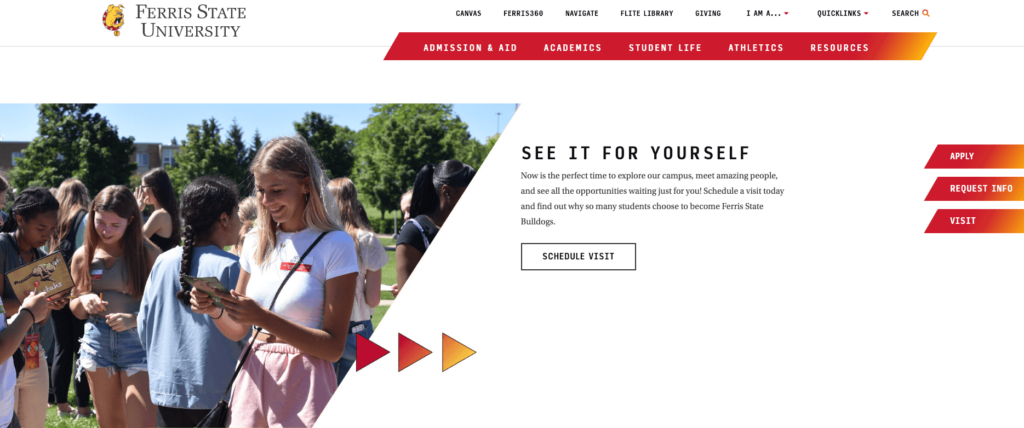
Ferris State University embraces bold colors and dynamic content to draw users in. The website features a well-organized structure, making it easy for users to navigate through their extensive academic programs and discover what makes Ferris State unique. Users can even immediately apply since unlike many other university web designs, the apply button is right on the top menu, making it easy for students to start their enrollment process.
4. The New School
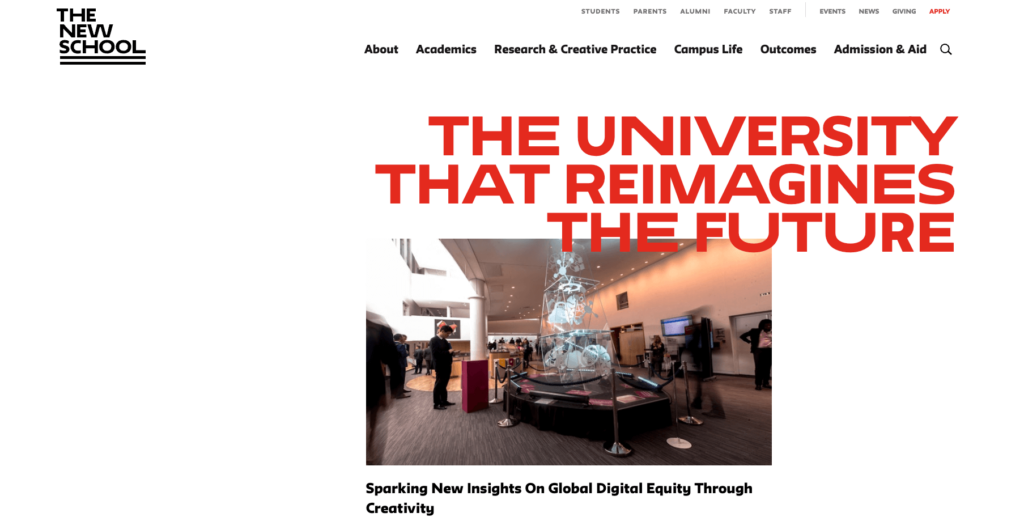
With its vibrant red colors and eye-catching design elements, this website, of course, belongs to one of the world’s leading schools. The New School is a popular choice for many international students, particularly those interested in art, architecture, and technology. As befits an art school, The New School’s website is designed in a way that is both edgy and modern, making it quite captivating. The use of large visuals encourages users to explore the site further. If you’re looking for a design example that breaks away from the norm, this website is definitely a great one to consider. Perhaps you can collaborate with a web design company to bring the inspiration you’ve gained from The New School’s website to life!
5. Florida A&M University
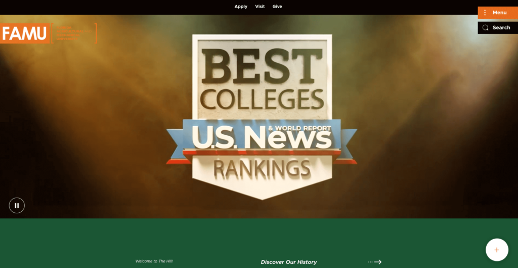
At Florida A&M University, the website design reflects the institution’s rich heritage and commitment to innovation. With vibrant imagery and comprehensive information on academic programs and student life, the site provides a thorough and inviting overview of the university experience. Crafting a website that effectively balances user experience with a unique brand identity like FAMU can be a challenge. However, we believe education marketing agencies bring a wealth of expertise to the table if needed. Just keep in mind that these specialists can create a website that is both visually appealing and also optimized to attract and convert prospective students.
6. Ravensbourne University London
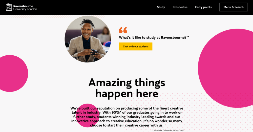
Ravensbourne University London impresses with its bold, creative approach to website design. Reflecting its focus on digital media and design, the site is a vibrant showcase of student work and innovative programs, inviting users to explore and engage. This website brings together different design elements to create a fun user experience.
7. St. Lawrence University
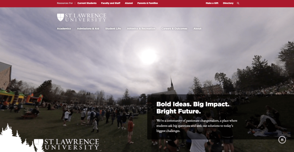
St. Lawrence University combines storytelling with visually appealing design elements to highlight its unique location and community. The website offers an immersive look at student life and academic opportunities, set against the backdrop of the scenic Adirondacks. The use of memorable and confident quotes to welcome users is a strong opening move. Students considering St. Lawrence University are likely to be impressed by the school’s self-confidence conveyed through these quotes. However, a well-designed website goes beyond a strong first impression. We believe St. Lawrence successfully uses the rest of the website to further convince prospective students by providing them with clear information about academics, campus life, and the application process.
Clicking the three lines in the upper right corner reveals a minimalist menu. This menu prioritizes user experience by offering clear access to key information about the school. Beyond basic sections like admissions, academics, and student life, St. Lawrence provides unique student-focused options. Notably, the “Athletics and Recreation” section caters to both aspiring student athletes and those seeking an active lifestyle. Learning about dedicated outdoor and indoor training facilities can be a big plus for many students. This highlights the importance of showcasing unique features in your higher education website design!
8. IAAD – Istituto d’Arte Applicata e Design
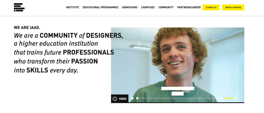
When it comes to art schools, expectations and options are vastly different. IAAD’s website exemplifies this perfectly. The IAAD website stands as a testament to the institution’s focus on design, offering a clean, modern aesthetic that showcases its programs in communication design, fashion design, and more. The site utilizes bold typography, vibrant colors, and interactive elements, reflecting the school’s innovative and creative approach. Furthermore, the user-friendly interface invites exploration and discovery with intuitive navigation and engaging visuals, allowing prospective students to truly immerse themselves in the IAAD experience.
9. Stanford University
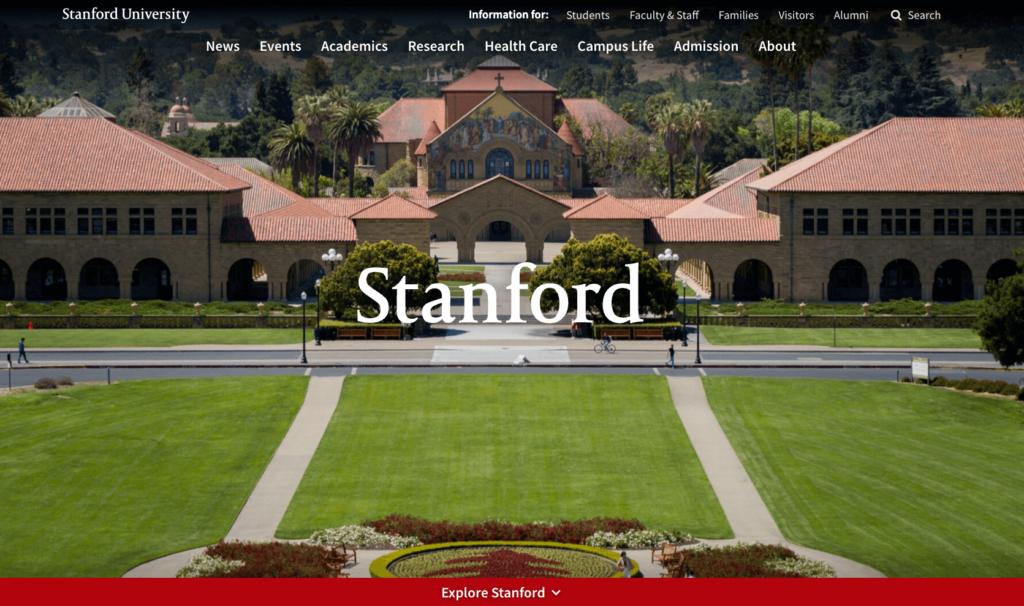
The quality of a school’s website may not always be indicative of the school itself. A flashy website from an Ivy League school or a world-renowned institution like Stanford or MIT can’t be the sole factor in your decision-making process. However, there’s no reason not to use them as an example! After all, in the competitive world of higher education marketing, even the most prestigious schools understand the importance of a strong online presence.
As mentioned, Stanford University needs no introduction, and its website lives up to the institution’s reputation for excellence. The design is both elegant and functional, offering easy access to information on its groundbreaking research, diverse academic programs, and campus life. The homepage, greeted by vibrant red colors associated with the school and large visuals of the stunning campus, naturally features recent developments and successes. While attracting a broad range of students is undoubtedly a goal for Stanford, highlighting their cutting-edge research and unique programs can be especially effective for students seeking a particular academic focus.
10. Architectural Association School of Architecture
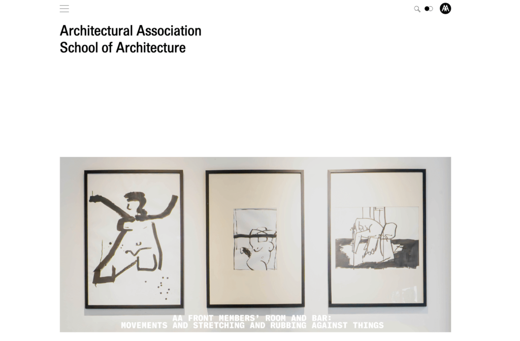
It’s quite natural for one of the world’s best architecture schools to have high-quality visuals of art and architecture on its website, with very little text. As you browse the homepage, which embodies all impressions of art with its impressive minimalist design, you feel like you’re touring an art gallery. When you click on the three lines in the upper left corner, you’ll find a menu listed for you to explore the depths of the website.
There’s a unique feature in the menu that sets it apart from other sites. First, it opens to cover half the page. A gray but slightly transparent background is used to list many important categories. However, a large circle element with the apply button is placed for prospective students. We believe that one of the most important features of a school’s website is the ability to easily access the application page despite all the details.
Although prestigious architectural or art schools may have a more unique design and content, most institutions still do not tackle the workload of creating a website by themselves. Web design agencies partner with many renowned universities for an intuitive website design that converts students. This approach offers several benefits, even if you’re not an art school. Partnering with a professional agency can help you achieve a unique design for your higher education institution while leveraging their expertise in creating user-friendly interfaces that resonate with prospective students.
11. Imperial College
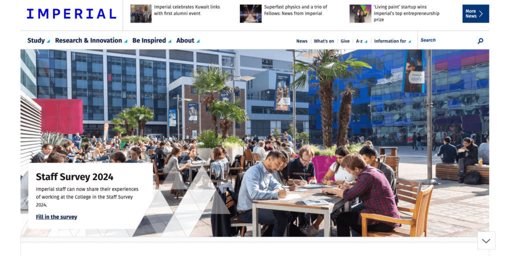
The website of Imperial College London seems to have a different style compared to many other higher education institution websites. At first glance, it gives the impression of being a news site rather than a school website. The focus is on student achievements and developments at the school. Together with this content, it is presented that it is one of the world’s leading universities and that prospective students can see where they can go with the successes of current or alumni students and academic staff.
12. University of Cambridge
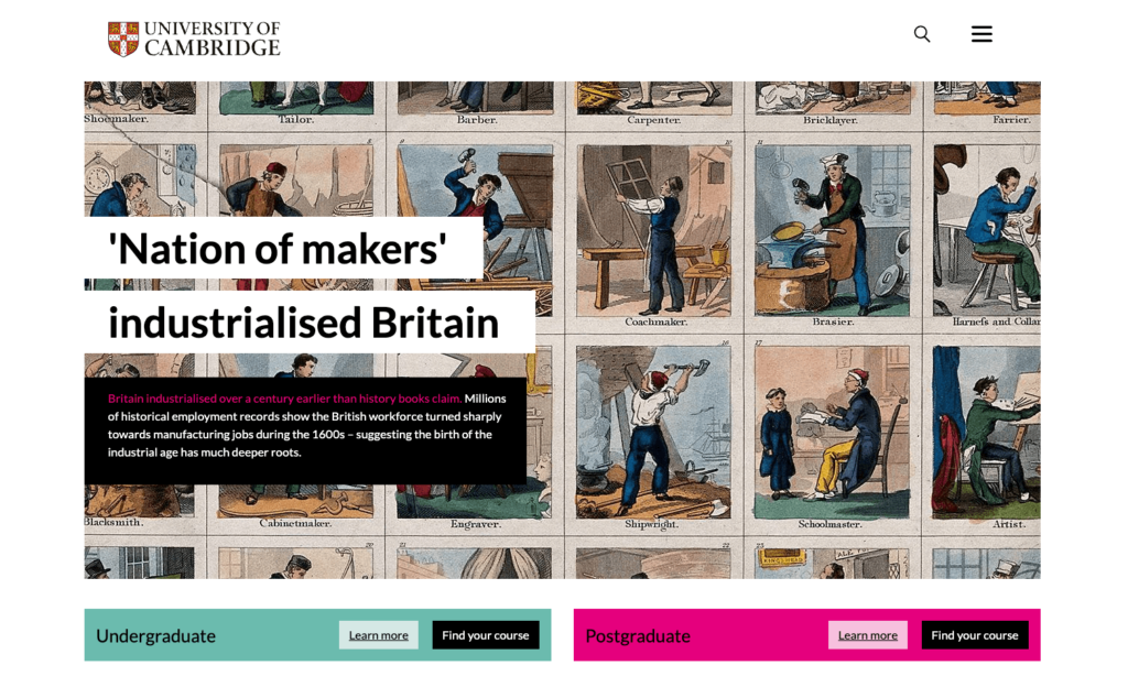
Upon entering the University of Cambridge website, you’re greeted by a stunning work of art, immediately showcasing the school’s rich history. One of the most successful design elements is the clear guidance for prospective students. After being welcomed by a large visual, the “Undergraduate” and “Postgraduate” tabs located directly below provide easy access for those interested in applying. News and events are also prominently featured on the homepage, keeping you informed about all things Cambridge.
The website utilizes a modern and clean aesthetic. While the traditional school colors aren’t the primary focus, the use of subtle shades of pink and green hints at Cambridge’s innovative spirit alongside its established legacy. High-quality visuals and pops of color enhance the user experience without overwhelming the viewer. In essence, the website strikes a balance between clean minimalism and engaging design elements.
13. Sorbonne University
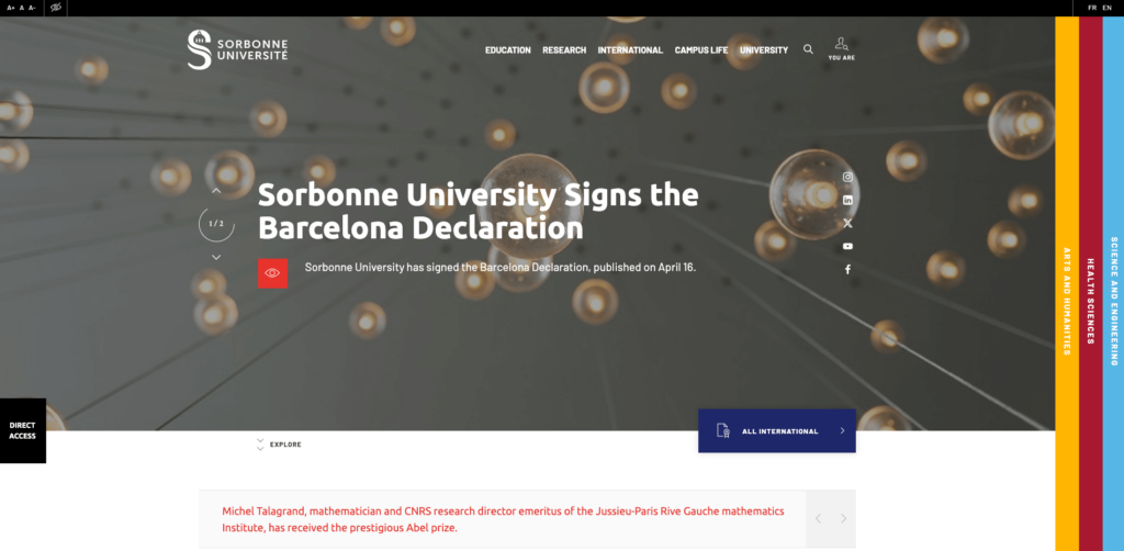
The website of Sorbonne University is one of the most unique higher education website examples we have come across. With its unconventional design, it offers users an enjoyable visit. The A+ etc. buttons in the upper left corner help you easily enlarge the font. In addition, this website also has options to make it easily accessible to disabled visitors.
It is not correct to say that the website has a fixed color scheme throughout, but one of the most striking design features is the columns on the right side. In a unique design, the faculties are placed in horizontal columns on the right side, taking the website beyond being a mainstream school site. On the homepage, many headings are divided into sections, and the presence of relevant CTAs in each area greatly increases the likelihood of users browsing the website.
14. University of Lille
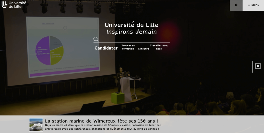
The website of the University of Lille, another popular school in France, boasts a relatively more complex design. On the homepage, interactive videos showcasing student life at Lille greet you, alongside easy access to news and school details. However, several features truly set this website apart.
A three-line menu in the upper right corner provides access to site content. Adjacent to the menu is a unique button allowing users to switch between light and dark mode for a personalized browsing experience. Furthermore, the website prioritizes accessibility with a special design for users with disabilities, reflecting the university’s commitment to inclusivity.
The ability to take a 360-degree virtual tour of the campus is another noteworthy feature. Prospective students can explore the university environment virtually, getting a feel for the atmosphere and potentially saving time and travel costs associated with a physical campus visit.
15. Technical University of Munich
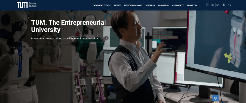
The presentation of the campus, courses, and student life through videos elevates the website of the Technical University of Munich to a higher level. The use of navy blue as the primary color creates a clean and professional appearance.
One of the most valuable features for prospective students is the clarity of information presented on the homepage. The “TUM in Figures” section stands out for its clear presentation of detailed statistics such as student population, awards won, and other important details that can significantly influence a student’s decision-making process.
The colorful and user-friendly menu in the upper right corner utilizes categorized icons to represent different user groups (students, faculty, alumni), making it easy for visitors to navigate and find the information they need. This approach adds a touch of vibrancy to the website while also enhancing user experience.
16. Ludwig Maximilian University
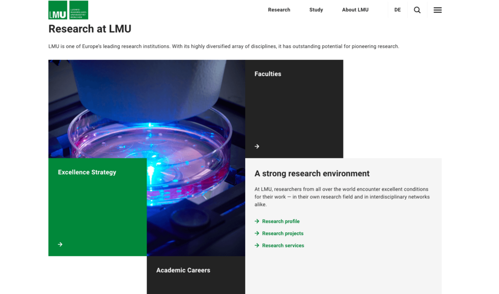
The LMU website may have the most unique design on this list. The school’s primary color, green, can be found throughout the site. Geometric shapes play a central role in the website’s aesthetic. While this unconventional approach might require slight adjustments in information discovery, the well-organized top menus provide a clear and intuitive navigation system. As a result, visitors can still easily access a wealth of information about the school.

 MikeTyes


_2.jpg)
_2.jpg)
![How Many Visitors Should Your Website Get? [Data from 400+ Web Traffic Analysts]](https://blog.hubspot.com/hubfs/Copy%20of%20Untitled-Sep-30-2021-06-33-43-49-PM.png#keepProtocol)
_2.jpg)


